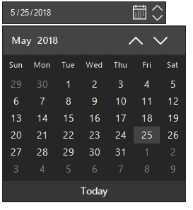
Appearance in Windows Forms DateTimePicker
The appearance of each and every part in the DateTimeEdit can be customized. The SfDateTimeEdit allows you to customize the drop-down icon, calendar, and up-down buttons by using Style properties.
Customize DateTimeEdit appearance
The BackColor, ForeColor, and BorderColor of the control can be customized by using the following Style properties of the SfDateTimeEdit. The up-down and drop-down buttons of the SfDateTimeEdit control can also be customized using the Style.
- BackColor - To change the background color of DateTimeEdit.
- ForeColor - To change the foreground color of date-time text in DateTimeEdit.
- WatermarkForeColor - To change the color to draw the Watermark Text that displays in DateTimeEdit when the Value is null.
- BorderColor - To change the border color of DateTimeEdit.
- DisabledBackColor - To change the background color of DateTimeEdit in disabled or readonly state.
- DisabledForeColor - To change the foreground color of date-time text in disabled or readonly state.
- FocusedBorderColor - To change the border color of DateTimeEdit in focused state.
- HoverBorderColor - To change the border color of DateTimeEdit in mouse hover state.
The following code snippets illustrates the customization.
using Syncfusion.WinForms.Input;

sfDateTimeEdit1.Style.BorderColor = Color.Red;
Imports Syncfusion.WinForms.Input
sfDateTimeEdit1.Style.BorderColor = Color.Red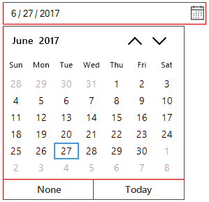
Customize drop-down appearance
The BackColor and ForeColor of drop-down icon to open the calendar can be customized by the following DropDown style properties. The following style properties of DropDown are used to change the color of drop-down icon in different states.
- BackColor - To change the background color of dropdown icon in DateTimeEdit.
- HoverBackColor - To change the background color of dropdown icon in mouse hover state.
- PressedBackColor - To change the background color of dropdown icon in pressed state.
- ForeColor - To change the foreground color of dropdown icon in DateTimeEdit.
- HoverForeColor - To change the foreground color of dropdown icon in mouse hover state.
- PressedForeColor - To change the foreground color of dropdown icon in pressed state.
The following code snippets illustrate the same.
using Syncfusion.WinForms.Input;

//Setting the DropDown Fore color

this.dateTimeEdit.Style.DropDown.ForeColor = Color.Purple;
this.dateTimeEdit.Style.DropDown.HoverForeColor = Color.Yellow;
this.dateTimeEdit.Style.DropDown.PressedForeColor = Color.Green;

//Setting the DropDown Back color

this.sfDateTimeEdit1.Style.DropDown.BackColor = Color.Aqua;
this.sfDateTimeEdit1.Style.DropDown.HoverBackColor = Color.Gray;
this.sfDateTimeEdit1.Style.DropDown.PressedBackColor = Color.Orange;
Imports Syncfusion.WinForms.Input
'Setting the DropDown Fore color
Me.dateTimeEdit.Style.DropDown.ForeColor = Color.Purple
Me.dateTimeEdit.Style.DropDown.HoverForeColor = Color.Yellow
Me.dateTimeEdit.Style.DropDown.PressedForeColor = Color.Green
'Setting the DropDown Back color
Me.sfDateTimeEdit1.Style.DropDown.BackColor = Color.Aqua
Me.sfDateTimeEdit1.Style.DropDown.HoverBackColor = Color.Gray
Me.sfDateTimeEdit1.Style.DropDown.PressedBackColor = Color.Orange

Customize default calendar Icon in drop-down button
The DateTimeIcon property in the SfDateTimeEdit control allows you to customize the calendar icon displayed in the drop-down button. By setting this property, you can replace the default icon with your own image, helping to match the design of your application.
Note: The recommended size for the custom image is 16x16 pixels. If the image is larger than this size, it will be automatically resized to 16x16 pixels.
using Syncfusion.WinForms.Input;

this.dateTimeEdit.DateTimeIcon = Image.FromFile(@"Images/calendar.png");
Imports Syncfusion.WinForms.Input
Me.dateTimeEdit.DateTimeIcon = Image.FromFile(@"Images/calendar.png");
Change visibility of drop-down button
The drop-down button in the SfDateTimeEdit allows you to open the pop-up calendar by using the mouse interaction. The visibility of drop-down button can be changed by the ShowDropDown property.
using Syncfusion.WinForms.Input;

//Enable the DropDown Button

this.dateTimeEdit.ShowDropDown = true;

//Disable the DropDown Button

this.dateTimeEdit.ShowDropDown = false;
Imports Syncfusion.WinForms.Input
'Enable the DropDown Button
Me.dateTimeEdit.ShowDropDown = true
'Disable the DropDown Button
Me.dateTimeEdit.ShowDropDown = false
Customize up-down appearance
The ForeColor of up-down icon in the SfDateTimeEdit can be customized by the following Style properties. The following style properties of the SfDateTimeEdit can be used to change the color of up-down icon in different states:
- UpDownForeColor - To change the foreground color of up-down icon in DateTimeEdit.
- UpDownHoverForeColor - To change the foreground color of up-down icon in mouse hover state.
- UpDownBackColor - To change the background color of up-down icon in DateTimeEdit.
- UpDownHoverBackColor - To change the background color of up-down icon in mouse hover state.
The following code snippets illustrate the same.
using Syncfusion.WinForms.Input;

//Setting the UpDown Fore color

this.dateTimeEdit.Style.UpDownForeColor = Color.HotPink;
this.dateTimeEdit.Style.UpDownHoverForeColor = Color.Blue;
this.dateTimeEdit.Style.UpDownBackColor = Color.LightGray;
this.dateTimeEdit.Style.UpDownHoverBackColor = Color.Yellow;
Imports Syncfusion.WinForms.Input
'Setting the UpDown Fore color
Me.dateTimeEdit.Style.UpDownForeColor = Color.HotPink
Me.dateTimeEdit.Style.UpDownHoverForeColor = Color.Blue
Me.dateTimeEdit.Style.UpDownBackColor = Color.LightGray
Me.dateTimeEdit.Style.UpDownHoverBackColor = Color.Yellow
Change visibility of up-down
The up-down allows you to change the value by increment or decrement of values of the date, month, and year based on the selected field. The value change by up and down buttons are only applicable when the DateTimeEditingMode is mask. The visibility of up-down buttons can be changed by the ShowUpDown property.
using Syncfusion.WinForms.Input;

//Enable the UpDown Button

this.dateTimeEdit.ShowUpDown = true;

//Disable the UpDown Button

this.dateTimeEdit.ShowUpDown = false;
Imports Syncfusion.WinForms.Input
'Enable the UpDown Button
Me.dateTimeEdit.ShowUpDown = true
'Disable the UpDown Button
Me.dateTimeEdit.ShowUpDown = false
Customize drop-down calendar appearance
The drop-down calendar of the SfDateTimeEdit can be obtained from the MonthCalendar property. All the customization with calendar will be reflected in drop-down calendar of the SfDateTimeEdit. The following code snippets illustrate how to change the visibility of footer in the drop-down calendar of the SfDateTimeEdit:
using Syncfusion.WinForms.Input;

dateTimeEdit.MonthCalendar.ShowFooter = false;
Imports Syncfusion.WinForms.Input
dateTimeEdit.MonthCalendar.ShowFooter = false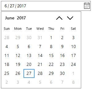
Drop-down calendar size customization
The size of the drop-down calendar can be customized by using the DropDownSize property.
using Syncfusion.WinForms.Input;

//Setting DropDownSize

this.dateTimeEdit.DropDownSize = new Size(294, 293);
this.dateTimeEdit.Width = 294;
Imports Syncfusion.WinForms.Input
'Setting DropDownSize
Me.dateTimeEdit.DropDownSize = New Size(294, 293)
Me.dateTimeEdit.Width = 294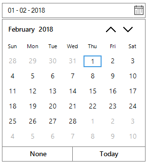
Show Week Numbers
Week numbers can be displayed by setting ShowWeekNumbers property as true.
using Syncfusion.WinForms.Input;

//Setting ShowWeekNumbers

sfDateTimeEdit1.MonthCalendar.ShowWeekNumbers = true;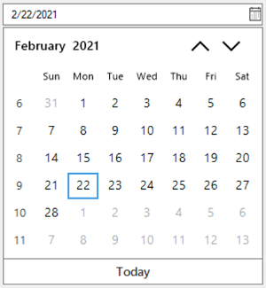
Themes
SfDateTimeEdit offers four built-in themes for professional representation as follows.
- Office2016Colorful
- Office2016White
- Office2016DarkGray
- Office2016Black
Theme can be applied to SfDateTimeEdit by following the below steps:
Load theme assembly
Syncfusion.Office2016Theme.WinForms assembly should be added as reference to set theme for SfDateTimeEdit in any application:
Before applying theme to SfDateTimeEdit, required theme assembly should be loaded as follows.
using Syncfusion.WinForms.Input;
using Syncfusion.WinForms.Controls;

static class Program
{
    /// <summary>
    /// The main entry point for the application.
    /// </summary>

    static void Main()
    {
        SfSkinManager.LoadAssembly(typeof(Office2016Theme).Assembly);
        Application.EnableVisualStyles();
        Application.SetCompatibleTextRenderingDefault(false);
        Application.Run(new Form1());
    }
}
Imports Syncfusion.WinForms.Input
Imports Syncfusion.WinForms.Controls
Friend Module Program
''' <summary>
''' The main entry point for the application.
''' </summary>
Sub Main()
SfSkinManager.LoadAssembly(GetType(Office2016Theme).Assembly)
Application.EnableVisualStyles()
Application.SetCompatibleTextRenderingDefault(False)
Application.Run(New Form1())
End Sub
End ModuleApply theme
Appearance of SfDateTimeEdit can be changed by ThemeName of SfDateTimeEdit.
Office2016Colorful
This option helps to set the Office2016Colorful Theme.
using Syncfusion.WinForms.Input;

// Office2016Colorful

this.dateTimeEdit.ThemeName = "Office2016Colorful";
Imports Syncfusion.WinForms.Input
' Office2016Colorful
Me.dateTimeEdit.ThemeName = "Office2016Colorful"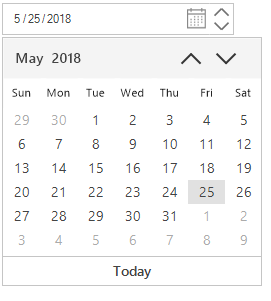
Office2016White
This option helps to set the Office2016White Theme.
using Syncfusion.WinForms.Input;

// Office2016White

this.dateTimeEdit.ThemeName = "Office2016White";
Imports Syncfusion.WinForms.Input
' Office2016White
Me.dateTimeEdit.ThemeName = "Office2016White"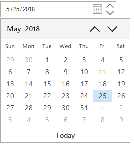
Office2016DarkGray
This option helps to set the Office2016DarkGray Theme.
using Syncfusion.WinForms.Input;

// Office2016DarkGray

this.dateTimeEdit.ThemeName = "Office2016DarkGray";
Imports Syncfusion.WinForms.Input
' Office2016DarkGray
Me.dateTimeEdit.ThemeName = "Office2016DarkGray"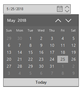
Office2016Black
This option helps to set the Office2016Black Theme.
using Syncfusion.WinForms.Input;

// Office2016Black

this.dateTimeEdit.ThemeName = "Office2016Black";
Imports Syncfusion.WinForms.Input
' Office2016Black
Me.dateTimeEdit.ThemeName = "Office2016Black"