Customization in .NET MAUI Scheduler
Customization of the .NET MAUI Scheduler lets you adjust its views, appearance, and functionality to match your application requirements.
Change different scheduler views
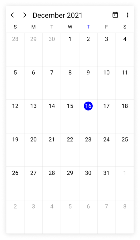
The .NET MAUI Scheduler control provides nine different types of views to display dates and it can be assigned to the control by using the View property. The control is assigned to the Day view by default. The current date will be displayed initially for all the Scheduler views.
<ContentPage
    . . .
    xmlns:scheduler="clr-namespace:Syncfusion.Maui.Scheduler;assembly=Syncfusion.Maui.Scheduler">

    <scheduler:SfScheduler x:Name="scheduler" View="Month"/>
</ContentPage>
using Syncfusion.Maui.Scheduler;
. . .
public partial class MainPage : ContentPage
{
public MainPage()
{
InitializeComponent();
SfScheduler scheduler = new SfScheduler();
scheduler.View = SchedulerView.Month;
this.Content = scheduler;
}
}
Change first day of week
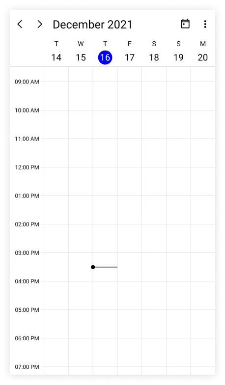
The scheduler allows customization on the first day of the week with the FirstDayOfWeek property. The Scheduler will default to Sunday as the first day of the week.
The following code shows the Scheduler with Tuesday as the first day of the week.
<ContentPage
    . . .
    xmlns:scheduler="clr-namespace:Syncfusion.Maui.Scheduler;assembly=Syncfusion.Maui.Scheduler">

    <scheduler:SfScheduler x:Name="scheduler" FirstDayOfWeek="Tuesday"/>
</ContentPage>
using Syncfusion.Maui.Scheduler;
. . .
public partial class MainPage : ContentPage
{
public MainPage()
{
InitializeComponent();
SfScheduler scheduler = new SfScheduler();
scheduler.FirstDayOfWeek = DayOfWeek.Tuesday;
this.Content = scheduler;
}
}
Today highlight brush
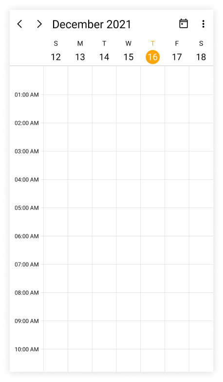
The today highlight brush of the Scheduler can be customized by using the TodayHighlightBrush property in the SfScheduler, which highlights the today’s circle and text in the Scheduler view header and month cell.
<ContentPage
    . . .
    xmlns:scheduler="clr-namespace:Syncfusion.Maui.Scheduler;assembly=Syncfusion.Maui.Scheduler">

    <scheduler:SfScheduler x:Name="scheduler" TodayHighlightBrush="Orange"/>
</ContentPage>
using Syncfusion.Maui.Scheduler;
. . .
public partial class MainPage : ContentPage
{
public MainPage()
{
InitializeComponent();
SfScheduler scheduler = new SfScheduler();
scheduler.TodayHighlightBrush = Brush.Orange;
this.Content = scheduler;
}
}
Cell border brush
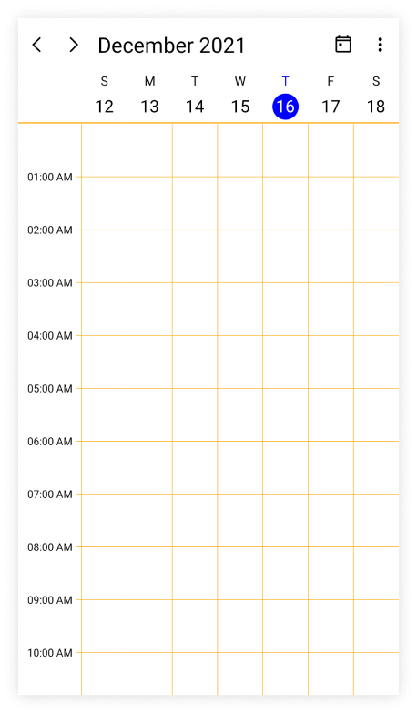
The vertical and horizontal line color of the Scheduler can be customized by using the CellBorderBrush property in the SfScheduler.
<ContentPage
    . . .
    xmlns:scheduler="clr-namespace:Syncfusion.Maui.Scheduler;assembly=Syncfusion.Maui.Scheduler">

    <scheduler:SfScheduler x:Name="scheduler" CellBorderBrush="Orange"/>
</ContentPage>
using Syncfusion.Maui.Scheduler;
. . .
public partial class MainPage : ContentPage
{
public MainPage()
{
InitializeComponent();
SfScheduler scheduler = new SfScheduler();
scheduler.CellBorderBrush = Brush.Orange;
this.Content = scheduler;
}
}
Background color
The Scheduler background color can be customized by using the BackgroundColor property in the SfScheduler.
<ContentPage
    . . .
    xmlns:scheduler="clr-namespace:Syncfusion.Maui.Scheduler;assembly=Syncfusion.Maui.Scheduler">

    <scheduler:SfScheduler x:Name="scheduler" BackgroundColor="LightBlue"/>
</ContentPage>
using Syncfusion.Maui.Scheduler;
. . .
public partial class MainPage : ContentPage
{
public MainPage()
{
InitializeComponent();
SfScheduler scheduler = new SfScheduler();
scheduler.BackgroundColor = Colors.LightBlue;
this.Content = scheduler;
}
}Show navigation arrows
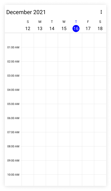
By using the ShowNavigationArrows property of the SfScheduler, you can navigate to the previous or next views of the Scheduler. By default, the value ShowNavigationArrows is true, which displays the navigation icons and Today button in the header view. It allows to quickly navigate to today and previous or next views.
<ContentPage
    . . .
    xmlns:scheduler="clr-namespace:Syncfusion.Maui.Scheduler;assembly=Syncfusion.Maui.Scheduler">

    <scheduler:SfScheduler x:Name="scheduler" ShowNavigationArrows="False"/>
</ContentPage>
using Syncfusion.Maui.Scheduler;
. . .
public partial class MainPage : ContentPage
{
public MainPage()
{
InitializeComponent();
SfScheduler scheduler = new SfScheduler();
scheduler.ShowNavigationArrows = false;
this.Content = scheduler;
}
}
Show week number
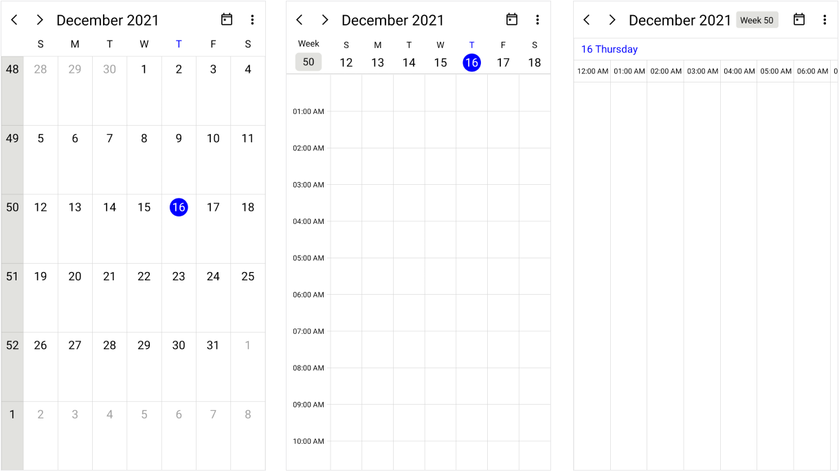
Display the week number of the year in all Scheduler views of the SfScheduler by setting the ShowWeekNumber property to true. By default, it is false. The week numbers will be displayed based on the ISO standard.
<ContentPage
    . . .
    xmlns:scheduler="clr-namespace:Syncfusion.Maui.Scheduler;assembly=Syncfusion.Maui.Scheduler">

    <scheduler:SfScheduler x:Name="scheduler" ShowWeekNumber="True"/>
</ContentPage>
using Syncfusion.Maui.Scheduler;
. . .
public partial class MainPage : ContentPage
{
public MainPage()
{
InitializeComponent();
SfScheduler scheduler = new SfScheduler();
scheduler.ShowWeekNumber = true;
this.Content = scheduler;
}
}NOTE
This property is not applicable when the
SchedulerViewisTimeline Month.
Customize the week number text style
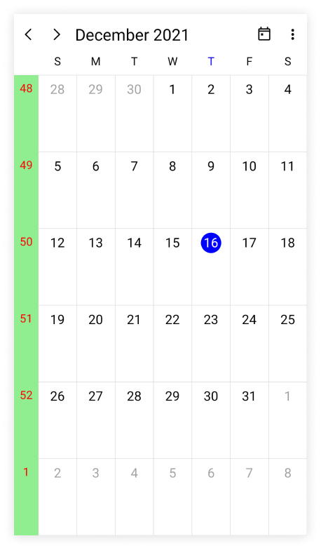
The Week number text style of the Scheduler can be customized by using the WeekNumberStyle property, which allows you to customize the TextStyle and the Background color in the Week number of the SfScheduler.
<ContentPage
    . . .
    xmlns:scheduler="clr-namespace:Syncfusion.Maui.Scheduler;assembly=Syncfusion.Maui.Scheduler">

    <scheduler:SfScheduler x:Name="scheduler" ShowWeekNumber="True"/>
</ContentPage>
using Syncfusion.Maui.Scheduler;
. . .
public partial class MainPage : ContentPage
{
public MainPage()
{
InitializeComponent();
SfScheduler scheduler = new SfScheduler();
scheduler.ShowWeekNumber = true;
var schedulerTextStyle = new SchedulerTextStyle()
{
TextColor = Colors.Red,
FontSize = 14
};
var schedulerWeekNumberStyle = new SchedulerWeekNumberStyle()
{
Background = Brush.LightGreen,
TextStyle = schedulerTextStyle
};
scheduler.WeekNumberStyle = schedulerWeekNumberStyle;
this.Content = scheduler;
}
}NOTE
It is not applicable if the
ViewisTimeline Monthand it is applied only when theShowWeekNumberproperty isenabled.
NOTE
You can refer to our .NET MAUI Scheduler feature tour page for its groundbreaking feature representations. You can also explore our .NET MAUI Scheduler Example that shows you how to render the Scheduler in .NET MAUI.