Populating ItemsSource in .NET MAUI Tab View
18 Nov 201819 minutes to read
The .NET MAUI Tab View supports two ways to provide tab items: through the Items collection (when you want to define tabs declaratively in XAML or in code-behind) and through the ItemsSource property (when you want to bind a collection of data objects to the control). This page covers the data-binding scenario using ItemsSource.
Any class can be used as an item source for the Tab View by assigning its collection to the ItemsSource property. Use the HeaderItemTemplate to define how each header item is rendered and the ContentItemTemplate to define how each tab’s content is rendered. Both templates are of type DataTemplate.
Prerequisites
Before using the SfTabView, ensure the following NuGet package is installed in your .NET MAUI project:
Syncfusion.Maui.TabView
For step-by-step setup, refer to the Getting Started documentation.
Define the data model and view model
Create a Model class with a Name property and a TabItemsSourceViewModel class that exposes a collection of Model items, initialized with the required data objects, as shown in the following code examples.
// Model
public class Model : INotifyPropertyChanged
{
    public event PropertyChangedEventHandler PropertyChanged;

    protected void OnPropertyChanged(string propertyName)
    {
        PropertyChanged?.Invoke(this, new PropertyChangedEventArgs(propertyName));
    }

    private string name;
    public string Name
    {
        get { return name; }
        set
        {
            name = value;
            OnPropertyChanged(nameof(Name));
        }
    }
}
// ViewModels
public class TabItemsSourceViewModel : INotifyPropertyChanged
{
public event PropertyChangedEventHandler PropertyChanged;
protected void OnPropertyChanged(string propertyName)
{
var handler = PropertyChanged;
if (handler != null)
handler(this, new PropertyChangedEventArgs(propertyName));
}
private ObservableCollection<Model> tabItems;
public ObservableCollection<Model> TabItems
{
get { return tabItems; }
set
{
tabItems = value;
OnPropertyChanged("TabItems");
}
}
public TabItemsSourceViewModel()
{
TabItems = new ObservableCollection<Model>
{
new Model { Name = "Alexandar" },
new Model { Name = "Gabriella" },
new Model { Name = "Clara" },
new Model { Name = "Tye" },
new Model { Name = "Nora" },
new Model { Name = "Sebastian" }
};
}
}The following code example binds the collection to the ItemsSource property of Tab View.
<tabView:SfTabView ItemsSource="{Binding TabItems}" >
    <tabView:SfTabView.BindingContext>
        <local:TabItemsSourceViewModel />
    </tabView:SfTabView.BindingContext>
</tabView:SfTabView>
TabItemsSourceViewModel viewModel = new TabItemsSourceViewModel();
this.BindingContext = viewModel;
SfTabView tabView = new SfTabView()
{
ItemsSource = viewModel.TabItems,
};HeaderItemTemplate
By defining the HeaderItemTemplate of the Tab View, you can provide a custom user interface (UI) to display the tab header data items. The template’s BindingContext is the bound data object (a Model instance in this sample).
<tabView:SfTabView ItemsSource="{Binding TabItems}" >
    <tabView:SfTabView.HeaderItemTemplate>
            <DataTemplate >
                <Label  Padding="5,10,10,10"  Text="{Binding Name}"/>
                </DataTemplate>
        </tabView:SfTabView.HeaderItemTemplate>
</tabView:SfTabView>
TabItemsSourceViewModel viewModel = new TabItemsSourceViewModel();
SfTabView tabView = new SfTabView()
{
ItemsSource = viewModel.TabItems,
HeaderItemTemplate = new DataTemplate(() =>
{
var nameLabel = new Label { Padding = new Thickness(5,10,10,10)};
nameLabel.SetBinding(Label.TextProperty, "Name");
return nameLabel;
}),
};public class TabItemsSourceViewModel : INotifyPropertyChanged
{
public event PropertyChangedEventHandler PropertyChanged;
protected void OnPropertyChanged(string propertyName)
{
var handler = PropertyChanged;
if (handler != null)
handler(this, new PropertyChangedEventArgs(propertyName));
}
private ObservableCollection<Model> tabItems;
public ObservableCollection<Model> TabItems
{
get { return tabItems; }
set
{
tabItems = value;
OnPropertyChanged("TabItems");
}
}
public TabItemsSourceViewModel()
{
TabItems = new ObservableCollection<Model>
{
new Model { Name = "Alexandar" },
new Model { Name = "Gabriella" },
new Model { Name = "Clara" },
new Model { Name = "Tye" },
new Model { Name = "Nora" },
new Model { Name = "Sebastian" }
};
}
}
public class Model : INotifyPropertyChanged
{
public event PropertyChangedEventHandler PropertyChanged;
protected void OnPropertyChanged(string propertyName)
{
PropertyChanged?.Invoke(this, new PropertyChangedEventArgs(propertyName));
}
private string name;
public string Name
{
get { return name; }
set
{
name = value;
OnPropertyChanged(nameof(Name));
}
}
}ContentItemTemplate
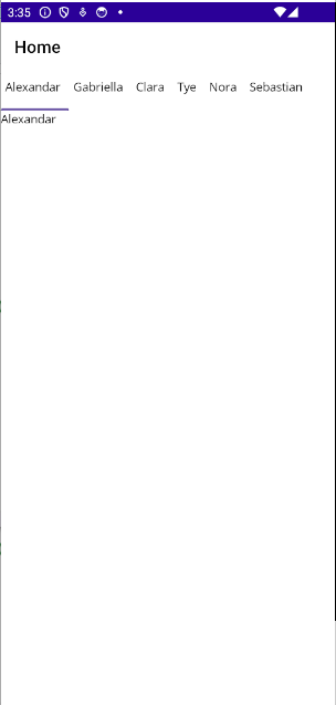
By defining the ContentItemTemplate of the Tab View, you can provide a custom user interface (UI) to display the tab content data items. The template’s BindingContext is the bound data object (a Model instance in this sample).
<tabView:SfTabView ItemsSource="{Binding TabItems}" >
    <tabView:SfTabView.HeaderItemTemplate>
            <DataTemplate >
                <Label  Padding="5,10,10,10"  Text="{Binding Name}"/>
                </DataTemplate>
        </tabView:SfTabView.HeaderItemTemplate>
            <tabView:SfTabView.ContentItemTemplate>
            <DataTemplate>
                    <Label TextColor="Black"  Text="{Binding Name}" />
            </DataTemplate>
    </tabView:SfTabView.ContentItemTemplate>
</tabView:SfTabView>
TabItemsSourceViewModel viewModel = new TabItemsSourceViewModel();
SfTabView tabView = new SfTabView()
{
ItemsSource = viewModel.TabItems,
HeaderItemTemplate = new DataTemplate(() =>
{
var nameLabel = new Label { Padding = new Thickness(5,10,10,10)};
nameLabel.SetBinding(Label.TextProperty, "Name");
return nameLabel;
}),
ContentItemTemplate = new DataTemplate(() =>
{
var nameLabel = new Label { TextColor=Colors.Black };
nameLabel.SetBinding(Label.TextProperty, "Name");
return nameLabel;
}),
};public class TabItemsSourceViewModel : INotifyPropertyChanged
{
public event PropertyChangedEventHandler PropertyChanged;
protected void OnPropertyChanged(string propertyName)
{
var handler = PropertyChanged;
if (handler != null)
handler(this, new PropertyChangedEventArgs(propertyName));
}
private ObservableCollection<Model> tabItems;
public ObservableCollection<Model> TabItems
{
get { return tabItems; }
set
{
tabItems = value;
OnPropertyChanged("TabItems");
}
}
public TabItemsSourceViewModel()
{
TabItems = new ObservableCollection<Model>
{
new Model { Name = "Alexandar" },
new Model { Name = "Gabriella" },
new Model { Name = "Clara" },
new Model { Name = "Tye" },
new Model { Name = "Nora" },
new Model { Name = "Sebastian" }
};
}
}
public class Model : INotifyPropertyChanged
{
public event PropertyChangedEventHandler PropertyChanged;
protected void OnPropertyChanged(string propertyName)
{
PropertyChanged?.Invoke(this, new PropertyChangedEventArgs(propertyName));
}
private string name;
public string Name
{
get { return name; }
set
{
name = value;
OnPropertyChanged(nameof(Name));
}
}
}
Data template selector
By deriving a DataTemplateSelector and assigning it to the HeaderItemTemplate of the Tab View, you can choose between multiple templates for the tab header based on conditions evaluated against the bound data object. The OnSelectTemplate method is invoked once per tab item and should return the appropriate DataTemplate for that item.
Similarly, you can derive a DataTemplateSelector and assign it to the ContentItemTemplate of the Tab View to switch the content template based on conditions.
The star image shown in the output should be included externally.
<ContentPage.Resources>
    <DataTemplate x:Key="NormalHeaderTemplate">
        <Label Text="{Binding Title}"
               VerticalTextAlignment="Center" Margin="10" />
    </DataTemplate>

    <DataTemplate x:Key="ImportantHeaderTemplate">
        <StackLayout Orientation="Horizontal"
                     Spacing="10" Margin="10">
            <Image Source="star.png" WidthRequest="16"
                   HeightRequest="16"/>
            <Label Text="{Binding Title}" FontAttributes="Bold"
                   VerticalTextAlignment="Center" TextColor="DarkGoldenrod"/>
        </StackLayout>
    </DataTemplate>

    <local:TabHeaderTemplateSelector x:Key="TabHeaderTemplateSelector"
                                     NormalTemplate="{StaticResource NormalHeaderTemplate}"
                                     ImportantTemplate="{StaticResource ImportantHeaderTemplate}" />
</ContentPage.Resources>
<ContentPage.BindingContext>
    <local:TabItemViewModel />
</ContentPage.BindingContext>

<tabView:SfTabView ItemsSource="{Binding Tabs}"
                   HeaderItemTemplate="{StaticResource TabHeaderTemplateSelector}" />
SfTabView tabView = new SfTabView
{
ItemsSource = ((TabItemViewModel)BindingContext).Tabs,
HeaderItemTemplate = (TabHeaderTemplateSelector)Resources["TabHeaderTemplateSelector"]
};public class TabHeaderTemplateSelector : DataTemplateSelector
{
public DataTemplate NormalTemplate { get; set; }
public DataTemplate ImportantTemplate { get; set; }
protected override DataTemplate OnSelectTemplate(object item, BindableObject container)
{
var viewModel = item as TabItemModel;
return viewModel?.IsImportant == true ? ImportantTemplate : NormalTemplate;
}
}
public class TabItemModel
{
public string Title { get; set; } = string.Empty;
public bool IsImportant { get; set; }
}
public class TabItemViewModel
{
public ObservableCollection<TabItemModel> Tabs { get; }
public TabItemViewModel()
{
Tabs = new ObservableCollection<TabItemModel>
{
new TabItemModel { Title = "Profile" },
new TabItemModel { Title = "Notifications", IsImportant = true },
new TabItemModel { Title = "Settings" }
};
}
}
The full sample is available on GitHub.