Bar Pointer in .NET MAUI Linear Gauge (SfLinearGauge)
13 Jul 202610 minutes to read
A bar pointer is an accenting line or shaded background that can be placed on a Linear Gauge to mark any current value in the scale track. The bar pointers always start from the minimum value of the scale and end with the specified value. Therefore, the Value property is a required parameter for creating a bar pointer. Multiple bar pointers can be added to a single gauge.
NOTE
Prerequisite: Ensure that the required NuGet package is installed, the necessary namespaces are imported, and the .NET MAUI Linear Gauge control is properly configured in your application. For detailed setup and configuration instructions, refer to the Getting Started guide.
Default bar pointer
The following code sample creates a default bar pointer with the value 50. The default PointerSize is 10.
<gauge:SfLinearGauge>
    <gauge:SfLinearGauge.BarPointers>
        <gauge:BarPointer Value="50"/>
    </gauge:SfLinearGauge.BarPointers>
</gauge:SfLinearGauge>
SfLinearGauge gauge = new SfLinearGauge();
gauge.BarPointers.Add(new BarPointer()
{
Value = 50,
});
this.Content = gauge;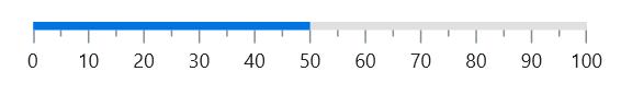
Customize the bar pointer thickness
The thickness can be changed using the PointerSize property of the bar pointer. The following code sample demonstrates the same.
<gauge:SfLinearGauge>
    <gauge:SfLinearGauge.BarPointers>
        <gauge:BarPointer Value="50" PointerSize="10"/>
    </gauge:SfLinearGauge.BarPointers>
</gauge:SfLinearGauge>
SfLinearGauge gauge = new SfLinearGauge();
gauge.BarPointers.Add(new BarPointer()
{
Value = 50,
PointerSize = 10
});
this.Content = gauge;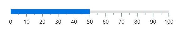
Customize edge style
The edge style can be changed using the CornerStyle property of the bar pointer. The edge style can be any of the StartCurve, EndCurve, BothCurve, and BothFlat options. The default value is BothFlat.
<gauge:SfLinearGauge>
    <gauge:SfLinearGauge.BarPointers>
        <gauge:BarPointer Value="50" PointerSize="10"
                          CornerStyle="BothCurve"/>
    </gauge:SfLinearGauge.BarPointers>
</gauge:SfLinearGauge>
SfLinearGauge gauge = new SfLinearGauge();
gauge.BarPointers.Add(new BarPointer()
{
Value = 50,
PointerSize = 10,
CornerStyle = CornerStyle.BothCurve
});
this.Content = gauge;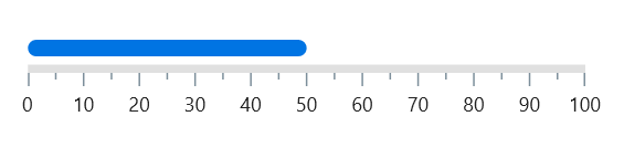
Customize the position
By default, the bar pointer is positioned cross to the scale. This position can be changed by the Position property of a pointer. It is possible to position the bar pointer Inside, Cross, or Outside the scale. The default position is Cross. The following code sample demonstrates how to change the bar pointer position to inside the scale.
<gauge:SfLinearGauge>
    <gauge:SfLinearGauge.BarPointers>
        <gauge:BarPointer Value="50" Position="Inside"/>
    </gauge:SfLinearGauge.BarPointers>
</gauge:SfLinearGauge>
SfLinearGauge gauge = new SfLinearGauge();
gauge.BarPointers.Add(new BarPointer()
{
Value = 50,
Position = GaugeElementPosition.Inside,
});
this.Content = gauge;
Customize the offset
In addition to positioning the bar pointer, it is also possible to change the offset of the bar pointer. The Offset value is the distance from the scale and it has no effect on cross-positioned elements. The default Offset value is 0. The following code sample demonstrates how to change the offset value of the bar pointer.
<gauge:SfLinearGauge>
    <gauge:SfLinearGauge.BarPointers>
        <gauge:BarPointer Value="50" Position="Outside" Offset="5"/>
    </gauge:SfLinearGauge.BarPointers>
</gauge:SfLinearGauge>
SfLinearGauge gauge = new SfLinearGauge();
gauge.BarPointers.Add(new BarPointer()
{
Value = 50,
Position = GaugeElementPosition.Outside,
Offset = 5
});
this.Content = gauge;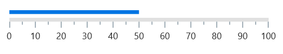
Change the color of the bar pointer
The color of the bar pointer can be changed by the Fill property. The following code sample demonstrates the same.
<gauge:SfLinearGauge>
    <gauge:SfLinearGauge.BarPointers>
        <gauge:BarPointer Value="50" Fill="Red"/>
    </gauge:SfLinearGauge.BarPointers>
</gauge:SfLinearGauge>
SfLinearGauge gauge = new SfLinearGauge();
gauge.BarPointers.Add(new BarPointer()
{
Value = 50,
Fill = new SolidColorBrush(Colors.Red),
});
this.Content = gauge;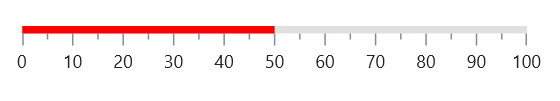
Apply gradient
The gradient can be applied by using the GradientStops property of bar pointer, which accepts a collection of GaugeGradientStop objects. Each GaugeGradientStop defines a Value (the scale position) and a Color (the color at that position). The following code sample demonstrates how to apply a linear gradient to the bar pointer.
<gauge:SfLinearGauge>
    <gauge:SfLinearGauge.BarPointers>
        <gauge:BarPointer Value="70">
            <gauge:BarPointer.GradientStops>
                <gauge:GaugeGradientStop Value="0" Color="Green"/>
                <gauge:GaugeGradientStop Value="35"
                                         Color="#ff0074E3"/>
            </gauge:BarPointer.GradientStops>
        </gauge:BarPointer>
    </gauge:SfLinearGauge.BarPointers>
</gauge:SfLinearGauge>
SfLinearGauge gauge = new SfLinearGauge();
ObservableCollection<GaugeGradientStop> gradientStops = new ObservableCollection<GaugeGradientStop>();
gradientStops.Add(new GaugeGradientStop() { Value = 0, Color = Colors.Green });
gradientStops.Add(new GaugeGradientStop() { Value = 35, Color = Color.FromArgb("#ff0074E3") });
gauge.BarPointers.Add(new BarPointer()
{
Value = 70,
GradientStops = gradientStops
});
this.Content = gauge;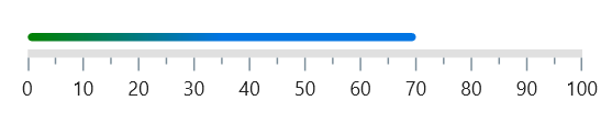
Child support
By using the Child property of bar pointer, you can provide a child for the bar pointer. To improve readability, the child content is used to add any UI content, such as text or images, inside the bar pointer. In the following example, labels and ticks are hidden and the line style thickness is increased to accommodate the child content within the bar pointer.
<gauge:SfLinearGauge ShowLabels="False" ShowTicks="False">
    <gauge:SfLinearGauge.LineStyle>
        <gauge:LinearLineStyle CornerStyle="BothCurve"
                               Thickness="30"/>
    </gauge:SfLinearGauge.LineStyle>
    <gauge:SfLinearGauge.BarPointers>
        <gauge:BarPointer CornerStyle="BothCurve" Value="50"
                          PointerSize="30">
            <gauge:BarPointer.Child>
                <Label Text="50%" Margin="0,0,10,0"
                       HorizontalOptions="End"
                       TextColor="White" VerticalOptions="Center"/>
            </gauge:BarPointer.Child>
        </gauge:BarPointer>
    </gauge:SfLinearGauge.BarPointers>
</gauge:SfLinearGauge>
SfLinearGauge gauge = new SfLinearGauge();
gauge.ShowLabels = false;
gauge.ShowTicks = false;
gauge.LineStyle = new LinearLineStyle()
{
Thickness = 30,
CornerStyle = CornerStyle.BothCurve
};
Label label = new Label()
{
Text = "50%",
Margin = new Thickness(0, 0, 10, 0),
TextColor = Colors.White,
HorizontalOptions = LayoutOptions.End,
VerticalOptions = LayoutOptions.Center
};
gauge.BarPointers.Add(new BarPointer()
{
Value = 50,
PointerSize = 30,
CornerStyle = CornerStyle.BothCurve,
Child = label
});
this.Content = gauge;