About Syncfusion® .NET MAUI Image Editor Control
18 Nov 20185 minutes to read
The .NET MAUI Image Editor (SfImageEditor) lets you edit images by annotating them with freehand drawing paths, text, and built-in shapes, and by cropping and flipping them. A built-in toolbar provides quick access to the editing operations.
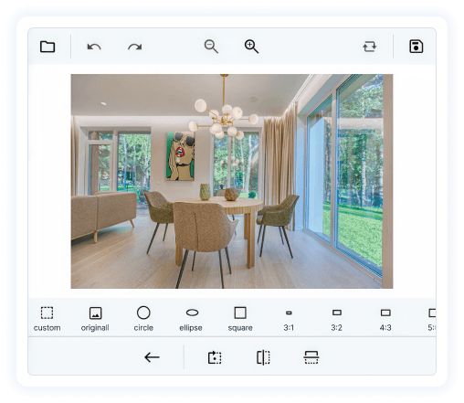
Business use cases
- Photo editing applications that require image enhancement, cropping, and annotation features.
- Social media apps that allow users to edit and customize images before sharing.
- Document management systems that require marking and annotating images for review or approval.
- Business applications that support image customization for reports, forms, or visual content creation.
Key features
- Image cropping allows you to select and trim specific portions of an image.
- Visual effects allows you to apply effects such as brightness, contrast, blur, saturation, exposure, sharpen, hue, and opacity.
- Zooming and panning allows you to navigate images for detailed editing.
- Transformation allows you to perform operations such as rotation and flipping.
- Annotation allows you to add text, shapes, and freehand drawings to enhance or mark images.
- Toolbar provides built-in tools for easy access to editing features, with customization options.
- Undo and redo allows you to revert or reapply changes during editing.
- Save allows you to store edited images to a desired location after modifications.
- Serialization allows you to save and restore the editing state of images, enabling persistence and reuse across sessions.
Globalization
The following table summarizes the globalization support available in this control.
 Full Support
 Not Applicable
| Control | Localization | RTL | Time zone | Screen reader | Keyboard navigation |
|---|---|---|---|---|---|
| Image Editor | |
|
|
|
|
Related controls
- Signature Pad for capturing and adding signature annotations to images.
- Popup for presenting image editing tools or previews.
- Toolbar for providing quick access to editing actions with customization options.
See also
- Getting Started shows a step-by-step guide to begin using the Image Editor control.
- Image filters let you apply built-in filters to adjust brightness, contrast, and colors.
- Custom view allows you to embed custom UI elements inside the editor to extend functionality.
- UI Kit provides interactive demos and reference UI examples.
Resources
Feature Tour
Get a quick overview of key features and capabilities to kick start your journey.
Explore Features
Tutorial Videos
Watch step‑by‑step video guides to quickly understand concepts and implementation.
Watch now
Knowledge Base
Find practical solutions, troubleshooting tips and how‑to guides for common scenarios.
Search KB's