Appearance in .NET MAUI Expander (SfExpander)
18 Jun 202624 minutes to read
The .NET MAUI SfExpander comes with built-in support for customizing the appearance of the header.
Header icon position
The SfExpander allows you to customize the position of the header icon by using the HeaderIconPosition property. By default, the header icon position is End.
<ContentPage.Content>
<ScrollView>
<StackLayout HorizontalOptions="{OnPlatform MacCatalyst=Center,WinUI=Center}" >
<Label Text="Invoice: #FRU037020142097" Opacity="1.0" VerticalTextAlignment="Center" Margin="0,0,0,5" FontAttributes="Bold" VerticalOptions="Center" HorizontalOptions="Center"/>
<Border StrokeShape="RoundRectangle 8,8,8,8" Margin="{OnPlatform Default='8,0,8,8',WinUI='8,0,6,8',MacCatalyst='8,0,6,8'}" Stroke="#CAC4D0" StrokeThickness="{OnPlatform MacCatalyst=2,Default=1}" WidthRequest="{OnPlatform MacCatalyst=460,WinUI=340}">
<syncfusion:SfExpander x:Name="expander"
IsExpanded="true"
HeaderIconPosition="Start">
<syncfusion:SfExpander.Header>
<Grid RowDefinitions="48" ColumnDefinitions="35,*">
<Label Text="" FontSize="16" Margin="14,2,2,2" FontFamily='{OnPlatform Android=AccordionFontIcons.ttf#,WinUI=AccordionFontIcons.ttf#AccordionFontIcons,MacCatalyst=AccordionFontIcons,iOS=AccordionFontIcons}'
VerticalOptions="Center" VerticalTextAlignment="Center"/>
<Label CharacterSpacing="0.25" FontFamily="Roboto-Regular" Text="Invoice Date" FontSize="14" Grid.Column="1" VerticalOptions="Center"/>
</Grid>
</syncfusion:SfExpander.Header>
<syncfusion:SfExpander.Content>
<Grid Padding="18,8,0,18" >
<Label CharacterSpacing="0.25" FontFamily="Roboto-Regular" Text="11:03 AM, 15 January 2019" FontSize="14" VerticalOptions="Center"/>
</Grid>
</syncfusion:SfExpander.Content>
</syncfusion:SfExpander>
</Border>
<Border StrokeShape="RoundRectangle 8,8,8,8" Margin="{OnPlatform Default='8,0,8,8',WinUI='8,0,6,8',MacCatalyst='8,0,6,8'}" Stroke="#CAC4D0" StrokeThickness="{OnPlatform MacCatalyst=2,Default=1}" WidthRequest="{OnPlatform MacCatalyst=460,WinUI=340}">
<syncfusion:SfExpander AnimationDuration="200"
IsExpanded="False"
HeaderIconPosition="Start">
<syncfusion:SfExpander.Header>
<Grid RowDefinitions="48" ColumnDefinitions="35,*">
<Label Text="" FontSize="16" Margin="14,2,2,2" FontFamily='{OnPlatform Android=AccordionFontIcons.ttf#,WinUI=AccordionFontIcons.ttf#AccordionFontIcons,MacCatalyst=AccordionFontIcons,iOS=AccordionFontIcons}' VerticalOptions="Center" VerticalTextAlignment="Center"/>
<Label CharacterSpacing="0.25" FontFamily="Roboto-Regular" Text="Item(s)" FontSize="14" Grid.Column="1" VerticalOptions="Center"/>
</Grid>
</syncfusion:SfExpander.Header>
<syncfusion:SfExpander.Content>
<Grid Padding="18,8,18,18" RowDefinitions="20,20,20,20,20,20,20" ColumnDefinitions="*,*">
<Label FontSize="14" CharacterSpacing="0.25" Text="2018 Subaru Outback"/>
<Label FontSize="14" CharacterSpacing="0.25" Text="All-Weather Mats" Grid.Row="1"/>
<Label FontSize="14" CharacterSpacing="0.25" Text="Door Edge Guard Kit" Grid.Row="2"/>
<Label FontSize="14" CharacterSpacing="0.25" Text="Rear Bumper Cover" Grid.Row="3"/>
<Label FontSize="14" CharacterSpacing="0.25" Text="Wheel Locks" Grid.Row="4"/>
<Label FontSize="14" CharacterSpacing="0.25" Text="Gas Full Tank" Grid.Row="5"/>
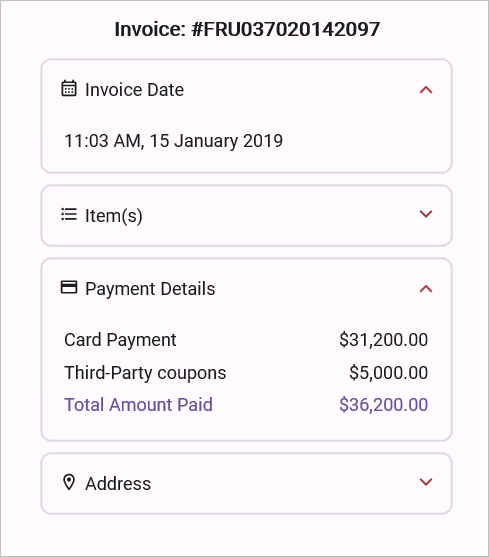
<Label FontSize="14" CharacterSpacing="0.25" Text="Total Amount" TextColor="{StaticResource Primary}" Grid.Row="6"/>
<Label FontSize="14" CharacterSpacing="0.25" HorizontalOptions="End" Text="$35,705.00" Grid.Row="0" Grid.Column="1"/>
<Label FontSize="14" CharacterSpacing="0.25" HorizontalOptions="End" Text="$101.00" Grid.Row="1" Grid.Column="1"/>
<Label FontSize="14" CharacterSpacing="0.25" HorizontalOptions="End" Text="$162.00" Grid.Row="2" Grid.Column="1"/>
<Label FontSize="14" CharacterSpacing="0.25" HorizontalOptions="End" Text="$107.00" Grid.Row="3" Grid.Column="1"/>
<Label FontSize="14" CharacterSpacing="0.25" HorizontalOptions="End" Text="$81.00" Grid.Row="4" Grid.Column="1"/>
<Label FontSize="14" CharacterSpacing="0.25" HorizontalOptions="End" Text="$64.00" Grid.Row="5" Grid.Column="1"/>
<Label FontSize="14" CharacterSpacing="0.25" HorizontalOptions="End" Text="$36,220.00" TextColor="{StaticResource Primary}" Grid.Row="6" Grid.Column="1"/>
</Grid>
</syncfusion:SfExpander.Content>
</syncfusion:SfExpander>
</Border>
<Border StrokeShape="RoundRectangle 8,8,8,8" Margin="{OnPlatform Default='8,0,8,8',WinUI='8,0,6,8',MacCatalyst='8,0,6,8'}" Stroke="#CAC4D0" StrokeThickness="{OnPlatform MacCatalyst=2,Default=1}" WidthRequest="{OnPlatform MacCatalyst=460,WinUI=340}">
<syncfusion:SfExpander AnimationDuration="200"
IsExpanded="False"
HeaderIconPosition="Start">
<syncfusion:SfExpander.Header>
<Grid RowDefinitions="48" ColumnDefinitions="35,*">
<Label Text="" FontSize="16" Margin="14,2,2,2" FontFamily='{OnPlatform Android=AccordionFontIcons.ttf#,WinUI=AccordionFontIcons.ttf#AccordionFontIcons,MacCatalyst=AccordionFontIcons,iOS=AccordionFontIcons}' VerticalOptions="Center" VerticalTextAlignment="Center"/>
<Label CharacterSpacing="0.25" FontFamily="Roboto-Regular" Text="Payment Details" FontSize="14" Grid.Column="1" VerticalOptions="Center"/>
</Grid>
</syncfusion:SfExpander.Header>
<syncfusion:SfExpander.Content>
<Grid Padding="18,8,18,18" RowSpacing="6" RowDefinitions="20,20,20" ColumnDefinitions="*,*">
<Grid.Resources>
<Style TargetType="Label">
<Setter Property="FontFamily" Value="Roboto-Regular"/>
</Style>
</Grid.Resources>
<Label FontSize="14" CharacterSpacing="0.25" Text="Card Payment"/>
<Label FontSize="14" CharacterSpacing="0.25" Text="Third-Party coupons" Grid.Row="1"/>
<Label FontSize="14" CharacterSpacing="0.25" Text="Total Amount Paid" TextColor="{StaticResource Primary}" Grid.Row="2"/>
<Label FontSize="14" CharacterSpacing="0.25" HorizontalOptions="End" Text="$31,200.00" Grid.Column="1"/>
<Label FontSize="14" CharacterSpacing="0.25" HorizontalOptions="End" Text="$5,000.00" Grid.Row="1" Grid.Column="1"/>
<Label FontSize="14" CharacterSpacing="0.25" HorizontalOptions="End" Text="$36,200.00" TextColor="{StaticResource Primary}" Grid.Row="2" Grid.Column="1"/>
</Grid>
</syncfusion:SfExpander.Content>
</syncfusion:SfExpander>
</Border>
<Border StrokeShape="RoundRectangle 8,8,8,8" Margin="{OnPlatform Default='8,0,8,8',WinUI='8,0,6,8',MacCatalyst='8,0,6,8'}" Stroke="#CAC4D0" StrokeThickness="{OnPlatform MacCatalyst=2,Default=1}" WidthRequest="{OnPlatform MacCatalyst=460,WinUI=340}">
<syncfusion:SfExpander AnimationDuration="200"
IsExpanded="True"
HeaderIconPosition="Start">
<syncfusion:SfExpander.Header>
<Grid RowDefinitions="48" ColumnDefinitions="35,*">
<Label Text="" FontSize="16" Margin="14,2,2,2" FontFamily='{OnPlatform Android=AccordionFontIcons.ttf#,WinUI=AccordionFontIcons.ttf#AccordionFontIcons,MacCatalyst=AccordionFontIcons,iOS=AccordionFontIcons}' VerticalOptions="Center" VerticalTextAlignment="Center"/>
<Label CharacterSpacing="0.25" FontFamily="Roboto-Regular" FontSize="14" Text="Address" Grid.Column="1" VerticalOptions="Center"/>
</Grid>
</syncfusion:SfExpander.Header>
<syncfusion:SfExpander.Content>
<Grid Padding="18,8,18,18" Grid.Row="1" RowSpacing="1" RowDefinitions="Auto,Auto,Auto">
<Grid.Resources>
<Style TargetType="Label">
<Setter Property="FontFamily" Value="Roboto-Regular"/>
</Style>
</Grid.Resources>
<Label CharacterSpacing="0.25" FontSize="14" Text="Alex" FontAttributes="Bold"/>
<Label CharacterSpacing="0.25" FontSize="14" Text="No.8 Blossom St, Washington, DC 20019" Grid.Row="1"/>
<Label CharacterSpacing="0.25" FontSize="14" Text="(202) 547-3555" Grid.Row="2"/>
</Grid>
</syncfusion:SfExpander.Content>
</syncfusion:SfExpander>
</Border>
</StackLayout>
</ScrollView>
</ContentPage.Content>public partial class MainPage : ContentPage
{
public MainPage()
{
InitializeComponent();
Title = "Invoice";
Content = new ScrollView
{
Content = new StackLayout
{
HorizontalOptions = LayoutOptions.Center,
Children =
{
CreateInvoiceHeader(),
CreateInvoiceDate(),
CreateItems(),
CreatePaymentDetails(),
CreateAddress()
}
}
};
}
private SfExpander CreateExpander(bool expanded, string icon, string title, View content)
{
var headerGrid = new Grid
{
ColumnDefinitions =
{
new ColumnDefinition { Width = 35 },
new ColumnDefinition { Width = GridLength.Star }
},
HeightRequest = 48
};
headerGrid.Add(
new Label
{
Text = icon,
FontFamily = "AccordionFontIcons",
FontSize = 16,
Margin = new Thickness(14, 2),
VerticalTextAlignment = TextAlignment.Center
},
column: 0,
row: 0
);
headerGrid.Add(
new Label
{
Text = title,
FontFamily = "Roboto-Regular",
FontSize = 14,
VerticalOptions = LayoutOptions.Center
},
column: 1,
row: 0
);
return new SfExpander
{
IsExpanded = expanded,
HeaderIconPosition = Syncfusion.Maui.Expander.ExpanderIconPosition.Start,
Header = headerGrid,
Content = content
};
}
private View CreateInvoiceHeader()
{
return new Label
{
Text = "Invoice: #FRU037020142097",
FontAttributes = FontAttributes.Bold,
Margin = new Thickness(0, 0, 0, 5),
HorizontalOptions = LayoutOptions.Center,
VerticalOptions = LayoutOptions.Center
};
}
private View CreateInvoiceDate()
{
return CreateBorder(CreateExpander(true, "\ue703", "Invoice Date",
new Grid
{
Padding = new Thickness(18, 8, 0, 18),
Children =
{
new Label
{
Text = "11:03 AM, 15 January 2019",
FontFamily = "Roboto-Regular",
FontSize = 14
}
}
}
)
);
}
private View CreateItems()
{
var grid = new Grid
{
Padding = new Thickness(18, 8, 18, 18),
ColumnDefinitions = { new ColumnDefinition(), new ColumnDefinition() }
};
string[] items =
{
"2018 Subaru Outback",
"All-Weather Mats",
"Door Edge Guard Kit",
"Rear Bumper Cover",
"Wheel Locks",
"Gas Full Tank",
"Total Amount"
};
string[] prices =
{
"$35,705.00",
"$101.00",
"$162.00",
"$107.00",
"$81.00",
"$64.00",
"$36,220.00"
};
for (int i = 0; i < items.Length; i++)
{
grid.Add(new Label
{
Text = items[i],
FontSize = 14,
FontFamily = "Roboto-Regular",
TextColor = i == 6 ? Colors.Blue : Colors.Black
}, 0, i);
grid.Add(new Label
{
Text = prices[i],
FontSize = 14,
HorizontalOptions = LayoutOptions.End,
TextColor = i == 6 ? Colors.Blue : Colors.Black
}, 1, i);
}
return CreateBorder(CreateExpander(false, "\ue701", "Item(s)", grid));
}
private View CreatePaymentDetails()
{
var grid = new Grid
{
Padding = new Thickness(18, 8, 18, 18),
ColumnDefinitions = { new ColumnDefinition(), new ColumnDefinition() },
RowDefinitions =
{
new RowDefinition(),
new RowDefinition(),
new RowDefinition()
}
};
grid.Add(new Label { Text = "Card Payment" }, 0, 0);
grid.Add(new Label { Text = "$31,200.00", HorizontalOptions = LayoutOptions.End }, 1, 0);
grid.Add(new Label { Text = "Third-Party coupons" }, 0, 1);
grid.Add(new Label { Text = "$5,000.00", HorizontalOptions = LayoutOptions.End }, 1, 1);
grid.Add(new Label
{
Text = "Total Amount Paid",
TextColor = Colors.Blue,
FontAttributes = FontAttributes.Bold
}, 0, 2);
grid.Add(new Label
{
Text = "$36,200.00",
TextColor = Colors.Blue,
HorizontalOptions = LayoutOptions.End
}, 1, 2);
return CreateBorder(CreateExpander(false, "\ue702", "Payment Details", grid));
}
private View CreateAddress()
{
var grid = new Grid
{
Padding = new Thickness(18, 8, 18, 18),
RowDefinitions =
{
new RowDefinition(),
new RowDefinition(),
new RowDefinition()
}
};
grid.Add(new Label { Text = "Alex", FontAttributes = FontAttributes.Bold }, 0, 0);
grid.Add(new Label { Text = "No.8 Blossom St, Washington, DC 20019" }, 0, 1);
grid.Add(new Label { Text = "(202) 547-3555" }, 0, 2);
return CreateBorder(CreateExpander(true, "\ue704", "Address", grid));
}
private View CreateBorder(View content)
{
return new Border
{
Stroke = Color.FromArgb("#CAC4D0"),
StrokeThickness = DeviceInfo.Platform == DevicePlatform.MacCatalyst ? 2 : 1,
StrokeShape = new RoundRectangle { CornerRadius = 8 },
WidthRequest = DeviceInfo.Platform == DevicePlatform.MacCatalyst ? 460 : DeviceInfo.Platform == DevicePlatform.WinUI ? 340 : -1,
Margin = new Thickness(8, 0, 8, 8),
Content = content
};
}
}
Header background color customization
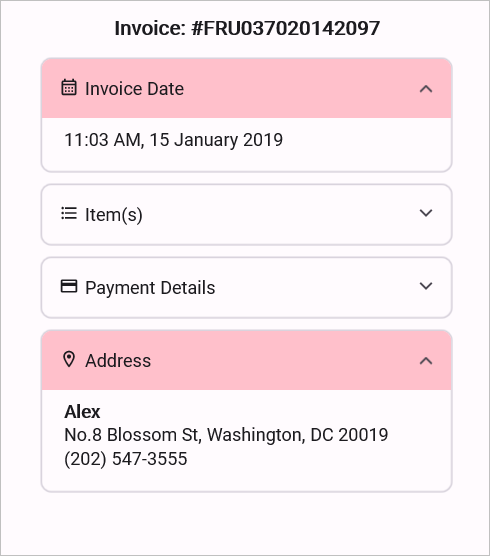
The SfExpander allows you to customize the background color of the expander header by using the HeaderBackground property.
<ContentPage.Content>
<ScrollView>
<StackLayout HorizontalOptions="{OnPlatform MacCatalyst=Center,WinUI=Center}" >
<Label Text="Invoice: #FRU037020142097" Opacity="1.0" VerticalTextAlignment="Center" Margin="0,0,0,5" FontAttributes="Bold" VerticalOptions="Center" HorizontalOptions="Center"/>
<Border StrokeShape="RoundRectangle 8,8,8,8" Margin="{OnPlatform Default='8,0,8,8',WinUI='8,0,6,8',MacCatalyst='8,0,6,8'}" Stroke="#CAC4D0" StrokeThickness="{OnPlatform MacCatalyst=2,Default=1}" WidthRequest="{OnPlatform MacCatalyst=460,WinUI=340}">
<syncfusion:SfExpander x:Name="expander"
IsExpanded="true"
HeaderBackground="Pink">
<syncfusion:SfExpander.Header>
<Grid RowDefinitions="48" ColumnDefinitions="35,*">
<Label Text="" FontSize="16" Margin="14,2,2,2" FontFamily='{OnPlatform Android=AccordionFontIcons.ttf#,WinUI=AccordionFontIcons.ttf#AccordionFontIcons,MacCatalyst=AccordionFontIcons,iOS=AccordionFontIcons}'
VerticalOptions="Center" VerticalTextAlignment="Center"/>
<Label CharacterSpacing="0.25" FontFamily="Roboto-Regular" Text="Invoice Date" FontSize="14" Grid.Column="1" VerticalOptions="Center"/>
</Grid>
</syncfusion:SfExpander.Header>
<syncfusion:SfExpander.Content>
<Grid Padding="18,8,0,18" >
<Label CharacterSpacing="0.25" FontFamily="Roboto-Regular" Text="11:03 AM, 15 January 2019" FontSize="14" VerticalOptions="Center"/>
</Grid>
</syncfusion:SfExpander.Content>
</syncfusion:SfExpander>
</Border>
<Border StrokeShape="RoundRectangle 8,8,8,8" Margin="{OnPlatform Default='8,0,8,8',WinUI='8,0,6,8',MacCatalyst='8,0,6,8'}" Stroke="#CAC4D0" StrokeThickness="{OnPlatform MacCatalyst=2,Default=1}" WidthRequest="{OnPlatform MacCatalyst=460,WinUI=340}">
<syncfusion:SfExpander AnimationDuration="200"
IsExpanded="False">
<syncfusion:SfExpander.Header>
<Grid RowDefinitions="48" ColumnDefinitions="35,*">
<Label Text="" FontSize="16" Margin="14,2,2,2" FontFamily='{OnPlatform Android=AccordionFontIcons.ttf#,WinUI=AccordionFontIcons.ttf#AccordionFontIcons,MacCatalyst=AccordionFontIcons,iOS=AccordionFontIcons}' VerticalOptions="Center" VerticalTextAlignment="Center"/>
<Label CharacterSpacing="0.25" FontFamily="Roboto-Regular" Text="Item(s)" FontSize="14" Grid.Column="1" VerticalOptions="Center"/>
</Grid>
</syncfusion:SfExpander.Header>
<syncfusion:SfExpander.Content>
<Grid Padding="18,8,18,18" RowDefinitions="20,20,20,20,20,20,20" ColumnDefinitions="*,*">
<Label FontSize="14" CharacterSpacing="0.25" Text="2018 Subaru Outback"/>
<Label FontSize="14" CharacterSpacing="0.25" Text="All-Weather Mats" Grid.Row="1"/>
<Label FontSize="14" CharacterSpacing="0.25" Text="Door Edge Guard Kit" Grid.Row="2"/>
<Label FontSize="14" CharacterSpacing="0.25" Text="Rear Bumper Cover" Grid.Row="3"/>
<Label FontSize="14" CharacterSpacing="0.25" Text="Wheel Locks" Grid.Row="4"/>
<Label FontSize="14" CharacterSpacing="0.25" Text="Gas Full Tank" Grid.Row="5"/>
<Label FontSize="14" CharacterSpacing="0.25" Text="Total Amount" TextColor="{StaticResource Primary}" Grid.Row="6"/>
<Label FontSize="14" CharacterSpacing="0.25" HorizontalOptions="End" Text="$35,705.00" Grid.Row="0" Grid.Column="1"/>
<Label FontSize="14" CharacterSpacing="0.25" HorizontalOptions="End" Text="$101.00" Grid.Row="1" Grid.Column="1"/>
<Label FontSize="14" CharacterSpacing="0.25" HorizontalOptions="End" Text="$162.00" Grid.Row="2" Grid.Column="1"/>
<Label FontSize="14" CharacterSpacing="0.25" HorizontalOptions="End" Text="$107.00" Grid.Row="3" Grid.Column="1"/>
<Label FontSize="14" CharacterSpacing="0.25" HorizontalOptions="End" Text="$81.00" Grid.Row="4" Grid.Column="1"/>
<Label FontSize="14" CharacterSpacing="0.25" HorizontalOptions="End" Text="$64.00" Grid.Row="5" Grid.Column="1"/>
<Label FontSize="14" CharacterSpacing="0.25" HorizontalOptions="End" Text="$36,220.00" TextColor="{StaticResource Primary}" Grid.Row="6" Grid.Column="1"/>
</Grid>
</syncfusion:SfExpander.Content>
</syncfusion:SfExpander>
</Border>
<Border StrokeShape="RoundRectangle 8,8,8,8" Margin="{OnPlatform Default='8,0,8,8',WinUI='8,0,6,8',MacCatalyst='8,0,6,8'}" Stroke="#CAC4D0" StrokeThickness="{OnPlatform MacCatalyst=2,Default=1}" WidthRequest="{OnPlatform MacCatalyst=460,WinUI=340}">
<syncfusion:SfExpander AnimationDuration="200"
IsExpanded="False">
<syncfusion:SfExpander.Header>
<Grid RowDefinitions="48" ColumnDefinitions="35,*">
<Label Text="" FontSize="16" Margin="14,2,2,2" FontFamily='{OnPlatform Android=AccordionFontIcons.ttf#,WinUI=AccordionFontIcons.ttf#AccordionFontIcons,MacCatalyst=AccordionFontIcons,iOS=AccordionFontIcons}' VerticalOptions="Center" VerticalTextAlignment="Center"/>
<Label CharacterSpacing="0.25" FontFamily="Roboto-Regular" Text="Payment Details" FontSize="14" Grid.Column="1" VerticalOptions="Center"/>
</Grid>
</syncfusion:SfExpander.Header>
<syncfusion:SfExpander.Content>
<Grid Padding="18,8,18,18" RowSpacing="6" RowDefinitions="20,20,20" ColumnDefinitions="*,*">
<Grid.Resources>
<Style TargetType="Label">
<Setter Property="FontFamily" Value="Roboto-Regular"/>
</Style>
</Grid.Resources>
<Label FontSize="14" CharacterSpacing="0.25" Text="Card Payment"/>
<Label FontSize="14" CharacterSpacing="0.25" Text="Third-Party coupons" Grid.Row="1"/>
<Label FontSize="14" CharacterSpacing="0.25" Text="Total Amount Paid" TextColor="{StaticResource Primary}" Grid.Row="2"/>
<Label FontSize="14" CharacterSpacing="0.25" HorizontalOptions="End" Text="$31,200.00" Grid.Column="1"/>
<Label FontSize="14" CharacterSpacing="0.25" HorizontalOptions="End" Text="$5,000.00" Grid.Row="1" Grid.Column="1"/>
<Label FontSize="14" CharacterSpacing="0.25" HorizontalOptions="End" Text="$36,200.00" TextColor="{StaticResource Primary}" Grid.Row="2" Grid.Column="1"/>
</Grid>
</syncfusion:SfExpander.Content>
</syncfusion:SfExpander>
</Border>
<Border StrokeShape="RoundRectangle 8,8,8,8" Margin="{OnPlatform Default='8,0,8,8',WinUI='8,0,6,8',MacCatalyst='8,0,6,8'}" Stroke="#CAC4D0" StrokeThickness="{OnPlatform MacCatalyst=2,Default=1}" WidthRequest="{OnPlatform MacCatalyst=460,WinUI=340}">
<syncfusion:SfExpander AnimationDuration="200"
IsExpanded="True"
HeaderBackground="Pink">
<syncfusion:SfExpander.Header>
<Grid RowDefinitions="48" ColumnDefinitions="35,*">
<Label Text="" FontSize="16" Margin="14,2,2,2" FontFamily='{OnPlatform Android=AccordionFontIcons.ttf#,WinUI=AccordionFontIcons.ttf#AccordionFontIcons,MacCatalyst=AccordionFontIcons,iOS=AccordionFontIcons}' VerticalOptions="Center" VerticalTextAlignment="Center"/>
<Label CharacterSpacing="0.25" FontFamily="Roboto-Regular" FontSize="14" Text="Address" Grid.Column="1" VerticalOptions="Center"/>
</Grid>
</syncfusion:SfExpander.Header>
<syncfusion:SfExpander.Content>
<Grid Padding="18,8,18,18" Grid.Row="1" RowSpacing="1" RowDefinitions="Auto,Auto,Auto">
<Grid.Resources>
<Style TargetType="Label">
<Setter Property="FontFamily" Value="Roboto-Regular"/>
</Style>
</Grid.Resources>
<Label CharacterSpacing="0.25" FontSize="14" Text="Alex" FontAttributes="Bold"/>
<Label CharacterSpacing="0.25" FontSize="14" Text="No.8 Blossom St, Washington, DC 20019" Grid.Row="1"/>
<Label CharacterSpacing="0.25" FontSize="14" Text="(202) 547-3555" Grid.Row="2"/>
</Grid>
</syncfusion:SfExpander.Content>
</syncfusion:SfExpander>
</Border>
</StackLayout>
</ScrollView>
</ContentPage.Content>public partial class MainPage : ContentPage
{
public MainPage()
{
InitializeComponent();
Title = "Invoice";
Content = new ScrollView
{
Content = new StackLayout
{
HorizontalOptions = LayoutOptions.Center,
Children =
{
CreateInvoiceHeader(),
CreateInvoiceDate(),
CreateItems(),
CreatePaymentDetails(),
CreateAddress()
}
}
};
}
private SfExpander CreateExpander(bool expanded, string icon, string title, View content)
{
var headerGrid = new Grid
{
ColumnDefinitions =
{
new ColumnDefinition { Width = 35 },
new ColumnDefinition { Width = GridLength.Star }
},
HeightRequest = 48
};
headerGrid.Add(
new Label
{
Text = icon,
FontFamily = "AccordionFontIcons",
FontSize = 16,
Margin = new Thickness(14, 2),
VerticalTextAlignment = TextAlignment.Center
},
column: 0,
row: 0
);
headerGrid.Add(
new Label
{
Text = title,
FontFamily = "Roboto-Regular",
FontSize = 14,
VerticalOptions = LayoutOptions.Center
},
column: 1,
row: 0
);
return new SfExpander
{
IsExpanded = expanded,
HeaderBackground = Colors.Pink,
Header = headerGrid,
Content = content
};
}
private View CreateInvoiceHeader()
{
return new Label
{
Text = "Invoice: #FRU037020142097",
FontAttributes = FontAttributes.Bold,
Margin = new Thickness(0, 0, 0, 5),
HorizontalOptions = LayoutOptions.Center,
VerticalOptions = LayoutOptions.Center
};
}
private View CreateInvoiceDate()
{
return CreateBorder(CreateExpander(true, "\ue703", "Invoice Date",
new Grid
{
Padding = new Thickness(18, 8, 0, 18),
Children =
{
new Label
{
Text = "11:03 AM, 15 January 2019",
FontFamily = "Roboto-Regular",
FontSize = 14
}
}
}
)
);
}
private View CreateItems()
{
var grid = new Grid
{
Padding = new Thickness(18, 8, 18, 18),
ColumnDefinitions = { new ColumnDefinition(), new ColumnDefinition() }
};
string[] items =
{
"2018 Subaru Outback",
"All-Weather Mats",
"Door Edge Guard Kit",
"Rear Bumper Cover",
"Wheel Locks",
"Gas Full Tank",
"Total Amount"
};
string[] prices =
{
"$35,705.00",
"$101.00",
"$162.00",
"$107.00",
"$81.00",
"$64.00",
"$36,220.00"
};
for (int i = 0; i < items.Length; i++)
{
grid.Add(new Label
{
Text = items[i],
FontSize = 14,
FontFamily = "Roboto-Regular",
TextColor = i == 6 ? Colors.Blue : Colors.Black
}, 0, i);
grid.Add(new Label
{
Text = prices[i],
FontSize = 14,
HorizontalOptions = LayoutOptions.End,
TextColor = i == 6 ? Colors.Blue : Colors.Black
}, 1, i);
}
return CreateBorder(CreateExpander(false, "\ue701", "Item(s)", grid));
}
private View CreatePaymentDetails()
{
var grid = new Grid
{
Padding = new Thickness(18, 8, 18, 18),
ColumnDefinitions = { new ColumnDefinition(), new ColumnDefinition() },
RowDefinitions =
{
new RowDefinition(),
new RowDefinition(),
new RowDefinition()
}
};
grid.Add(new Label { Text = "Card Payment" }, 0, 0);
grid.Add(new Label { Text = "$31,200.00", HorizontalOptions = LayoutOptions.End }, 1, 0);
grid.Add(new Label { Text = "Third-Party coupons" }, 0, 1);
grid.Add(new Label { Text = "$5,000.00", HorizontalOptions = LayoutOptions.End }, 1, 1);
grid.Add(new Label
{
Text = "Total Amount Paid",
TextColor = Colors.Blue,
FontAttributes = FontAttributes.Bold
}, 0, 2);
grid.Add(new Label
{
Text = "$36,200.00",
TextColor = Colors.Blue,
HorizontalOptions = LayoutOptions.End
}, 1, 2);
return CreateBorder(CreateExpander(false, "\ue702", "Payment Details", grid));
}
private View CreateAddress()
{
var grid = new Grid
{
Padding = new Thickness(18, 8, 18, 18),
RowDefinitions =
{
new RowDefinition(),
new RowDefinition(),
new RowDefinition()
}
};
grid.Add(new Label { Text = "Alex", FontAttributes = FontAttributes.Bold }, 0, 0);
grid.Add(new Label { Text = "No.8 Blossom St, Washington, DC 20019" }, 0, 1);
grid.Add(new Label { Text = "(202) 547-3555" }, 0, 2);
return CreateBorder(CreateExpander(true, "\ue704", "Address", grid));
}
private View CreateBorder(View content)
{
return new Border
{
Stroke = Color.FromArgb("#CAC4D0"),
StrokeThickness = DeviceInfo.Platform == DevicePlatform.MacCatalyst ? 2 : 1,
StrokeShape = new RoundRectangle { CornerRadius = 8 },
WidthRequest = DeviceInfo.Platform == DevicePlatform.MacCatalyst ? 460 : DeviceInfo.Platform == DevicePlatform.WinUI ? 340 : -1,
Margin = new Thickness(8, 0, 8, 8),
Content = content
};
}
}
Icon color customization
The SfExpander allows you to customize the color of the expander icon by using the HeaderIconColor property.
<ContentPage.Content>
<ScrollView>
<StackLayout HorizontalOptions="{OnPlatform MacCatalyst=Center,WinUI=Center}" >
<Label Text="Invoice: #FRU037020142097" Opacity="1.0" VerticalTextAlignment="Center" Margin="0,0,0,5" FontAttributes="Bold" VerticalOptions="Center" HorizontalOptions="Center"/>
<Border StrokeShape="RoundRectangle 8,8,8,8" Margin="{OnPlatform Default='8,0,8,8',WinUI='8,0,6,8',MacCatalyst='8,0,6,8'}" Stroke="#CAC4D0" StrokeThickness="{OnPlatform MacCatalyst=2,Default=1}" WidthRequest="{OnPlatform MacCatalyst=460,WinUI=340}">
<syncfusion:SfExpander x:Name="expander"
IsExpanded="true"
HeaderIconColor="Brown">
<syncfusion:SfExpander.Header>
<Grid RowDefinitions="48" ColumnDefinitions="35,*">
<Label Text="" FontSize="16" Margin="14,2,2,2" FontFamily='{OnPlatform Android=AccordionFontIcons.ttf#,WinUI=AccordionFontIcons.ttf#AccordionFontIcons,MacCatalyst=AccordionFontIcons,iOS=AccordionFontIcons}'
VerticalOptions="Center" VerticalTextAlignment="Center"/>
<Label CharacterSpacing="0.25" FontFamily="Roboto-Regular" Text="Invoice Date" FontSize="14" Grid.Column="1" VerticalOptions="Center"/>
</Grid>
</syncfusion:SfExpander.Header>
<syncfusion:SfExpander.Content>
<Grid Padding="18,8,0,18" >
<Label CharacterSpacing="0.25" FontFamily="Roboto-Regular" Text="11:03 AM, 15 January 2019" FontSize="14" VerticalOptions="Center"/>
</Grid>
</syncfusion:SfExpander.Content>
</syncfusion:SfExpander>
</Border>
<Border StrokeShape="RoundRectangle 8,8,8,8" Margin="{OnPlatform Default='8,0,8,8',WinUI='8,0,6,8',MacCatalyst='8,0,6,8'}" Stroke="#CAC4D0" StrokeThickness="{OnPlatform MacCatalyst=2,Default=1}" WidthRequest="{OnPlatform MacCatalyst=460,WinUI=340}">
<syncfusion:SfExpander AnimationDuration="200"
IsExpanded="False"
HeaderIconColor="Brown">
<syncfusion:SfExpander.Header>
<Grid RowDefinitions="48" ColumnDefinitions="35,*">
<Label Text="" FontSize="16" Margin="14,2,2,2" FontFamily='{OnPlatform Android=AccordionFontIcons.ttf#,WinUI=AccordionFontIcons.ttf#AccordionFontIcons,MacCatalyst=AccordionFontIcons,iOS=AccordionFontIcons}' VerticalOptions="Center" VerticalTextAlignment="Center"/>
<Label CharacterSpacing="0.25" FontFamily="Roboto-Regular" Text="Item(s)" FontSize="14" Grid.Column="1" VerticalOptions="Center"/>
</Grid>
</syncfusion:SfExpander.Header>
<syncfusion:SfExpander.Content>
<Grid Padding="18,8,18,18" RowDefinitions="20,20,20,20,20,20,20" ColumnDefinitions="*,*">
<Label FontSize="14" CharacterSpacing="0.25" Text="2018 Subaru Outback"/>
<Label FontSize="14" CharacterSpacing="0.25" Text="All-Weather Mats" Grid.Row="1"/>
<Label FontSize="14" CharacterSpacing="0.25" Text="Door Edge Guard Kit" Grid.Row="2"/>
<Label FontSize="14" CharacterSpacing="0.25" Text="Rear Bumper Cover" Grid.Row="3"/>
<Label FontSize="14" CharacterSpacing="0.25" Text="Wheel Locks" Grid.Row="4"/>
<Label FontSize="14" CharacterSpacing="0.25" Text="Gas Full Tank" Grid.Row="5"/>
<Label FontSize="14" CharacterSpacing="0.25" Text="Total Amount" TextColor="{StaticResource Primary}" Grid.Row="6"/>
<Label FontSize="14" CharacterSpacing="0.25" HorizontalOptions="End" Text="$35,705.00" Grid.Row="0" Grid.Column="1"/>
<Label FontSize="14" CharacterSpacing="0.25" HorizontalOptions="End" Text="$101.00" Grid.Row="1" Grid.Column="1"/>
<Label FontSize="14" CharacterSpacing="0.25" HorizontalOptions="End" Text="$162.00" Grid.Row="2" Grid.Column="1"/>
<Label FontSize="14" CharacterSpacing="0.25" HorizontalOptions="End" Text="$107.00" Grid.Row="3" Grid.Column="1"/>
<Label FontSize="14" CharacterSpacing="0.25" HorizontalOptions="End" Text="$81.00" Grid.Row="4" Grid.Column="1"/>
<Label FontSize="14" CharacterSpacing="0.25" HorizontalOptions="End" Text="$64.00" Grid.Row="5" Grid.Column="1"/>
<Label FontSize="14" CharacterSpacing="0.25" HorizontalOptions="End" Text="$36,220.00" TextColor="{StaticResource Primary}" Grid.Row="6" Grid.Column="1"/>
</Grid>
</syncfusion:SfExpander.Content>
</syncfusion:SfExpander>
</Border>
<Border StrokeShape="RoundRectangle 8,8,8,8" Margin="{OnPlatform Default='8,0,8,8',WinUI='8,0,6,8',MacCatalyst='8,0,6,8'}" Stroke="#CAC4D0" StrokeThickness="{OnPlatform MacCatalyst=2,Default=1}" WidthRequest="{OnPlatform MacCatalyst=460,WinUI=340}">
<syncfusion:SfExpander AnimationDuration="200"
IsExpanded="False"
HeaderIconColor="Brown">
<syncfusion:SfExpander.Header>
<Grid RowDefinitions="48" ColumnDefinitions="35,*">
<Label Text="" FontSize="16" Margin="14,2,2,2" FontFamily='{OnPlatform Android=AccordionFontIcons.ttf#,WinUI=AccordionFontIcons.ttf#AccordionFontIcons,MacCatalyst=AccordionFontIcons,iOS=AccordionFontIcons}' VerticalOptions="Center" VerticalTextAlignment="Center"/>
<Label CharacterSpacing="0.25" FontFamily="Roboto-Regular" Text="Payment Details" FontSize="14" Grid.Column="1" VerticalOptions="Center"/>
</Grid>
</syncfusion:SfExpander.Header>
<syncfusion:SfExpander.Content>
<Grid Padding="18,8,18,18" RowSpacing="6" RowDefinitions="20,20,20" ColumnDefinitions="*,*">
<Grid.Resources>
<Style TargetType="Label">
<Setter Property="FontFamily" Value="Roboto-Regular"/>
</Style>
</Grid.Resources>
<Label FontSize="14" CharacterSpacing="0.25" Text="Card Payment"/>
<Label FontSize="14" CharacterSpacing="0.25" Text="Third-Party coupons" Grid.Row="1"/>
<Label FontSize="14" CharacterSpacing="0.25" Text="Total Amount Paid" TextColor="{StaticResource Primary}" Grid.Row="2"/>
<Label FontSize="14" CharacterSpacing="0.25" HorizontalOptions="End" Text="$31,200.00" Grid.Column="1"/>
<Label FontSize="14" CharacterSpacing="0.25" HorizontalOptions="End" Text="$5,000.00" Grid.Row="1" Grid.Column="1"/>
<Label FontSize="14" CharacterSpacing="0.25" HorizontalOptions="End" Text="$36,200.00" TextColor="{StaticResource Primary}" Grid.Row="2" Grid.Column="1"/>
</Grid>
</syncfusion:SfExpander.Content>
</syncfusion:SfExpander>
</Border>
<Border StrokeShape="RoundRectangle 8,8,8,8" Margin="{OnPlatform Default='8,0,8,8',WinUI='8,0,6,8',MacCatalyst='8,0,6,8'}" Stroke="#CAC4D0" StrokeThickness="{OnPlatform MacCatalyst=2,Default=1}" WidthRequest="{OnPlatform MacCatalyst=460,WinUI=340}">
<syncfusion:SfExpander AnimationDuration="200"
IsExpanded="True"
HeaderIconColor="Brown">
<syncfusion:SfExpander.Header>
<Grid RowDefinitions="48" ColumnDefinitions="35,*">
<Label Text="" FontSize="16" Margin="14,2,2,2" FontFamily='{OnPlatform Android=AccordionFontIcons.ttf#,WinUI=AccordionFontIcons.ttf#AccordionFontIcons,MacCatalyst=AccordionFontIcons,iOS=AccordionFontIcons}' VerticalOptions="Center" VerticalTextAlignment="Center"/>
<Label CharacterSpacing="0.25" FontFamily="Roboto-Regular" FontSize="14" Text="Address" Grid.Column="1" VerticalOptions="Center"/>
</Grid>
</syncfusion:SfExpander.Header>
<syncfusion:SfExpander.Content>
<Grid Padding="18,8,18,18" Grid.Row="1" RowSpacing="1" RowDefinitions="Auto,Auto,Auto">
<Grid.Resources>
<Style TargetType="Label">
<Setter Property="FontFamily" Value="Roboto-Regular"/>
</Style>
</Grid.Resources>
<Label CharacterSpacing="0.25" FontSize="14" Text="Alex" FontAttributes="Bold"/>
<Label CharacterSpacing="0.25" FontSize="14" Text="No.8 Blossom St, Washington, DC 20019" Grid.Row="1"/>
<Label CharacterSpacing="0.25" FontSize="14" Text="(202) 547-3555" Grid.Row="2"/>
</Grid>
</syncfusion:SfExpander.Content>
</syncfusion:SfExpander>
</Border>
</StackLayout>
</ScrollView>
</ContentPage.Content>public partial class MainPage : ContentPage
{
public MainPage()
{
InitializeComponent();
Title = "Invoice";
Content = new ScrollView
{
Content = new StackLayout
{
HorizontalOptions = LayoutOptions.Center,
Children =
{
CreateInvoiceHeader(),
CreateInvoiceDate(),
CreateItems(),
CreatePaymentDetails(),
CreateAddress()
}
}
};
}
private SfExpander CreateExpander(bool expanded, string icon, string title, View content)
{
var headerGrid = new Grid
{
ColumnDefinitions =
{
new ColumnDefinition { Width = 35 },
new ColumnDefinition { Width = GridLength.Star }
},
HeightRequest = 48
};
headerGrid.Add(
new Label
{
Text = icon,
FontFamily = "AccordionFontIcons",
FontSize = 16,
Margin = new Thickness(14, 2),
VerticalTextAlignment = TextAlignment.Center
},
column: 0,
row: 0
);
headerGrid.Add(
new Label
{
Text = title,
FontFamily = "Roboto-Regular",
FontSize = 14,
VerticalOptions = LayoutOptions.Center
},
column: 1,
row: 0
);
return new SfExpander
{
IsExpanded = expanded,
HeaderIconColor = Colors.Brown,
Header = headerGrid,
Content = content
};
}
private View CreateInvoiceHeader()
{
return new Label
{
Text = "Invoice: #FRU037020142097",
FontAttributes = FontAttributes.Bold,
Margin = new Thickness(0, 0, 0, 5),
HorizontalOptions = LayoutOptions.Center,
VerticalOptions = LayoutOptions.Center
};
}
private View CreateInvoiceDate()
{
return CreateBorder(CreateExpander(true, "\ue703", "Invoice Date",
new Grid
{
Padding = new Thickness(18, 8, 0, 18),
Children =
{
new Label
{
Text = "11:03 AM, 15 January 2019",
FontFamily = "Roboto-Regular",
FontSize = 14
}
}
}
)
);
}
private View CreateItems()
{
var grid = new Grid
{
Padding = new Thickness(18, 8, 18, 18),
ColumnDefinitions = { new ColumnDefinition(), new ColumnDefinition() }
};
string[] items =
{
"2018 Subaru Outback",
"All-Weather Mats",
"Door Edge Guard Kit",
"Rear Bumper Cover",
"Wheel Locks",
"Gas Full Tank",
"Total Amount"
};
string[] prices =
{
"$35,705.00",
"$101.00",
"$162.00",
"$107.00",
"$81.00",
"$64.00",
"$36,220.00"
};
for (int i = 0; i < items.Length; i++)
{
grid.Add(new Label
{
Text = items[i],
FontSize = 14,
FontFamily = "Roboto-Regular",
TextColor = i == 6 ? Colors.Blue : Colors.Black
}, 0, i);
grid.Add(new Label
{
Text = prices[i],
FontSize = 14,
HorizontalOptions = LayoutOptions.End,
TextColor = i == 6 ? Colors.Blue : Colors.Black
}, 1, i);
}
return CreateBorder(CreateExpander(false, "\ue701", "Item(s)", grid));
}
private View CreatePaymentDetails()
{
var grid = new Grid
{
Padding = new Thickness(18, 8, 18, 18),
ColumnDefinitions = { new ColumnDefinition(), new ColumnDefinition() },
RowDefinitions =
{
new RowDefinition(),
new RowDefinition(),
new RowDefinition()
}
};
grid.Add(new Label { Text = "Card Payment" }, 0, 0);
grid.Add(new Label { Text = "$31,200.00", HorizontalOptions = LayoutOptions.End }, 1, 0);
grid.Add(new Label { Text = "Third-Party coupons" }, 0, 1);
grid.Add(new Label { Text = "$5,000.00", HorizontalOptions = LayoutOptions.End }, 1, 1);
grid.Add(new Label
{
Text = "Total Amount Paid",
TextColor = Colors.Blue,
FontAttributes = FontAttributes.Bold
}, 0, 2);
grid.Add(new Label
{
Text = "$36,200.00",
TextColor = Colors.Blue,
HorizontalOptions = LayoutOptions.End
}, 1, 2);
return CreateBorder(CreateExpander(false, "\ue702", "Payment Details", grid));
}
private View CreateAddress()
{
var grid = new Grid
{
Padding = new Thickness(18, 8, 18, 18),
RowDefinitions =
{
new RowDefinition(),
new RowDefinition(),
new RowDefinition()
}
};
grid.Add(new Label { Text = "Alex", FontAttributes = FontAttributes.Bold }, 0, 0);
grid.Add(new Label { Text = "No.8 Blossom St, Washington, DC 20019" }, 0, 1);
grid.Add(new Label { Text = "(202) 547-3555" }, 0, 2);
return CreateBorder(CreateExpander(true, "\ue704", "Address", grid));
}
private View CreateBorder(View content)
{
return new Border
{
Stroke = Color.FromArgb("#CAC4D0"),
StrokeThickness = DeviceInfo.Platform == DevicePlatform.MacCatalyst ? 2 : 1,
StrokeShape = new RoundRectangle { CornerRadius = 8 },
WidthRequest = DeviceInfo.Platform == DevicePlatform.MacCatalyst ? 460 : DeviceInfo.Platform == DevicePlatform.WinUI ? 340 : -1,
Margin = new Thickness(8, 0, 8, 8),
Content = content
};
}
}
Visual State Manager
The appearance of the SfExpander can be customized using the following VisualStates:
- Expanded
- Collapsed
- PointerOver
- Normal
<ContentPage.Content>
<ScrollView>
<StackLayout HorizontalOptions="{OnPlatform MacCatalyst=Center,WinUI=Center}" >
<Label Text="Invoice: #FRU037020142097" Opacity="1.0" VerticalTextAlignment="Center" Margin="0,0,0,5" FontAttributes="Bold" VerticalOptions="Center" HorizontalOptions="Center"/>
<Border StrokeShape="RoundRectangle 8,8,8,8" Margin="{OnPlatform Default='8,0,8,8',WinUI='8,0,6,8',MacCatalyst='8,0,6,8'}" Stroke="#CAC4D0" StrokeThickness="{OnPlatform MacCatalyst=2,Default=1}" WidthRequest="{OnPlatform MacCatalyst=460,WinUI=340}">
<syncfusion:SfExpander x:Name="expander"
IsExpanded="true">
<syncfusion:SfExpander.Header>
<Grid RowDefinitions="48" ColumnDefinitions="35,*">
<Label Text="" FontSize="16" Margin="14,2,2,2" FontFamily='{OnPlatform Android=AccordionFontIcons.ttf#,WinUI=AccordionFontIcons.ttf#AccordionFontIcons,MacCatalyst=AccordionFontIcons,iOS=AccordionFontIcons}'
VerticalOptions="Center" VerticalTextAlignment="Center"/>
<Label CharacterSpacing="0.25" FontFamily="Roboto-Regular" Text="Invoice Date" FontSize="14" Grid.Column="1" VerticalOptions="Center"/>
</Grid>
</syncfusion:SfExpander.Header>
<syncfusion:SfExpander.Content>
<Grid Padding="18,8,0,18" >
<Label CharacterSpacing="0.25" FontFamily="Roboto-Regular" Text="11:03 AM, 15 January 2019" FontSize="14" VerticalOptions="Center"/>
</Grid>
</syncfusion:SfExpander.Content>
<VisualStateManager.VisualStateGroups>
<VisualStateGroupList>
<VisualStateGroup>
<VisualState Name="Expanded">
<VisualState.Setters>
<Setter Property="HeaderBackground" Value="#6750A4"/>
<Setter Property="HeaderIconColor" Value="#FFFFFF"/>
</VisualState.Setters>
</VisualState>
<VisualState Name="Collapsed">
<VisualState.Setters>
<Setter Property="HeaderBackground" Value="#141C1B1F"/>
<Setter Property="HeaderIconColor" Value="#49454F"/>
</VisualState.Setters>
</VisualState>
<VisualState Name="PointerOver">
<VisualState.Setters>
<Setter Property="HeaderBackground" Value="#ded6d5"/>
<Setter Property="HeaderIconColor" Value="#524f4f"/>
</VisualState.Setters>
</VisualState>
<VisualState Name="Normal">
<VisualState.Setters>
<Setter Property="HeaderBackground" Value="#faf8f7"/>
<Setter Property="HeaderIconColor" Value="#000000"/>
</VisualState.Setters>
</VisualState>
</VisualStateGroup>
</VisualStateGroupList>
</VisualStateManager.VisualStateGroups>
</syncfusion:SfExpander>
</Border>
<Border StrokeShape="RoundRectangle 8,8,8,8" Margin="{OnPlatform Default='8,0,8,8',WinUI='8,0,6,8',MacCatalyst='8,0,6,8'}" Stroke="#CAC4D0" StrokeThickness="{OnPlatform MacCatalyst=2,Default=1}" WidthRequest="{OnPlatform MacCatalyst=460,WinUI=340}">
<syncfusion:SfExpander AnimationDuration="200"
IsExpanded="False"
HeaderIconColor="Brown">
<syncfusion:SfExpander.Header>
<Grid RowDefinitions="48" ColumnDefinitions="35,*">
<Label Text="" FontSize="16" Margin="14,2,2,2" FontFamily='{OnPlatform Android=AccordionFontIcons.ttf#,WinUI=AccordionFontIcons.ttf#AccordionFontIcons,MacCatalyst=AccordionFontIcons,iOS=AccordionFontIcons}' VerticalOptions="Center" VerticalTextAlignment="Center"/>
<Label CharacterSpacing="0.25" FontFamily="Roboto-Regular" Text="Item(s)" FontSize="14" Grid.Column="1" VerticalOptions="Center"/>
</Grid>
</syncfusion:SfExpander.Header>
<syncfusion:SfExpander.Content>
<Grid Padding="18,8,18,18" RowDefinitions="20,20,20,20,20,20,20" ColumnDefinitions="*,*">
<Label FontSize="14" CharacterSpacing="0.25" Text="2018 Subaru Outback"/>
<Label FontSize="14" CharacterSpacing="0.25" Text="All-Weather Mats" Grid.Row="1"/>
<Label FontSize="14" CharacterSpacing="0.25" Text="Door Edge Guard Kit" Grid.Row="2"/>
<Label FontSize="14" CharacterSpacing="0.25" Text="Rear Bumper Cover" Grid.Row="3"/>
<Label FontSize="14" CharacterSpacing="0.25" Text="Wheel Locks" Grid.Row="4"/>
<Label FontSize="14" CharacterSpacing="0.25" Text="Gas Full Tank" Grid.Row="5"/>
<Label FontSize="14" CharacterSpacing="0.25" Text="Total Amount" TextColor="{StaticResource Primary}" Grid.Row="6"/>
<Label FontSize="14" CharacterSpacing="0.25" HorizontalOptions="End" Text="$35,705.00" Grid.Row="0" Grid.Column="1"/>
<Label FontSize="14" CharacterSpacing="0.25" HorizontalOptions="End" Text="$101.00" Grid.Row="1" Grid.Column="1"/>
<Label FontSize="14" CharacterSpacing="0.25" HorizontalOptions="End" Text="$162.00" Grid.Row="2" Grid.Column="1"/>
<Label FontSize="14" CharacterSpacing="0.25" HorizontalOptions="End" Text="$107.00" Grid.Row="3" Grid.Column="1"/>
<Label FontSize="14" CharacterSpacing="0.25" HorizontalOptions="End" Text="$81.00" Grid.Row="4" Grid.Column="1"/>
<Label FontSize="14" CharacterSpacing="0.25" HorizontalOptions="End" Text="$64.00" Grid.Row="5" Grid.Column="1"/>
<Label FontSize="14" CharacterSpacing="0.25" HorizontalOptions="End" Text="$36,220.00" TextColor="{StaticResource Primary}" Grid.Row="6" Grid.Column="1"/>
</Grid>
</syncfusion:SfExpander.Content>
</syncfusion:SfExpander>
</Border>
<Border StrokeShape="RoundRectangle 8,8,8,8" Margin="{OnPlatform Default='8,0,8,8',WinUI='8,0,6,8',MacCatalyst='8,0,6,8'}" Stroke="#CAC4D0" StrokeThickness="{OnPlatform MacCatalyst=2,Default=1}" WidthRequest="{OnPlatform MacCatalyst=460,WinUI=340}">
<syncfusion:SfExpander AnimationDuration="200"
IsExpanded="False"
HeaderIconColor="Brown">
<syncfusion:SfExpander.Header>
<Grid RowDefinitions="48" ColumnDefinitions="35,*">
<Label Text="" FontSize="16" Margin="14,2,2,2" FontFamily='{OnPlatform Android=AccordionFontIcons.ttf#,WinUI=AccordionFontIcons.ttf#AccordionFontIcons,MacCatalyst=AccordionFontIcons,iOS=AccordionFontIcons}' VerticalOptions="Center" VerticalTextAlignment="Center"/>
<Label CharacterSpacing="0.25" FontFamily="Roboto-Regular" Text="Payment Details" FontSize="14" Grid.Column="1" VerticalOptions="Center"/>
</Grid>
</syncfusion:SfExpander.Header>
<syncfusion:SfExpander.Content>
<Grid Padding="18,8,18,18" RowSpacing="6" RowDefinitions="20,20,20" ColumnDefinitions="*,*">
<Grid.Resources>
<Style TargetType="Label">
<Setter Property="FontFamily" Value="Roboto-Regular"/>
</Style>
</Grid.Resources>
<Label FontSize="14" CharacterSpacing="0.25" Text="Card Payment"/>
<Label FontSize="14" CharacterSpacing="0.25" Text="Third-Party coupons" Grid.Row="1"/>
<Label FontSize="14" CharacterSpacing="0.25" Text="Total Amount Paid" TextColor="{StaticResource Primary}" Grid.Row="2"/>
<Label FontSize="14" CharacterSpacing="0.25" HorizontalOptions="End" Text="$31,200.00" Grid.Column="1"/>
<Label FontSize="14" CharacterSpacing="0.25" HorizontalOptions="End" Text="$5,000.00" Grid.Row="1" Grid.Column="1"/>
<Label FontSize="14" CharacterSpacing="0.25" HorizontalOptions="End" Text="$36,200.00" TextColor="{StaticResource Primary}" Grid.Row="2" Grid.Column="1"/>
</Grid>
</syncfusion:SfExpander.Content>
</syncfusion:SfExpander>
</Border>
<Border StrokeShape="RoundRectangle 8,8,8,8" Margin="{OnPlatform Default='8,0,8,8',WinUI='8,0,6,8',MacCatalyst='8,0,6,8'}" Stroke="#CAC4D0" StrokeThickness="{OnPlatform MacCatalyst=2,Default=1}" WidthRequest="{OnPlatform MacCatalyst=460,WinUI=340}">
<syncfusion:SfExpander AnimationDuration="200"
IsExpanded="True"
HeaderIconColor="Brown">
<syncfusion:SfExpander.Header>
<Grid RowDefinitions="48" ColumnDefinitions="35,*">
<Label Text="" FontSize="16" Margin="14,2,2,2" FontFamily='{OnPlatform Android=AccordionFontIcons.ttf#,WinUI=AccordionFontIcons.ttf#AccordionFontIcons,MacCatalyst=AccordionFontIcons,iOS=AccordionFontIcons}' VerticalOptions="Center" VerticalTextAlignment="Center"/>
<Label CharacterSpacing="0.25" FontFamily="Roboto-Regular" FontSize="14" Text="Address" Grid.Column="1" VerticalOptions="Center"/>
</Grid>
</syncfusion:SfExpander.Header>
<syncfusion:SfExpander.Content>
<Grid Padding="18,8,18,18" Grid.Row="1" RowSpacing="1" RowDefinitions="Auto,Auto,Auto">
<Grid.Resources>
<Style TargetType="Label">
<Setter Property="FontFamily" Value="Roboto-Regular"/>
</Style>
</Grid.Resources>
<Label CharacterSpacing="0.25" FontSize="14" Text="Alex" FontAttributes="Bold"/>
<Label CharacterSpacing="0.25" FontSize="14" Text="No.8 Blossom St, Washington, DC 20019" Grid.Row="1"/>
<Label CharacterSpacing="0.25" FontSize="14" Text="(202) 547-3555" Grid.Row="2"/>
</Grid>
</syncfusion:SfExpander.Content>
<VisualStateManager.VisualStateGroups>
<VisualStateGroupList>
<VisualStateGroup>
<VisualState Name="Expanded">
<VisualState.Setters>
<Setter Property="HeaderBackground" Value="#6750A4"/>
<Setter Property="HeaderIconColor" Value="#FFFFFF"/>
</VisualState.Setters>
</VisualState>
<VisualState Name="Collapsed">
<VisualState.Setters>
<Setter Property="HeaderBackground" Value="#141C1B1F"/>
<Setter Property="HeaderIconColor" Value="#49454F"/>
</VisualState.Setters>
</VisualState>
<VisualState Name="PointerOver">
<VisualState.Setters>
<Setter Property="HeaderBackground" Value="#ded6d5"/>
<Setter Property="HeaderIconColor" Value="#524f4f"/>
</VisualState.Setters>
</VisualState>
<VisualState Name="Normal">
<VisualState.Setters>
<Setter Property="HeaderBackground" Value="#faf8f7"/>
<Setter Property="HeaderIconColor" Value="#000000"/>
</VisualState.Setters>
</VisualState>
</VisualStateGroup>
</VisualStateGroupList>
</VisualStateManager.VisualStateGroups>
</syncfusion:SfExpander>
</Border>
</StackLayout>
</ScrollView>
</ContentPage.Content>
NOTE