Predefined Symbols in .NET MAUI Badge View (SfBadgeView)
21 May 20251 minute to read
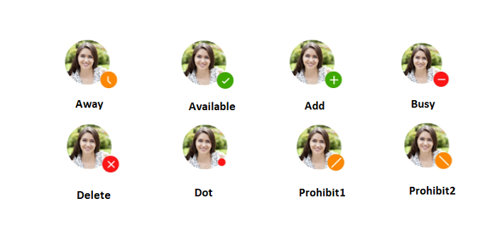
The .NET MAUI Badge View allows you to set badge icons using the Icon property. Badge icons will be visible when the badge text is not set. The badge supports the following types of Icon:
- Add
- Available
- Away
- Busy
- Delete
- Dot
- None
- Prohibit1
- Prohibit2
NOTE
When both the
IconandBadgeTextare set for the Badge View, the badge text has higher priority and will be rendered in output.
<badge:SfBadgeView  HorizontalOptions="Center" VerticalOptions="Center" >
        <badge:SfBadgeView.Content>
            <Image Source="friends.jpg" HeightRequest="70" WidthRequest="60"/>
        </badge:SfBadgeView.Content>
        <badge:SfBadgeView.BadgeSettings>
            <badge:BadgeSettings Type="Warning"  Offset="0, -10" Position="BottomRight" Icon="Away"/>
        </badge:SfBadgeView.BadgeSettings>
</badge:SfBadgeView>
SfBadgeView sfBadgeView = new SfBadgeView();
sfBadgeView.HorizontalOptions = LayoutOptions.Center;
sfBadgeView.VerticalOptions = LayoutOptions.Center;
Image image = new Image();
image.Source = "friends.jpg";
image.HeightRequest = 70;
image.WidthRequest = 60;
sfBadgeView.Content = image;
BadgeSettings badgeSetting = new BadgeSettings();
badgeSetting.Type = BadgeType.Warning;
badgeSetting.Icon = BadgeIcon.Away;
badgeSetting.Position = BadgePosition.BottomRight;
badgeSetting.Offset = new Point(0, -10);
sfBadgeView.BadgeSettings = badgeSetting;
Content = sfBadgeView;