Badge Customization in .NET MAUI Badge View (SfBadgeView)
24 Sep 202522 minutes to read
The BadgeSettings property helps you to customize the basic look and feel of the Badge View.
The BadgeSettings contains the sub-elements such as badge types, positions and colors. You can customize various aspects, including background color, text color, stroke, width, offset, and font attributes.
Font customization
Customize the font using the FontSize, FontAttributes, and FontFamily properties.
<badge:SfBadgeView BadgeText="48"  WidthRequest="120" HeightRequest="80"  HorizontalOptions="Center" VerticalOptions="Center">
            <badge:SfBadgeView.Content>
                <Button Text ="Primary" BackgroundColor="#d6d8d7" TextColor="Black"  WidthRequest="120" HeightRequest="60" />
            </badge:SfBadgeView.Content>
            <badge:SfBadgeView.BadgeSettings>
                <badge:BadgeSettings FontSize="15" FontAttributes="Bold" FontFamily="serif">
                </badge:BadgeSettings>
            </badge:SfBadgeView.BadgeSettings>
 </badge:SfBadgeView>
SfBadgeView sfBadgeView = new SfBadgeView();
sfBadgeView.WidthRequest = 120;
sfBadgeView.HeightRequest = 50;
sfBadgeView.HorizontalOptions = LayoutOptions.Center;
sfBadgeView.VerticalOptions = LayoutOptions.Center;
sfBadgeView.BadgeText = "48";
Button button = new Button();
button.Text = "Primary";
button.TextColor = Colors.Black;
button.BackgroundColor =Color.FromRgba(214, 216, 215, 255);
button.WidthRequest = 120;
button.HeightRequest = 60;
sfBadgeView.Content = button;
BadgeSettings badgeSetting = new BadgeSettings();
badgeSetting.FontAttributes = FontAttributes.Bold;
badgeSetting.FontSize = 15;
badgeSetting.FontFamily = "serif";
sfBadgeView.BadgeSettings = badgeSetting;
Content = sfBadgeView;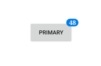
Stroke customization
The stroke and stroke thickness of the Badge View can be customized using the Stroke and StrokeThickness properties, respectively.
<badge:SfBadgeView BadgeText="30"  WidthRequest="120" HeightRequest="60" HorizontalOptions="Center" VerticalOptions="Center">
    <badge:SfBadgeView.Content>
        <Button Text ="Primary" BackgroundColor="#d6d8d7" TextColor="Black" WidthRequest="120" HeightRequest="60"/>
    </badge:SfBadgeView.Content>
    <badge:SfBadgeView.BadgeSettings>
        <badge:BadgeSettings Stroke="Orange" StrokeThickness="2" />
    </badge:SfBadgeView.BadgeSettings>
</badge:SfBadgeView>
SfBadgeView sfBadgeView = new SfBadgeView();
sfBadgeView.WidthRequest = 120;
sfBadgeView.HeightRequest = 80;
sfBadgeView.BadgeText = "30";
sfBadgeView.HorizontalOptions = LayoutOptions.Center;
sfBadgeView.VerticalOptions = LayoutOptions.Center;
Button button = new Button();
button.TextColor = Colors.Black;
button.BackgroundColor = Color.FromRgba(214, 216, 215, 255);
button.Text = "Primary";
button.WidthRequest = 120;
button.HeightRequest = 60;
sfBadgeView.Content = button;
BadgeSettings badgeSetting = new BadgeSettings();
badgeSetting.Stroke = Colors.Orange;
badgeSetting.StrokeThickness = 2;
sfBadgeView.BadgeSettings = badgeSetting;
Content = sfBadgeView;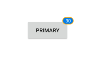
Text customization
The text color and margin of the Badge View can be changed using the TextColor and TextPadding properties, respectively.
<badge:SfBadgeView BadgeText="45"  WidthRequest="120" HeightRequest="80" HorizontalOptions="Center" VerticalOptions="Center">
    <badge:SfBadgeView.Content>
        <Button Text ="Primary" BackgroundColor="#d6d8d7" TextColor="Black" WidthRequest="120" HeightRequest="60"/>
    </badge:SfBadgeView.Content>
    <badge:SfBadgeView.BadgeSettings>
        <badge:BadgeSettings TextColor="LightYellow"  TextPadding ="10" />
    </badge:SfBadgeView.BadgeSettings>
</badge:SfBadgeView>
SfBadgeView sfBadgeView = new SfBadgeView();
sfBadgeView.HorizontalOptions = LayoutOptions.Center;
sfBadgeView.VerticalOptions = LayoutOptions.Center;
sfBadgeView.WidthRequest = 120;
sfBadgeView.HeightRequest = 80;
sfBadgeView.BadgeText = "45";
Button button = new Button();
button.WidthRequest = 120;
button.HeightRequest = 60;
button.BackgroundColor = Color.FromRgba(214, 216, 215, 255);
button.Text = "Primary";
button.Text = "Primary";
sfBadgeView.Content = button;
BadgeSettings badgeSetting = new BadgeSettings();
badgeSetting.TextColor = Color.LightYellow;
badgeSetting.TextPadding = 10;
sfBadgeView.BadgeSettings = badgeSetting;
Content = sfBadgeView;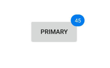
Predefined styles
The colors of the badge can be customized using the Type property of the BadgeSettings. The badge supports the following essential colors for different scenarios:
- Dark
- Error
- Info
- Light
- Primary
- Secondary
- Success
- Warning
<badge:SfBadgeView BadgeText="8" HeightRequest="70" WidthRequest="60" HorizontalOptions="Center" VerticalOptions="Center">
        <badge:SfBadgeView.Content>
            <Image Source="badgefacebook.png"  HeightRequest="70" WidthRequest="60"/>
        </badge:SfBadgeView.Content>
        <badge:SfBadgeView.BadgeSettings>
            <badge:BadgeSettings Type="Error" />
        </badge:SfBadgeView.BadgeSettings>
</badge:SfBadgeView>
SfBadgeView sfBadgeView = new SfBadgeView();
sfBadgeView.HeightRequest = 70;
sfBadgeView.WidthRequest = 60;
sfBadgeView.HorizontalOptions = LayoutOptions.Center;
sfBadgeView.VerticalOptions = LayoutOptions.Center;
sfBadgeView.BadgeText = "8";
Image image = new Image();
image.Source = "badgefacebook.png";
image.HeightRequest = 70;
image.WidthRequest = 60;
sfBadgeView.Content = image;
BadgeSettings badgeSetting = new BadgeSettings();
badgeSetting.Type = BadgeType.Error;
sfBadgeView.BadgeSettings = badgeSetting;
Content = sfBadgeView;
Badge background customization
Other than the predefined styles, the color of the badge can be customized using the Type property of theBadgeSettings which has to be set as None. Then the color of the Badge View can be set using the Background property.
<badge:SfBadgeView BadgeText="48" WidthRequest="120" HeightRequest="60" HorizontalOptions="Center" VerticalOptions="Center" >
    <badge:SfBadgeView.Content>
        <Button Text ="Primary"  BackgroundColor="#d6d8d7" TextColor="Black" WidthRequest="120" HeightRequest="60"/>
    </badge:SfBadgeView.Content>
    <badge:SfBadgeView.BadgeSettings>
        <badge:BadgeSettings Type="None" Background="Green" />
    </badge:SfBadgeView.BadgeSettings>
</badge:SfBadgeView>
SfBadgeView sfBadgeView = new SfBadgeView();
sfBadgeView.HeightRequest = 60;
sfBadgeView.WidthRequest = 120;
sfBadgeView.HorizontalOptions = LayoutOptions.Center;
sfBadgeView.VerticalOptions = LayoutOptions.Center;
sfBadgeView.BadgeText = "48";
Button button = new Button();
button.Text = "Primary";
button.TextColor = Colors.Black;
button.BackgroundColor = Color.FromRgba(214, 216, 215, 255);
button.HeightRequest = 60;
button.WidthRequest = 120;
sfBadgeView.Content = button;
BadgeSettings badgeSetting = new BadgeSettings();
badgeSetting.Type = BadgeType.None;
badgeSetting.Background = new SolidColorBrush(Colors.Green);
sfBadgeView.BadgeSettings = badgeSetting;
Content = sfBadgeView;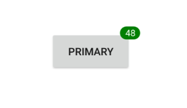
Setting corner radius of the badge
The CornerRadius property reduces the corners’ radius.
<badge:SfBadgeView BadgeText="100" WidthRequest="120" HeightRequest="60" HorizontalOptions="Center" VerticalOptions="Center" >
        <badge:SfBadgeView.Content>
            <Button Text ="Primary" BackgroundColor="#d6d8d7" TextColor="Black" WidthRequest="120" HeightRequest="60"/>
        </badge:SfBadgeView.Content>
        <badge:SfBadgeView.BadgeSettings>
            <badge:BadgeSettings CornerRadius="5,5,5,5"/>
        </badge:SfBadgeView.BadgeSettings>
</badge:SfBadgeView>
SfBadgeView sfBadgeView = new SfBadgeView();
sfBadgeView.HeightRequest = 60;
sfBadgeView.WidthRequest = 120;
sfBadgeView.HorizontalOptions = LayoutOptions.Center;
sfBadgeView.VerticalOptions = LayoutOptions.Center;
sfBadgeView.BadgeText = "100";
Button button = new Button();
button.Text = "Primary";
button.HeightRequest = 60;
button.WidthRequest = 120;
button.TextColor = Colors.Black;
button.BackgroundColor = Color.FromRgba(214, 216, 215, 255);
sfBadgeView.Content = button;
BadgeSettings badgeSetting = new BadgeSettings();
badgeSetting.CornerRadius = new Microsoft.Maui.CornerRadius(5, 5, 5, 5);
sfBadgeView.BadgeSettings = badgeSetting;
Content = sfBadgeView;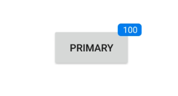
Alignment of badge
Align the Badge View using the Center, Start, and End properties of the BadgeAlignment property.
<badge:SfBadgeView BadgeText="20" HorizontalOptions="Center" VerticalOptions="Center" >
    <badge:SfBadgeView.Content>
        <Label Text="CENTER" BackgroundColor="LightGray" HorizontalTextAlignment="Center" VerticalTextAlignment="Center"
                WidthRequest="100" HeightRequest="60" TextColor="Black" />
    </badge:SfBadgeView.Content>
    <badge:SfBadgeView.BadgeSettings>
        <badge:BadgeSettings BadgeAlignment="Center" CornerRadius="0"/>
    </badge:SfBadgeView.BadgeSettings>
</badge:SfBadgeView>
SfBadgeView sfBadgeView = new SfBadgeView();
sfBadgeView.HorizontalOptions = LayoutOptions.Center;
sfBadgeView.VerticalOptions = LayoutOptions.Center;
sfBadgeView.BadgeText = "20";
Label label = new Label();
label.Text = "CENTER";
label.HeightRequest = 60;
label.WidthRequest = 100;
label.BackgroundColor = Colors.LightGray;
label.HorizontalTextAlignment = TextAlignment.Center;
label.VerticalTextAlignment = TextAlignment.Center;
label.TextColor = Colors.Black;
sfBadgeView.Content = label;
BadgeSettings badgeSetting = new BadgeSettings();
badgeSetting.BadgeAlignment = BadgeAlignment.Center;
badgeSetting.CornerRadius = 0;
sfBadgeView.BadgeSettings = badgeSetting;
Content = sfBadgeView;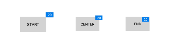
Badge Alignment and Sizing
The BadgeAlignment property positions the badge text relative to the SfBadgeView’s content. You can set this to Start, Center, or End. However, the final visual position of the badge is also dependent on how the SfBadgeView and its Content are sized. The following scenarios explain how alignment behaves based on different size configurations.
1. Alignment with a Fixed Size on SfBadgeView
When an explicit WidthRequest and HeightRequest are set directly on the SfBadgeView, the badge is aligned relative to these fixed dimensions. The size of the inner Content does not influence the badge’s position. This approach is useful when you need the badge to appear at the edge of a specific, defined area, regardless of the content inside.
<badge:SfBadgeView BadgeText="20"  WidthRequest="100" HeightRequest="100" HorizontalOptions="Center" VerticalOptions="Center" >
     <badge:SfBadgeView.Content>
         <Label Text="Start" BackgroundColor="LightGray" HorizontalTextAlignment="Center"       VerticalTextAlignment="Center" TextColor="Black" />
     </badge:SfBadgeView.Content>
     <badge:SfBadgeView.BadgeSettings>
         <badge:BadgeSettings BadgeAlignment="Start" CornerRadius="0"/>
     </badge:SfBadgeView.BadgeSettings>
 </badge:SfBadgeView>
SfBadgeView sfBadgeView = new SfBadgeView();
sfBadgeView.HorizontalOptions = LayoutOptions.Center;
sfBadgeView.VerticalOptions = LayoutOptions.Center;
sfBadgeView.WidthRequest = 100;
sfBadgeView.HeightRequest = 100;
sfBadgeView.BadgeText = "20";
Label label = new Label();
label.Text = "Start";
label.BackgroundColor = Colors.LightGray;
label.HorizontalTextAlignment = TextAlignment.Center;
label.VerticalTextAlignment = TextAlignment.Center;
label.TextColor = Colors.Black;
sfBadgeView.Content = label;
BadgeSettings badgeSetting = new BadgeSettings();
badgeSetting.BadgeAlignment = BadgeAlignment.Start;
sfBadgeView.BadgeSettings = badgeSetting;
Content = sfBadgeView;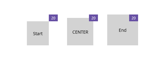
2. Alignment with a Fixed Size on the Content
When the SfBadgeView has no explicit size, but its Content does, the SfBadgeView wraps itself around the content. In this case, the badge is aligned relative to the bounds of the Content. This is a common scenario when you want to place a badge on a specific control like a Button or a larger Label.
<badge:SfBadgeView BadgeText="20" >
     <badge:SfBadgeView.Content>
     <Label Text="Start" Background="LightGray" HeightRequest="100" WidthRequest="100" HorizontalTextAlignment="Center" VerticalTextAlignment="Center"/>
     </badge:SfBadgeView.Content>
     <badge:SfBadgeView.BadgeSettings>
         <badge:BadgeSettings BadgeAlignment="Start" />
     </badge:SfBadgeView.BadgeSettings>
 </badge:SfBadgeView>
SfBadgeView sfBadgeView = new SfBadgeView();
sfBadgeView.BadgeText = "20";
Label label = new Label();
label.Text = "Start";
label.BackgroundColor = Colors.LightGray;
label.HorizontalTextAlignment = TextAlignment.Center;
label.VerticalTextAlignment = TextAlignment.Center;
label.TextColor = Colors.Black;
label.WidthRequest = 100;
label.HeightRequest = 100;
sfBadgeView.Content = label;
BadgeSettings badgeSetting = new BadgeSettings();
badgeSetting.BadgeAlignment = BadgeAlignment.Start;
sfBadgeView.BadgeSettings = badgeSetting;
Content = sfBadgeView;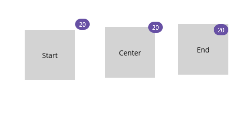
3. Alignment with Automatic Sizing
When neither the SfBadgeView nor its Content has an explicit size, both controls size themselves automatically based on their content. The SfBadgeView wraps its Content, and the badge is then aligned relative to the final calculated bounds of that Content.
<badge:SfBadgeView BadgeText="20" >
     <badge:SfBadgeView.Content>
     <Label Text="Start" Background="LightGray" HorizontalTextAlignment="Center" VerticalTextAlignment="Center"/>
     </badge:SfBadgeView.Content>
     <badge:SfBadgeView.BadgeSettings>
         <badge:BadgeSettings BadgeAlignment="Start" />
     </badge:SfBadgeView.BadgeSettings>
 </badge:SfBadgeView>
SfBadgeView sfBadgeView = new SfBadgeView();
sfBadgeView.BadgeText = "20";
Label label = new Label();
label.Text = "Start";
label.BackgroundColor = Colors.LightGray;
label.HorizontalTextAlignment = TextAlignment.Center;
label.VerticalTextAlignment = TextAlignment.Center;
label.TextColor = Colors.Black;
sfBadgeView.Content = label;
BadgeSettings badgeSetting = new BadgeSettings();
badgeSetting.BadgeAlignment = BadgeAlignment.Start;
sfBadgeView.BadgeSettings = badgeSetting;
Content = sfBadgeView;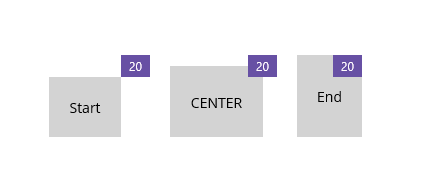
Keeping multiple badges aligned uniformly
When placing several SfBadgeView’s in the same row or grid, you can keep the visual alignment consistent across items whether a badge is present or not by using AutoHide. When BadgeText is 0 and AutoHide=True, the badge is not rendered. The content area remains uniformly aligned, so layouts stay consistent for items with and without badges.
<HorizontalStackLayout Spacing="20" HorizontalOptions="Center" VerticalOptions="Center">
     <core:SfBadgeView BadgeText="0" >
                 <core:SfBadgeView.Content>
             <core:SfAvatarView ContentType="AvatarCharacter" AvatarCharacter="Avatar1" CornerRadius="25" WidthRequest="50" HeightRequest="50"/>
         </core:SfBadgeView.Content>
                 <core:SfBadgeView.BadgeSettings>
             <core:BadgeSettings BadgeAlignment="Center" AutoHide="True"  Type="None" Background="Red"/>
                 </core:SfBadgeView.BadgeSettings>
             </core:SfBadgeView>


     <core:SfBadgeView BadgeText="10"    >
                 <core:SfBadgeView.Content>
             <core:SfAvatarView ContentType="AvatarCharacter" CornerRadius="25" WidthRequest="50" HeightRequest="50" AvatarCharacter="Avatar2"/>
         </core:SfBadgeView.Content>
                 <core:SfBadgeView.BadgeSettings>
             <core:BadgeSettings BadgeAlignment="Center"  Type="None" Background="Red" AutoHide="True" />
                 </core:SfBadgeView.BadgeSettings>
             </core:SfBadgeView>

        ...
    </HorizontalStackLayout >
HorizontalStackLayout horizontalStack = new HorizontalStackLayout();
horizontalStack.Spacing = 20;
horizontalStack.HorizontalOptions = LayoutOptions.Center;
horizontalStack.VerticalOptions = LayoutOptions.Center;
SfAvatarView avatar1 = new SfAvatarView();
avatar1.ContentType = ContentType.AvatarCharacter;
avatar1.AvatarCharacter = AvatarCharacter.Avatar1;
avatar1.CornerRadius = 25;
avatar1.WidthRequest = 50;
avatar1.HeightRequest = 50;
BadgeSettings badgeSettings1 = new BadgeSettings();
badgeSettings1.BadgeAlignment = BadgeAlignment.Center;
badgeSettings1.AutoHide = true;
badgeSettings1.Type = BadgeType.None;
badgeSettings1.Background = Colors.Red;
SfBadgeView badgeView1 = new SfBadgeView();
badgeView1.BadgeText = "0";
badgeView1.Content = avatar1;
badgeView1.BadgeSettings = badgeSettings1;
SfAvatarView avatar2 = new SfAvatarView();
avatar2.ContentType = ContentType.AvatarCharacter;
avatar2.AvatarCharacter = AvatarCharacter.Avatar2;
avatar2.CornerRadius = 25;
avatar2.WidthRequest = 50;
avatar2.HeightRequest = 50;
BadgeSettings badgeSettings2 = new BadgeSettings();
badgeSettings2.BadgeAlignment = BadgeAlignment.Center;
badgeSettings2.AutoHide = true;
badgeSettings2.Type = BadgeType.None;
badgeSettings2.Background = Colors.Red;
SfBadgeView badgeView2 = new SfBadgeView();
badgeView2.BadgeText = "10";
badgeView2.Content = avatar2;
badgeView2.BadgeSettings = badgeSettings2;
horizontalStack.Children.Add(badgeView1);
horizontalStack.Children.Add(badgeView2);
Content = horizontalStack;
FontAutoScalingEnabled
The FontAutoScalingEnabled property automatically scales the badge text’s font size based on the operating system’s text size. The default value is false.
<badge:SfBadgeView>
    <badge:SfBadgeView.BadgeSettings>
        <badge:BadgeSettings FontAutoScalingEnabled="True"/>
    </badge:SfBadgeView.BadgeSettings>
</badge:SfBadgeView>
SfBadgeView sfBadgeView = new SfBadgeView();
BadgeSettings badgeSetting = new BadgeSettings();
badgeSetting.FontAutoScalingEnabled = true;
sfBadgeView.BadgeSettings = badgeSetting;Visibility of badge
Show or hide the badges in the .NET MAUI Badge View by setting the IsVisible property in the BadgeSetting. By default, the badge will be visible.
<badge:SfBadgeView BadgeText="20">
    <badge:SfBadgeView.Content>
        <Button Text="Message"/>
    </badge:SfBadgeView.Content>
    <badge:SfBadgeView.BadgeSettings>
        <badge:BadgeSettings IsVisible="True"/>
    </badge:SfBadgeView.BadgeSettings>
</badge:SfBadgeView>
Button button=new Button();
button.Text="Message";
BadgeSettings badgeSettings=bew BadgeSettings();
badgeSettings.IsVisible=true;
BadgeView badgeView=new BadgeView();
badgeView.BadgeText=20;
badgeView.BadgeSettings=badgeSettings;
badgeVuew.Content=button;
Content=badgeView;