About Syncfusion .NET MAUI Calendar Control
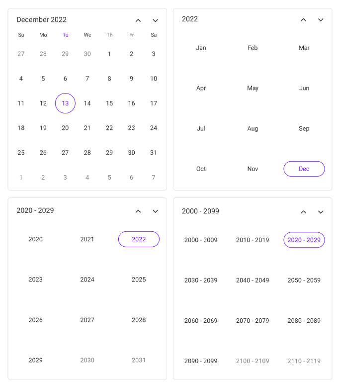
Syncfusion® .NET MAUI Calendar is a calendar control that allows users to select a Single date, Multiple dates, or a Range of dates. It provides various view options such as a Month, Year, Decade, and Century, which allow users to quickly navigate to the desired date. It also supports minimum dates, maximum dates, enable past dates, and disabled dates to restrict the date selection.
Business use cases
- Booking and reservation applications that require date selection and scheduling workflows.
- Business applications that depend on date-based filtering and data analysis.
- Event management systems that require navigation across months, years, and custom date ranges.
- Form-based applications that need single, multiple, or range date selection inputs.
Key features
-
Multiple calendar view modes allow switching between Month, Year, Decade, and Century views for easy navigation.
-
Quick navigation enables moving across different date levels efficiently using hierarchical calendar views.
-
Enable and disable built-in view switching allows enabling or restricting navigation between calendar views based on interaction.
-
Date selection support selecting single, multiple, range, or multiple range of dates programmatically or through user interaction.
-
Limit date selection allows limiting selectable dates using minimum and maximum range values.
-
Change first day of week allows setting the starting day of the week based on regional or application requirements.
-
Selectable day predicate allows disabling specific dates such as weekends or holidays to control user interaction.
-
Highlight weekends and special dates enables highlighting weekends and special dates using custom styles and colors.
-
Right to left (RTL) allows adapting the layout for RTL languages such as Arabic and Hebrew.
-
Globalization ensure that date and time values are displayed based on regional and cultural settings.
Globalization
The following table summarizes the globalization support available in this control.
 Full Support
| Control | Localization | RTL | Time zone | Screen reader | Keyboard navigation |
|---|---|---|---|---|---|
| Calendar | |
|
|
|
|
Related controls
- Date Picker for selecting and handling single date input scenarios.
- DateTime Picker for selecting combined date and time values.
- Time Picker for choosing specific time inputs.
See Also
- Getting Started shows how to begin using the Calendar control step by step.
- Selection modes explain different date selection behaviors.
- Customization shows how to modify appearance and interaction settings.
- UI Kit provides interactive demos and ready-made UI examples.