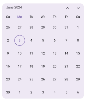
Customizations in .NET MAUI Calendar control
Each cell of the Month, Year, Decade and Century views can be customized in .NET MAUI Calendar (SfCalendar).
Month cell customization
You can customize the calendar month view cell by using the MonthView property of SfCalendar.
-
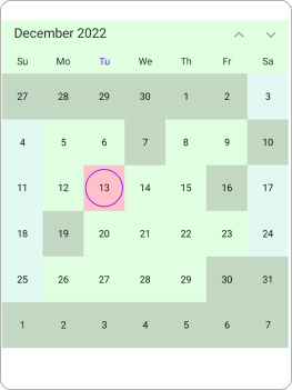
Month dates – You can customize the month dates text style and background of the
Calendarby using the TextStyle and Background properties of MonthView. -
Today date – You can customize the today date text style and background of the
Calendarby using the TodayTextStyle and TodayBackground properties of MonthView. -
Trailing and leading dates – You can hide the trailing and leading dates using the ShowTrailingAndLeadingDates property in the SfCalendar class. You can also customize the trailing and leading dates text style and background of the
Calendarusing the TrailingLeadingDatesTextStyle and TrailingLeadingDatesBackground properties of the MonthView. -
Disabled dates – You can disable the date by using the MinimumDate, MaximumDate, EnablePastDates and SelectableDayPredicate. The date before MinimumDate is said to disabled date, the date after the MaximumDate is said to disabled date, if you want to disable the date before today date by using the EnablePastDates and if you want to disable any particular date by using SelectableDayPredicate property. You can also customize the disabled dates text style and background of the
Calendarby using the DisabledDatesTextStyle and DisabledDatesBackground properties of MonthView. -
Weekend dates – You can customize the weekend dates text style and background of the
Calendarusing the WeekendDatesTextStyle and WeekendDatesBackground properties of the MonthView.
<calendar:SfCalendar  x:Name="calendar"
                        View="Month"
                        Background="PaleGreen">
            <Calendar:SfCalendar.MonthView>
                <Calendar:CalendarMonthView
                TodayBackground="Pink" DisabledDatesBackground="Grey" SpecialDatesBackground="#FFEFD2" WeekendDatesBackground="#E2F9F3"/>
            </Calendar:SfCalendar.MonthView>
</calendar:SfCalendar>
CalendarTextStyle textStyle = new CalendarTextStyle()
{
TextColor = Colors.Black,
FontSize = 12,
};
this.calendar.MinimumDate = DateTime.Now.AddDays(-15);
this.calendar.MaximumDate = DateTime.Now.AddDays(20);
this.calendar.EnablePastDates = true;
this.calendar.SelectableDayPredicate = (date) =>
{
if (date.Date == DateTime.Now.AddDays(3).Date || date.Date == DateTime.Now.AddDays(6).Date || date.Date == DateTime.Now.AddDays(-3).Date || date.Date == DateTime.Now.AddDays(-6).Date)
{
return false;
}
return true;
};
this.calendar.Background = Colors.PaleGreen.WithAlpha(0.3f);
this.calendar.ShowTrailingAndLeadingDates = true;
this.calendar.MonthView = new CalendarMonthView()
{
WeekendDays = new List<DayOfWeek>
{
DayOfWeek.Sunday,
DayOfWeek.Saturday,
},
TextStyle = textStyle,
TodayBackground = Colors.Pink,
TodayTextStyle = textStyle,
DisabledDatesBackground = Colors.Grey.WithAlpha(0.3f),
DisabledDatesTextStyle = textStyle,
TrailingLeadingDatesBackground = Colors.Red.WithAlpha(0.3f),
TrailingLeadingDatesTextStyle = textStyle,
SpecialDatesBackground = Color.FromArgb("#FFEFD2"),
SpecialDatesTextStyle = textStyle,
WeekendDatesBackground = Color.FromArgb("#E2F9F3"),
WeekendDatesTextStyle = textStyle,
};
-
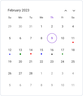
Special day predicate - The special day predicate decides whether the month cell date is a special date or not in the calendar. You can add a special date to the
Calendarusing the SpecialDayPredicate property, and you can also customize the special day text style and background of theCalendarusing the SpecialDatesTextStyle and SpecialDatesBackground properties of MonthView. You can customize the special day with icons such as dots, hearts, diamonds, stars, and bells in theMonthViewand also customize the icon color. If you do not wish to add any icon details, you can set them to be transparent.
<calendar:SfCalendar  x:Name="calendar"  View="Month">
</calendar:SfCalendar>this.calendar.MonthView.SpecialDayPredicate = (date) =>
{
if (date.Date == DateTime.Now.AddDays(2).Date)
{
CalendarIconDetails iconDetails = new CalendarIconDetails();
iconDetails.Icon = CalendarIcon.Circle;
iconDetails.Fill = Colors.Red;
return iconDetails;
}
else if (date.Date == DateTime.Now.AddDays(3).Date)
{
CalendarIconDetails iconDetails = new CalendarIconDetails();
iconDetails.Icon = CalendarIcon.Triangle;
iconDetails.Fill = Colors.Blue;
return iconDetails;
}
else if (date.Date == DateTime.Now.AddDays(4).Date)
{
CalendarIconDetails iconDetails = new CalendarIconDetails();
iconDetails.Icon = CalendarIcon.Square;
iconDetails.Fill = Colors.Green;
return iconDetails;
}
else if (date.Date == DateTime.Now.AddDays(5).Date)
{
CalendarIconDetails iconDetails = new CalendarIconDetails();
iconDetails.Icon = CalendarIcon.Heart;
iconDetails.Fill = Colors.Red;
return iconDetails;
}
else if (date.Date == DateTime.Now.AddDays(6).Date)
{
CalendarIconDetails iconDetails = new CalendarIconDetails();
iconDetails.Icon = CalendarIcon.Diamond;
iconDetails.Fill = Colors.Blue;
return iconDetails;
}
else if (date.Date == DateTime.Now.AddDays(7).Date)
{
CalendarIconDetails iconDetails = new CalendarIconDetails();
iconDetails.Icon = CalendarIcon.Bell;
iconDetails.Fill = Colors.Black;
return iconDetails;
}
else if (date.Date == DateTime.Now.AddDays(8).Date)
{
CalendarIconDetails iconDetails = new CalendarIconDetails();
iconDetails.Icon = CalendarIcon.Star;
iconDetails.Fill = Colors.Green;
return iconDetails;
}
return null;
};
NOTE
- The Background color and text style will be applied based on the following order: selectableDayPredicate dates, special dates, disable dates, today date, weekend dates, trailingLeading dates, and normal dates.
Year cell customization
You can customize the calendar year, decade, and century views by using the YearView property of SfCalendar.
-
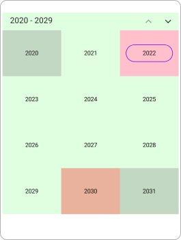
Year cell dates – You can customize the year view date’s text style and background of the
Calendarby using the TextStyle and Background properties of YearView. -
Disabled dates – You can disable the date by using the MinimumDate, MaximumDate, EnablePastDates and SelectableDayPredicate. The date before MinimumDate is said to disabled date, the date after the MaximumDate is said to disabled date, if you want disable the date before today date by using the EnablePastDates and if you want to disable any particular date by using SelectableDayPredicate property. You can also customize the disabled dates text style and background of the
Calendarby using the DisabledDatesTextStyle and DisabledDatesBackground properties of YearView. -
Leading dates – You can hide the leading dates by using the ShowTrailingAndLeadingDates property in the
SfCalendarclass. You can also customize the leading dates text style and background of theCalendarby using the LeadingDatesTextStyle and LeadingDatesBackground properties of YearView. -
Today date – You can customize the today date text style and background of the
Calendarby using the TodayTextStyle and TodayBackground properties of YearView.
<calendar:SfCalendar  x:Name="calendar"
                        View="Decade"
                        Background="PaleGreen">
            <Calendar:SfCalendar.YearView>
                <Calendar:CalendarYearView TodayBackground="Pink" DisabledDatesBackground="Grey" LeadingDatesBackground="Red" />
            </Calendar:SfCalendar.YearView>
</calendar:SfCalendar>
CalendarTextStyle textStyle = new CalendarTextStyle()
{
TextColor = Colors.Black,
FontSize = 12,
};
this.calendar.View = CalendarView.Decade;
this.calendar.MinimumDate = DateTime.Now.AddYears(-1);
this.calendar.MaximumDate = DateTime.Now.AddYears(8);
this.calendar.EnablePastDates = false;
this.calendar.Background = Colors.PaleGreen.WithAlpha(0.3f);
this.calendar.ShowTrailingAndLeadingDates = true;
this.calendar.YearView = new CalendarYearView()
{
TextStyle = textStyle,
TodayBackground = Colors.Pink,
TodayTextStyle = textStyle,
DisabledDatesBackground = Colors.Grey.WithAlpha(0.3f),
DisabledDatesTextStyle = textStyle,
LeadingDatesBackground = Colors.Red.WithAlpha(0.3f),
LeadingDatesTextStyle = textStyle,
};
NOTE
- The Background color and text style will be applied based on the following order: selectableDayPredicate dates, disable dates, today date and leading Dates.
Year view text format
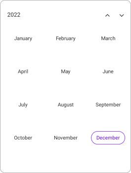
You can customize the month format of the Calendar by using the MonthFormat property in YearView.
<calendar:SfCalendar  x:Name="calendar"
                      View="Year">
            <Calendar:SfCalendar.YearView>
                <Calendar:CalendarYearView MonthFormat="MMMM" />
            </Calendar:SfCalendar.YearView>
</calendar:SfCalendar>this.calendar.YearView = new CalendarYearView()
{
MonthFormat = "MMMM",
};
Selection cell customization
You can customize the selection cell background and text style in Month, Year, Decade, and Century view by using the SfCalendar.
-
Selection Background - The Selected date background can be customized by using the SelectionBackground property in
SfCalendar. This property is used inSingle,Multipleand in between selected date ofRangeselection. -
Selection TextStyle - The Selected date text style can be customized by using the SelectionTextStyle property in
MonthView. This property is used inSingle,Multipleand start and end date of the selected date range ofRangeselection. -
Start Range Selection Background - The Start range date background can be customized by using the StartRangeSelectionBackground property in
SfCalendar. This property is used in Start range selected date ofRangeselection. -
End Range Selection Background - The End range date background can be customized by using the EndRangeSelectionBackground property in
SfCalendar. This property is used in End range selected date ofRangeselection. -
Range TextStyle – The in between selected date range text style can be customized by using the RangeTextStyle property in
MonthView. This property is used in between selected date range ofRangeselection.
<calendar:SfCalendar  x:Name="calendar"
                      View="Month"
                      Background="PaleGreen"
                      StartRangeSelectionBackground="Purple" EndRangeSelectionBackground="Purple" SelectionBackground="Pink">
</calendar:SfCalendar>
CalendarTextStyle textStyle = new CalendarTextStyle()
{
TextColor = Colors.Black,
FontSize = 12,
};
this.calendar.SelectedDateRange = new CalendarDateRange(DateTime.Now.AddDays(6).Date, DateTime.Now.AddDays(17).Date);
this.calendar.View = CalendarView.Month;
this.calendar.SelectionMode = CalendarSelectionMode.Range;
this.calendar.StartRangeSelectionBackground = Colors.Purple;
this.calendar.EndRangeSelectionBackground = Colors.Purple;
this.calendar.SelectionBackground = Colors.Pink;
this.calendar.MonthView.SelectionTextStyle = textStyle;
this.calendar.MonthView.RangeTextStyle = textStyle;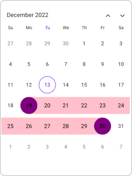
Month cell appearance using DataTemplate
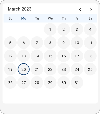
The month cell appearance can be customized using the CellTemplate property of MonthView in the SfCalendar.
<Grid>
    <Frame IsVisible="True" x:Name="frame" Background="White" HasShadow="False" CornerRadius="10"  HorizontalOptions="Center" VerticalOptions="Center" Margin="0" Padding="5">
        <calendar:SfCalendar x:Name="calendar"
                                ShowTrailingAndLeadingDates="False"
                                NavigationDirection="Horizontal"
                                TodayHighlightBrush="#0A3A74"
                                AllowViewNavigation="False">
            <calendar:SfCalendar.MonthView>
                <calendar:CalendarMonthView CellTemplate="{Binding Template}">
                    <calendar:CalendarMonthView.HeaderView>
                        <calendar:CalendarMonthHeaderView Background="#F1F7FF"/>
                    </calendar:CalendarMonthView.HeaderView>
                </calendar:CalendarMonthView>
            </calendar:SfCalendar.MonthView>
            <calendar:SfCalendar.BindingContext>
                <local:MonthTemplate/>
            </calendar:SfCalendar.BindingContext>
        </calendar:SfCalendar>
    </Frame>
</Grid>
public class MonthTemplate
{
private DataTemplate circleTemplate;
private DataTemplate template;
public DataTemplate Template
{
get
{
return this.template;
}
set
{
this.template = value;
}
}
public MonthTemplate()
{
this.circleTemplate = new DataTemplate(() =>
{
Grid grid = new Grid();
Border border = new Border();
border.BackgroundColor = Color.FromRgba("#F5F5F5");
border.StrokeShape = new RoundRectangle()
{
CornerRadius = new CornerRadius(25)
};
border.SetBinding(Border.StrokeThicknessProperty, "Date", converter: new DateToStrokeConverter());
border.Stroke = Color.FromArgb("#0A3A74");
Label label = new Label();
label.SetBinding(Label.TextProperty, "Date.Day");
label.HorizontalOptions = LayoutOptions.Center;
label.VerticalOptions = LayoutOptions.Center;
label.Padding = new Thickness(2);
border.Content = label;
grid.Add(border);
grid.Padding = new Thickness(1);
return grid;
});
this.template = this.circleTemplate;
}
}internal class DateToStrokeConverter : IValueConverter
{
public object Convert(object value, Type targetType, object parameter, CultureInfo culture)
{
var date = value as DateTime?;
if (date.HasValue && date.Value.Date == DateTime.Now.Date)
{
return 2;
}
return 0;
}
public object? ConvertBack(object value, Type targetType, object parameter, CultureInfo culture)
{
return null;
}
}
Month cell appearance using DataTemplateSelector
You can customize the month cell appearance using the CellTemplate property of MonthView in the SfCalendar. The DataTemplateSelector for a calendar can be used to choose a different data template for each cell in the calendar based on the cell’s data. It allows customizing the appearance of a particular cell based on certain conditions.
<Grid>
    <Grid.Resources>
        <DataTemplate x:Key="normalDateTemplate">
            <Grid Background = "Pink" >
                <Label HorizontalTextAlignment="Center" VerticalTextAlignment="Center" TextColor="Black" Text="{Binding Date.Day}"/>
            </Grid>
        </DataTemplate>
        <DataTemplate x:Key="todayDateTemplate">
            <Grid Background = "PaleGreen">
                <Label HorizontalTextAlignment="Center" VerticalTextAlignment="Center" TextColor="Black" Text="{Binding Date.Day}"/>
            </Grid>
        </DataTemplate>
        <DataTemplate x:Key="leadingTraililngDateTemplate">
            <Grid Background = "Purple">
                <Label HorizontalTextAlignment="Center" VerticalTextAlignment="Center" TextColor="Black" Text="{Binding Date.Day}"/>
            </Grid>
        </DataTemplate>
        <local:MonthCellTemplateSelector x:Key="monthCellTemplateSelector"
                                         TodayDateTemplate="{StaticResource todayDateTemplate}"
                                         NormalDateTemplate="{StaticResource normalDateTemplate}"
                                         LeadingTrailingDateTemplate="{StaticResource leadingTraililngDateTemplate}"/>
    </Grid.Resources>
    <calendar:SfCalendar x:Name="calendar"
                        View="Month" >
        <calendar:SfCalendar.MonthView>
            <calendar:CalendarMonthView CellTemplate="{StaticResource monthCellTemplateSelector}" />
        </calendar:SfCalendar.MonthView>
    </calendar:SfCalendar>
    </Grid>
public class MonthCellTemplateSelector : DataTemplateSelector
{
public MonthCellTemplateSelector()
{
}
public DataTemplate NormalDateTemplate { get; set; }
public DataTemplate TodayDateTemplate { get; set; }
public DataTemplate LeadingTrailingDateTemplate { get; set; }
protected override DataTemplate OnSelectTemplate(object item, BindableObject container)
{
var monthCellDetails = item as CalendarCellDetails;
if (monthCellDetails.Date == DateTime.Today.Date)
return TodayDateTemplate;
else if (monthCellDetails.IsTrailingOrLeadingDate)
return LeadingTrailingDateTemplate;
else
return NormalDateTemplate;
}
}this.calendar.View = CalendarView.Month;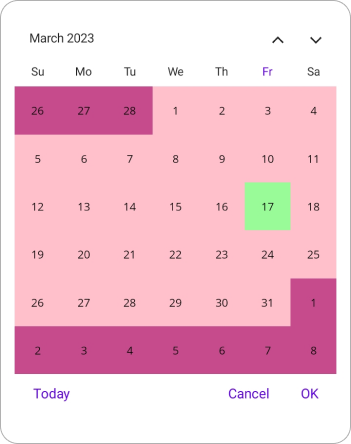
Year cell appearance using DataTemplate
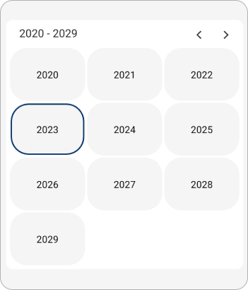
The year cell appearance can be customized using the CellTemplate property of YearView in the SfCalendar.
<Grid>
    <Frame IsVisible="True" x:Name="frame" Background="White" HasShadow="False" CornerRadius="10"  HorizontalOptions="Center" VerticalOptions="Center" Margin="0" Padding="5">
        <calendar:SfCalendar x:Name="calendar"
                                View="Decade"
                                ShowTrailingAndLeadingDates="False"
                                NavigationDirection="Horizontal"
                                TodayHighlightBrush="#0A3A74"
                                AllowViewNavigation="False">
            <calendar:SfCalendar.YearView>
                <calendar:CalendarYearView CellTemplate="{Binding Template}">
                </calendar:CalendarYearView>
            </calendar:SfCalendar.YearView>
            <calendar:SfCalendar.BindingContext>
                <local:DecadeTemplate/>
            </calendar:SfCalendar.BindingContext>
        </calendar:SfCalendar>
    </Frame>
</Grid>
public class DecadeTemplate
{
private DataTemplate circleTemplate;
private DataTemplate template;
public DataTemplate Template
{
get
{
return this.template;
}
set
{
this.template = value;
}
}
public DecadeTemplate()
{
this.circleTemplate = new DataTemplate(() =>
{
Grid grid = new Grid();
Border border = new Border();
border.BackgroundColor = Color.FromRgba("#F5F5F5");
border.StrokeShape = new RoundRectangle()
{
CornerRadius = new CornerRadius(25)
};
border.SetBinding(Border.StrokeThicknessProperty, "Date", converter: new DateToStrokeConverter());
border.Stroke = Color.FromArgb("#0A3A74");
Label label = new Label();
label.SetBinding(Label.TextProperty, "Date.Year");
label.HorizontalOptions = LayoutOptions.Center;
label.VerticalOptions = LayoutOptions.Center;
label.Padding = new Thickness(2);
border.Content = label;
grid.Add(border);
grid.Padding = new Thickness(1);
return grid;
});
this.template = this.circleTemplate;
}
}internal class DateToStrokeConverter : IValueConverter
{
public object Convert(object value, Type targetType, object parameter, CultureInfo culture)
{
var date = value as DateTime?;
if (date.HasValue && date.Value.Year == DateTime.Now.Year)
{
return 2;
}
return 0;
}
public object? ConvertBack(object value, Type targetType, object parameter, CultureInfo culture)
{
return null;
}
}
Year cell appearance using DataTemplateSelector
You can customize the year cell appearance by using the CellTemplate property of YearView in the SfCalendar. The DataTemplateSelector for a calendar can be used to choose a different data template for each cell in the calendar based on the cell’s data. It allows customizing the appearance of a particular cell based on certain conditions.
<Grid>
    <Grid.Resources>
        <DataTemplate x:Key="normalDateTemplate">
            <Grid Background = "Pink" >
                <Label HorizontalTextAlignment="Center" VerticalTextAlignment="Center" TextColor="Black" Text="{Binding Date.Year}"/>
            </Grid>
        </DataTemplate>
        <DataTemplate x:Key="todayDateTemplate">
            <Grid Background = "PaleGreen">
                <Label HorizontalTextAlignment="Center" VerticalTextAlignment="Center" TextColor="Black" Text="{Binding Date.Year}"/>
            </Grid>
        </DataTemplate>
        <DataTemplate x:Key="leadingDateTemplate">
            <Grid Background = "Purple">
                <Label HorizontalTextAlignment="Center" VerticalTextAlignment="Center" TextColor="Black" Text="{Binding Date.Year}"/>
            </Grid>
        </DataTemplate>
        <local:MonthCellTemplateSelector x:Key="monthCellTemplateSelector"
                                         TodayDateTemplate="{StaticResource todayDateTemplate}"
                                         NormalDateTemplate="{StaticResource normalDateTemplate}"
                                         LeadingDateTemplate="{StaticResource leadingDateTemplate}"/>
    </Grid.Resources>
    <calendar:SfCalendar x:Name="calendar"
                        View="Decade" >
        <calendar:SfCalendar.YearView>
            <calendar:CalendarYearView CellTemplate="{StaticResource yearCellTemplateSelector}" />
        </calendar:SfCalendar.YearView>
    </calendar:SfCalendar>
    </Grid>
public class YearCellTemplateSelector : DataTemplateSelector
{
public YearCellTemplateSelector()
{
}
public DataTemplate NormalDateTemplate { get; set; }
public DataTemplate TodayDateTemplate { get; set; }
public DataTemplate LeadingDateTemplate { get; set; }
protected override DataTemplate OnSelectTemplate(object item, BindableObject container)
{
var yearCellDetails = item as CalendarCellDetails;
if (yearCellDetails.Year == DateTime.Today.Year)
return TodayDateTemplate;
else if (yearCellDetails.IsTrailingOrLeadingDate)
return LeadingDateTemplate;
else
return NormalDateTemplate;
}
}this.calendar.View = CalendarView.Decade;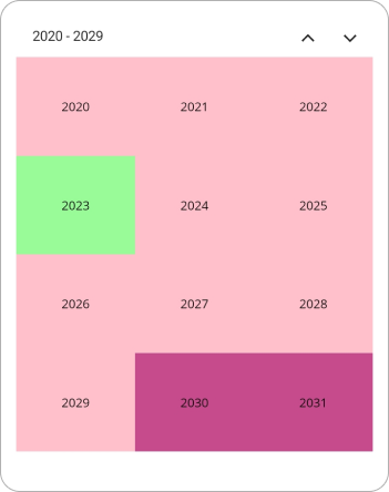
Corner radius
You can customize the corner radius of the calendar using the CornerRadius property of the SfCalendar, allowing you to set the desired roundness for the corners of the calendar. The default value of the CornerRadius property is 20.
<calendar:SfCalendar x:Name="calendar"
                     View="Month"
                     CornerRadius="15">
</calendar:SfCalendar>this.calendar.CornerRadius = 15;