About Syncfusion® .NET MAUI OTP Input Control
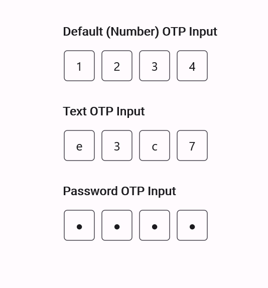
The Syncfusion® .NET MAUI OTP Input (SfOtpInput) control is used to capture one-time passwords (OTP) in a structured and user-friendly format. It simplifies the process of entering verification codes received through SMS, email, or authentication apps, improving usability and security in .NET MAUI applications.
Business use cases
- Authentication systems that require secure OTP-based verification for login and account access.
- Banking and financial applications that use multi-factor authentication with OTP validation.
- E-commerce applications that perform transaction verification using one-time passwords.
- Enterprise applications that enforce secure user identity confirmation and access control.
Key features
- OTP length configuration support allows defining the number of input fields based on OTP requirements.
- Styling mode support allows choosing visual styles such as outlined, filled, or underlined input fields.
- Input type support allows configuring field types such as numeric, text, or password for secure entry.
- Separator support allows adding custom separators between input fields for better readability.
- Structured input layout support allows improving user experience with clear and segmented input fields.
Globalization
The following table summarizes the globalization support available in this control.
 Full Support
 Not Applicable
| Control | Localization | RTL | Time zone | Screen reader | Keyboard navigation |
|---|---|---|---|---|---|
| OtpInput | |
|
|
|
|
Related controls
- Text Input Layout for enhancing text input fields with floating labels, validation UI, and better form clarity.
- Numeric Entry for precise numeric input and validation scenarios, complementing OTP’s digit‑based entry.
- Numeric UpDown for controlled numeric adjustments with increment/decrement buttons, offering another structured input option.
See Also
- Getting Started shows a step‑by‑step guide to begin using the OTP Input control.
- Input Types explains the different input modes supported.
- Customization describes how to adjust appearance and layout behavior.
- UI Kit provides interactive demos and ready-made UI examples.
Resources
Feature Tour
Get a quick overview of key features and capabilities to kick start your journey.
Explore Features
Showcase Samples
Explore real-world sample apps to see components in action and learn by example.
View Samples
Tutorial Videos
Watch step‑by‑step video guides to quickly understand concepts and implementation.
Watch now
Knowledge Base
Find practical solutions, troubleshooting tips and how‑to guides for common scenarios.
Search KB's