Getting Started
5 Sep 20179 minutes to read
Create your first Splitter in ASP.NET
ASP.NET Splitter control consists of movable split bar(s) that divides a container’s display area into two or more resizable and collapsible panels.
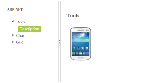
From the following guidelines, you can create a Splitter, add TreeView in the Splitter and set actions to view the image. It is used to split the document or image and Expand or Collapse in the Splitter. The following screenshot demonstrates the functionality of Splitter widget.
Create Splitter Control
You can create an ASP.NET Web Forms Project and add necessary Dll’s and scripts with the help of the given ASP.NET -Getting Started Documentation.
Add the following code example to the corresponding ASPX page to render Splitter.
<div class="content-container-fluid">

    <div class="row">

        <div class="cols-sample-area">

            <ej:Splitter ID="outerSplitter" runat="server" Height="280" Width="501">

                <ej:splitpane panesize="200">

                    <div>

                        <div class="cont">

                            <h3 class="h3">

                                ASP.NET

                            </h3>

                            <%--add tree view control here--%>

                        </div>

                    </div>

                </ej:splitpane>

                <ej:splitpane panesize="200">

                    <div>

                        <div class="cont">

                            <div class="_content">

                                Select any product from the tree to show the description.

                            </div>

                            <div class="tool des">

                                <h3>

                                    Tools

                                </h3>

                                <img src="galaxy.jpg" />

                            </div>

                            <div class="chart des">

                                <h3>

                                    Chart

                                </h3>

                                <img src="hard.jpg" />

                            </div>

                            <div class="grid des">

                                <h3>

                                    Grid

                                </h3>

                                <img src="amazon.png" />

                            </div>

                        </div>

                    </div>

                </ej:splitpane>

            </ej:Splitter>

        </div>

    </div>

</div>
Add the following styles to show the Splitter control in horizontal order.
#outerSplitter

{

	margin: 0 auto;

}

.cont

{

	padding: 20px;

	min-width: 50px;

}

.cont #treeView_Container

{

	margin-bottom: 0;

	border: none;

}

.h3

{

	font-size: 14px;

	margin: 0;

}


.des

{

	display: none;

}
Configure Tree View
Add the following code example in ASPX file to configure TreeView. Refer to the following link to know more details on TreeView control.
http://help.syncfusion.com/js/treeview/getting-started
<ej:TreeView ID="TreeView" runat="server" ClientSideOnNodeSelected="treeClicked">

    <nodes>

        <ej:treeviewnode text="Tools">

            <nodes>

                <ej:treeviewnode text="Description" id="tool">

                </ej:treeviewnode>

            </nodes>

        </ej:treeviewnode>

        <ej:treeviewnode text="Chart">

            <nodes>

                <ej:treeviewnode text="Description" id="chart">

                </ej:treeviewnode>

            </nodes>

        </ej:treeviewnode>

        <ej:treeviewnode text="Grid">

            <nodes>

                <ej:treeviewnode text="Description" id="grid">

                </ej:treeviewnode>

            </nodes>

        </ej:treeviewnode>

    </nodes>

</ej:TreeView>
Set Actions
Add the following code example in the ASPX page to set the action to view the image.
function treeClicked(sender, args) {

	var content = $('.' + sender.currentElement[0].id).html();

	$('._content').html(content);

}
The following screenshot is the output for the above code.
