Nested Splitter Support
16 Mar 20174 minutes to read
The Splitter provides nested pane support that allows you to add a pane between two pane elements.
Configure Nested Splitter
The following steps explain the implementation of the “nested splitter” option.
In an ASPX page set the corresponding <div> elements for outer and inner Splitter control.
<ej:Splitter Height="280" Width="600" ID="outersplitter" Orientation="Vertical" runat="server">
<ej:SplitPane PaneSize="60">
<div>
<div style="padding: 0px 15px;">
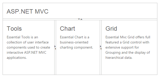
<h3 class="h3">ASP.NET MVC </h3>
</div>
</div>
</ej:SplitPane>
<ej:SplitPane>
<ej:Splitter ID="innersplitter" Width="600" EnableAutoResize="true" runat="server">
<ej:SplitPane paneSize="200">
<div>
<div style="padding: 0px 15px;">
<h3 class="h3">Tools </h3>
Essential Tools is an collection of user interface components used to create interactive
ASP.NET MVC applications.
</div>
</div>
</ej:SplitPane>
<ej:SplitPane paneSize="170">
<div>
<div style="padding: 0px 15px;">
<h3 class="h3">Chart </h3>
Essential Chart is a business-oriented charting component.
</div>
</div>
</ej:SplitPane>
<ej:SplitPane>
<div>
<div style="padding: 0px 15px;">
<h3 class="h3">Grid </h3>
Essential MVC Grid offers full featured a Grid control with extensive support for
Grouping and the display of hierarchical data.
</div>
</div>
</ej:SplitPane>
</ej:Splitter>
</ej:SplitPane>
</ej:Splitter>The following screenshot displays the output of the above code example.