How can I help you?
Tooltip
RangeNavigator provides Tooltip support for sliders. Sliders are used to select data at particular range in the RangeNavigator control. Tooltips for sliders display the selected start and end DateTime values.
Customization
RangeNavigator provides support for you to customize the text display in the tooltip and background using TooltipSettings property. You can change font family, font color, font style, font weight. By default “Segoe UI” font family is set to tooltip text.
- Tooltip visibility can be enabled or disabled using
Visibleproperty. - You can change background color of tooltip using
BackgroundColorproperty. - You can customize the
Color,Family,FontStyle,Opacity,SizeandWeightof tooltip text inFontproperty.
<ej:RangeNavigator ID="RangeNavigator1" runat="server" Locale="fr-FR">

<TooltipSettings Visible="true" BackgroundColor="black" TooltipDisplayMode="onDemand">

<Font Color="red"  Family="Segoe UI" Style="Normal" FontSize="12px"  Opacity="1" Weight="Regular"></Font>

</TooltipSettings>

<%--Code --%>

<%--Code --%>

</ej:RangeNavigator>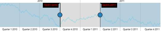
Tool Tip
Label Format
By default, the tooltip texts are automatically determined based on the data points. To make it readable and understandable you can format the tooltip text. For DateTime data, all globalized format are supported. By default the LabelFormat is “MM/dd/yyyy”.
Some of the LabelFormat for DateTime data are as follows:
- ‘MMM, yyyy’
- ‘dd, MMM’
- ‘dd/MM/yyyy’
- ‘dd, hh:mm’
- ‘hh:mm:ss’
- ‘hh:mm:ss:tt’
<ej:RangeNavigator ID="Range1" runat="server">

<TooltipSettings LabelFormat="MMM, yyyy"></TooltipSettings>

. . . . . . .

. . . . . . .

</ej:RangeNavigator>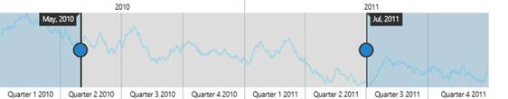
labelFormat
Tooltip display mode
By default the tooltip for RangeNavigator gets displayed. You can change this behavior using the TooltipDisplayMode property in the tooltip and it takes the following values.
| Value | Description |
|---|---|
| always | Tooltip get displayed for RangeNavigator always. |
| onDemand | Tooltip get displayed only when we move the slider. |
<ej:RangeNavigator ID="RangeNavigator1" runat="server" Locale="fr-FR">

<TooltipSettings Visible="true" TooltipDisplayMode="onDemand">

</TooltipSettings>

<%--Code --%>

<%--Code --%>

</ej:RangeNavigator>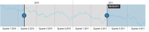
Tool Tip display mode