Basic Features in Flutter Slider (SfSlider)
18 Nov 201824 minutes to read
This section explains how to add and configure numeric and date sliders, core properties, and callbacks.
Minimum
The minimum value that the user can select. The default value of min property is 0.0 and it must be less than the max value.
Maximum
The maximum value that the user can select. The default value of max property is 1.0 and it must be greater than the min value.
Value
It represents the value currently selected in the slider. The slider’s thumb is drawn corresponding to this value.
For date values, the Flutter Slider does not have auto interval support. So, it is mandatory to set interval, dateIntervalType, and dateFormat for date values.
Numeric slider
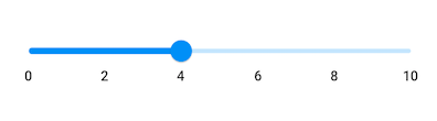
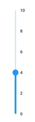
You can show numeric values in the Flutter Slider by setting double values to the min, max and value properties.
Horizontal
import 'package:flutter/material.dart';
import 'package:syncfusion_flutter_sliders/sliders.dart';

class NumericSliderPage extends StatefulWidget {
  @override
  _NumericSliderPageState createState() => _NumericSliderPageState();
}

class _NumericSliderPageState extends State<NumericSliderPage> {
  double _value = 4.0;

  @override
  Widget build(BuildContext context) {
    return MaterialApp(
        home: Scaffold(
            body: Center(
                child: SfSlider(
                  min: 0.0,
                  max: 10.0,
                  value: _value,
                  interval: 2,
                  showLabels: true,
                  onChanged: (double newValue) {
                    setState(() {
                      _value = newValue;
                    });
                  },
                )
            )
        )
     );
  }
}
Vertical
import 'package:flutter/material.dart';
import 'package:syncfusion_flutter_sliders/sliders.dart';

class VerticalNumericSliderPage extends StatefulWidget {
  @override
  _VerticalNumericSliderPageState createState() => _VerticalNumericSliderPageState();
}

class _VerticalNumericSliderPageState extends State<VerticalNumericSliderPage> {
  double _value = 4.0;

  @override
  Widget build(BuildContext context) {
    return MaterialApp(
        home: Scaffold(
            body: Center(
                child: SfSlider.vertical(
                  min: 0.0,
                  max: 10.0,
                  value: _value,
                  interval: 2,
                  showLabels: true,
                  onChanged: (double newValue) {
                    setState(() {
                      _value = newValue;
                    });
                  },
                )
            )
        )
     );
  }
}
Date slider
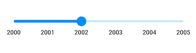
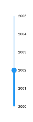
You can show date values in the Flutter Slider by setting DateTime values to the min, max and value properties.
You must import
intlpackage for formatting date slider using theDateFormatclass.
Horizontal
import 'package:flutter/material.dart';
import 'package:intl/intl.dart';
import 'package:syncfusion_flutter_sliders/sliders.dart';

class DateSliderPage extends StatefulWidget {
  @override
  _DateSliderPageState createState() => _DateSliderPageState();
}

class _DateSliderPageState extends State<DateSliderPage> {
  DateTime _value = DateTime(2002, 01, 01);

  @override
  Widget build(BuildContext context) {
    return MaterialApp(
        home: Scaffold(
            body: Center(
                child: SfSlider(
                  min: DateTime(2000, 01, 01, 00),
                  max: DateTime(2004, 12, 31, 24),
                  value: _value,
                  interval: 1,
                  showLabels: true,
                  dateFormat: DateFormat.y(),
                  dateIntervalType: DateIntervalType.years,
                  onChanged: (DateTime newValue) {
                    setState(() {
                      _value = newValue;
                    });
                  },
                )
            )
        )
    );
  }
}
Vertical
import 'package:flutter/material.dart';
import 'package:intl/intl.dart';
import 'package:syncfusion_flutter_sliders/sliders.dart';

class VerticalDateSliderPage extends StatefulWidget {
  @override
  _VerticalDateSliderPageState createState() => _VerticalDateSliderPageState();
}

class _VerticalDateSliderPageState extends State<VerticalDateSliderPage> {
  DateTime _value = DateTime(2002, 01, 01);

  @override
  Widget build(BuildContext context) {
    return MaterialApp(
        home: Scaffold(
            body: Center(
                child: SfSlider.vertical(
                  min: DateTime(2000, 01, 01, 00),
                  max: DateTime(2004, 12, 31, 24),
                  value: _value,
                  interval: 1,
                  showLabels: true,
                  dateFormat: DateFormat.y(),
                  dateIntervalType: DateIntervalType.years,
                  onChanged: (DateTime newValue) {
                    setState(() {
                      _value = newValue;
                    });
                  },
                )
            )
        )
    );
  }
}
Handle onChangeStart, onChanged, and onChangeEnd callbacks
onChangeStart
The onChangeStart callback is called when the user begins to interact with the slider using a tap or drag action. This callback is only used to notify the user that the interaction has started and it does not change the value of the slider thumb.
import 'package:flutter/material.dart';
import 'package:syncfusion_flutter_sliders/sliders.dart';

class OnChangeStartPage extends StatefulWidget {
  @override
  _OnChangeStartPageState createState() => _OnChangeStartPageState();
}

class _OnChangeStartPageState extends State<OnChangeStartPage> {
  double _value = 4.0;

  @override
  Widget build(BuildContext context) {
    return Scaffold(
      body: SfSlider(
        min: 0.0,
        max: 10.0,
        value: _value,
        onChangeStart: (double startValue) {
          debugPrint('Interaction started');
        },
        onChanged: (double newValue) {
          setState(() {
            _value = newValue;
          });
        },
      ),
    );
  }
}
onChangeEnd
The onChangeEnd callback is called when the user stops interacting with the slider using a tap or drag action. This callback is only used to notify the user that the interaction has ended and it does not change the value of the slider thumb.
import 'package:flutter/material.dart';
import 'package:syncfusion_flutter_sliders/sliders.dart';

class OnChangeEndPage extends StatefulWidget {
  @override
  _OnChangeEndPageState createState() => _OnChangeEndPageState();
}

class _OnChangeEndPageState extends State<OnChangeEndPage> {
  double _value = 4.0;

  @override
  Widget build(BuildContext context) {
    return Scaffold(
      body: SfSlider(
        min: 0.0,
        max: 10.0,
        value: _value,
        onChanged: (double newValue) {
          setState(() {
            _value = newValue;
          });
        },
        onChangeEnd: (double endValue) {
          debugPrint('Interaction ended');
        },
      ),
    );
  }
}
onChanged
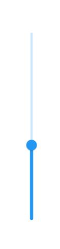
The onChanged callback is called when the user selects a value through interaction.
The Flutter Slider passes the new value to the callback but does not change its state until the parent widget rebuilds the slider with the new value.
If it is null, the Flutter Slider will be disabled.
Horizontal
import 'package:flutter/material.dart';
import 'package:syncfusion_flutter_sliders/sliders.dart';

class OnChangedPage extends StatefulWidget {
  @override
  _OnChangedPageState createState() => _OnChangedPageState();
}

class _OnChangedPageState extends State<OnChangedPage> {
  double _value = 4.0;

  @override
  Widget build(BuildContext context) {
    return MaterialApp(
        home: Scaffold(
             body: Center(
                child: SfSlider(
                  min: 0.0,
                  max: 10.0,
                  value: _value,
                  onChanged: (double newValue) {
                    setState(() {
                      _value = newValue;
                    });
                  },
                )
            )
        )
    );
  }
}
Vertical
import 'package:flutter/material.dart';
import 'package:syncfusion_flutter_sliders/sliders.dart';

class VerticalOnChangedPage extends StatefulWidget {
  @override
  _VerticalOnChangedPageState createState() => _VerticalOnChangedPageState();
}

class _VerticalOnChangedPageState extends State<VerticalOnChangedPage> {
  double _value = 4.0;

  @override
  Widget build(BuildContext context) {
    return MaterialApp(
        home: Scaffold(
             body: Center(
                child: SfSlider.vertical(
                  min: 0.0,
                  max: 10.0,
                  value: _value,
                  onChanged: (double newValue) {
                    setState(() {
                      _value = newValue;
                    });
                  },
                )
            )
        )
    );
  }
}
Active color
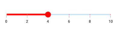
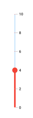
It represents the color applied to the active track, thumb, overlay, and inactive dividers. The active side of the Flutter Slider is between the min value and the thumb.
Horizontal
import 'package:flutter/material.dart';
import 'package:syncfusion_flutter_sliders/sliders.dart';

class ActiveColorPage extends StatefulWidget {
  @override
  _ActiveColorPageState createState() => _ActiveColorPageState();
}

class _ActiveColorPageState extends State<ActiveColorPage> {
  double _value = 4.0;

  @override
  Widget build(BuildContext context) {
    return MaterialApp(
        home: Scaffold(
            body: Center(
                child: SfSlider(
                  min: 0.0,
                  max: 10.0,
                  value: _value,
                  interval: 2,
                  activeColor: Colors.red,
                  showDividers: true,
                  showTicks: true,
                  showLabels: true,
                  onChanged: (double newValue) {
                    setState(() {
                      _value = newValue;
                    });
                  },
                )
            )
        )
    );
  }
}
Vertical
import 'package:flutter/material.dart';
import 'package:syncfusion_flutter_sliders/sliders.dart';

class VerticalActiveColorPage extends StatefulWidget {
  @override
  _VerticalActiveColorPageState createState() => _VerticalActiveColorPageState();
}

class _VerticalActiveColorPageState extends State<VerticalActiveColorPage> {
  double _value = 4.0;

  @override
  Widget build(BuildContext context) {
    return MaterialApp(
        home: Scaffold(
            body: Center(
                child: SfSlider.vertical(
                  min: 0.0,
                  max: 10.0,
                  value: _value,
                  interval: 2,
                  activeColor: Colors.red,
                  showDividers: true,
                  showTicks: true,
                  showLabels: true,
                  onChanged: (double newValue) {
                    setState(() {
                      _value = newValue;
                    });
                  },
                )
            )
        )
    );
  }
}
Inactive color
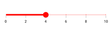
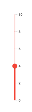
It represents the color applied to the inactive track and active dividers.
The inactive side of the Flutter Slider is between the thumb and the max value.
Horizontal
import 'package:flutter/material.dart';
import 'package:syncfusion_flutter_sliders/sliders.dart';

class InactiveColorPage extends StatefulWidget {
  @override
  _InactiveColorPageState createState() => _InactiveColorPageState();
}

class _InactiveColorPageState extends State<InactiveColorPage> {
  double _value = 4.0;

  @override
  Widget build(BuildContext context) {
    return MaterialApp(
        home: Scaffold(
            body: Center(
                child: SfSlider(
                  min: 0.0,
                  max: 10.0,
                  value: _value,
                  interval: 2,
                  activeColor: Colors.red,
                  inactiveColor: Colors.red.withValues(alpha: 0.2),
                  showDividers: true,
                  showTicks: true,
                  showLabels: true,
                  onChanged: (double newValue) {
                    setState(() {
                      _value = newValue;
                    });
                  },
                )
            )
        )
    );
  }
}
Vertical
import 'package:flutter/material.dart';
import 'package:syncfusion_flutter_sliders/sliders.dart';

class VerticalInactiveColorPage extends StatefulWidget {
  @override
  _VerticalInactiveColorPageState createState() => _VerticalInactiveColorPageState();
}

class _VerticalInactiveColorPageState extends State<VerticalInactiveColorPage> {
  double _value = 4.0;

  @override
  Widget build(BuildContext context) {
    return MaterialApp(
        home: Scaffold(
            body: Center(
                child: SfSlider.vertical(
                  min: 0.0,
                  max: 10.0,
                  value: _value,
                  interval: 2,
                  activeColor: Colors.red,
                  inactiveColor: Colors.red.withValues(alpha: 0.2),
                  showDividers: true,
                  showTicks: true,
                  showLabels: true,
                  onChanged: (double newValue) {
                    setState(() {
                      _value = newValue;
                    });
                  },
                )
            )
        )
    );
  }
}
For customizing individual items
To know more about how to customize both thumb and divider in the Flutter Slider, you can watch this video.