How can I help you?
Applying Themes in Xamarin Controls
9 Jan 20257 minutes to read
Syncfusion® themes allow you apply colors across all the Syncfusion® controls with a uniform approach and provide consistent look and feel to your applications. This section covers the following topics:
- Applying light and dark themes
- Overriding the default theme
- Creating your own theme
Applying light and dark themes
By default, Syncfusion® provides support for light and dark themes. As names suggest, these themes will have colors with light and dark color contrasts, respectively.
To apply themes to your application, merge the following items:
- Theme resource dictionary
- Control style resource dictionaries
Theme resource dictionary
This resource dictionary contains keys and their respective color codes for all the Syncfusion® controls. Currently, the following two theme resource dictionaries are available:
- Light theme resource dictionary
- Dark theme resource dictionary
Control style resource dictionaries
Each Syncfusion® control has a separate control style resource dictionary, whose styles are mapped to the keys declared in theme resource dictionary as a ‘DynamicResource’.
<Application xmlns:syncTheme="clr-namespace:Syncfusion.XForms.Themes;assembly=Syncfusion.Core.XForms"
xmlns:gauge="clr-namespace:Syncfusion.SfGauge.XForms;assembly=Syncfusion.SfGauge.XForms"
xmlns:buttons="clr-namespace:Syncfusion.XForms.Buttons;assembly=Syncfusion.Buttons.XForms"
             ...>
<Application.Resources>
        <ResourceDictionary>
            <ResourceDictionary.MergedDictionaries>
                <!-- Theme resource dictionary -->
                <syncTheme:DarkTheme />
                <!-- Control style resource dictionaries -->
                <gauge:SfCircularGaugeStyles />
                <buttons:SfButtonStyles />
            </ResourceDictionary.MergedDictionaries>
        </ResourceDictionary>
</Application.Resources>

....

</Application>
Merging the dictionaries
You can merge the theme resource dictionary and control style resource dictionaries in the following two ways:
Manual merging
For manual merging, both the theme resource dictionary and each control style resource dictionary need to be merged for the required controls in the application resources as follows.
<Application xmlns:syncTheme="clr-namespace:Syncfusion.XForms.Themes;assembly=Syncfusion.Core.XForms"
xmlns:gauge="clr-namespace:Syncfusion.SfGauge.XForms;assembly=Syncfusion.SfGauge.XForms"
xmlns:buttons="clr-namespace:Syncfusion.XForms.Buttons;assembly=Syncfusion.Buttons.XForms"
             ...>
<Application.Resources>
        <ResourceDictionary>
            <ResourceDictionary.MergedDictionaries>
                <!-- Theme resource dictionary -->
                <syncTheme:DarkTheme />
                <!-- Control style resource dictionaries -->
                <gauge:SfCircularGaugeStyles />
                <buttons:SfButtonStyles />
            </ResourceDictionary.MergedDictionaries>
        </ResourceDictionary >
</Application.Resources>

....

</Application>
Automatic merging
When using more number of Syncfusion® controls in an application, to make the process easier for merging the control style dictionaries of the controls, the SyncfusionThemeDictionary class has been provided for automatic merging. When the theme resource dictionary is merged to this dictionary, control style resource dictionaries will be merged automatically. However, only the styles for the controls used in the application will be merged.
<Application xmlns:syncTheme="clr-namespace:Syncfusion.XForms.Themes;assembly=Syncfusion.Core.XForms"
             ...>

<Application.Resources>
    <syncTheme:SyncfusionThemeDictionary>
        <syncTheme:SyncfusionThemeDictionary.MergedDictionaries>
            <!-- Theme resource dictionary -->
            <syncTheme:DarkTheme />
        </syncTheme:SyncfusionThemeDictionary.MergedDictionaries>
    </syncTheme:SyncfusionThemeDictionary>
</Application.Resources>

....

</Application>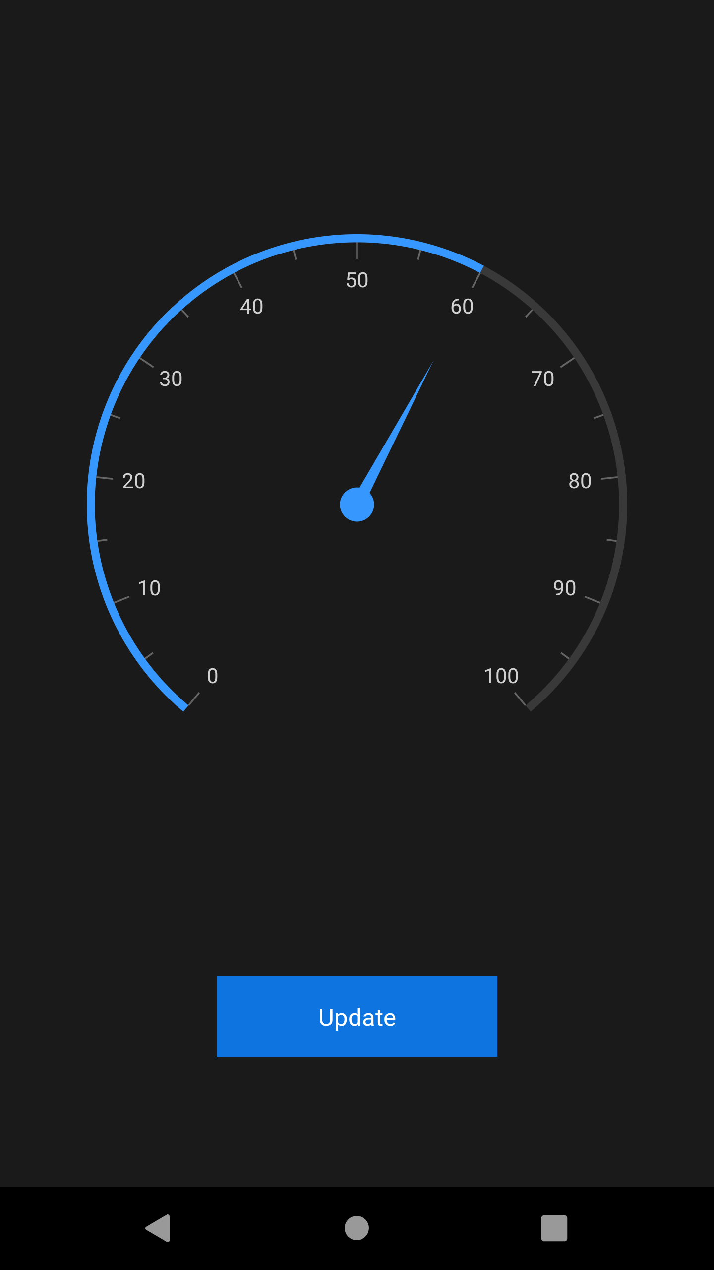
Overriding the default theme
The theme resource dictionary contains a set of keys that are mapped to the style in control style dictionaries. The default appearance of themes can be customized by overriding the key values.
The following section explains how to override both the primary and control specific keys.
Overriding the primary keys
The theme resource dictionary contains the following set of primary keys that are mapped to the UI elements of all the controls. To override the primary colors of theme, change the values for these keys as required. You can find the keys and the UI elements to which they are mapped to all the controls in this documentation.
- SyncPrimaryColor
- SyncPrimaryLightColor
- SyncPrimaryDarkColor
- SyncPrimaryForegroundColor
- SyncPrimaryLightForegroundColor
- SyncPrimaryDarkForegroundColor
- SyncSuccessColor
- SyncErrorColor
- SyncWarningColor
- SyncInfoColor
<Application xmlns:syncCore="clr-namespace:Syncfusion.XForms.Themes;assembly=Syncfusion.Core.XForms"
             ...>
<Application.Resources>
    <syncCore:SyncfusionThemeDictionary>
        <syncCore:SyncfusionThemeDictionary.MergedDictionaries>
            <syncCore:DarkTheme />
            <ResourceDictionary>
                <Color x:Key="SyncPrimaryColor">LimeGreen</Color>
                <Color x:Key="SyncPrimaryLightColor">LimeGreen</Color>
            </ResourceDictionary>
        </syncCore:SyncfusionThemeDictionary.MergedDictionaries>
    </syncCore:SyncfusionThemeDictionary>
</Application.Resources>

....

</Application>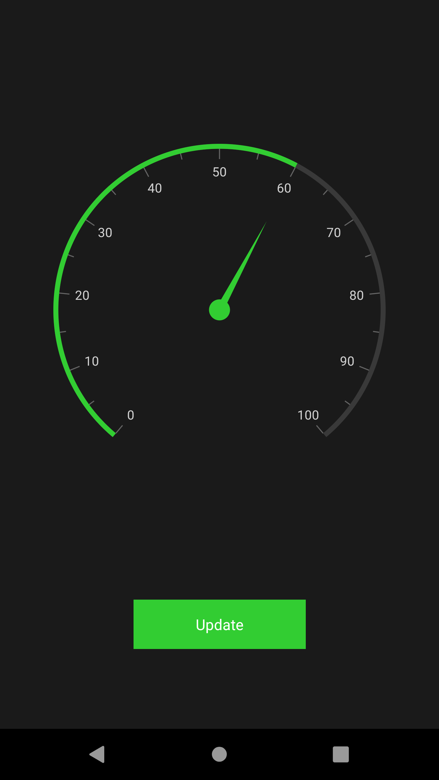
Overriding the control specific keys
In addition to the primary keys, the theme resource dictionary also contains the keys that are specific to each controls; these keys can also be overridden. You can find the keys and the UI elements to which they are mapped to all the controls in this documentation.
<Application xmlns:syncTheme="clr-namespace:Syncfusion.XForms.Themes;assembly=Syncfusion.Core.XForms"
             ...>
<Application.Resources>
    <syncCore:SyncfusionThemeDictionary>
        <syncCore:SyncfusionThemeDictionary.MergedDictionaries>
            <syncCore:DarkTheme />
            <ResourceDictionary>
                <Color x:Key="SyncPrimaryColor">LimeGreen</Color>
                <Color x:Key="SyncPrimaryLightColor">LimeGreen</Color>
                <Color x:Key="SfCircularGaugeScaleRimColor">Green</Color>
            </ResourceDictionary>
        </syncCore:SyncfusionThemeDictionary.MergedDictionaries>
    </syncCore:SyncfusionThemeDictionary>
</Application.Resources>

....

</Application>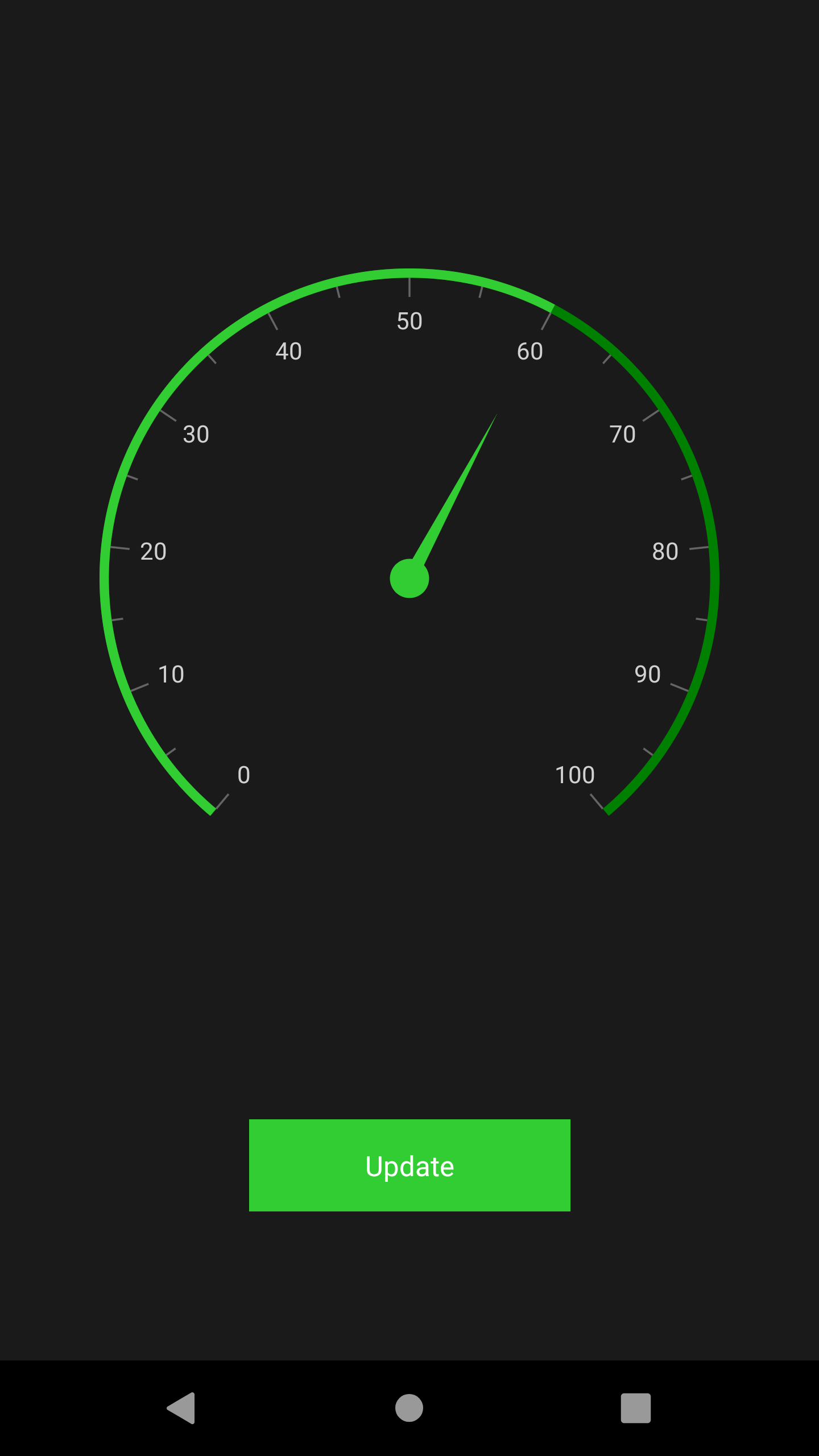
Creating your own theme
As an alternative approach to the above methods, you can also create your own theme. To create own theme, first, you need to merge the resource, whose key name should be “ControlName” + “Theme” based on the controls, e.g., SfChartTheme and SfTextInputLayoutTheme. You can find this key for each control in this documentation. After merging this resource, you need to merge the required color resources based on the UI elements that need to be customized. You can find the keys and the UI elements to which they are mapped to all the controls in this documentation.
Using this approach, you can create your own theme to all the controls or for specific controls you need.
<Application xmlns:syncTheme="clr-namespace:Syncfusion.XForms.Themes;assembly=Syncfusion.Core.XForms"
             ...>
<Application.Resources>
    <syncCore:SyncfusionThemeDictionary>
        <syncCore:SyncfusionThemeDictionary.MergedDictionaries>
            <ResourceDictionary>
                <x:String x:Key="SfCircularGaugeTheme">CustomTheme</x:String>
                <Color x:Key="SyncPrimaryColor">LimeGreen</Color>
                <Color x:Key="SyncPrimaryLightColor">LimeGreen</Color>
                <Color x:Key="SfCircularGaugeScaleRimColor">Green</Color>
            </ResourceDictionary>
        </syncCore:SyncfusionThemeDictionary.MergedDictionaries>
    </syncCore:SyncfusionThemeDictionary>
</Application.Resources>

....

</Application>