How can I help you?
Setting Sliding Panel Content in Xamarin Navigation Drawer
8 Aug 202221 minutes to read
The drawer pane content is viewable only if drawer is in open state. Its content can be set as
-
Header Content
-
Drawer Content
-
Footer Content
NOTE
Header and Footer content are optional but Drawer content is mandatory to allocate space for the drawer.
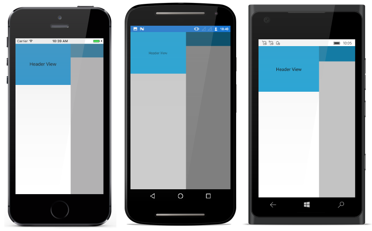
Header Content
As the name suggests it is displayed at the top of drawer. DrawerHeaderView property is used to set the header content of drawer.
<?xml version="1.0" encoding="utf-8"?>
<ContentPage xmlns="http://xamarin.com/schemas/2014/forms"
             xmlns:x="http://schemas.microsoft.com/winfx/2009/xaml"
             xmlns:local="clr-namespace:NaviSample"
             xmlns:navigationdrawer="clr-namespace:Syncfusion.SfNavigationDrawer.XForms;assembly=Syncfusion.SfNavigationDrawer.XForms"
             x:Class="NaviSample.MainPage">
<navigationdrawer:SfNavigationDrawer x:Name="navigationDrawer">
        <navigationdrawer:SfNavigationDrawer.ContentView>
            <StackLayout>
                <Grid BackgroundColor="#1aa1d6"
                      HeightRequest="50"
                      VerticalOptions="Start">
                    <Button x:Name="hamburgerButton"
                            HeightRequest="50"
                            WidthRequest="50"
                            HorizontalOptions="Start"
                            FontSize="20"
                            BackgroundColor="#1aa1d6"
                            Clicked="hamburgerButton_Clicked"/>
                </Grid>
            </StackLayout>
        </navigationdrawer:SfNavigationDrawer.ContentView>
        <navigationdrawer:SfNavigationDrawer.DrawerHeaderView>
            <Grid BackgroundColor="#1aa1d6">
               <StackLayout VerticalOptions="Center"
                            HorizontalOptions="Center">
                <Label Text="Header View"/>
               </StackLayout>
            </Grid>
        </navigationdrawer:SfNavigationDrawer.DrawerHeaderView>
    </navigationdrawer:SfNavigationDrawer>
</ContentPage>
using System;
using Syncfusion.SfNavigationDrawer.XForms;
using Xamarin.Forms;
namespace NaviSample
{
public partial class MainPage : ContentPage
{
public MainPage()
{
InitializeComponent();
navigationDrawer.DrawerWidth = 200;
hamburgerButton.Image = (FileImageSource)ImageSource.FromFile("hamburger_icon.png");
}
void hamburgerButton_Clicked(object sender, EventArgs e)
{
navigationDrawer.ToggleDrawer();
}
}
}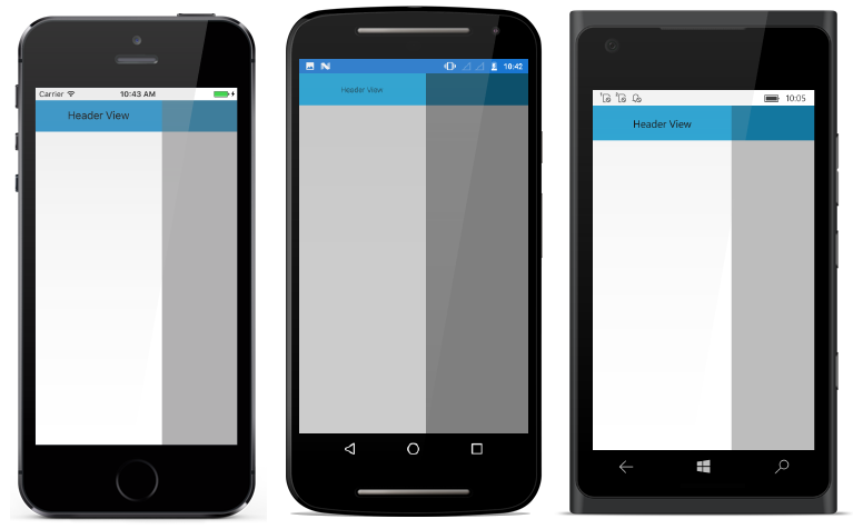
Header Height
Height of the drawer header content can be adjusted using DrawerHeaderHeight property.
NOTE
DrawerHeaderViewwill be disabled by settingDrawerHeaderHeightto zero
<?xml version="1.0" encoding="utf-8"?>
<ContentPage xmlns="http://xamarin.com/schemas/2014/forms"
             xmlns:x="http://schemas.microsoft.com/winfx/2009/xaml"
             xmlns:local="clr-namespace:NaviSample"
             xmlns:navigationdrawer="clr-namespace:Syncfusion.SfNavigationDrawer.XForms;assembly=Syncfusion.SfNavigationDrawer.XForms"
             x:Class="NaviSample.MainPage">
 <navigationdrawer:SfNavigationDrawer x:Name="navigationDrawer"
                                      DrawerHeaderHeight="50">
        <navigationdrawer:SfNavigationDrawer.ContentView>
            <StackLayout>
                <Grid BackgroundColor="#1aa1d6"
                      HeightRequest="50"
                      VerticalOptions="Start">
                    <Button x:Name="hamburgerButton"
                            HeightRequest="50"
                            WidthRequest="50"
                            HorizontalOptions="Start"
                            FontSize="20"
                            BackgroundColor="#1aa1d6"
                            Clicked="hamburgerButton_Clicked"/>
                </Grid>
            </StackLayout>
        </navigationdrawer:SfNavigationDrawer.ContentView>
        <navigationdrawer:SfNavigationDrawer.DrawerHeaderView>
            <Grid BackgroundColor="#1aa1d6" >
                    <StackLayout VerticalOptions="Center"
                                 HorizontalOptions="Center">
                <Label Text="Header View"/>
                       </StackLayout>
            </Grid>
        </navigationdrawer:SfNavigationDrawer.DrawerHeaderView>
    </navigationdrawer:SfNavigationDrawer>
</ContentPage>
using System;
using Syncfusion.SfNavigationDrawer.XForms;
using Xamarin.Forms;
namespace NaviSample
{
public partial class MainPage : ContentPage
{
public MainPage()
{
InitializeComponent();
navigationDrawer.DrawerHeaderHeight = 50;
hamburgerButton.Image = (FileImageSource)ImageSource.FromFile("hamburger_icon.png");
}
void hamburgerButton_Clicked(object sender, EventArgs e)
{
navigationDrawer.ToggleDrawer();
}
}
}
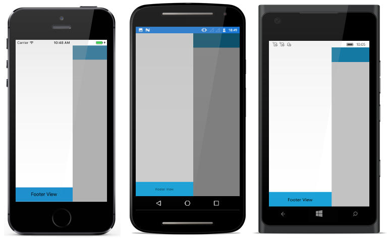
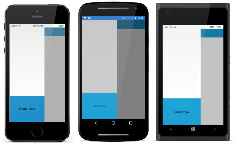
Footer Content
As the name suggests it is displayed at the bottom of drawer. DrawerFooterView property is used to set the footer content of drawer.
<?xml version="1.0" encoding="utf-8"?>
<ContentPage xmlns="http://xamarin.com/schemas/2014/forms"
             xmlns:x="http://schemas.microsoft.com/winfx/2009/xaml"
             xmlns:local="clr-namespace:NaviSample"
             xmlns:navigationdrawer="clr-namespace:Syncfusion.SfNavigationDrawer.XForms;assembly=Syncfusion.SfNavigationDrawer.XForms"
             x:Class="NaviSample.MainPage">
    <navigationdrawer:SfNavigationDrawer x:Name="navigationDrawer">
        <navigationdrawer:SfNavigationDrawer.ContentView>
            <StackLayout>
                <Grid BackgroundColor="#1aa1d6"
                      HeightRequest="50"
                      VerticalOptions="Start">
                    <Button x:Name="hamburgerButton"
                            HeightRequest="50"
                            WidthRequest="50"
                            HorizontalOptions="Start"
                            FontSize="20"
                            BackgroundColor="#1aa1d6"
                            Clicked="hamburgerButton_Clicked"/>
                </Grid>
            </StackLayout>
        </navigationdrawer:SfNavigationDrawer.ContentView>
        <navigationdrawer:SfNavigationDrawer.DrawerFooterView>
           <Grid BackgroundColor="#1aa1d6" >
            <StackLayout VerticalOptions="Center"
                         HorizontalOptions="Center">
                <Label Text="Footer View"/>
            </StackLayout>
           </Grid>
        </navigationdrawer:SfNavigationDrawer.DrawerFooterView>
    </navigationdrawer:SfNavigationDrawer>
</ContentPage>
using System;
using Syncfusion.SfNavigationDrawer.XForms;
using Xamarin.Forms;
namespace NaviSample
{
public partial class MainPage : ContentPage
{
public MainPage()
{
InitializeComponent();
navigationDrawer.DrawerFooterHeight = 50;
hamburgerButton.Image = (FileImageSource)ImageSource.FromFile("hamburger_icon.png");
}
void hamburgerButton_Clicked(object sender, EventArgs e)
{
navigationDrawer.ToggleDrawer();
}
}
}
Footer Height
Height of the drawer footer content can be adjusted using DrawerFooterHeight property.
NOTE
DrawerFooterViewwill be disabled by settingDrawerFooterHeightto zero
<?xml version="1.0" encoding="utf-8"?>
<ContentPage xmlns="http://xamarin.com/schemas/2014/forms"
             xmlns:x="http://schemas.microsoft.com/winfx/2009/xaml"
             xmlns:local="clr-namespace:NaviSample"
             xmlns:navigationdrawer="clr-namespace:Syncfusion.SfNavigationDrawer.XForms;assembly=Syncfusion.SfNavigationDrawer.XForms"
             x:Class="NaviSample.MainPage">
<navigationdrawer:SfNavigationDrawer x:Name="navigationDrawer"
                                     DrawerFooterHeight="50">
        <navigationdrawer:SfNavigationDrawer.ContentView>
            <StackLayout>
                <Grid BackgroundColor="#1aa1d6"
                      HeightRequest="50"
                      VerticalOptions="Start">
                    <Button x:Name="hamburgerButton"
                            HeightRequest="50"
                            WidthRequest="50"
                            HorizontalOptions="Start"
                            FontSize="20"
                            BackgroundColor="#1aa1d6"
                            Clicked="hamburgerButton_Clicked"/>
                </Grid>
            </StackLayout>
        </navigationdrawer:SfNavigationDrawer.ContentView>
        <navigationdrawer:SfNavigationDrawer.DrawerFooterView>
            <Grid BackgroundColor="#1aa1d6" >
            <StackLayout VerticalOptions="Center"
                         HorizontalOptions="Center">
                <Label Text="Footer View"/>
            </StackLayout>
             </Grid>
        </navigationdrawer:SfNavigationDrawer.DrawerFooterView>
    </navigationdrawer:SfNavigationDrawer>
</ContentPage>
using System;
using Syncfusion.SfNavigationDrawer.XForms;
using Xamarin.Forms;
namespace NaviSample
{
public partial class MainPage : ContentPage
{
public MainPage()
{
InitializeComponent();
navigationDrawer.DrawerFooterHeight = 50;
hamburgerButton.Image = (FileImageSource)ImageSource.FromFile("hamburger_icon.png");
}
void hamburgerButton_Clicked(object sender, EventArgs e)
{
navigationDrawer.ToggleDrawer();
}
}
}
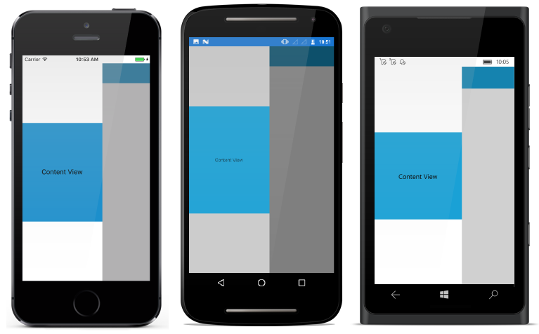
Main Content
Drawer main content is displayed in between header and footer content. It can be set using DrawerContentView property. Content view occupies the remaining space left by header and footer content.
<?xml version="1.0" encoding="utf-8"?>
<ContentPage xmlns="http://xamarin.com/schemas/2014/forms"
             xmlns:x="http://schemas.microsoft.com/winfx/2009/xaml"
             xmlns:local="clr-namespace:NaviSample"
             xmlns:navigationdrawer="clr-namespace:Syncfusion.SfNavigationDrawer.XForms;assembly=Syncfusion.SfNavigationDrawer.XForms"
             x:Class="NaviSample.MainPage">
 <navigationdrawer:SfNavigationDrawer x:Name="navigationDrawer">
        <navigationdrawer:SfNavigationDrawer.ContentView>
            <StackLayout>
                <Grid BackgroundColor="#1aa1d6"
                      HeightRequest="50"
                      VerticalOptions="Start">
                    <Button x:Name="hamburgerButton"
                            HeightRequest="50"
                            WidthRequest="50"
                            HorizontalOptions="Start"
                            FontSize="20"
                            BackgroundColor="#1aa1d6"
                            Clicked="hamburgerButton_Clicked"/>
                </Grid>
            </StackLayout>
        </navigationdrawer:SfNavigationDrawer.ContentView>
        <navigationdrawer:SfNavigationDrawer.DrawerContentView>
            <Grid BackgroundColor="#1aa1d6">
                <Label Text="Content View"
                       VerticalOptions="Center"
                       HorizontalOptions="Center"/>
            </Grid>
        </navigationdrawer:SfNavigationDrawer.DrawerContentView>
    </navigationdrawer:SfNavigationDrawer>
</ContentPage>
using System;
using Syncfusion.SfNavigationDrawer.XForms;
using Xamarin.Forms;
namespace NaviSample
{
public partial class MainPage : ContentPage
{
public MainPage()
{
InitializeComponent();
hamburgerButton.Image = (FileImageSource)ImageSource.FromFile("hamburger_icon.png");
}
void hamburgerButton_Clicked(object sender, EventArgs e)
{
navigationDrawer.ToggleDrawer();
}
}
}