Selection in Xamarin ListView (SfListView)
9 Aug 202324 minutes to read
This section explains how to perform selection and its related operations in the Xamarin ListView (SfListView).
UI selection
The Xamarin ListView (SfListView) allows selecting items either programmatically or touch interactions by setting the SfListView.SelectionMode property value to other than None. The control has different selection modes to perform selection operations listed as follows:
- None: Allows disabling selection.
-
Single: Allows selecting single item only. When clicking the selected item, selection not will not be cleared. This is the default value for
SelectionMode. - SingleDeselect: Allows selecting single item only. When clicking the selected item, selection gets cleared.
- Multiple: Allows selecting more than one item. Selection is not cleared when selecting more than one items. When clicking the selected item, selection gets cleared.
The SfListView allows selecting items on different gestures such as tap, double tap, and hold by setting the SfListView.SelectionGesture. The default value for the SelectionGesture is TouchGesture.Tap.
<syncfusion:SfListView x:Name="listView"
                        SelectionMode="Multiple"
SelectionGesture="Hold"/>listView.SelectionMode = SelectionMode.Multiple;
listView.SelectionGesture = TouchGesture.Hold;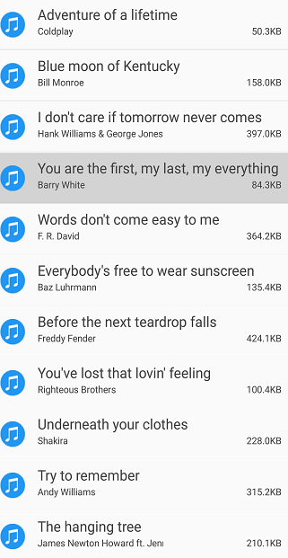
Programmatic selection
When the SfListView.SelectionMode is other than None, the item or items in the SfListView can be selected from the code by setting the SfListView.SelectedItem, or adding items to the SfListView.SelectedItems property based on the SelectionMode.
When the selection mode is Single, programmatically select an item by setting the underlying object to the SfListView.SelectedItem property.
//Perform selection using selected item
listView.SelectedItem = viewModel.Items[5];
When the selection mode is Multiple, programmatically select more than one item by adding the underlying object to the SfListView.SelectedItems property.
//Perform multiple selection using selected items
public class SelectionViewModel : INotifyPropertyChanged
{
    private ObservableCollection<object> selectedItems;

    public SelectionViewModel()
    {
        GenerateSource();
        SelectedItems = new ObservableCollection<object>();
    }

    public ObservableCollection<object> SelectedItems
    {
        get { return selectedItems; }
        set { this.selectedItems = value; }
    }
    private async void GenerateSource()
    {
        var random = new Random();
        SelectedItems.Add(MusicInfo[0]);
    }
}

listView.SelectedItems.Add (viewModel.Items [4]);
listView.SelectedItems.Add (viewModel.Items[5]);
NOTE
The
SfListView.SelectedItemsproperty type is a type of ObservableCollection
<sync:SfListView x:Name="listView" SelectedItems="{Binding SelectedItems}">
</sync:SfListView>
All items of the SfListView can be selected using the SelectAll method.
listView.SelectAll();NOTE
When programmatically select an item, then the selection related events will not be triggered. It triggers only on UI interactions.
However, get the notification from the SelectedItems collection changed event, which will be triggered when add an item at runtime.
Selected items
Get selected items
The SfListView gets all the selected items through the SfListView.SelectedItems property and gets the single item by using the SfListView.SelectedItem property.
Clear selected items
The selected items can be cleared by calling the SelectedItems.Clear() method.
listView.SelectedItems.Clear();CurrentItem vs SelectedItem
The SfListView gets the selected item by using the SfListView.SelectedItem and SfListView.CurrentItem properties. Both SfListView.SelectedItem and SfListView.CurrentItem returns the same data object when selecting single item. When selecting more than one item, the SfListView.SelectedItem property returns the first selected item, and the SfListView.CurrentItem property returns the last selected item.
WARNING
If you select an item when SfListView.SelectionMode is
Noneor if you select multiple items whenSfListView.SelectionModeisSingle, exception will be thrown.
Selected item customization
The Xamarin ListView (SfListView) supports customizing the selection background color for the selected items by using the SfListView.SelectedItemTemplate if the background color is set to view loaded in the SfListView.ItemTemplate.
<ContentPage  xmlns:syncfusion="clr-namespace:Syncfusion.ListView.XForms;assembly=Syncfusion.SfListView.XForms">
  <syncfusion:SfListView x:Name="listView">
   <syncfusion:SfListView.SelectedItemTemplate>
    <DataTemplate>
     <Grid x:Name="grid" BackgroundColor="RoyalBlue">
      <Grid.RowDefinitions>
         <RowDefinition Height="*" />
         <RowDefinition Height="*" />
         <RowDefinition Height="1" />
       </Grid.RowDefinitions>
      <Label Text="{Binding SongTitle}" />
      <Label Text="{Binding SongAuther}" Grid.Row="1"/>
      <Frame Grid.Row="2" HasShadow="True" HeightRequest="1"/>
     </Grid>
    </DataTemplate>
   </syncfusion:SfListView.SelectedItemTemplate>
  </syncfusion:SfListView>
</ContentPage>listView.SelectedItemTemplate = new DataTemplate(() =>
{
var grid = new Grid();
grid.RowDefinitions.Add(new RowDefinition { Height = new GridLength(1, GridUnitType.Star) });
grid.RowDefinitions.Add(new RowDefinition { Height = new GridLength(1, GridUnitType.Star) });
grid.RowDefinitions.Add(new RowDefinition { Height = new GridLength(1) });
grid.BackgroundColor = Color.RoyalBlue;
var songTitle = new Label();
songTitle.SetBinding(Label.TextProperty, new Binding("SongTitle"));
var songAuthor = new Label();
songAuthor.SetBinding(Label.TextProperty, new Binding("songAuthor"));
var frame = new Frame()
{
HeightRequest = 1,
HasShadow = true,
};
grid.Children.Add(songTitle);
grid.Children.Add(songAuthor, 0, 1);
grid.Children.Add(frame, 0, 2);
return grid;
});Download the entire sample from GitHub here.
Show checked circle on selected items
To customize the appearance of the selected item or items by using the appearance of SfListView.SelectedItemTemplate. The following customizations should give an idea to customize the appearance of selected items in the control.
<ContentPage xmlns:syncfusion="clr-namespace:Syncfusion.ListView.XForms;assembly=Syncfusion.SfListView.XForms">
  <syncfusion:SfListView x:Name="listView">
   <syncfusion:SfListView.SelectedItemTemplate>
    <DataTemplate>
     <Grid x:Name="grid">
      <Grid.ColumnDefinitions>
       <ColumnDefinition Width="40" />
       <ColumnDefinition Width="*" />
       <ColumnDefinition Width="Auto" />
      </Grid.ColumnDefinitions>
      <Image Source="{Binding SongThumbnail}"/>
      <Grid Grid.Column="1">
       <Grid.RowDefinitions>
        <RowDefinition Height="*" />
        <RowDefinition Height="*" />
       </Grid.RowDefinitions>
       <Label Text="{Binding SongTitle}" />
       <Grid Grid.Row="1">
        <Grid.ColumnDefinitions>
         <ColumnDefinition Width="*" />
         <ColumnDefinition Width="*" />
        </Grid.ColumnDefinitions>
        <Label Text="{Binding SongAuther}" />
        <Label Grid.Column="1" Text="{Binding SongSize}"/>
       </Grid>
      </Grid>
      <Image Grid.Column="2" x:Name="selectionImage" IsVisible="True" Source="Selected.png"/>
     </Grid>
    </DataTemplate>
   </syncfusion:SfListView.SelectedItemTemplate>
  </syncfusion:SfListView>
</ContentPage>listView.SelectedItemTemplate = new DataTemplate(() =>
{
var grid1 = new Grid();
grid1.ColumnDefinitions.Add(new ColumnDefinition { Width = new GridLength(40) });
grid1.ColumnDefinitions.Add(new ColumnDefinition { Width = new GridLength(1, GridUnitType.Star) });
grid1.ColumnDefinitions.Add(new ColumnDefinition { Width = new GridLength(1, GridUnitType.Auto) });
var songThumbnail = new Image();
songThumbnail.SetBinding(Image.SourceProperty, new Binding("SongThumbnail"));
var grid2 = new Grid();
grid2.RowDefinitions.Add(new RowDefinition { Height = new GridLength(1, GridUnitType.Star) });
grid2.RowDefinitions.Add(new RowDefinition { Height = new GridLength(1, GridUnitType.Star) });
grid2.Padding = new Thickness(15, 0, 0, 0);
var songTitle = new Label();
songTitle.SetBinding(Label.TextProperty, new Binding("SongTitle"));
var grid3 = new Grid();
grid3.ColumnDefinitions.Add(new ColumnDefinition { Width = new GridLength(1, GridUnitType.Star) });
grid3.ColumnDefinitions.Add(new ColumnDefinition { Width = new GridLength(1, GridUnitType.Star) });
var songAuthor = new Label();
songAuthor.SetBinding(Label.TextProperty, new Binding("songAuthor"));
var songSize = new Label();
songSize.SetBinding(Label.TextProperty, new Binding("SongSize"));
grid3.Children.Add(songAuthor);
grid3.Children.Add(songSize, 1, 0);
grid2.Children.Add(songTitle);
grid2.Children.Add(grid3, 0, 1);
var selectionImage = new Image()
{
IsVisible = true,
Source = "Selected.png"
};
grid1.Children.Add(songThumbnail);
grid1.Children.Add(grid2, 1, 0);
grid1.Children.Add(selectionImage, 2, 0);
return grid1;
});Download the entire source code from GitHub here.

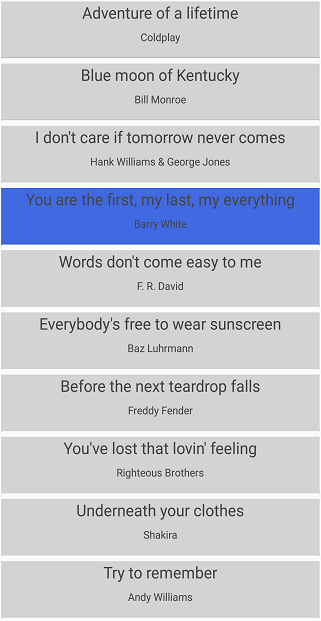
Selected item style
Selection background
The SfListView allows changing the selection background color for the selected items by using the SfListView.SelectionBackgroundColor property. You can also change the selection background color at runtime.
<syncfusion:SfListView x:Name="listView"
SelectionBackgroundColor="Khaki"/>listView.SelectionBackgroundColor = Color.Khaki;
Programmatic animation
The SfListView allows programmatic animation in selection at runtime by using the virtual method AnimateSelectedItem of SelectionController class.
listView.SelectionController = new SelectionControllerExt(listView);

public class SelectionControllerExt : SelectionController
{
   public SelectionControllerExt(SfListView listView) : base(listView)
   {
   }

   protected override void AnimateSelectedItem(ListViewItem selectedListViewItem)
   {
      base.AnimateSelectedItem(selectedListViewItem);
      selectedListViewItem.Opacity = 0;
      selectedListViewItem.FadeTo(1, 3000, Easing.SinInOut);
   }
}
Download the entire source code from GitHub here.
Events
SelectionChanging event
The SelectionChanging event is raised while selecting an item at the execution time. ItemSelectionChangingEventArgs has the following members which provides the information for SelectionChanging event:
- AddedItems: Gets collection of the underlying data objects where the selection is going to be processed.
- RemovedItems: Gets collection of the underlying data objects where the selection is going to be removed.
You can cancel the selection process within this event by setting the ItemSelectionChangingEventArgs.Cancel property to true.
The SelectionChanging event is used for the following use case:
- Disable the selection of the particular item based on the underlying data.
listView.SelectionChanging += ListView_SelectionChanging;

private void ListView_SelectionChanging(object sender, ItemSelectionChangingEventArgs e)
{
  if (e.AddedItems.Count > 0 && e.AddedItems[0] == ViewModel.Items[0])
      e.Cancel = true;
}
SelectionChanged event
The SelectionChanged event will occur once selection process has been completed for the selected item in the SfListView. ItemSelectionChangedEventArgs has the following members which, provides information for SelectionChanged event:
- AddedItems: Gets collection of the underlying data objects where the selection has been processed.
- RemovedItems: Gets collection of the underlying data objects where the selection has been removed.
The SelectionChanged event used for the following use cases:
- Clears all the selected item.
- Removes the particular selected item.
- Gets the index of the selected item.
listView.SelectionChanged += ListView_OnSelectionChanged;

private void ListView_OnSelectionChanged(object sender, ItemSelectionChangedEventArgs e)
{
   listView.SelectedItems.Clear();
}
NOTE
SelectionChanging and SelectionChanged events will be triggered only on UI interactions.
Commands
SelectionChangedCommand
The SelectionChangedCommand will be triggered when the selection is changed and passing the SelectionChangedCommandParameter as parameter. The default value of SelectionChangedCommandParameter is Null. If SelectionChangedCommandParameter is not defined then ItemSelectionChangedEventArgs will be passed as argument.
<ContentPage xmlns:syncfusion="clr-namespace:Syncfusion.ListView.XForms;assembly=Syncfusion.SfListView.XForms">
  <syncfusion:SfListView x:Name="listView"
   SelectionChangedCommand="{Binding ListViewSelectionChangedCommand}"
   SelectionChangedCommandParameter="{x:Reference listView}"
   ItemsSource="{Binding BookInfo}"
   ItemSize="100">
  </syncfusion:SfListView>
</ContentPage>
public class CommandViewModel
{
private Command<Object> selectionChangedCommand;
public Command<object> ListViewSelectionChangedCommand
{
get { return selectionChangedCommand; }
set { selectionChangedCommand = value; }
}
public CommandViewModel()
{
ListViewSelectionChangedCommand = new Command<object>(SelectionChangedCommandMethod);
}
private void SelectionChangedCommandMethod(object obj)
{
var listView = obj as SfListView;
DisplayAlert("Message", (listView.SelectedItem as Contacts).ContactName + " is selected", "OK");
}
}Key navigation
The AllowKeyNavigation property enables navigation through keyboard buttons. When the AllowKeyNavigation property is true, navigation gets enabled. Otherwise, set to false. Behavior of key navigation in UWP and macOS are explained as follows :
- When the SfListView.SelectionMode is
Single, the selected item is highlighted withFocusBorderColoraround the item while key navigation. - When the
SelectionModeisSingleDeSelectorMultiple, the FocusBorderColor will set to theCurrentItemonly on key navigation. - If focusable elements i.e.
Entry,SearchBar, etc. are loaded in the page, theFocuswill not be changed either to other elements in the view or to the next ListViewItem whenTaborShift+Tabkey is pressed in the LinearLayout. - In the GridLayout with span count greater than 1, the
FocusBorderColorwill navigate to the next or previousListViewItemwhen pressingTaborShift+Tabkey. - In macOS, need to move the focus manually to perform key navigation.
FocusBorderColor
FocusBorderColor used to set the border color for the current focused item. For Android and iOS platform, the default color is Color.Transparent and for macOS and UWP platform, the default color is Color.FromRgb(76, 161, 254).
FocusBorderThickness
FocusBorderThickness used to set the border thickness for the current focused item. For Android and iOS platform, the default thickness is 0 and for macOS and UWP platform, the default thickness is 1.
MacOS support
Known issues
- If
SfListViewflings with moreinertiaor the scrollbar reaches either the bottom or top of the view, the listview items will not layout properly. Since, it occurs in simple custom control andXamarin.Forms.ListView. So, a defect report is logged toBugzillateam. Find the bug report: https://github.com/xamarin/Xamarin.Forms/issues/2403 - When
Groupingis enabled, the listview items and group header items will not layout properly while scrolling theSfListView. - Application will get crash when
Linkeroption is set toLink All. - If an
Imageis loaded in the ItemTemplate property, it is necessary to define a definite size for theImage.
Not yet implemented
The following features are not yet implemented due to some limitations in the Xamarin.Forms.macOS platform:
How to
Disable selection on particular item
The selection of a particular set of items can be disabled based on the SfListView.SelectedItems of the underlying collections.
public partial class MainPage : ContentPage
{
  public MainPage()
  {
    InitializeComponent();
  }

  private void listView_SelectionChanging(object sender, Syncfusion.ListView.XForms.ItemSelectionChangingEventArgs e)
  {
  if (e.AddedItems.Count > 0 && (e.AddedItems[0] as Contacts).Category == "Non-Selectable items")
      e.Cancel = true;
  }
}
Download the entire sample from GitHub here.
Automatically scroll to bring a selected item into the view
To bring the SfListView.SelectedItem automatically into the view when it changed at runtime by calling the ScrollToRowIndex method.
In linear layout, you can get the row index of SfListView.SelectedItem and resolve if header and group header are used.
public partial class MainPage : ContentPage
{
  public MainPage()
  {
    InitializeComponent();
    listView.PropertyChanged += listView_PropertyChanged;
  }

  private void listView_PropertyChanged(object sender, System.ComponentModel.PropertyChangedEventArgs e)
  {
    if (e.PropertyName == "SelectedItem")
    {
       var selectedItemIndex = listView.DataSource.DisplayItems.IndexOf(listView.SelectedItem);
       selectedItemIndex += (listView.HeaderTemplate != null && !listView.IsStickyHeader || !listView.IsStickyGroupHeader) ? 1 : 0;
       selectedItemIndex -= (listView.GroupHeaderTemplate != null && listView.IsStickyGroupHeader) ? 1 : 0;
       (listView.LayoutManager as LinearLayout).ScrollToRowIndex(selectedItemIndex);
    }
  }
}
Download the entire sample from GitHub here.
Gets the index of selected item
When performing selection, you can get the index of the selected item by using the SelectionChanged event from the DataSource.DisplayItems.
public partial class MainPage : ContentPage
{
  public MainPage()
  {
    InitializeComponent();
    listView.SelectionChanged += ListView_SelectionChanged;
  }

  private void ListView_SelectionChanged(object sender, ItemSelectionChangedEventArgs e)
  {
    var items = e.AddedItems;
    var index = listView.DataSource.DisplayItems.IndexOf(items[0]);
    entry.Text = index.ToString();
  }
}
Download the entire sample from GitHub here.
Display selection when ItemTemplate contains image
When ItemTemplate contains only image, then the selection color will not be visible in the view when select an image. To see selection, add any layout such as Grid or StackLayout above the image, and set margin or padding to it.
<ContentPage xmlns:syncfusion="clr-namespace:Syncfusion.ListView.XForms;assembly=Syncfusion.SfListView.XForms">
  <syncfusion:SfListView
   ItemsSource="{Binding BookInfo}"
   ItemSize="100">
    <syncfusion:SfListView.ItemTemplate>
        <DataTemplate>
            <Grid Margin="10">
                <Image Source="{Binding Image}" Aspect="Fill"/>
            </Grid>
        </DataTemplate>
    </syncfusion:SfListView.ItemTemplate>
</syncfusion:SfListView>
</ContentPage>
public partial class MainPage : ContentPage
{
SfListView listView;
public MainPage()
{
InitializeComponent();
listView = new SfListView();
listView.ItemSize = 100;
listView.ItemsSource = viewModel.BookInfo;
listView.ItemTemplate = new DataTemplate(() =>
{
var grid = new Grid() { Margin = 10 };
var image = new Image() { Aspect = Aspect.Fill};
image.SetBinding(Image.SourceProperty, new Binding("Image"));
grid.Children.Add(image);
return grid;
});
this.Content = listView;
}
}Limitation
- When a grid is loaded inside the ItemTemplate with background color, the SelectionBackgroundColor will not display. Because, it overlaps the
SelectionBackgroundColor. In this case, set the background color for the ListView instead ofItemTemplate. - When the
SfListViewcontains duplicated items in the collection, only the first item whose instance was created initially will be selected or deselected.
NOTE
You can refer to our Xamarin ListView feature tour page for its groundbreaking feature representations. You can also explore our Xamarin.Forms ListView example to know how to render set of data items with Xamarin.Forms views or custom templates.
See also
How to select ListView item using Enter key in Xamarin.Forms ListView (UWP)
How to disable a selection in the Xamarin.Forms listview
How to disable selection for particular items in SfListView
How to notify item selection using MVVM in Xamarin.Forms ListView
How to change the ListView selected item text color in Xamarin.Forms (SfListView)
How to change selected image in Xamarin.Forms ListView (SfListView)
How to apply ListView selected item color in Xamarin.Forms navigation (SfListView)?
How to achieve SingleDeSelect when use ListView with Rg.Plugin.Popup in Xamarin.Forms (SfListView)