How can I help you?
Column Types in Xamarin DataGrid (SfDataGrid)
10 Jan 202524 minutes to read
The SfDataGrid contains different types of columns. The functionalities of the column can be implied by its name. Based on the requirements any column can be used.
The following table describes the types of columns and its usage:
| Column Type | Renderer | Description |
|---|---|---|
| To display string or numbers in each row. | ||
| To display switch in each row. | ||
| To display an image in each row. | ||
| To customize the column based on the requirements. | ||
| To display a numeric data. | ||
| To display the IEnumerable data using Picker. | ||
| To display the IEnumerable data using Picker. | ||
| To display the date and time value. | ||
| To add additional columns that are not bound with data object from the underlying data source. |
GridColumn
The GridColumn is the base column types of all columns. Hence its properties are used by all the columns. The following sub-sections explain the properties and customizations of GridColumn:
Binding options
Display content of the GridColumn is determined from the GridColumn.DisplayBinding property. It gets or sets display binding that associates the GridColumn with a property in the data source.
The actual bound value of the GridColumn is determined from GridColumn.ValueBinding property. It gets or sets value binding that associates the GridColumn with a property in the data source.
Mapping column to particular property
The GridColumn.MappingName associates the GridColumn with a property available in the underlying data source. While setting MappingName alone to the SfDataGrid, the GridColumn.DisplayBinding will be automatically generated based on the MappingName. Data manipulation operations like sorting, filtering, and grouping will be done based on the MappingName property.
To format cell content, use the converter of the GridColumn.DisplayBinding to customize the cell content. The following code example appends the text “Customer” along with the Customer ID:
<ContentPage.Resources>
    <ResourceDictionary>
        <local:DisplayBindingConverter x:Key="displayBindingConverter" />
    </ResourceDictionary>
</ContentPage.Resources>

<syncfusion:SfDataGrid x:Name="dataGrid"
                       ItemsSource="{Binding OrdersInfo}">

    <syncfusion:SfDataGrid.Columns>
        <syncfusion:GridTextColumn MappingName="CustomerID"
                                   DisplayBinding="{Binding CustomerID,
                                   Converter={StaticResource displayBindingConverter}}" />
    </syncfusion:SfDataGrid.Columns>
</syncfusion:SfDataGrid>public class DisplayBindingConverter : IValueConverter
{
public object Convert(object value, Type targetType, object parameter, CultureInfo culture)
{
if (value != null)
return "Customer:" + value.ToString();
return null;
}
public object ConvertBack(object value, Type targetType, object parameter, CultureInfo culture)
{
return value.ToString().Substring(9);
}
}Header customizations
HeaderCellTextSize
The FontSize can be customized using the GridColumn.HeaderCellTextSize property. The default font size is 14.
HeaderFont
The FontFamily can be customized using the GridColumn.HeaderFont property. The default font value is HelveticaNeue LT 55 Roman.
HeaderFontAttribute
The FontAttribute can be customized using the GridColumn.HeaderFontAttribute property. The default value of this property is None. It can be customized as Bold or Italic.
HeaderText
To customize the display content of the header cell, use the GridColumn.HeaderText property. It specifies the text displayed in the column header. If header text is not defined, then GridColumn.MappingName will be assigned to the header text and will be displayed as column header.
HeaderTextAlignment
To get or set the TextAlignment of the header cell, use the GridColumn.HeaderTextAlignment property. The default alignment is Center. It can be customized as Start or End.
HeaderTemplate
Based on the requirement, the header cell can be customized using the GridColumn.HeaderTemplate property. To customize header cell by loading a template in the header cell, follow the code example:
<syncfusion:SfDataGrid.Columns>
    <syncfusion:GridTextColumn MappingName="OrderID">
        <syncfusion:GridTextColumn.HeaderTemplate>
            <DataTemplate>
                <Label x:Name="OrderID" Text="OrderID" TextColor="Black"
                       BackgroundColor="Yellow" YAlign="Center" />
            </DataTemplate>
        </syncfusion:GridTextColumn.HeaderTemplate>
    </syncfusion:GridTextColumn>
</syncfusion:SfDataGrid.Columns>
Setting manual column width
SfDataGrid allows you to customize the width of each GridColumn in the SfDataGrid.Columns collection. To customize column width, use the GridColumn.Width property. By default, this property will not be assigned any value. The GridColumn renders in view based on the value of the DefaultColumnWidth property.
NOTE
Set the
IsHiddenproperty toTrueinstead of setting column width as0to hide a column.
Customize the width for auto generated columns in both XAML and code as follows:
<sfgrid:SfDataGrid x:Name="dataGrid"
                   AutoGenerateColumns="false"
    <sfgrid:SfDataGrid.Columns x:TypeArguments="sfgrid:Columns">
      <sfgrid:GridTextColumn MappingName="OrderID"
                             Width="100"/>
      </sfgrid:SfDataGrid.Columns >
  </sfgrid:SfDataGrid>
// AutoGenerated Column
dataGrid.AutoGeneratingColumn += DataGrid_AutoGeneratingColumn;
void dataGrid_AutoGeneratingColumn(object sender, AutoGeneratingColumnArgs e){
if (e.Column.MappingName == "OrderID") {
e.Column.Width = 100;
}
}
// Manually generated column
dataGrid.Columns.Add(new GridTextColumn() { MappingName = "OrderID" ,Width = 100 });Hiding a column
To hide a particular column, use the GridColumn.IsHidden property. The default value of the IsHidden property is False.
NOTE
Set the
IsHiddenproperty toTrueinstead of setting column width as0to hide a column.
To hide column using the IsHidden property, follow the code example:
<syncfusion:GridTextColumn MappingName="OrderID" IsHidden = "True"/>// AutoGenerate Column
dataGrid.AutoGeneratingColumn += DataGrid_AutoGeneratingColumn;
void dataGrid_AutoGeneratingColumn(object sender, AutoGeneratingColumnArgs e){
if (e.Column.MappingName == "OrderID") {
e.Column.IsHidden = true;
}
}
// Manually generated column
dataGrid.Columns.Add(new GridTextColumn() { MappingName = "OrderID", IsHidden = true});LoadUIView
The GridColumn.LoadUIView property indicates whether to load UIElement inside the GridCell or to draw cell value directly in the canvas of the GridCell in Android platform.
- When
LoadUIViewis set tofalse, cell value of the column is directly drawn in thecanvasof the grid cells to improve performance. - While setting the
LoadUIViewtotrue, aUIElement(SfLabel) is loaded in theGridCells.
The default value of the LoadUIView is false for Xamarin.Forms.Android, and true for other platforms in Xamarin.Forms.
GridTextColumn customerID = new GridTextColumn();
customerID.MappingName = "Description";
customerID.LoadUIView = true;
Padding
SfDataGrid allows the users to set padding for the cells in both display and edit mode by using the property GridColumn.Padding.
<syncfusion:GridTextColumn MappingName="OrderID" TextAlignment="Start" Padding="10,0,0,0"/>GridTextColumn orderID = new GridTextColumn();
orderID.MappingName = "OrderID";
orderID.TextAlignment = TextAlignment.Start;
orderID.Padding = new Thickness(10, 0, 0, 0);NOTE
GridTemplateColumnignores theGridTemplateColumn.Paddingvalues set in the sample since it takes default padding values based on the DataGridStyle.GetGridLinesVisibility, so that the borders are visible. Hence to set custom padding values, set margin for the base view of your DataTemplate.
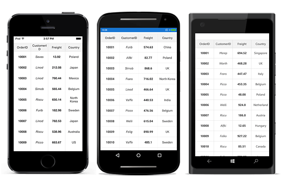
GridTextColumn
GridTextColumn inherits all the properties of GridColumn. It is used to host the textual content in the record cells. Each of the record cell displays text based on the MappingName that associates the column with a property in the data source.
The following code example creates GridTextColumn:
<syncfusion:GridTextColumn MappingName="OrderID" />dataGrid.Columns.Add(new GridTextColumn() { MappingName = "OrderID" });The following topics explain the customizations done in the GridTextColumn:
Formatting
To format values displayed in the GridColumn, use the GridColumn.Format property.
Format column using StringFormat
Assign the format of string to the GridColumn.Format property based on the bound data type of the property, the GridColumn is associated to format the value. You can use different StringFormats to customize values displayed in the record cells.
To apply formatting for a GridTextColumn, follow the code example:
<syncfusion:SfDataGrid.Columns>
    <syncfusion:GridTextColumn MappingName="Freight" Format="C" />
    <syncfusion:GridTextColumn MappingName="ShippingDate" Format="dd/MM/yyyy" />
</syncfusion:SfDataGrid.Columns>dataGrid.Columns.Add (new GridTextColumn () {
MappingName = "Freight",
Format = "C"
});
dataGrid.Columns.Add (new GridTextColumn () {
MappingName = "ShippingDate",
Format = "dd/MM/yyyy"
});Format column using converter
Using converter, set the format of the column.
To set the format using converter, follow the code example:
<sfgrid:SfDataGrid.Columns>
    <sfgrid:GridTextColumn MappingName="Salary" DisplayBinding="{Binding Salary, Converter={StaticResource SummaryConverter}}" />
</sfgrid:SfDataGrid.Columns>public object Convert(object value, Type targetType, object parameter, CultureInfo culture)
{
var formattedString = string.Format("$ {0}", value);
return formattedString;
}NOTE
For AutoGenerated columns formatting can be applied by handling the SfDataGrid.AutoGeneratingColumn event.
Formatting GridTextColumn with different culture
To apply different CultureInfo for GridColumns, use the GridColumn.CultureInfo property. Assign format of the string to this property. Based on the type of the property the column is associated to format the value. You can use different StringFormats to customize values displayed in the record cells.
To apply different cultures for the GridColumns, follow the code example:
dataGrid.Columns.Add (new GridTextColumn () {
    MappingName = "Freight",
    Format = "C",
    CultureInfo = new CultureInfo("en-US")
});

dataGrid.Columns.Add (new GridTextColumn () {
    MappingName = "OrderID",
    Format = "C",
    CultureInfo = new CultureInfo("en-GB")
});
For auto generated columns, this is achievable by handling the SfDataGrid.AutoGeneratingColumn event. To apply different cultures for auto generated GridColumns, follow the code example:
void GridAutoGeneratingColumns(object sender, AutoGeneratingColumnArgs e)
{
    if (e.Column.MappingName == "Freight") {
        e.Column.Format = "C";
        e.Column.CultureInfo = new CultureInfo ("en-US");
    } else if (e.Column.MappingName == "OrderID") {
        e.Column.Format = "C";
        e.Column.CultureInfo = new CultureInfo ("en-GB");
    }
}
Font and alignment options
CellTextSize
The FontSize for the content of record cells can be customized using the GridColumn.CellTextSize property. The default font size of the record cells is 14.
RecordFont
The FontFamily for the content of record cell can be customized using the GridColumn.RecordFont property. The default font value is Helvetica Neue.
FontAttribute
The FontAttribute for the content of record cells can be customized using the [GridColumn.FontAttribute]. The record cells text can be customized as Bold, or Italic, or None. The default value of this property is None.
To set font attribute for a column, follow the code example:
<sfgrid:SfDataGrid x:Name="dataGrid" ItemsSource="{Binding OrdersInfo}">
     <sfgrid:SfDataGrid.Columns>
      <sfgrid:GridTextColumn MappingName="Freight" FontAttribute="Bold" />
      </sfgrid:SfDataGrid.Columns>
</sfgrid:SfDataGrid>dataGrid.Columns.Add (new GridTextColumn ()
{
MappingName = "Freight",
FontAttribute = FontAttribute.Bold,
});Run the application to render the following output:
TextAlignment
To get or set TextAlignment of the header cell, use the GridColumn.TextAlignment property. The default alignment of the record cell is Center. It can be customized as Start or End.
LineBreakMode
When the text for the record cells exceeds the content area, wrap the record cell by setting the GridColumn.LineBreakMode as LineBreakMode.WordWrap.
To use LineBreakMode, follow the code example:
dataGrid.Columns[0].LineBreakMode=LineBreakMode.WordWrap;GridSwitchColumn
GridSwitchColumn inherits all the properties of GridColumn. It loads a switch as the content of record cells in the column and responds to value changes in it. The underlying data source can be changed that it toggles the values shown in the switch. The SfDataGrid automatically generates GridSwitchColumn if the property in the underlying collection of type set to bool.
To use GridSwitchColumn, follow the code example:
<ContentPage.BindingContext>
    <local:ViewModel />
</ContentPage.BindingContext>

<sfGrid:SfDataGrid x:Name="dataGrid"
                   AutoGenerateColumns="True"
                   ItemsSource="{Binding OrdersInfo}">
    <sfGrid:SfDataGrid.Columns>
        <sfGrid:GridSwitchColumn MappingName="IsClosed" />
    </sfGrid:SfDataGrid.Columns>
</sfGrid:SfDataGrid>// Model class
public class Model
{
private bool _isClosed;
public bool IsClosed
{
get { return _isClosed; }
set
{
this._isClosed = value;
}
}
}
// ViewModel class
public class ViewModel
{
public ViewModel()
{
GetOrderDetails(50);
}
#region ItemsSource
private ObservableCollection<OrderInfo> ordersInfo;
public ObservableCollection<OrderInfo> OrdersInfo
{
get { return ordersInfo; }
set { this.ordersInfo = value; }
}
#endregion
#region ItemSource Generator
public void GetOrderDetails(int count)
{
var orderDetails = new ObservableCollection<OrderInfo>();
for (int i = 1; i <= count; i++)
{
var order = new OrderInfo()
{
IsClosed = (i % 2) == 0 ? true : false
};
orderDetails.Add(order);
}
ordersInfo = orderDetails;
}
#endregion
}Editing for switch column
To edit the switch column, set the AllowEditing property to true. By default, AllowEditing is true. If AllowEditing is set to false, you cannot check or uncheck the Switch column.
To set the AllowEditing property, follow the code example:
<sfgrid:GridSwitchColumn MappingName="IsClosed" AllowEditing="true"/>GridSwitchColumn column = new GridSwitchColumn();
column.MappingName = "IsClosed";
column.AllowEditing = true;GridImageColumn
GridImageColumn is derived from GridColumn. Hence, it inherits all the properties of GridColumn. It displays image as cell content of a column. To create GridImageColumn, the property corresponding to the column in the underlying collection must be ImageSource type.
In GridImageColumn, it is possible to load images in any of the following four ways:
- FromFile: Required to specify the path of the file.
- FromResource: Required to set image as embedded resource.
- FromStream: Required to load image from byte[] array.
- FromURI: Required to set image from a web service or website.
To load image (embedded resource) in GridImageColumn, follow the code example:
<ContentPage.BindingContext>
    <local:ViewModel />
</ContentPage.BindingContext>

<sfGrid:SfDataGrid x:Name="dataGrid"
                   AutoGenerateColumns="True"
                   ItemsSource="{Binding OrdersInfo}">
    <sfGrid:SfDataGrid.Columns>
        <sfGrid:GridImageColumn MappingName="DealerImage" />
    </sfGrid:SfDataGrid.Columns>
</sfGrid:SfDataGrid>// Model class
public class Model
{
private ImageSource _dealer;
public ImageSource DealerImage
{
get { return _dealer; }
set
{
this._dealer = value;
}
}
}
// ViewModel class
public class ViewModel
{
public ViewModel()
{
GetOrderDetails(50);
}
#region ItemsSource
private ObservableCollection<OrderInfo> ordersInfo;
public ObservableCollection<OrderInfo> OrdersInfo
{
get { return ordersInfo; }
set { this.ordersInfo = value; }
}
#endregion
#region ItemSource Generator
public void GetOrderDetails(int count)
{
var orderDetails = new ObservableCollection<OrderInfo>();
for (int i = 1; i <= count; i++)
{
var order = new OrderInfo()
{
DealerImage = ImageSource.FromResource("DataGridDemo.Buchanan.png") // Need to give the image path properly. Here, DataGridDemo denotes the project name and Buchanan denotes the image name.
};
orderDetails.Add(order);
}
ordersInfo = orderDetails;
}
#endregion
}
Aspect
SfDataGrid allows you to set the Aspect to size the loaded images within the bounds of the grid cell (whether to stretch, crop or letterbox) using the GridImageColumn.Aspect property. The supported aspects are described below, the default value is AspectFit.
AspectFill: Clips the image so that it fills the display area while preserving the aspect (no distortion).
AspectFit: Letterboxes the image (if required) so that the entire image fits into the display area, with blank space added to the top/bottom or sides depending on whether the image is wide or tall.
Fill: Stretches the image to completely and exactly fill the display area. This may result in the image being distorted.
To set Aspect to images loaded inside GridImageColumn, refer the below code snippet.
<ContentPage.BindingContext>
    <local:ViewModel />
</ContentPage.BindingContext>

<sfGrid:SfDataGrid x:Name="dataGrid"
                   AutoGenerateColumns="True"
                   ItemsSource="{Binding OrdersInfo}">
    <sfGrid:SfDataGrid.Columns>
        <sfGrid:GridImageColumn MappingName="DealerImage" Aspect="AspectFit"/>
    </sfGrid:SfDataGrid.Columns>
</sfGrid:SfDataGrid>
GridTemplateColumn
The GridTemplateColumn is derived from GridColumn. Hence, it inherits all the properties of GridColumn. It allows you to extend the functionality of GridColumn with own view by creating the CellTemplate or CellTemplateSelector.
The following table provides the list of properties in GridTemplateColumn:
| Property | Type | Description | Default Value |
|---|---|---|---|
| CellTemplate | DataTemplate | Gets or sets the template that is used to display the contents of the record cells. | Null |
| EditTemplate | DataTemplate | Gets or sets the template that is used to edit the contents of the record cells. | Null |
| CellTemplateSelector | DataTemplateSelector | Gets or sets the template selector that is used to display the contents of the record cells. | Null |
Cell template
Underlying records will be the BindingContext for the CellTemplate. The following code example shows templating of GridTemplateColumn:
<syncfusion:GridTemplateColumn MappingName="CustomerID">
    <syncfusion:GridTemplateColumn.CellTemplate>
        <DataTemplate>
            <Label Text="{Binding CustomerID}" TextColor="Blue"
                   XAlign="Center" YAlign="Center" />
        </DataTemplate>
    </syncfusion:GridTemplateColumn.CellTemplate>
</syncfusion:GridTemplateColumn>
GridTemplateColumn templateColumn = new GridTemplateColumn()
{
MappingName = "CustomerID",
Width = 50,
};
var dataTemplate = new DataTemplate(() =>
{
var label = new Label()
{
TextColor = Color.Blue,
VerticalOptions = LayoutOptions.Center,
HorizontalOptions = LayoutOptions.Center
};
label.SetBinding(Label.TextProperty, "CustomerID");
return label;
});
templateColumn.CellTemplate = dataTemplate;The following code example illustrates how template column can be used to load a stock cell inside it:
<ContentPage.Resources>
    <ResourceDictionary>
        <local:ImageConverter x:Key="imageConverter" />
    </ResourceDictionary>
</ContentPage.Resources>

<ContentPage.ContentView>
    <syncfusion:SfDataGrid x:Name="dataGrid"
                           ColumnSizer="Star">

        <syncfusion:SfDataGrid.Columns>
            <syncfusion:GridTemplateColumn HeaderText="Stock Change"
                                           MappingName="StockChange">
                <syncfusion:GridTemplateColumn.CellTemplate>
                    <DataTemplate>
                        <Grid>
                            <Grid.ColumnDefinitions>
                                <ColumnDefinition Width="Auto" />
                                <ColumnDefinition Width="*" />
                            </Grid.ColumnDefinitions>
                            <Image Grid.Column="0"
                                   Source="{Binding StockChange,
                                   Converter={StaticResource imageConverter}}" />
                            <Label x:Name="changeValue" Grid.Column="1"
                                   Text="{Binding StockChange}" TextColor="Black"
                                   XAlign="Center" YAlign="Center">
                            </Label>
                        </Grid>
                    </DataTemplate>
                </syncfusion:GridTemplateColumn.CellTemplate>
            </syncfusion:GridTemplateColumn>
        </syncfusion:SfDataGrid.Columns>
    </syncfusion:SfDataGrid>
</ContentPage.ContentView>
In order to get the above code example working, write a converter to load images inside the GridCell based on the CellValue. The images that have to be loaded in the GridCell must be added as EmbeddedResource.
The converter code for loading images in a template column is shown in the following code:
public class ImageConverter:IValueConverter
{
public object Convert (object value, Type targetType, object parameter, CultureInfo culture)
{
var data = value as double?;
if (data != null && data > 0)
return ImageSource.FromResource("DataGridSample.Icons.Green.png");
else
return ImageSource.FromResource("DataGridSample.Icons.Red.png");
}
public object ConvertBack (object value, Type targetType, object parameter, CultureInfo culture)
{
throw new NotImplementedException ();
}
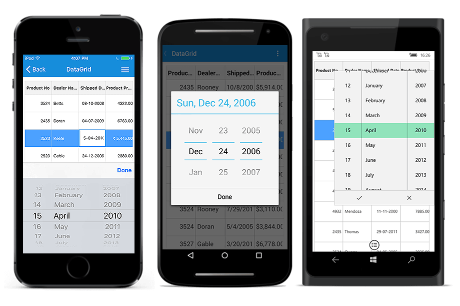
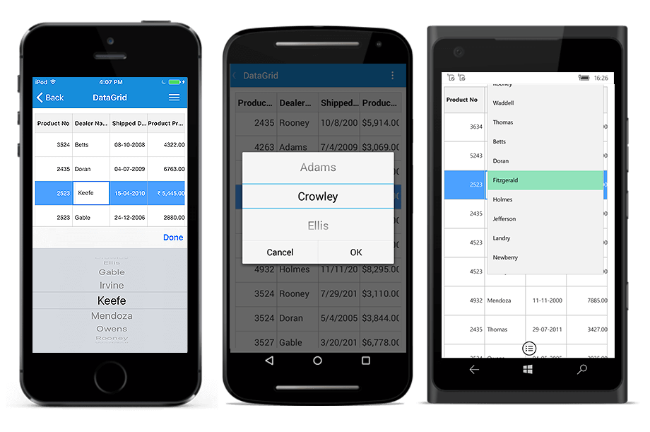
}The following screenshot shows the different types of columns in the SfDataGrid:

Edit template
The SfDataGrid allows you to load any custom view in edit mode using the EditTemplate property.
<ContentPage.Resources>
    <ResourceDictionary>
        <local:ImageConverter x:Key="imageConverter" />
    </ResourceDictionary>
</ContentPage.Resources>

<ContentPage.ContentView>
    <syncfusion:SfDataGrid x:Name="dataGrid"
                           ColumnSizer="Star">

        <syncfusion:SfDataGrid.Columns>
            <syncfusion:GridTemplateColumn HeaderText="Stock Change"
                                           MappingName="StockChange">
                <syncfusion:GridTemplateColumn.CellTemplate>
                    <DataTemplate>
                        <Grid>
                            <Grid.ColumnDefinitions>
                                <ColumnDefinition Width="Auto" />
                                <ColumnDefinition Width="*" />
                            </Grid.ColumnDefinitions>
                            <Image Grid.Column="0"
                                   Source="{Binding StockChange,
                                   Converter={StaticResource imageConverter}}" />
                            <Label x:Name="changeValue" Grid.Column="1"
                                   Text="{Binding StockChange}" TextColor="Black"
                                   XAlign="Center" YAlign="Center">
                            </Label>
                        </Grid>
                    </DataTemplate>
                </syncfusion:GridTemplateColumn.CellTemplate>
                <syncfusion:GridTemplateColumn.EditTemplate>
                    <DataTemplate>
                        <Grid>
                            <Grid.ColumnDefinitions>
                                <ColumnDefinition Width="Auto" />
                                <ColumnDefinition Width="*" />
                            </Grid.ColumnDefinitions>
                            <Image Grid.Column="0"
                                   Source="{Binding StockChange,
                                   Converter={StaticResource imageConverter}}" />
                            <Entry Grid.Column="1"
                                   Text="{Binding StockChange}">
                            </Entry>
                        </Grid>
                    </DataTemplate>
                </syncfusion:GridTemplateColumn.EditTemplate>
            </syncfusion:GridTemplateColumn>
        </syncfusion:SfDataGrid.Columns>
    </syncfusion:SfDataGrid>
</ContentPage.ContentView>
CellTemplateSelector
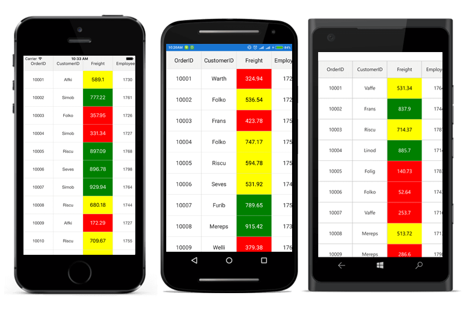
Underlying records will be the BindingContext for the CellTemplateSelector. The following code example shows templating of the GridTemplateColumn using the CellTemplateSelector property:
<ContentPage.Resources>
    <ResourceDictionary>
        <DataTemplate x:Key="low" >
            <Label Text="{Binding Freight}"
                   TextColor="White"
                   BackgroundColor="Red"
                   HorizontalTextAlignment="Center"
                   VerticalTextAlignment="Center" />
        </DataTemplate>
        <DataTemplate x:Key="average" >
            <Label Text="{Binding Freight}"
                   TextColor="Black"
                   BackgroundColor="Yellow"
                   HorizontalTextAlignment="Center"
                   VerticalTextAlignment="Center" />
        </DataTemplate>
        <DataTemplate x:Key="high" >
            <Label Text="{Binding Freight}"
                   TextColor="White"
                   BackgroundColor="Green"
                   HorizontalTextAlignment="Center"
                   VerticalTextAlignment="Center" />
        </DataTemplate>
    </ResourceDictionary>
</ContentPage.Resources>

<sfgrid:GridTemplateColumn MappingName="Freight" >
    <sfgrid:GridTemplateColumn.CellTemplateSelector>
        <local:FreightTemplateSelector High="{StaticResource high}"
                                       Average="{StaticResource average}"
                                       Low="{StaticResource low}"/>
    </sfgrid:GridTemplateColumn.CellTemplateSelector>
</sfgrid:GridTemplateColumn>// FreightTemplateSelector implementation
public class FreightTemplateSelector : DataTemplateSelector
{
public DataTemplate Low { get; set; }
public DataTemplate Average { get; set; }
public DataTemplate High { get; set; }
protected override DataTemplate OnSelectTemplate(object item, BindableObject container)
{
var value = double.Parse((item as OrderInfo).Freight);
if (value > 750)
return High;
else if (value > 500)
return Average;
else
return Low;
}
}
Getting row index of a row in GridTemplateColumn
The SfDataGrid provides various resolving methods to resolve the row index of grid rows based on certain criteria. The actual row index of a row can be resolved by using the ResolveToRowIndex(recordRowIndex) method.
The row index of a grid row can be obtained in GridTemplateColumn by retrieving the record index of the row using the bound data from its BindingContext and by resolving the recordRowIndex using the SfDataGrid.ResolveToRowIndex(recordRowIndex) method.
// MainPage.Xaml
<sfgrid:GridTemplateColumn HeaderText="ShipCity" MappingName="ShipCity">
  <sfgrid:GridTemplateColumn.CellTemplate>
    <DataTemplate>
      <Button Clicked="button_Clicked" WidthRequest="120" Text="{Binding ShipCity}"/>
    </DataTemplate>
  </sfgrid:GridTemplateColumn.CellTemplate>
</sfgrid:GridTemplateColumn>// MainPage.cs
public partial class MainPage : ContentPage
{
public MainPage()
{
InitializeComponent();
}
private void button_Clicked(object sender, EventArgs e)
{
var button = sender as Button;
var record = button.BindingContext as OrderInfo;
var recordRowIndex = viewModel.OrderInfoCollection.IndexOf(record);
var rowIndex = sfGrid.ResolveToRowIndex(recordRowIndex);
}
}NOTE
The row index of the row can also be retrieved by using the GridTapped, GridDoubleTapped, and GridLongPressed events. When using complex layout in a
DataTemplate, set theInputTransparentproperty of the views loaded in theDataTemplateof the GridTemplateColumn toTrue.
Loading DatePicker and TimePicker together
Currently Xamarin.Forms does not provide a view that combines both the DatePicker and the TimePicker as one control. However, the two controls are available individually.
The SfDataGrid supports DatePicker and TimePicker in the same column. It can be achieved by loading the DatePicker and TimePicker in StackLayout in the GridTemplateColumn.
To load DatePicker and TimePicker together, follow the code example:
<sfgrid:GridTemplateColumn MappingName="ShippingDate">
    <sfgrid:GridTemplateColumn.CellTemplate>
        <DataTemplate>
           <StackLayout Orientation="Horizontal">
              <DatePicker Date="{Binding ShippingDate}" TextColor="Black"/>
              <TimePicker Time="{Binding ShippingTime}" TextColor="Black"/>
           </StackLayout>
      </DataTemplate>
   </sfgrid:GridTemplateColumn.CellTemplate>
</sfgrid:GridTemplateColumn>
The following screenshot shows that how DatePicker and TimePicker are viewed together:
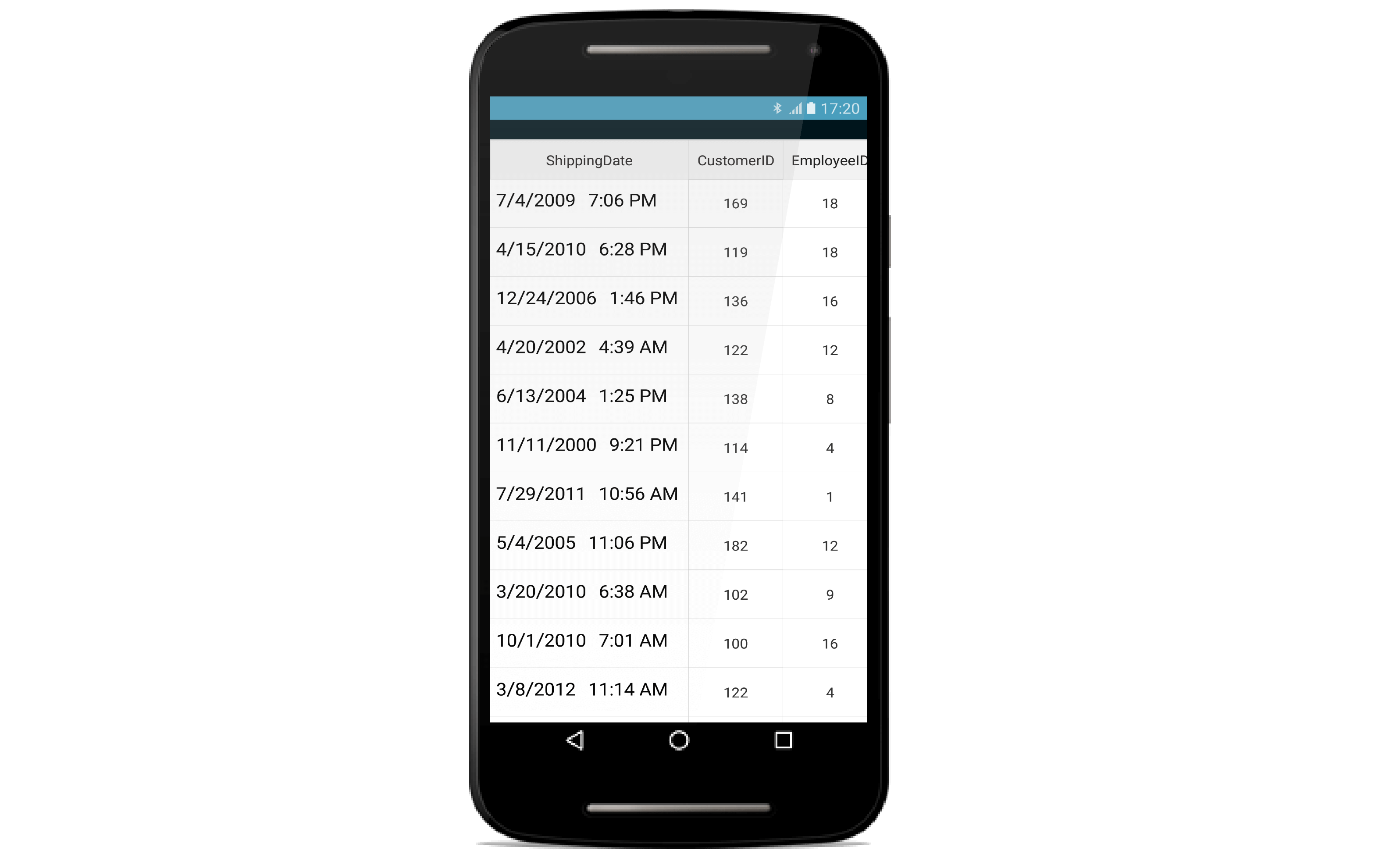
GridDateTimeColumn
The SfDataGrid.GridDateTimeColumn inherits all the properties of the SfDataGrid.GridColumn. It displays the date information as the content of a column. To create the SfDataGrid.GridDateTimeColumn, the property corresponding to the column in the underlying collection must be of type DateTime. To enable or disable editing for the particular column, set the GridColumn.AllowEditing property to true or false. In the editing mode it displays a customized DatePicker element which is derived from the Xamarin.Forms.DatePicker. The SfDatePicker enables to scroll through a list of dates between the GridDateTimeColumn.MinimumDate and GridDateTimeColumn.MaximumDate and selects one from it.
<ContentPage.BindingContext>
    <local:ViewModel x:Name ="viewModel"/>
</ContentPage.BindingContext>

<sfGrid:SfDataGrid x:Name="dataGrid"
                   ItemsSource="{Binding OrdersInfo}">
    <sfGrid:SfDataGrid.Columns>
        <sfgrid:GridDateTimeColumn Format="d"
                                   HeaderText="Shipped Date"
                                   MappingName="ShippedDate" />
    </sfGrid:SfDataGrid.Columns>
</sfGrid:SfDataGrid>
dataGrid = new SfDataGrid();
GridDateTimeColumn dateColumn = new GridDateTimeColumn()
{
MappingName = "ShippedDate",
HeaderText = "Shipped Date",
Format = "d"
};
dataGrid.Columns.Add(dateColumn);// Model class
public class Model
{
private DateTime shippedDate;
public DateTime ShippedDate
{
get { return shippedDate; }
set
{
shippedDate = value;
RaisePropertyChanged("ShippedDate");
}
}
}
// ViewModel class
public class ViewModel
{
private List<DateTime> OrderedDates;
public ViewModel()
{
GetOrderDetails(50);
}
#region ItemsSource
private ObservableCollection<OrderInfo> ordersInfo;
public ObservableCollection<OrderInfo> OrdersInfo
{
get { return ordersInfo; }
set { this.ordersInfo = value; }
}
#endregion
#region ItemSource Generator
private List<DateTime> GetDateBetween(int startYear, int endYear, int count)
{
List<DateTime> date = new List<DateTime>();
Random d = new Random(1);
Random m = new Random(2);
Random y = new Random(startYear);
for (int i = 0; i < count; i++)
{
int year = y.Next(startYear, endYear);
int month = m.Next(3, 13);
int day = d.Next(1, 31);
date.Add(new DateTime(year, month, day));
}
return date;
}
public void GetOrderDetails(int count)
{
var orderDetails= new ObservableCollection<OrderInfo>();
this.OrderedDates = GetDateBetween(2000, 2014, count);
for (int i = 1; i <= count; i++)
{
var order = new OrderInfo()
{
ShippedDate = this.OrderedDates[i - 1],
};
orderDetails.Add(order);
}
ordersInfo = orderDetails;
}
#endregion
}
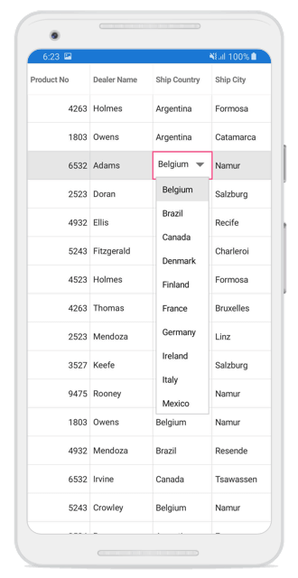
GridPickerColumn
The GridPickerColumn inherits all the properties of the SfDataGrid.GridColumn. It displays a list of items in the form of a picker as the content of a column. To enable or disable editing for the particular column, set the GridColumn.AllowEditing property to true or false. In the editing mode it displays a customized Picker element which is derived from the Xamarin.Forms.Picker. The data source to Picker can be set by using the GridPickerColumn.ItemsSource property. The picker column can be populated with data by the following ways:
- Collection of primitive types
- Collection of user-defined types (Custom objects)
Collection of primitive types
To display the collection of items in the picker drop down, create a GridPickerColumn and set its ItemsSource property to a simple collection.
To load the GridPickerColumn with a simple string collection, follow the code example:
<ContentPage.BindingContext>
    <local:ViewModel x:Name="viewModel"/>
</ContentPage.BindingContext>

<sfGrid:SfDataGrid x:Name="dataGrid"
                   ItemsSource="{Binding OrdersInfo}">
    <sfGrid:SfDataGrid.Columns>
        <sfgrid:GridPickerColumn BindingContext="{x:Reference viewModel}"
                                 HeaderText="Dealer Name"
                                 ItemsSource="{Binding CustomerNames}"
                                 MappingName="DealerName"/>
    </sfGrid:SfDataGrid.Columns>
</sfGrid:SfDataGrid>
dataGrid = new SfDataGrid();
GridPickerColumn pickerColumn = new GridPickerColumn()
{
BindingContext = viewModel,
MappingName = "DealerName",
ItemsSource = viewModel.CustomerNames,
HeaderText = "Dealer Name"
};
dataGrid.Columns.Add(pickerColumn);// ViewModel class
public class ViewModel
{
public ObservableCollection<string> CustomerNames { get; set; }
public ViewModel()
{
this.CustomerNames = Customers.ToObservableCollection();
}
internal string[] Customers = new string[] {"Adams","Crowley","Ellis","Gable","Irvine","Keefe","Mendoza","Owens","Rooney","Wadded",};
}Collection of user-defined types
To display a list of user-defined items in the picker drop down, create a SfDataGrid.GridPickerColumn and set its ItemsSource property to a user-defined collection. Initially, the picker column will be displayed with the values from the GridColumn.MappingName property of the column if the DisplayMemberPath and ValueMemberPath are not set.
DisplayMemberPath
Displays a value by comparing values of the properties set as GridColumn.MappingName and ValueMemberPath in their respective underlying collections. If the values of ValueMemberPath property contains the current value of MappingName property, its corresponding value of DisplayMemberPath property is displayed in the GridCell. Or else the GridCell appears blank. However, in edit mode the values of the DisplayMemberPath property are displayed as picker items.
ValueMemberPath
Once editing completed, the column having the MappingName equal to the ValueMemberPath has its data changed to the corresponding ValueMemberPath value for the selected DisplayMemberPath value in the picker.
Customization of picker dropdown values
To customize the picker data using DisplayMemberPath and ValueMemberPath, follow the code example:
<ContentPage.BindingContext>
    <local:ViewModel x:Name="viewModel"/>
</ContentPage.BindingContext>

<sfGrid:SfDataGrid x:Name="dataGrid"
                   ItemsSource="{Binding OrdersInfo}">
    <sfGrid:SfDataGrid.Columns>

        <sfgrid:GridTextColumn   HeaderText="Order ID"
                                 MappingName="OrderID"/>

        <sfgrid:GridPickerColumn BindingContext="{x:Reference viewModel}"
                                 HeaderText="Picker Column"
                                 DisplayMemberPath="EmployeeID"
                                 ValueMemberPath="OrderID"
                                 ItemsSource="{Binding PickerInfo}"
                                 MappingName="OrderID"/>
    </sfGrid:SfDataGrid.Columns>
</sfGrid:SfDataGrid>
sfGrid = new SfDataGrid();
viewModel = new ViewModel();
sfGrid.ItemsSource = viewModel.OrdersInfo;
GridTextColumn orderIDColumn = new GridTextColumn();
orderIDColumn.MappingName = "OrderID";
orderIDColumn.HeaderText = "Order ID";
GridPickerColumn pickerColumn = new GridPickerColumn();
pickerColumn.MappingName = "OrderID";
pickerColumn.HeaderText = "Picker Column";
pickerColumn.DisplayMemberPath = "EmployeeID";
pickerColumn.ValueMemberPath = "OrderID";
pickerColumn.ItemsSource = viewModel.PickerInfo;
sfGrid.Columns.Add(orderIDColumn);
sfGrid.Columns.Add(pickerColumn);
// ViewModel class
public class ViewModel
{
public class ViewModel :INotifyPropertyChanged
{
public ViewModel ()
{
SetRowsToGenerate (100);
this.PickerInfo = OrdersInfo.ToList();
}
#region ItemsSource
private OrderInfoRepository order;
private ObservableCollection<OrderInfo> ordersInfo;
public ObservableCollection<OrderInfo> OrdersInfo
{
get { return ordersInfo; }
set { this.ordersInfo = value; RaisePropertyChanged("OrdersInfo"); }
}
public List<OrderInfo> PickerInfo
{
get;
set;
}
#endregion
#region ItemSource Generator
public void SetRowsToGenerate (int count)
{
order = new OrderInfoRepository ();
ordersInfo = order.GetOrderDetails (count);
}
#endregion
public ObservableCollection<OrderInfo> GetOrderDetails(int count)
{
ObservableCollection<OrderInfo> orderDetails = new ObservableCollection<OrderInfo> ();
for (int i = 1; i <= count; i++)
{
var order = new OrderInfo ()
{
OrderID = i,
EmployeeID = i+5,
};
orderDetails.Add (order);
}
return orderDetails;
}
#region INotifyPropertyChanged implementation
public event PropertyChangedEventHandler PropertyChanged;
private void RaisePropertyChanged(String name)
{
if (PropertyChanged != null)
this.PropertyChanged(this, new PropertyChangedEventArgs(name));
}
#endregion
}
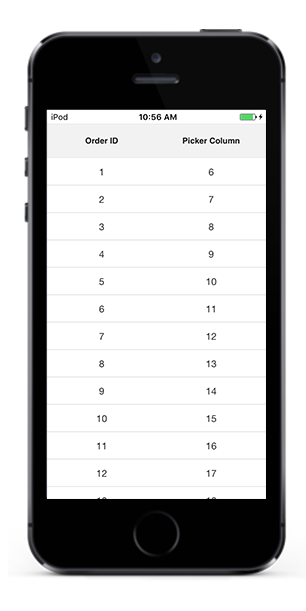
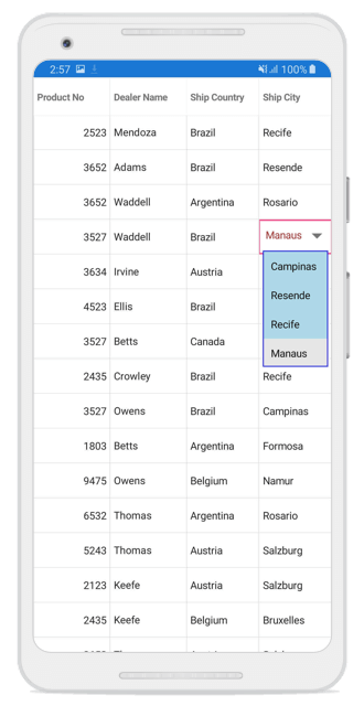
}The following screenshots explain the above code and show the working of the PickerColumn with ValueMemberPath and DisplayMemberPath properties set:
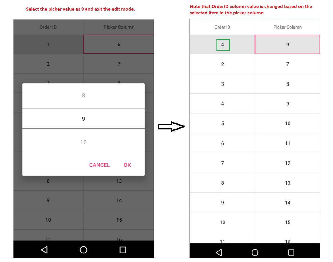
In the above code example underlying collection has two properties (OrderID,EmployeeID). A GridPickerColumn has been created with MappingName = OrderID, DisplayMemberPath = EmployeeID, ValueMemberPath = OrderID. EmployeeId has the values 6,7,8,9,10…. and OrderID has the values 1,2,3,4,5…. . Initially, the GridCells of the PickerColumn will be displayed with the values 6,7,8,9,10…. in row wise order based on the DisplayMemberPath.
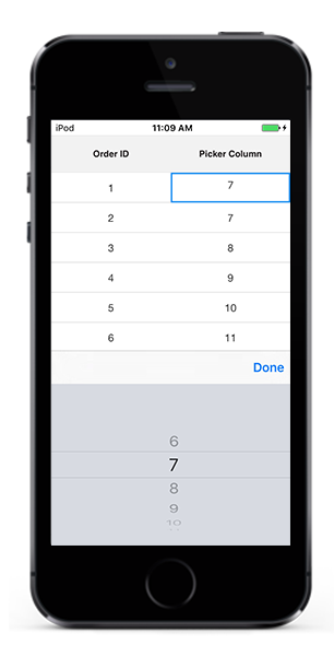
Upon entering the edit mode at RowColumnIndex(1,1), the Picker pop up opens with the picker items as 6,7,8,9,10…. again based on the DisplayMemberPath.
When edit mode is exited by selecting a value(9) from the Picker pop up, the GridCell at RowColumn index(0,1) displays the corresponding OrderID value for the selected EmployeeID value which is 4.
Loading Different ItemSource for each row of GridPickerColumn
You can load the different ItemsSource to each row of GridPickerColumn by setting GridPickerColumn.ItemsSourceSelector property.
Implementing IItemsSourceSelector
GridPickerColumn.ItemsSourceSelector needs to implement IItemsSourceSelector interface which requires you to implement GetItemsSource method which receives the below parameters,
- Record – data object associated with row.
- Data Context – Binding context of data grid.
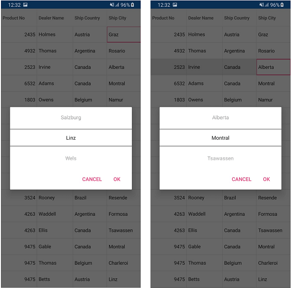
In the below code, ItemsSource for ShipCity column returned based on ShipCountry column value using the record and Binding context of data grid passed to GetItemsSource method.
<ContentPage.Resources>
    <ResourceDictionary>
        <local:ItemSourceSelector x:Key="converter"/>
    </ResourceDictionary>
</ContentPage.Resources>

<sfgrid:SfDataGrid x:Name="dataGrid"
					ItemsSource="{Binding DealerInformation}"
					AllowEditing="True"
					AutoGenerateColumns="false"
					NavigationMode="Cell"
					EditTapAction="OnDoubleTap"
					SelectionMode="Single">
    <sfgrid:SfDataGrid.Columns>
        <sfgrid:GridPickerColumn BindingContext="{x:Reference viewModel}"
									ItemsSource="{Binding CountryList}"
									MappingName="ShipCountry"
									LoadUIView="True">
        </sfgrid:GridPickerColumn>

        <sfgrid:GridPickerColumn ItemsSourceSelector="{StaticResource converter}"
									MappingName="ShipCity"
									LoadUIView="True">
        </sfgrid:GridPickerColumn>
    </sfgrid:SfDataGrid.Columns>
</sfgrid:SfDataGrid>
public class ItemSourceSelector : IItemsSourceSelector
{
public IEnumerable GetItemsSource(object record, object dataContext)
{
if (record == null)
{
return null;
}
var orderinfo = record as DealerInfo;
var countryName = orderinfo.ShipCountry;
var viewModel = dataContext as EditingViewModel;
// Returns ShipCity collection based on ShipCountry.
if (viewModel.ShipCities.ContainsKey(countryName))
{
string[] shipcities = null;
viewModel.ShipCities.TryGetValue(countryName, out shipcities);
return shipcities.ToList();
}
return null;
}
}
GridComboBoxColumn
The GridComboBoxColumn inherits all the properties of the SfDataGrid.GridColumn. It displays a list of items in the form of a SfComboBox as the content of a column. To enable or disable editing for the particular column, set the GridColumn.AllowEditing property to true or false. In the editing mode it displays a SfComboBox element. The data source to SfComboBox can be set by using the GridColumn.AllowEditing property to true or false. In the editing mode it displays a SfComboBox element. The data source to SfComboBox can be set by using the GridComboBoxColumn.ItemsSource property. The combobox column can be populated with data by the following ways:
- Collection of primitive types
- Collection of user-defined types (Custom objects)
Collection of primitive types
To display the collection of items in the comboBox drop down, create a GridComboBoxColumn and set its GridComboBoxColumn.ItemsSource property to a simple collection.
To load the GridComboBoxColumn with a simple string collection, follow the code example:
<ContentPage.BindingContext>
    <local:ViewModel x:Name="viewModel"/>
</ContentPage.BindingContext>

<sfGrid:SfDataGrid x:Name="dataGrid"
                   ItemsSource="{Binding OrdersInfo}">
    <sfGrid:SfDataGrid.Columns>
        <sfgrid:GridComboBoxColumn BindingContext="{x:Reference viewModel}"
                                 HeaderText="Dealer Name"
                                 ItemsSource="{Binding CustomerNames}"
                                 MappingName="DealerName"/>
    </sfGrid:SfDataGrid.Columns>
</sfGrid:SfDataGrid>
dataGrid = new SfDataGrid();
GridComboBoxColumn comboBoxColumn = new GridComboBoxColumn()
{
BindingContext = viewModel,
MappingName = "DealerName",
ItemsSource = viewModel.CustomerNames,
HeaderText = "Dealer Name"
};
dataGrid.Columns.Add(comboBoxColumn);// ViewModel class
public class ViewModel
{
public ObservableCollection<string> CustomerNames { get; set; }
public ViewModel()
{
this.CustomerNames = Customers.ToObservableCollection();
}
internal string[] Customers = new string[] {"Adams","Crowley","Ellis","Gable","Irvine","Keefe","Mendoza","Owens","Rooney","Wadded",};
}Collection of user-defined types
To display a list of user-defined items in the combo-box drop down, create a GridComboBoxColumn and set its GridComboBoxColumn.ItemsSource property to a user-defined collection. Initially, the combo-box column will be displayed with the values from the GridColumn.MappingName property of the column if the DisplayMemberPath and ValueMemberPath are not set.
For more details about the DisplayMemberPath and ValueMemberPath, Please refer here.
Customizing GridComboBoxColumn
Editable element of the GridComboBoxColumn can be Customizing by using the custom GridCellComboBoxRenderer.
Replace the default renderer with custom renderer in the SfDataGrid.CellRenderers collection.
this.dataGrid.CellRenderers.Remove("ComboBox");
this.dataGrid.CellRenderers.Add("ComboBox", new CustomComboBoxRenderer());

public class CustomComboBoxRenderer : GridCellComboBoxRenderer
{
    public override void OnInitializeEditView(DataColumnBase dataColumn, GridComboBox view)
    {
        base.OnInitializeEditView(dataColumn, view);
        view.DropDownBackgroundColor = Color.LightBlue;
        view.DropDownBorderColor = Color.Blue;
        view.TextColor = Color.Brown;
    }
}
Customizing drop down width
To customize the drop down width of ComboBox editor of GridComboBoxColumn, set GridComboBoxColumn.DropDownWidth property to a desired value.
<sfgrid:SfDataGrid x:Name="dataGrid"
                   ItemsSource="{Binding OrdersInfo}">
    <sfgrid:SfDataGrid.Columns>
        <sfgrid:GridComboBoxColumn BindingContext="{x:Reference viewmodel}"
                                   MappingName="OrderID"
                                   DisplayMemberPath="EmployeeID"
                                   ValueMemberPath="OrderID"
                                   ItemsSource="{Binding comboBoxInfo}"
                                   CanFilterSuggestions="True"
                                   DropDownWidth="100" />
    </sfgrid:SfDataGrid.Columns>
</sfgrid:SfDataGrid>
GridComboBoxColumn comboBoxColumn = new GridComboBoxColumn()
{
MappingName = "OrderID",
DisplayMemberPath = "EmployeeID",
ValueMemberPath = "OrderID",
ItemsSource = viewmodel.comboBoxInfo,
CanFilterSuggestions = true,
DropDownWidth = 100,
};
dataGrid.Columns.Add(comboBoxColumn);Loading Different ItemSource for each row of GridComboBoxColumn
You can load the different ItemsSource to each row of GridComboBoxColumn by setting GridComboBoxColumn.ItemsSourceSelector property.
Implementing IItemsSourceSelector
GridComboBoxColumn.ItemsSourceSelector needs to implement IItemsSourceSelector interface which requires you to implement GetItemsSource method which receives the below parameters,
- Record – data object associated with row.
- Data Context – Binding context of data grid.
In the below code, ItemsSource for ShipCity column returned based on ShipCountry column value using the record and Binding context of data grid passed to GetItemsSource method.
<ContentPage.Resources>
    <ResourceDictionary>
        <local:ItemSourceSelector x:Key="converter"/>
    </ResourceDictionary>
</ContentPage.Resources>

<sfgrid:SfDataGrid x:Name="dataGrid"
					ItemsSource="{Binding DealerInformation}"
					AllowEditing="True"
					AutoGenerateColumns="false"
					NavigationMode="Cell"
					EditTapAction="OnDoubleTap"
					SelectionMode="Single">
    <sfgrid:SfDataGrid.Columns>
        <sfgrid:GridComboBoxColumn BindingContext="{x:Reference viewModel}"
									ItemsSource="{Binding CountryList}"
									MappingName="ShipCountry"
									LoadUIView="True">
        </sfgrid:GridComboBoxColumn>

        <sfgrid:GridComboBoxColumn ItemsSourceSelector="{StaticResource converter}"
									MappingName="ShipCity"
									LoadUIView="True">
        </sfgrid:GridComboBoxColumn>
    </sfgrid:SfDataGrid.Columns>
</sfgrid:SfDataGrid>
public class ItemSourceSelector : IItemsSourceSelector
{
public IEnumerable GetItemsSource(object record, object dataContext)
{
if (record == null)
{
return null;
}
var orderinfo = record as DealerInfo;
var countryName = orderinfo.ShipCountry;
var viewModel = dataContext as EditingViewModel;
// Returns ShipCity collection based on ShipCountry.
if (viewModel.ShipCities.ContainsKey(countryName))
{
string[] shipcities = null;
viewModel.ShipCities.TryGetValue(countryName, out shipcities);
return shipcities.ToList();
}
return null;
}
}
Editing the combo box
The GridComboBoxColumn supports both editable and non-editable text box to choose selected items in given data source. Users can select one item from the suggestion list.
IsEditableMode property is used to enable the user input in GridComboBoxColumn. The default value is false.
<ContentPage.BindingContext>
    <local:ViewModel x:Name="viewModel"/>
</ContentPage.BindingContext>

<sfGrid:SfDataGrid x:Name="dataGrid"
                   ItemsSource="{Binding OrdersInfo}">
    <sfGrid:SfDataGrid.Columns>
        <sfgrid:GridComboBoxColumn BindingContext="{x:Reference viewModel}"
                                 HeaderText="Dealer Name"
                                 IsEditableMode="True"
                                 ItemsSource="{Binding CustomerNames}"
                                 MappingName="DealerName"/>
    </sfGrid:SfDataGrid.Columns>
</sfGrid:SfDataGrid>
dataGrid = new SfDataGrid();
GridComboBoxColumn comboBoxColumn = new GridComboBoxColumn()
{
BindingContext = viewModel,
MappingName = "DealerName",
ItemsSource = viewModel.CustomerNames,
IsEditableMode = True,
HeaderText = "Dealer Name"
};
dataGrid.Columns.Add(comboBoxColumn);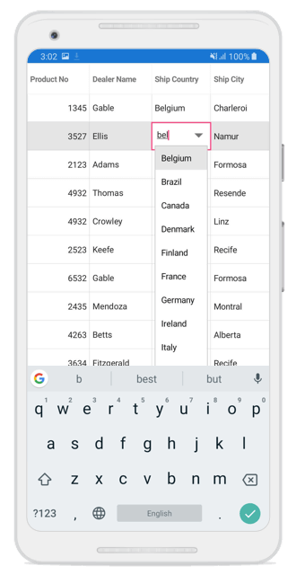
Auto completing on edit mode
The auto completion on the edit mode can be enabled by using the GridComboBoxColumn.AutoCompleteMode property. Default value is Suggest. Following types of auto complete modes are available,
- Append
- Suggest
- SuggestAppend
<ContentPage.BindingContext>
    <local:ViewModel x:Name="viewModel"/>
</ContentPage.BindingContext>

<sfGrid:SfDataGrid x:Name="dataGrid"
                   ItemsSource="{Binding OrdersInfo}">
    <sfGrid:SfDataGrid.Columns>
        <sfgrid:GridComboBoxColumn BindingContext="{x:Reference viewModel}"
                                 HeaderText="Dealer Name"
                                 IsEditableMode="True"
                                 AutoCompleteMode="Suggest"
                                 ItemsSource="{Binding CustomerNames}"
                                 MappingName="DealerName"/>
    </sfGrid:SfDataGrid.Columns>
</sfGrid:SfDataGrid>
dataGrid = new SfDataGrid();
GridComboBoxColumn comboBoxColumn = new GridComboBoxColumn()
{
BindingContext = viewModel,
MappingName = "DealerName",
ItemsSource = viewModel.CustomerNames,
IsEditableMode = True,
AutoCompleteMode = ComboBoxMode.Suggest,
HeaderText = "Dealer Name"
};
dataGrid.Columns.Add(comboBoxColumn);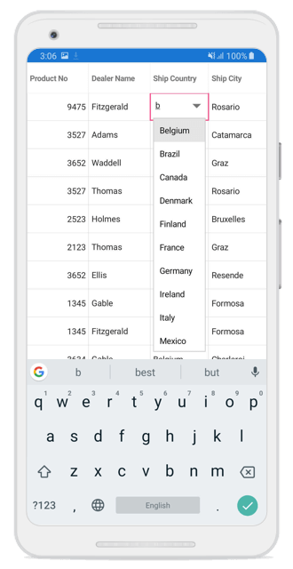
Auto suggesting on edit mode
By default, auto suggestion in the dropdown will display the value based on the StartsWith filter condition. This can be changed to retrieve the matches with the Contains condition by using the SuggestionMode property.
<ContentPage.BindingContext>
    <local:ViewModel x:Name="viewModel"/>
</ContentPage.BindingContext>

<sfGrid:SfDataGrid x:Name="dataGrid"
                   ItemsSource="{Binding OrdersInfo}">
    <sfGrid:SfDataGrid.Columns>
        <sfgrid:GridComboBoxColumn BindingContext="{x:Reference viewModel}"
                                 HeaderText="Dealer Name"
                                 IsEditableMode="True"
                                 CanFilterSuggestions="True"
                                 AutoCompleteMode="Suggest"
                                 SuggestionMode="Contains"
                                 ItemsSource="{Binding CustomerNames}"
                                 MappingName="DealerName"/>
    </sfGrid:SfDataGrid.Columns>
</sfGrid:SfDataGrid>
dataGrid = new SfDataGrid();
GridComboBoxColumn comboBoxColumn = new GridComboBoxColumn()
{
BindingContext = viewModel,
MappingName = "DealerName",
ItemsSource = viewModel.CustomerNames,
IsEditableMode = True,
CanFilterSuggestions = true;
AutoCompleteMode = ComboBoxMode.Suggest,
SuggestionMode = SuggestionMode.Contains,
HeaderText = "Dealer Name"
};
dataGrid.Columns.Add(comboBoxColumn);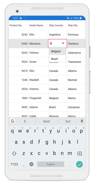
GridNumericColumn
The GridNumericColumn inherits all the properties of GridColumn. It is used to display numeric data. To create GridNumericColumn, the property corresponding to the column in the underlying collection must be a numeric type(int, double, float, etc.). To enable or disable editing a particular column, set the GridColumn.AllowEditing property to true or false. In the editing mode it displays the SfNumericTextBox element from the View. To create a GridNumericColumn, follow the code example:
<ContentPage.BindingContext>
    <local:ViewModel  x:Name ="viewModel"/>
</ContentPage.BindingContext>

<sfGrid:SfDataGrid x:Name="dataGrid"
                   ItemsSource="{Binding OrdersInfo}">
    <sfGrid:SfDataGrid.Columns>
        <sfgrid:GridNumericColumn NumberDecimalDigits="0"
                                  HeaderText="Product No"
                                  MappingName="ProductNo"/>
    </sfGrid:SfDataGrid.Columns>
</sfGrid:SfDataGrid>
dataGrid = new SfDataGrid();
GridNumericColumn numericColumn = new GridNumericColumn()
{
MappingName = "ProductNo",
HeaderText = "Product No",
NumberDecimalDigits =0
};
dataGrid.Columns.Add(numericColumn);Number formatting
TheGridNumericColumn allows formatting the numeric data with culture-specific information.
-
NumberDecimalDigits: To change the number of decimal digits to be displayed after the decimal point, use the
GridNumericColumn.NumberDecimalDigitsproperty. -
NumberDecimalSeparator: By default, the dot(.) operator separates the decimal part of numeric value. Any operator can be used as decimal separator using the
GridNumericColumn.NumberDecimalSeparatorproperty. -
NumberGroupSeparator: By default, the comma(,) separates group of digits before the decimal point. Any operator can be used as group separator using the
GridNumericColumn.NumberGroupSeparatorproperty. -
NumberGroupSizes: To change the number of digits in each group before the decimal point on numeric values, use the
GridNumericColumn.NumberGroupSizesproperty. -
NumberNegativePattern: To format the pattern of negative numeric values, use
GridNumericColumn.NumberNegativePattern. -
MinValue: To set the minimum value for the numeric column, use the
GridNumericColumn.MinValueproperty. -
MaxValue: To set the maximum value for the numeric column, use the
GridNumericColumn.MaxValueproperty.
Row header
Row header is a special column placed as first cell of each row, and it will be always frozen. To enable the row header, set the SfDataGrid.ShowRowHeader to true.
Further, the SfDataGrid allows customizing the row header width using the SfDataGrid.RowHeaderWidthProperty. The default value of SfDataGrid.RowHeaderWidth is 20.
To enable and customize the row header, follow the code example:
<sfgrid:SfDataGrid x:Name="dataGrid"
                   ColumnSizer="Star"
                   ShowRowHeader="True"
                   RowHeaderWidth="50"
                   ItemsSource="{Binding OrdersInfo}">
</sfgrid:SfDataGrid>dataGrid.ShowRowHeader = true;
dataGrid.RowHeaderWidth = 50;Bind a view model property inside header template?
The SfDataGrid allows binding the view model property to the HeaderTemplate by setting the BindingContext of the the GridColumn as ViewModel.
To bind a view model property inside HeaderTemplate, follow the code example:
<sfgrid:SfDataGrid x:Name="dataGrid"
                    ItemsSource="{Binding OrdersInfo}"
                    AutoGenerateColumns="False"
                    ColumnSizer="Star"
                    SelectionMode="Single">
      <sfgrid:SfDataGrid.Columns>
        <sfgrid:GridTextColumn MappingName="OrderID">
           <sfgrid:GridColumn.HeaderTemplate>
              <DataTemplate>
               <Label BindingContext="{StaticResource viewModel}"
                            VerticalTextAlignment ="Center"
                            HorizontalTextAlignment="Center"
                      Text="{Binding HeaderText}" TextColor="Blue" IsVisible="{Binding _Visibility}"/>
              </DataTemplate>
            </sfgrid:GridColumn.HeaderTemplate>
        </sfgrid:GridTextColumn>
        <sfgrid:GridTextColumn MappingName="EmployeeID"/>
        <sfgrid:GridTextColumn MappingName="FirstName"/>
        <sfgrid:GridTextColumn MappingName="ShipCity"/>
      </sfgrid:SfDataGrid.Columns>
 </sfgrid:SfDataGrid>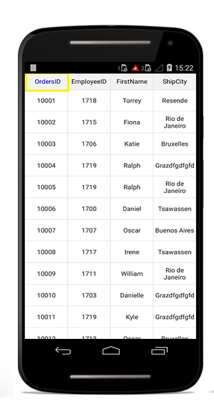
See also
How to enable the MultiSelection in GridComboBoxColumn of DataGrid (SfDataGrid)
How to bind a column collection from view model in SfDataGrid Xamarin.Forms
How to create a custom GridColumn
How to bind button command to ViewModel from TemplateColumn of DataGrid
How to get the row index of a row in SfDataGrid when using GridTemplateColumn
How to display the DatePicker and TimePicker combined in a GridColumn in SfDataGrid
How to set the different color for each column header in SfDataGrid
How to customize the header text of a grid column with different colors