How can I help you?
Layout Customizations in Xamarin.iOS SfPopupLayout
25 Feb 202218 minutes to read
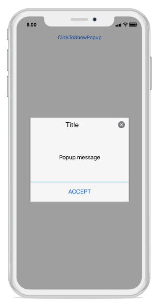
The SfPopupLayout supports two types of SfPopupLayout.PopupView.AppearanceMode. By default, the AppearanceMode.OneButton is set. You can change the appearance of the SfPopupLayout by using the SfPopupLayout.PopupView.AppearanceMode property.
Two different appearance modes in the SfPopupLayout are as follows.
| Modes | Description |
|---|---|
| Shows the SfPopupLayout with one button in the footer view. This is the default value. | |
| Shows the SfPopupLayout with two buttons in the footer view. |
Pop-up with one button in the footer
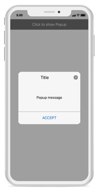
In the following code example, the SfPopupLayout.PopupView.AppearanceMode property is set as OneButton which displays only the Accept button in the footer view.
using Syncfusion.iOS.PopupLayout;

namespace GettingStarted
{
    public class MyViewController:UIViewController
    {
        SfPopupLayout popupLayout;
        CustomView customView;
        UIButton showPopupButton;

        public MyViewController()
        {
            popupLayout = new SfPopupLayout();
            popupLayout.Content = GetContentOfPopup();

            //Setting the AppearanceMode as OneButton
            popupLayout.PopupView.AppearanceMode = AppearanceMode.OneButton;

            this.View.AddSubview(popupLayout);
        }
        private UIView GetContentOfPopup()
        {
            customView = new CustomView();
            customView.BackgroundColor = UIColor.White;

            showPopupButton = new UIButton();
            showPopupButton.SetTitle("Click to show Popup", UIControlState.Normal);
            showPopupButton.SetTitleColor(UIColor.White, UIControlState.Normal);
            showPopupButton.BackgroundColor = UIColor.Gray;
            showPopupButton.TouchDown += ShowPopupButton_TouchDown;

            customView.AddSubview(showPopupButton);
            return customView;
        }
        private void ShowPopupButton_TouchDown(object sender, EventArgs e)
        {
            popupLayout.Show();
        }
        public override void ViewDidLayoutSubviews()
        {
            base.ViewDidLayoutSubviews();
            popupLayout.Frame = new CGRect(0, 20, this.View.Frame.Width, this.View.Frame.Height - 20);
        }
    }
}
Executing the above codes renders the following output in an iOS device.
Pop-up with two buttons in the footer
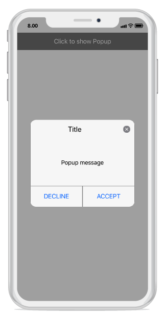
In the following code example, the SfPopupLayout.PopupView.AppearanceMode property is set as TwoButton which displays both Accept button and Decline button in the footer view.
using Syncfusion.iOS.PopupLayout;

namespace GettingStarted
{
    public class MyViewController:UIViewController
    {
        SfPopupLayout popupLayout;
        CustomView customView;
        UIButton showPopupButton;

        public MyViewController()
        {
            popupLayout = new SfPopupLayout();
            popupLayout.Content = GetContentOfPopup();

            //Setting the AppearanceMode as TwoButton
            popupLayout.PopupView.AppearanceMode = AppearanceMode.TwoButton;

            this.View.AddSubview(popupLayout);
        }
        private UIView GetContentOfPopup()
        {
            customView = new CustomView();
            customView.BackgroundColor = UIColor.White;

            showPopupButton = new UIButton();
            showPopupButton.SetTitle("Click to show Popup", UIControlState.Normal);
            showPopupButton.SetTitleColor(UIColor.White, UIControlState.Normal);
            showPopupButton.BackgroundColor = UIColor.Gray;
            showPopupButton.TouchDown += ShowPopupButton_TouchDown;

            customView.AddSubview(showPopupButton);
            return customView;
        }
        private void ShowPopupButton_TouchDown(object sender, EventArgs e)
        {
            popupLayout.Show();
        }
        public override void ViewDidLayoutSubviews()
        {
            base.ViewDidLayoutSubviews();
            popupLayout.Frame = new CGRect(0, 20, this.View.Frame.Width, this.View.Frame.Height - 20);
        }
    }
}
Executing the above codes renders the following output in an iOS device.
Customizing pop-up layouts
You can customize the entire view of the pop-up by loading the templates or custom views for the header, body, and footer.
Header customization
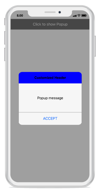
Any view can be added as the header content using the SfPopupLayout.PopupView.HeaderView property to refresh it. Refer to the following code example in which a UILabel is added as a header content.
using Syncfusion.iOS.PopupLayout;

namespace GettingStarted
{
    public class MyViewController:UIViewController
    {
        SfPopupLayout popupLayout;
        CustomView customView;
        UIButton showPopupButton;
        UILabel headerContent;

        public MyViewController()
        {
            popupLayout = new SfPopupLayout();
            popupLayout.Content = GetContentOfPopup();

            headerContent = new UILabel();
            headerContent.Text = "Customized Header";
            headerContent.TextAlignment = UITextAlignment.Center;
            headerContent.BackgroundColor = UIColor.Blue;
            headerContent.Font = UIFont.FromName("Helvetica-Bold", 16);

            // Adding Header view of the SfPopupLayout
            popupLayout.PopupView.HeaderView = headerContent;
            popupLayout.PopupView.ShowCloseButton = false;
            this.View.AddSubview(popupLayout);
        }
        private UIView GetContentOfPopup()
        {
            customView = new CustomView();
            customView.BackgroundColor = UIColor.White;

            showPopupButton = new UIButton();
            showPopupButton.SetTitle("Click to show Popup", UIControlState.Normal);
            showPopupButton.SetTitleColor(UIColor.White, UIControlState.Normal);
            showPopupButton.BackgroundColor = UIColor.Gray;
            showPopupButton.TouchDown += ShowPopupButton_TouchDown;

            customView.AddSubview(showPopupButton);
            return customView;
        }
        private void ShowPopupButton_TouchDown(object sender, EventArgs e)
        {
            popupLayout.Show();
        }
        public override void ViewDidLayoutSubviews()
        {
            base.ViewDidLayoutSubviews();
            popupLayout.Frame = new CGRect(0, 20, this.View.Frame.Width, this.View.Frame.Height - 20);
        }
    }
}
Executing the above codes renders the following output in an iOS device.
Footer customization
Any view can be added as the footer content using the SfPopupLayout.PopupView.FooterView property to refresh it. Refer to the following code example in which a UILabel is added as a footer content.
using Syncfusion.iOS.PopupLayout;

namespace GettingStarted
{
    public class MyViewController:UIViewController
    {
        SfPopupLayout popupLayout;
        CustomView customView;
        UIButton showPopupButton;
        UILabel footerContent;

        public MyViewController()
        {
            popupLayout = new SfPopupLayout();
            popupLayout.Content = GetContentOfPopup();

            footerContent = new UILabel();
            footerContent.Text = "Customized Footer";
            footerContent.TextAlignment = UITextAlignment.Center;
            footerContent.BackgroundColor = UIColor.Blue;
            footerContent.Font = UIFont.FromName("Helvetica-Bold", 16);

            // Adding Footer view of the SfPopupLayout
            popupLayout.PopupView.FooterView = footerContent;

            this.View.AddSubview(popupLayout);
        }
        private UIView GetContentOfPopup()
        {
            customView = new CustomView();
            customView.BackgroundColor = UIColor.White;

            showPopupButton = new UIButton();
            showPopupButton.SetTitle("Click to show Popup", UIControlState.Normal);
            showPopupButton.SetTitleColor(UIColor.White, UIControlState.Normal);
            showPopupButton.BackgroundColor = UIColor.Gray;
            showPopupButton.TouchDown += ShowPopupButton_TouchDown;

            customView.AddSubview(showPopupButton);
            return customView;
        }
        private void ShowPopupButton_TouchDown(object sender, EventArgs e)
        {
            popupLayout.Show();
        }
        public override void ViewDidLayoutSubviews()
        {
            base.ViewDidLayoutSubviews();
            popupLayout.Frame = new CGRect(0, 20, this.View.Frame.Width, this.View.Frame.Height - 20);
        }
    }
}
Executing the above codes renders the following output in an iOS device.

Styles
The SfPopupLayout applies style to all of its elements by using the SfPopupLayout.PopupView.PopupStyle property.
Customizing header elements
The SfPopupLayout allows customizing the header elements with various available header customizations.
| Property | Description |
|---|---|
| Gets or sets the background color for the header. | |
| Gets or sets the font style for the header title. | |
| Gets or sets the font size for the header title. | |
| Gets or sets the text alignment for the header. | |
| Gets or sets the text color for the header title. |
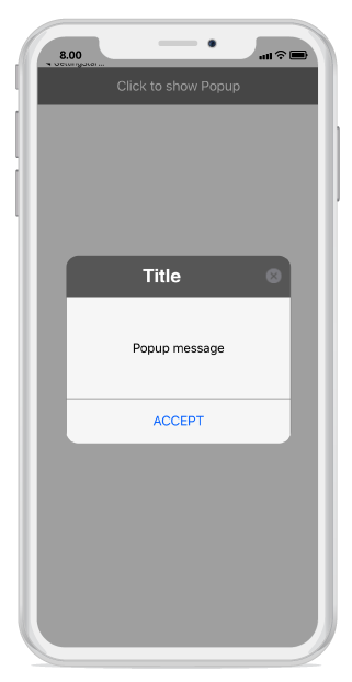
Refer to the following code example for customizing the header elements.
//MyViewController.cs

public MyViewController()
{
    ....
    popupLayout = new SfPopupLayout();
    popupLayout.Content = GetContentOfPopup();
    popupLayout.PopupView.PopupStyle.HeaderBackgroundColor = UIColor.FromRGB(105, 105, 105);
    popupLayout.PopupView.PopupStyle.HeaderFont = "Helvetica-Bold";
    popupLayout.PopupView.PopupStyle.HeaderFontSize = 25;
    popupLayout.PopupView.PopupStyle.HeaderTextAlignment = UITextAlignment.Center;
    popupLayout.PopupView.PopupStyle.HeaderTextColor = UIColor.White;
    this.View.AddSubview(popupLayout);
    ....
}
Executing the above codes renders the following output in an iOS device.
Customizing footer elements
The SfPopupLayout allows customizing the footer elements with various available footer customizations.
| Property | Description |
|---|---|
| Gets or sets the background color for the footer. | |
| SfPopupLayout.PopupView.PopupStyle.AcceptButtonBackgroundColor |
Gets or sets the background color for the Accept button in the footer. |
| Gets or sets the foreground color for the Accept button in the footer. | |
| SfPopupLayout.PopupView.PopupStyle.DeclineButtonBackgroundColor |
Gets or sets the background color for the Decline button in the footer. |
| Gets or sets the foreground color for the Decline button in the footer. |
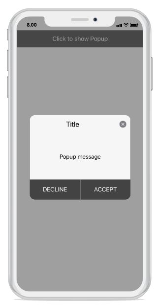
Refer to the following code example for customizing the header elements.
//MyViewController.cs

public MyViewController()
{
    ....
    popupLayout = new SfPopupLayout();
    popupLayout.Content = GetContentOfPopup();
    popupLayout.PopupView.PopupStyle.FooterBackgroundColor = UIColor.LightGray;
    popupLayout.PopupView.PopupStyle.AcceptButtonBackgroundColor = UIColor.FromRGB(105, 105, 105);
    popupLayout.PopupView.PopupStyle.AcceptButtonTextColor = UIColor.White;
    popupLayout.PopupView.PopupStyle.DeclineButtonBackgroundColor = UIColor.FromRGB(105, 105, 105);
    popupLayout.PopupView.PopupStyle.DeclineButtonTextColor = UIColor.White;
    this.View.AddSubview(popupLayout);
    ....
}
Executing the above codes renders the following output in an iOS device.
Border customization
The SfPopupLayout allows customizing the border appearance with various available border customizations.
| Property | Description |
|---|---|
| Gets or sets the border color for the PopupView. | |
| Gets or sets the border thickness for the PopupView. | |
| Gets or sets the corner radius for the PopupView. |
Refer to the following code example for customizing the border elements.
//MyViewController.cs

public MyViewController()
{
    ....
    popupLayout = new SfPopupLayout();
    popupLayout.Content = GetContentOfPopup();
    popupLayout.PopupView.PopupStyle.BorderColor = UIColor.Blue;
    popupLayout.PopupView.PopupStyle.BorderThickness = 3;
    popupLayout.PopupView.PopupStyle.CornerRadius = 5;
    this.View.AddSubview(popupLayout);
    ....
}
Executing the above codes renders the following output in an iOS device.
