How can I help you?
Visual Customization
17 Jan 20254 minutes to read
Customizing shape
The check box shape can be customized using the CornerRadius property. This property specifies uniform radius value for every corner of the check box.
SfCheckBox checkBox = new SfCheckBox(this);
checkBox.Text = "CheckBox";
checkBox.Checked = true;
checkBox.CornerRadius = 5.0f;
Customizing state color
The default state colors can be customized using the ButtonTintList property. The checked/unchecked/indeterminate state color is updated with ColorStateList to the ButtonTintList.
int[][] states ={new int[]{ Android.Resource.Attribute.StateChecked },
                new int[]{Syncfusion.Buttons.Android.Resource.Attribute.state_indeterminate},
		new int[]{-Android.Resource.Attribute.StateChecked }};
int[] colors = { Color.Green,  Color.Purple, Color.Violet};

SfCheckBox check = new SfCheckBox(this);
check.Text = "CheckBox";
check.Checked = true;
check.ButtonTintList = new ColorStateList(states, colors);
SfCheckBox uncheck = new SfCheckBox(this);
uncheck.Text = "CheckBox";
uncheck.ButtonTintList = new ColorStateList(states, colors);
SfCheckBox indeterminate = new SfCheckBox(this);
indeterminate.Checked = null;
indeterminate.IsThreeState = true;
indeterminate.Text = "CheckBox";
indeterminate.ButtonTintList = new ColorStateList(states, colors);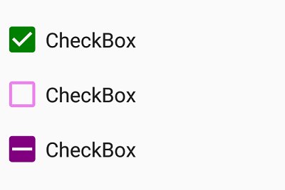
BorderWidth
The border thickness of the tick box in the checkbox can be customized with the BorderWidth property.
//unchecked state and its color
int[][] states = { new int[] { -Android.Resource.Attribute.StateChecked } };
int[] colors = { Color.Blue};

SfCheckBox normalSizedCheckBox = new SfCheckBox(this)
{
Text = "Hello",
BorderWidth = 2,
TextSize = 20,
ButtonTintList = new Android.Content.Res.ColorStateList(states,colors)
};

SfCheckBox mediumSizedCheckBox = new SfCheckBox(this)
{
Text = "Hello",
BorderWidth = 4,
TextSize = 25,
ButtonTintList = new Android.Content.Res.ColorStateList(states, colors)
};

SfCheckBox maximumSizedCheckBox = new SfCheckBox(this)
{
Text = "Hello",
BorderWidth = 6,
TextSize = 30,
ButtonTintList = new Android.Content.Res.ColorStateList(states, colors)
};
Setting caption text appearance
You can customize the display text appearance of the SfCheckBox control using the following properties:
-
SetTextColor: Changes the color of the text. -
TextAlignment: Changes the horizontal alignment of the caption text. -
Typeface: Changes the font family of the text and sets font attributes(bold/italic/none) of the caption text. -
TextSize: Sets font size of the caption text.
SfCheckBox caption = new SfCheckBox(this);
caption.Checked = true;
caption.Text = "CheckBox";
caption.SetTextColor(Color.Violet);
caption.TextAlignment = TextAlignment.Center;
caption.Typeface = Typeface.Create("Arial", TypefaceStyle.Bold);
caption.TextSize = 20;