Getting Started with WPF Wizard Control
18 Nov 20184 minutes to read
This section explains how to get started with the WizardControl.
Highlighting features
The following are some of the key features of Wizard Control:
- Wizard Control uses WizardPage objects to organize content into multiple pages.
- Built-in navigation buttons such as Back, Next, Finish, Cancel, and Help enable navigation between wizard pages.
- Supports customization of the appearance of both Wizard Control and WizardPage.
Assembly deployment
Refer to the Control Dependencies section for the list of assemblies and NuGet packages required to use the Wizard Control in a WPF application.
NuGet package: Syncfusion.Tools.Wpf
For more information about installing NuGet packages in a WPF application, refer to the following article:
How to install nuget packages
Creating Application with Wizard Control
In this walkthrough, you will create a WPF application that uses the Wizard Control.
- Creating project
- Adding control via designer
- Adding control manually in XAML
- Adding control manually in C#
- Adding multiple pages
Creating project
Follow these steps to create a WPF project in Visual Studio and add the Wizard Control to it.
Adding control via designer
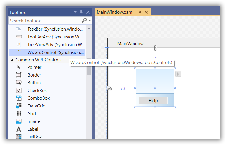
The WizardControl can be added to the application by dragging it from the Toolbox and dropping it onto the designer surface. The required assembly references are added automatically.
Adding control manually in XAML
To add the WizardControl manually in XAML, follow these steps:
-
Add the required assembly references to the project:
- Syncfusion.Shared.WPF
- Syncfusion.Tools.WPF
-
Import the Syncfusion WPF schema http://schemas.syncfusion.com/wpf in the XAML page.
-
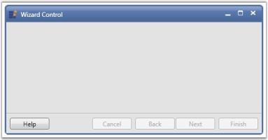
Add the WizardControl to the XAML page.
<Window
        xmlns="http://schemas.microsoft.com/winfx/2006/xaml/presentation"
        xmlns:x="http://schemas.microsoft.com/winfx/2006/xaml"
        xmlns:d="http://schemas.microsoft.com/expression/blend/2008"
        xmlns:mc="http://schemas.openxmlformats.org/markup-compatibility/2006"
        xmlns:local="clr-namespace:WizardControl"
        xmlns:syncfusion="http://schemas.syncfusion.com/wpf" x:Class="WizardControl.MainWindow"
        mc:Ignorable="d"
        Title="MainWindow" Height="450" Width="800">
    <Grid>
        <syncfusion:WizardControl Name="wizardControl"/>
    </Grid>
</Window>
Adding control manually in C#
To add the WizardControl manually in C#, follow these steps:
-
Add the required assembly references to the project:
- Syncfusion.Shared.WPF
- Syncfusion.Tools.WPF
-
Import the Syncfusion.Windows.Tools.Controls namespace.
-
Create an instance of
WizardControland add it to the window.using System.Windows; using System.Windows.Controls; using Syncfusion.Windows.Tools.Controls; namespace WizardControl { /// <summary> /// Interaction logic for MainWindow.xaml /// </summary> public partial class MainWindow : Window { public MainWindow() { InitializeComponent(); WizardControl wizardControl = new WizardControl(); this.Content = wizardControl; } } }
Adding multiple pages
You can add multiple pages to the WizardControl by using WizardPage objects. The Back, Next, Finish, and Cancel buttons are enabled or disabled automatically based on the currently displayed page.
<syncfusion:WizardControl Name="wizardControl">
    <syncfusion:WizardPage Name="wizardPage1"/>
    <syncfusion:WizardPage Name="wizardPage2"/>
    <syncfusion:WizardPage Name="wizardPage3"/>
</syncfusion:WizardControl>
WizardControl wizardControl = new WizardControl();
WizardPage wizardPage1 = new WizardPage();
WizardPage wizardPage2 = new WizardPage();
WizardPage wizardPage3 = new WizardPage();
wizardControl.Items.Add(wizardPage1);
wizardControl.Items.Add(wizardPage2);
wizardControl.Items.Add(wizardPage3);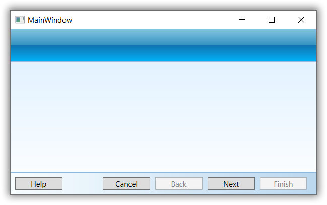
Theme
Wizard Control supports a variety of built-in themes. Refer to the following articles to learn how to apply themes to the Wizard Control: