How can I help you?
Appearance in WPF Tile View
18 Feb 20258 minutes to read
This section explains different styling, theming options available in TileViewControl control.
Setting the foreground
You can change the foreground color of the each TileViewItem separately by using the TileViewItem.Foreground property. The default value of TileViewItem.Foreground property is Black.
<syncfusion:TileViewControl Name="tileViewControl">
    <syncfusion:TileViewItem Foreground="Red" Header="Item1" Content="Content1"/>
    <syncfusion:TileViewItem Foreground="Blue" Header="Item2" Content="Content2"/>
    <syncfusion:TileViewItem Foreground="Green" Header="Item3" Content="Content3"/>
    <syncfusion:TileViewItem Foreground="Yellow" Header="Item4" Content="Content4"/>
</syncfusion:TileViewControl>
TileViewControl tileViewControl = new TileViewControl();
tileViewControl.Items.Add(new TileViewItem() { Header = "Item 1",
Content = "Content1", Foreground = Brushes.Red });
tileViewControl.Items.Add(new TileViewItem() { Header = "Item 2",
Content = "Content2", Foreground = Brushes.Blue});
tileViewControl.Items.Add(new TileViewItem() { Header = "Item 3",
Content = "Content3",Foreground = Brushes.Green });
tileViewControl.Items.Add(new TileViewItem() { Header = "Item 4",
Content = "Content4", Foreground = Brushes.Yellow });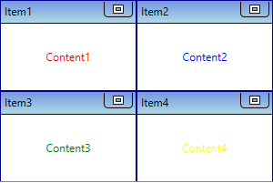
NOTE
Setting the background
You can change the background color of the each TileViewItem separately by using the TileViewItem.Background property. The default value of TileViewItem.Background property is White.
<syncfusion:TileViewControl Name="tileViewControl">
    <syncfusion:TileViewItem Background="Red" Header="Item1" Content="Content1"/>
    <syncfusion:TileViewItem Background="Blue" Header="Item2" Content="Content2"/>
    <syncfusion:TileViewItem Background="Green" Header="Item3" Content="Content3"/>
    <syncfusion:TileViewItem Background="Yellow" Header="Item4" Content="Content4"/>
</syncfusion:TileViewControl>
TileViewControl tileViewControl = new TileViewControl();
tileViewControl.Items.Add(new TileViewItem() { Header = "Item 1",
Content = "Content1", Background = Brushes.Red });
tileViewControl.Items.Add(new TileViewItem() { Header = "Item 2",
Content = "Content2", Background = Brushes.Blue});
tileViewControl.Items.Add(new TileViewItem() { Header = "Item 3",
Content = "Content3",Background = Brushes.Green });
tileViewControl.Items.Add(new TileViewItem() { Header = "Item 4",
Content = "Content4", Background = Brushes.Yellow });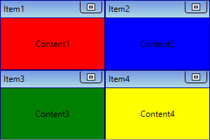
NOTE
Setting the border
You can change the border color of the each TileViewItem separately by using the TileViewItem.BorderBrush property. You can also change the border thickness by using the TileViewItem.BorderThickness property. The default value of TileViewItem.BorderBrush property is Dark Blue and TileViewItem.BorderThickness property is 1.
<syncfusion:TileViewControl Name="tileViewControl">
    <syncfusion:TileViewItem BorderThickness="3" BorderBrush="Red"
                             Header="Item1" Content="Content1"/>
    <syncfusion:TileViewItem BorderThickness="3" BorderBrush="Blue"
                             Header="Item2" Content="Content2"/>
    <syncfusion:TileViewItem BorderThickness="3" BorderBrush="Green"
                             Header="Item3" Content="Content3"/>
    <syncfusion:TileViewItem BorderThickness="3" BorderBrush="Yellow"
                             Header="Item4" Content="Content4"/>
</syncfusion:TileViewControl>
TileViewControl tileViewControl = new TileViewControl();
tileViewControl.Items.Add(new TileViewItem() { Header = "Item 1",Content = "Content1",
BorderBrush = Brushes.Red, BorderThickness= new Thickness(3)});
tileViewControl.Items.Add(new TileViewItem() { Header = "Item 2", Content = "Content2",
BorderBrush = Brushes.Blue, BorderThickness= new Thickness(3)});
tileViewControl.Items.Add(new TileViewItem() { Header = "Item 3", Content = "Content3",
BorderBrush = Brushes.Green, BorderThickness= new Thickness(3)});
tileViewControl.Items.Add(new TileViewItem() { Header = "Item 4", Content = "Content4",
BorderBrush = Brushes.Yellow, BorderThickness= new Thickness(3)});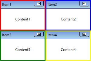
NOTE
Change flow direction
You can change the flow direction of the TileViewControl layout from right to left by setting the TileViewControl.FlowDirection property value as RightToLeft. The default value of TileViewControl.FlowDirection property is LeftToRight.
<syncfusion:TileViewControl FlowDirection="RightToLeft"
                            Name="tileViewControl" >
     <syncfusion:TileViewItem Header="Item1" Content="Content1"/>
     <syncfusion:TileViewItem Header="Item2" Content="Content2"/>
     <syncfusion:TileViewItem Header="Item3" Content="Content3"/>
     <syncfusion:TileViewItem Header="Item4" Content="Content4"/>
</syncfusion:TileViewControl>tileViewControl.FlowDirection = FlowDirection.RightToLeft;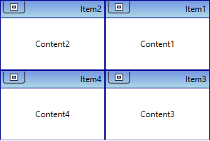
NOTE
Change flow direction for specific TileViewItem
You can change the flow direction of the specific TileViewItem layout from right to left by setting the TileViewItem.FlowDirection property value as RightToLeft. The default value of TileViewItem.FlowDirection property is LeftToRight.
<syncfusion:TileViewControl Name="tileViewControl" />
     <syncfusion:TileViewItem FlowDirection="RightToLeft" Header="Item1"
                              Content="Content1"/>
     <syncfusion:TileViewItem Header="Item2" Content="Content2"/>
     <syncfusion:TileViewItem Header="Item3" Content="Content3"/>
     <syncfusion:TileViewItem FlowDirection="RightToLeft" Header="Item4"
                              Content="Content4"/>
</syncfusion:TileViewControl>
TileViewControl tileViewControl = new TileViewControl();
tileViewControl.Items.Add(new TileViewItem() { Header = "Item 1",
Content = "Content1", FlowDirection = FlowDirection.RightToLeft });
tileViewControl.Items.Add(new TileViewItem() { Header = "Item 2",
Content = "Content2" });
tileViewControl.Items.Add(new TileViewItem() { Header = "Item 3",
Content = "Content3" });
tileViewControl.Items.Add(new TileViewItem() { Header = "Item 4",
Content = "Content4", FlowDirection = FlowDirection.RightToLeft });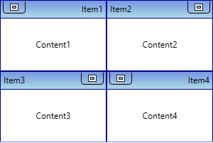
NOTE
Theme
TileViewControl supports various built-in themes. Refer to the below links to apply themes for the TileViewControl,