Getting Started with WPF Radial Slider (SfRadialSlider)
16 Jun 202315 minutes to read
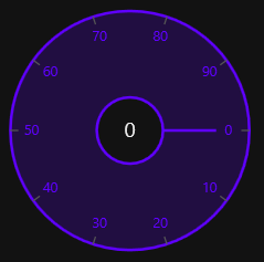
This section explains how to create a WPF SfRadialSlider and explains about its structure.
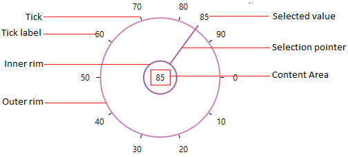
Structure of SfRadialSlider
Assembly deployment
Refer to the Control Dependencies section to get the list of assemblies or NuGet package that needs to be added as a reference to use the control in any application.
Refer to this documentation to find more details about installing nuget packages in a WPF application.
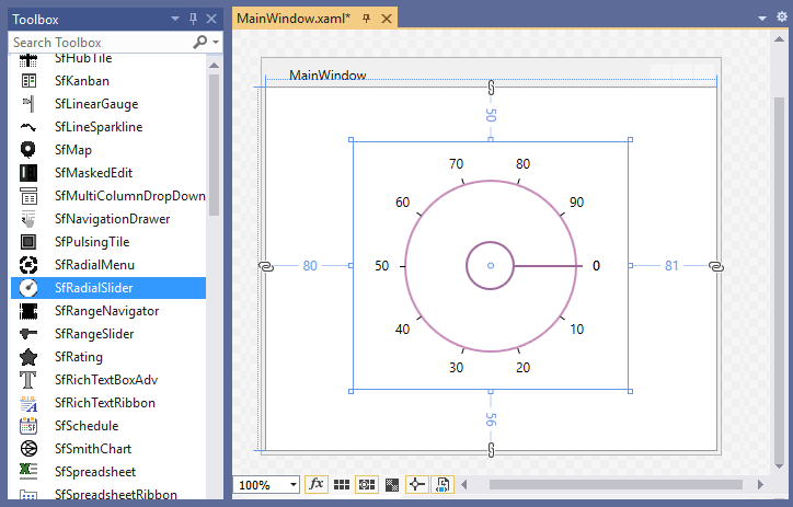
Adding WPF SfRadialSlider via designer
-
The
SfRadialSlidercan be added to an application by dragging it from the toolbox to a designer view. The following dependent assemblies will be added automatically:- Syncfusion.SfRadialMenu.WPF
- Syncfusion.SfShared.WPF
- Set the properties for
SfRadialSliderin design mode using the SmartTag feature.
Adding WPF SfRadialSlider via XAML
To add the SfRadialSlider manually in XAML, follow these steps:
-
Create a new WPF project in Visual Studio.
-
Add the following required assembly references to the project:
- Syncfusion.SfRadialMenu.WPF
- Syncfusion.SfShared.WPF
-
Import Syncfusion WPF schema http://schemas.syncfusion.com/wpf, and declare the SfRadialSlider in XAML page.
<Window x:Class="SfRadialSlider_sample.MainWindow"
        xmlns="http://schemas.microsoft.com/winfx/2006/xaml/presentation"
        xmlns:x="http://schemas.microsoft.com/winfx/2006/xaml"
        xmlns:d="http://schemas.microsoft.com/expression/blend/2008"
        xmlns:mc="http://schemas.openxmlformats.org/markup-compatibility/2006"
        xmlns:local="clr-namespace:SfRadialSlider_sample"
        xmlns:syncfusion="http://schemas.syncfusion.com/wpf"
        mc:Ignorable="d"
        Title="MainWindow" Height="450" Width="800">

    <Grid>
        <syncfusion:SfRadialSlider Name="radialSlider"
                                   Height="200"
                                   Width="200"/>
    </Grid>
</Window>
Adding WPF SfRadialSlider via C#
To add the SfRadialSlider manually in C#, follow these steps:
-
Create a new WPF application via Visual Studio.
-
Add the following required assembly references to the project:
- Syncfusion.Shared.WPF
-
Include the required namespace.
using Syncfusion.Windows.Shared; -
Create an instance of
SfRadialSlider, and add it to the window.// Creating an instance of the SfRadialSlider SfRadialSlider radialSlider = new SfRadialSlider(); // Setting height and width to SfRadialSlider radialSlider.Height = 200; radialSlider.Width = 200;
NOTE
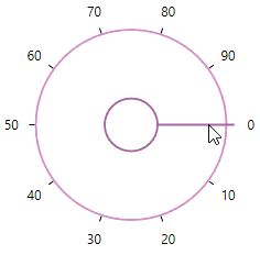
Select tick value
You can select any tick value by dragging the pointer along the circular track or clicking on the corresponding track value. You can get the selected value by using the Value property. The default value of Value property is 0.
Select tick value programmatically
You can select a tick value programmatically by assigning the tick value to the Value property.
<syncfusion:SfRadialSlider Value="34"
Name="radialSlider" />radialSlider.Value = 34;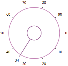
NOTE
Display selected value
You can display the selected value in the content area of the SfRadialSlider by setting the selected value to the Content property. The default value of Content property is null.
public class ViewModel
{
    private double selectedValue;

    public double SelectedValue {
        get {
            return selectedValue;
        }
        set {
            selectedValue= value;
        }
    }
}<syncfusion:SfRadialSlider Content="{Binding SelectedValue,Mode=TwoWay}"
Value="{Binding SelectedValue,Mode=TwoWay}"
Name="radialSlider">
<syncfusion:SfRadialSlider.DataContext>
<local:ViewModel/>
</syncfusion:SfRadialSlider.DataContext>
</syncfusion:SfRadialSlider>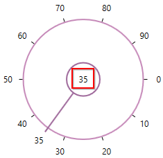
NOTE
Change min-max tick value
You can change the minimum and maximum ticks value of the SfRadialSlider by using the Minimum and Maximum properties. The default value of Minimum property is 0 and Maximum property is 100.
<syncfusion:SfRadialSlider Minimum="100"
                           Maximum="200"
Name="radialSlider" />radialSlider.Minimum = 100;
radialSlider.Maximum = 200;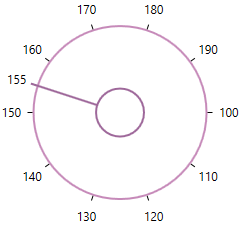
NOTE
Change start and end position
You can change starting and ending position for generating the ticks in the circular track by using the StartAngle and EndAngle properties. The default value of EndAngle property is 0 and StartAngle property is 360.
<syncfusion:SfRadialSlider StartAngle="90"
                           EndAngle="330"
Name="radialSlider" />radialSlider.StartAngle = 90;
radialSlider.EndAngle = 300;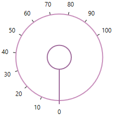
NOTE
Change tick display interval
You can change the tick display interval from the Minimum to Maximum values by using the TickFrequency property. Based on TickFrequency’s multiples, the display interval is set from Minimum to Maximum value.
<syncfusion:SfRadialSlider TickFrequency="20"
Name="radialSlider" />radialSlider.TickFrequency = 20;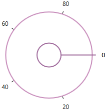
NOTE
Step interval
If you want to control the smallest possible range of value to be selected in SfRadialSlider, use the SmallChange property. The default value of SmallChange property is 0.1. For example, if SmallChange is set to 5, then it is only possible to select values that are multiples of 5.
<syncfusion:SfRadialSlider SmallChange="5"
Name="radialSlider" />radialSlider.SmallChange = 5;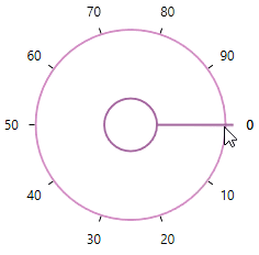
NOTE
Change inner and outer rim radius
You can change inner and outer rim radius of the SfRadialSlider by using the InnerRimRadiusFactor and OuterRimRadiusFactor properties. The default value of InnerRimRadiusFactor property is 0.2 and OuterRimRadiusFactor property is 0.7.
<syncfusion:SfRadialSlider InnerRimRadiusFactor="0.5"
                           OuterRimRadiusFactor="0.8"
Name="radialSlider" />radialSlider.InnerRimRadiusFactor = 0.5;
radialSlider.OuterRimRadiusFactor = 0.8;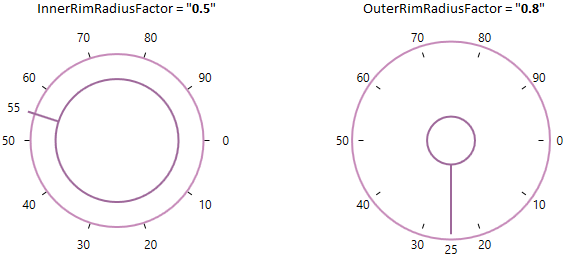
NOTE
Change tick direction
You can change the ticks direction either clockwise or counter-clockwise direction by using the SweepDirection property. The default value of SweepDirection property is Clockwise.
<syncfusion:SfRadialSlider SweepDirection="Counterclockwise"
                           StartAngle="180"
                           EndAngle="360"
Name="radialSlider" />radialSlider.SweepDirection = SweepDirection.Counterclockwise;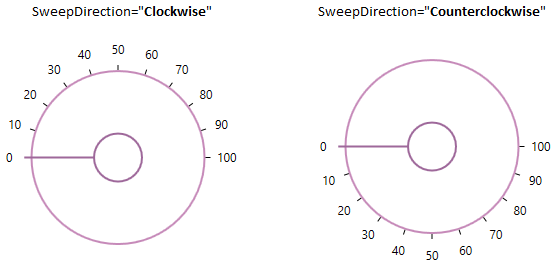
NOTE
Text formatting
You can customize the text format for the specific or all tick labels by handling the DrawLabel event and setting the DrawLabelEventArgs.Handled property value as true. You can change the content and foreground of the tick labels by using the DrawLabelEventArgs.Text and DrawLabelEventArgs.Foreground properties. You can also change the font family and font size of the tick labels by using the DrawLabelEventArgs.FontFamily and DrawLabelEventArgs.FontSize properties.
<syncfusion:SfRadialSlider DrawLabel="sfRadialSlider_DrawLabel"
                           Name="sfRadialSlider">
    <TextBlock Text="{Binding ElementName=sfRadialSlider, Path=Value}"
               FontSize="15"
               HorizontalAlignment="Center"
               VerticalAlignment="Center"/>
</syncfusion:SfRadialSlider>sfRadialSlider.DrawLabel += sfRadialSlider_DrawLabel;You can handle the event as follows,
private void sfRadialSlider_DrawLabel(object sender, DrawLabelEventArgs e) {
    e.Handled = true;
    e.Text += "°C";
    if (e.Value <= 33) {
        e.FontSize = 8;
        e.FontFamily = new FontFamily("Arial");
        e.Foreground = Brushes.Green;
    }
    else if (e.Value > 33 && e.Value <= 66) {
        e.FontSize = 10;
        e.FontFamily = new FontFamily("Courier");
        e.Foreground = Brushes.Gold;
    }
    else {
        e.FontSize = 12;
        e.FontFamily = new FontFamily("Georgia");
        e.Foreground = Brushes.Red;
    }
}
NOTE
Value changed notification
The selected value changed in SfRadialSlider can be examined using ValueChanged event. The ValueChanged event contains the old and newly selected tick value in the OldValue and NewValue properties.
<syncfusion:SfRadialSlider ValueChanged="RadialSlider_ValueChanged"
                      Name="radialSlider"/>
SfRadialSlider radialSlider = new SfRadialSlider();
radialSlider.ValueChanged += RadialSlider_ValueChanged;You can handle the event as follows,
private void RadialSlider_ValueChanged(object sender, RoutedPropertyChangedEventArgs<double> e){
    //Get old and new selected tick value
    var oldValue = e.OldValue;
    var newValue = e.NewValue;
}
Theme
SfRadialSlider supports various built-in themes. Refer to the below links to apply themes for the SfRadialSlider,