How can I help you?
Appearance in WPF Percent TextBox
18 Feb 20256 minutes to read
This section deals with the appearance of PercentTextBox control and contains the following topics.
Setting the Foreground
The PercentTextBox control Foreground can be modified based on the percent value of the control. The following are the foreground for PercentTextBox control.
Foreground for Positive Value
We can change a positive color for the percent value of PercentTextBox by setting the PositiveForeground property and it will be applied when the PercentValue is positive. The default color of PositiveForeground is Black.
<syncfusion:PercentTextBox x:Name="percentTextBox" Width="100" Height="25" PercentValue = "10" PositiveForeground="Blue" />PercentTextBox percentTextBox = new PercentTextBox();
percentTextBox.Width = 100;
percentTextBox.Height = 25;
percentTextBox.PercentValue = 10;
percentTextBox.PositiveForeground = Brushes.Blue;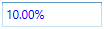
Foreground for Negative Value
We can change a negative color for the value of PercentTextBox by setting the NegativeForeground property and it will be applied when the ApplyNegativeForeground property is true and the PercentValue is negative. The default color of NegativeForeground is Red.
<syncfusion:PercentTextBox x:Name="percentTextBox" PercentValue="10" Width="100" Height="25" PercentValue = "-10"
                          NegativeForeground="SpringGreen" ApplyNegativeForeground="True" />
PercentTextBox percentTextBox = new PercentTextBox();
percentTextBox.Width = 100;
percentTextBox.Height = 25;
percentTextBox.PercentValue = -10;
percentTextBox.ApplyNegativeForeground = true;
percentTextBox.NegativeForeground = Brushes.SpringGreen;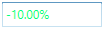
Foreground for Zero Value
We can change a zero color for the percent value of PercentTextBox by setting the ZeroColor property and it will be applied when the ApplyZeroColor property is true and the PercentValue is zero.
The default color of ZeroColor is Green.
<syncfusion:PercentTextBox x:Name="percentTextBox" PercentValue="0" Width="100" Height="25"
                          ApplyZeroColor="True" ZeroColor="DarkGoldenrod"/>
PercentTextBox percentTextBox = new PercentTextBox();
percentTextBox.Width = 100;
percentTextBox.Height = 25;
percentTextBox.PercentValue = 0;
percentTextBox.ApplyZeroColor = true;
percentTextBox.ZeroColor = Brushes.DarkGoldenrod;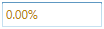
Setting the Background
PercentTextBox allows different brushes to fill the control. The Background property can be used to modify the control background color. The default color of Background is White.
<syncfusion:PercentTextBox x:Name="percentTextBox" Width="100"
                          Height="25" Background="Cyan"/>
PercentTextBox percentTextBox = new PercentTextBox();
percentTextBox.Width = 100;
percentTextBox.Height = 25;
percentTextBox.Background = Brushes.Cyan;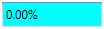
Setting the Corner Radius
Corner Radius indicates the degree to which the corners of the border can be rounded. To create curved borders for the PercentTextBox, use CornerRadius property. The default value of CornerRadius property is 1.
<syncfusion:PercentTextBox x:Name="percentTextBox" Width="100" Height="25" CornerRadius="5"/>PercentTextBox percentTextBox = new PercentTextBox();
percentTextBox.Width = 100;
percentTextBox.Height = 25;
percentTextBox.CornerRadius = new CornerRadius(5);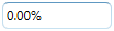
Apply Background for Selection
PercentTextBox allows different brushes to highlight the selected text by setting the SelectionBrush and SelectionOpacity properties. The SelectionOpacity property specifies the opacity of the SelectionBrush.
<syncfusion:PercentTextBox x:Name="percentTextBox" Width="100" Height="25" SelectionBrush="Red" SelectionOpacity="0.5"/>PercentTextBox percentTextBox = new PercentTextBox();
percentTextBox.Width = 100;
percentTextBox.Height = 25;
percentTextBox.SelectionBrush = Brushes.Red;
percentTextBox.SelectionOpacity = 0.3;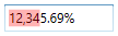
Align Value
PercentTextBox allows to display the value from right or center or left side by setting the TextAlignment property to Right or Left or Center. The Default value of TextAlignment is Left.
<syncfusion:PercentTextBox x:Name="percentTextBox" Width="100" Height="25" TextAlignment="Center"/>PercentTextBox percentTextBox = new PercentTextBox();
percentTextBox.Width = 100;
percentTextBox.Height = 25;
percentTextBox.TextAlignment = TextAlignment.Center;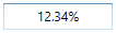
Setting ToolTip
PercentTextBox provides support for ToolTip to display certain information when the mouse hovers on the PercentTextBox. You can customize the tooltip information by setting the ToolTip property.
<syncfusion:PercentTextBox x:Name="percentTextBox" Width="100" Height="25" ToolTip="Enter Percentage Value"/>PercentTextBox percentTextBox = new PercentTextBox();
percentTextBox.Width = 100;
percentTextBox.Height = 25;
percentTextBox.ToolTip = "Enter Percentage value";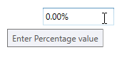
Theme
PercentTextBox supports various built-in themes. Refer to the below links to apply themes for the PercentTextBox,