Getting Started with WPF GridSplitter (SfGridSplitter)
18 Feb 202524 minutes to read
This section explains how to create a WPF GridSplitter (SfGridSplitter) and explains about its structure.
Structure of SfGridSplitter
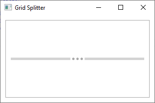
Visual representation
Assembly deployment
Refer to the control dependencies section to get the list of assemblies or NuGet package that needs to be added as a reference to use the control in any application.
You can find more details about installing the NuGet package in a WPF application in the following link:
Adding control manually in XAML
To add the control manually in XAML, follow the given steps:
- Add the following required assembly references to the project:
- Syncfusion.SfInput.WPF
- Syncfusion.SfShared.WPF
- Import Syncfusion® WPF schema http://schemas.syncfusion.com/wpf in the XAML page.
-
Declare the
SfGridSplittercontrol in the XAML page.<Window xmlns="http://schemas.microsoft.com/winfx/2006/xaml/presentation" xmlns:x="http://schemas.microsoft.com/winfx/2006/xaml" xmlns:syncfusion="http://schemas.syncfusion.com/wpf" x:Class="SfGridSplitterSample.MainWindow" Title="SfGridSplitter Sample" Height="350" Width="525"> <Grid> <!-- Adding SfGridSplitter control --> <syncfusion:SfGridSplitter x:Name="sfGridSplitter" HorizontalAlignment="Stretch"/> </Grid> </Window>
Add control manually in C#
To add the control manually in C#, follow the given steps:
- Add the following required assembly references to the project:
- Syncfusion.SfInput.WPF
- Syncfusion.SfShared.WPF
- Import the
SfGridSplitternamespace using Syncfusion.Windows.Controls.Input;. -
Create an
SfGridSplitterinstance, and add it to the window.using Syncfusion.Windows.Controls.Input; namespace SfGridSplitterSample { public partial class MainWindow : Window { public MainWindow() { InitializeComponent(); //Creating an instance of SfGridSplitter control SfGridSplitter sfGridSplitter = new SfGridSplitter(); sfGridSplitter.HorizontalAlignment = HorizontalAlignment.Stretch; //Adding SfGridSplitter as window content this.Content = sfGridSplitter; } } }
NOTE
Resize the grid rows
If we want to resize the specific grid rows, place the SfGridSplitter on next or previous row and set the HorizontalAlignment property as Stretch and ResizeBehavior property value as PreviousAndNext.
<Border
    Margin="10"
    BorderBrush="DarkGray"
    BorderThickness="1">
    <Grid>
        <Grid.RowDefinitions>
            <RowDefinition />
            <RowDefinition Height="auto" />
            <RowDefinition />
        </Grid.RowDefinitions>
        <TextBlock Grid.Row="0"
                   HorizontalAlignment="Center"
                   VerticalAlignment="Center"
                   TextAlignment="Center"
                   Text="Panel 1">
        </TextBlock>
        <TextBlock Grid.Row="2"
                   HorizontalAlignment="Center"
                   VerticalAlignment="Center"
                   TextAlignment="Center"
                   Text="Panel 2">
        </TextBlock>

        <!--Grid Splitter-->
        <syncfusion:SfGridSplitter Name="gridSplitter"
                                   HorizontalAlignment="Stretch"
                                   ResizeBehavior="PreviousAndNext"
                                   Width="auto"
                                   Grid.Row="1">
        </syncfusion:SfGridSplitter>
    </Grid>
</Border>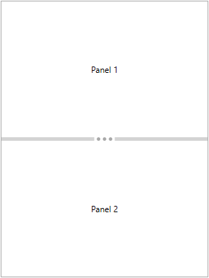
NOTE
Resize the grid columns
If we want to resize the specific grid columns, place the SfGridSplitter on next or previous column and set the VerticalAlignment property as Stretch and ResizeBehavior property value as PreviousAndNext.
<Border
    Margin="10"
    BorderBrush="DarkGray"
    BorderThickness="1">
    <Grid>
        <Grid.ColumnDefinitions>
            <ColumnDefinition />
            <ColumnDefinition Width="auto" />
            <ColumnDefinition />
        </Grid.ColumnDefinitions>
        <TextBlock Grid.Column="0"
                   HorizontalAlignment="Center"
                   VerticalAlignment="Center"
                   TextAlignment="Center"
                   Text="Panel 1">
        </TextBlock>
        <TextBlock Grid.Column="2"
                   HorizontalAlignment="Center"
                   VerticalAlignment="Center"
                   TextAlignment="Center"
                   Text="Panel 2">
        </TextBlock>

        <!--Grid Splitter-->
        <syncfusion:SfGridSplitter Name="gridSplitter"
                                   HorizontalAlignment="Stretch"
                                   ResizeBehavior="PreviousAndNext"
                                   Width="auto"
                                   Grid.Column="1">
        </syncfusion:SfGridSplitter>
    </Grid>
</Border>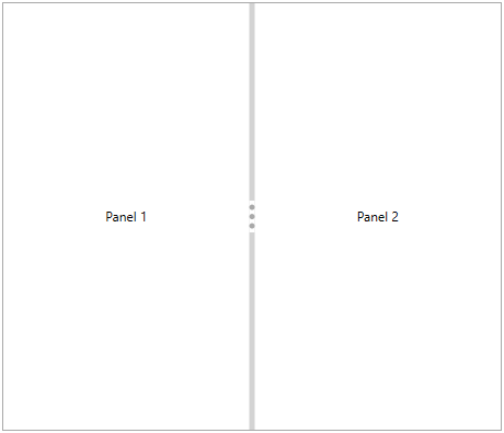
NOTE
NOTE
We can restrict the moving location of the grid splitter (Left or Right or Bottom or Top) by setting the value for
ResizeBehaviorproperty. TheResizeBehaviorvalue must be assigned based on the row or column where the grid splitter placed.
Resizing the grid rows and columns with specific pixel
If we want to resize the rows or columns of grid with particular pixel interval, Set the pixel value for DragIncrement and KeyboardIncrement properties. If we move the splitter using the mouse, DragIncrement property values is used as resize pixel interval. If we move the splitter using the Up-Down buttons, KeyboardIncrement property values is used as resize pixel interval. The default value of DragIncrement property is 1 and KeyboardIncrement property is 20.
<Border
    Margin="10"
    BorderBrush="DarkGray"
    BorderThickness="1">
    <Grid>
        <Grid.RowDefinitions>
            <RowDefinition />
            <RowDefinition Height="auto" />
            <RowDefinition />
        </Grid.RowDefinitions>
        <TextBlock Grid.Row="0"
                   HorizontalAlignment="Center"
                   VerticalAlignment="Center"
                   TextAlignment="Center"
                   Text="Panel 1">
        </TextBlock>
        <TextBlock Grid.Row="2"
                   HorizontalAlignment="Center"
                   VerticalAlignment="Center"
                   TextAlignment="Center"
                   Text="Panel 2">
        </TextBlock>

        <!--Grid Splitter-->
        <syncfusion:SfGridSplitter DragIncrement="50"
                                   KeyboardIncrement="50"
                                   HorizontalAlignment="Stretch"
                                   Width="auto"
                                   Grid.Row="1">
        </syncfusion:SfGridSplitter>
    </Grid>
</Border>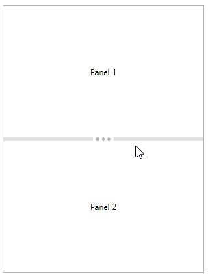
NOTE
Resize the grid rows or columns programmatically
We can move the splitter and resize the affected columns or rows programmatically with certain pixels by passing the pixel value in MoveSplitter(Double) method.
<Border
    Margin="10"
    BorderBrush="DarkGray"
    BorderThickness="1">
    <Grid>
        <Grid.RowDefinitions>
            <RowDefinition />
            <RowDefinition Height="auto" />
            <RowDefinition />
        </Grid.RowDefinitions>
        <TextBlock Grid.Row="0"
                   HorizontalAlignment="Center"
                   VerticalAlignment="Center"
                   TextAlignment="Center"
                   Text="Panel 1">
        </TextBlock>
        <TextBlock Grid.Row="2"
                   HorizontalAlignment="Center"
                   VerticalAlignment="Center"
                   TextAlignment="Center"
                   Text="Panel 2">
        </TextBlock>

        <!--Grid Splitter-->
        <syncfusion:SfGridSplitter Name="gridSplitter"
                                   HorizontalAlignment="Stretch"
                                   ResizeBehavior="PreviousAndNext"
                                   Width="auto"
                                   Grid.Row="1">
        </syncfusion:SfGridSplitter>
    </Grid>
</Border>//GridSplitter moves 50 pixels.
gridSplitter.MoveSplitter(50);Show or hide the grid row and columns
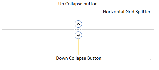
We can collapse or expands the element in either side of the splitter by clicking the collapse buttons. We can show or hide the collapse button by using the EnableCollapseButton property value as true. The default value of EnableCollapseButton is false.
<Border
    Margin="10"
    BorderBrush="DarkGray"
    BorderThickness="1">
    <Grid>
        <Grid.RowDefinitions>
            <RowDefinition />
            <RowDefinition Height="auto" />
            <RowDefinition />
        </Grid.RowDefinitions>
        <TextBlock Grid.Row="0"
                   HorizontalAlignment="Center"
                   VerticalAlignment="Center"
                   TextAlignment="Center"
                   Text="Panel 1">
        </TextBlock>
        <TextBlock Grid.Row="2"
                   HorizontalAlignment="Center"
                   VerticalAlignment="Center"
                   TextAlignment="Center"
                   Text="Panel 2">
        </TextBlock>

        <!--Grid Splitter-->
        <syncfusion:SfGridSplitter EnableCollapseButton="True"
                                   HorizontalAlignment="Stretch"
                                   Width="auto"
                                   Grid.Row="1" >
        </syncfusion:SfGridSplitter>
    </Grid>
</Border>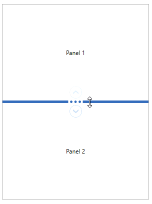
NOTE
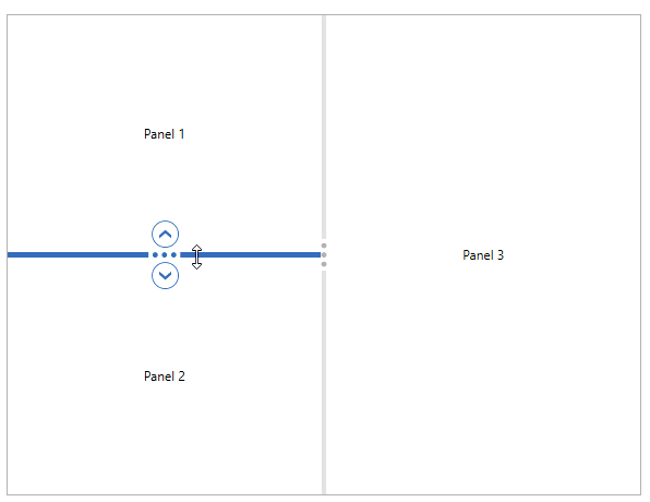
Custom UI for Collapse buttons
If you you want to change the UI of horizontal splitter up and down collapse button separately, use the UpButtonTemplate and DownButtonTemplate properties. If you want to change the UI of vertical splitter left and right collapse button, use the LeftButtonTemplate and RightButtonTemplate properties
NOTE
You can see the effect of collapse button templates only on when
EnableCollapseButtonproperty value istrue.
<Border
    Margin="10"
    BorderBrush="DarkGray"
    BorderThickness="1">
    <Grid>
        <Grid.RowDefinitions>
            <RowDefinition />
            <RowDefinition Height="auto" />
            <RowDefinition />
        </Grid.RowDefinitions>
        <Grid.ColumnDefinitions>
            <ColumnDefinition />
            <ColumnDefinition Width="auto" />
            <ColumnDefinition />
        </Grid.ColumnDefinitions>
        <TextBlock  HorizontalAlignment="Center"
                    VerticalAlignment="Center"
                    Grid.Row="0"
                    Grid.Column="0"
                    TextAlignment="Center"
                    Text="Panel 1"/>

        <TextBlock HorizontalAlignment="Center"
                   VerticalAlignment="Center"
                   Grid.Row="2"
                   Grid.Column="0"
                   Text="Panel 2"/>

        <TextBlock HorizontalAlignment="Center"
                   VerticalAlignment="Center"
                   Grid.RowSpan="3"
                   Grid.Column="2"
                   Text="Panel 3"/>

        <!--Horizontal Splitter-->
        <syncfusion:SfGridSplitter Grid.Row="1"
                                   Grid.Column="0"
                                   Height="5"
                                   HorizontalAlignment="Stretch"
                                   EnableCollapseButton="True"
                                   ResizeBehavior="PreviousAndNext">

            <!--Up button template-->
            <syncfusion:SfGridSplitter.UpButtonTemplate>
                <DataTemplate>
                    <Ellipse Width="20" Height="20" Fill="Blue"/>
                </DataTemplate>
            </syncfusion:SfGridSplitter.UpButtonTemplate>

            <!--Down button template-->
            <syncfusion:SfGridSplitter.DownButtonTemplate>
                <DataTemplate>
                    <Ellipse Width="20" Height="20" Fill="Orange"/>
                </DataTemplate>
            </syncfusion:SfGridSplitter.DownButtonTemplate>
        </syncfusion:SfGridSplitter>

        <!--Vertical Splitter-->
        <syncfusion:SfGridSplitter Grid.RowSpan="3"
                                   Grid.Column="1"
                                   Width="5"
                                   VerticalAlignment="Stretch"
                                   EnableCollapseButton="True"
                                   ResizeBehavior="PreviousAndNext"
                                   ShowsPreview="True">
            <!--Left button template-->
            <syncfusion:SfGridSplitter.LeftButtonTemplate>
                <DataTemplate>
                    <Ellipse Width="20" Height="20" Fill="Red"/>
                </DataTemplate>
            </syncfusion:SfGridSplitter.LeftButtonTemplate>

            <!--Right button template-->
            <syncfusion:SfGridSplitter.RightButtonTemplate>
                <DataTemplate>
                    <Ellipse Width="20" Height="20" Fill="Green"/>
                </DataTemplate>
            </syncfusion:SfGridSplitter.RightButtonTemplate>
        </syncfusion:SfGridSplitter>
    </Grid>
</Border>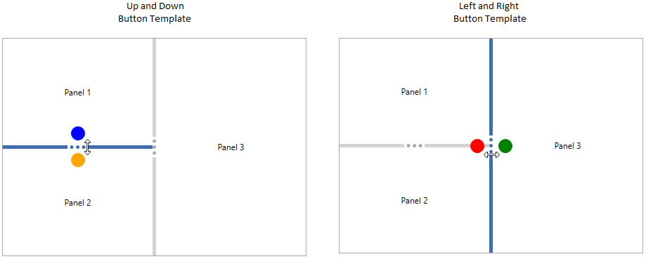
NOTE
Custom UI for expander gripper
If you you want to change the UI of vertical and horizontal splitter gripper separately, use the VerticalGripperTemplate and HorizontalGripperTemplate properties.
<Border
    Margin="10"
    BorderBrush="DarkGray"
    BorderThickness="1">
    <Grid>
        <Grid.RowDefinitions>
            <RowDefinition />
            <RowDefinition Height="auto" />
            <RowDefinition />
        </Grid.RowDefinitions>
        <Grid.ColumnDefinitions>
            <ColumnDefinition />
            <ColumnDefinition Width="auto" />
            <ColumnDefinition />
        </Grid.ColumnDefinitions>
        <TextBlock  HorizontalAlignment="Center"
                    VerticalAlignment="Center"
                    Grid.Row="0"
                    Grid.Column="0"
                    Text="Panel 1"/>

        <TextBlock HorizontalAlignment="Center"
                   VerticalAlignment="Center"
                   Grid.Row="2"
                   Grid.Column="0"
                   Text="Panel 2"/>

        <TextBlock HorizontalAlignment="Center"
                   VerticalAlignment="Center"
                   Grid.RowSpan="3"
                   Grid.Column="2"
                   Text="Panel 3"/>

        <!--Horizontal Splitter-->
        <syncfusion:SfGridSplitter Grid.Row="1"
                                   Grid.Column="0"
                                   Height="20"
                                   HorizontalAlignment="Stretch"
                                   EnableCollapseButton="True"
                                   ResizeBehavior="PreviousAndNext"
                                   ShowsPreview="True">

            <!--Horizontal Gripper Template-->
            <syncfusion:SfGridSplitter.HorizontalGripperTemplate>
                <DataTemplate>
                    <TextBlock Background="Blue"
                               Foreground="White"
                               TextAlignment="Center"
                               VerticalAlignment="Center"
                               HorizontalAlignment="Center"
                               Text="Click and drag"
                               Width="90"
                               Height="20"/>
                </DataTemplate>
            </syncfusion:SfGridSplitter.HorizontalGripperTemplate>
        </syncfusion:SfGridSplitter>

        <!--Vertical Splitter-->
        <syncfusion:SfGridSplitter Grid.RowSpan="3"
                                   Grid.Column="1"
                                   Width="20"
                                   VerticalAlignment="Stretch"
                                   EnableCollapseButton="True"
                                   ResizeBehavior="PreviousAndNext"
                                   ShowsPreview="True">

            <!--Vertical GripperTemplate-->
            <syncfusion:SfGridSplitter.VerticalGripperTemplate>
                <DataTemplate>
                    <TextBlock Background="Red"
                               Foreground="White"
                               TextAlignment="Center"
                               VerticalAlignment="Center"
                               HorizontalAlignment="Center"
                               Text="Click and drag"
                               Width="90"
                               Height="20">
                        <TextBlock.LayoutTransform>
                            <RotateTransform Angle="-90"/>
                        </TextBlock.LayoutTransform>
                    </TextBlock>
                </DataTemplate>
            </syncfusion:SfGridSplitter.VerticalGripperTemplate>
        </syncfusion:SfGridSplitter>
    </Grid>
</Border>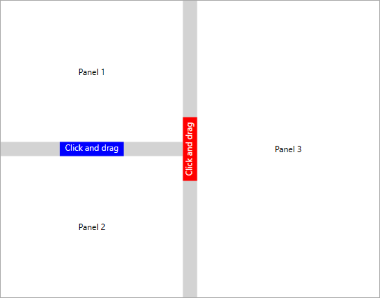
NOTE
Deferred resizing
We can directly redistribute the row or columns by using SfGridSplitter. If we want to preview the location of redistributing row or columns before it changed, we can use the ShowsPreview property as true.
<Border
    Margin="10"
    BorderBrush="DarkGray"
    BorderThickness="1">
    <Grid>
        <Grid.RowDefinitions>
            <RowDefinition />
            <RowDefinition Height="auto" />
            <RowDefinition />
        </Grid.RowDefinitions>
        <TextBlock Grid.Row="0"
                   HorizontalAlignment="Center"
                   VerticalAlignment="Center"
                   TextAlignment="Center"
                   Text="Panel 1">
        </TextBlock>
        <TextBlock Grid.Row="2"
                   HorizontalAlignment="Center"
                   VerticalAlignment="Center"
                   TextAlignment="Center"
                   Text="Panel 2">
        </TextBlock>

        <!--Grid Splitter-->
        <syncfusion:SfGridSplitter ShowsPreview="True"
                                   HorizontalAlignment="Stretch"
                                   Width="auto"
                                   Grid.Row="1" >
        </syncfusion:SfGridSplitter>
    </Grid>
</Border>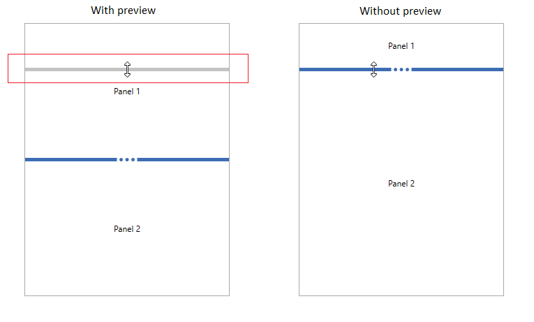
NOTE
Grid splitter for the merged columns or rows
If we want resize the merged columns or rows, place the grid splitter on next or previous row or column of the grid.
<Border
    Margin="10"
    BorderBrush="DarkGray"
    BorderThickness="1">
    <Grid>
        <Grid.RowDefinitions>
            <RowDefinition />
            <RowDefinition Height="auto" />
            <RowDefinition />
        </Grid.RowDefinitions>
        <Grid.ColumnDefinitions>
            <ColumnDefinition />
            <ColumnDefinition Width="auto" />
            <ColumnDefinition />
        </Grid.ColumnDefinitions>
        <TextBlock  HorizontalAlignment="Center" VerticalAlignment="Center"
            Grid.Row="0"
            Grid.Column="0" TextAlignment="Center"
             Text="Panel 1">
        </TextBlock>
        <TextBlock HorizontalAlignment="Center" VerticalAlignment="Center"
            Grid.Row="2"
            Grid.Column="0" Text="Panel 2">
        </TextBlock>

        <TextBlock HorizontalAlignment="Center" VerticalAlignment="Center"
            Grid.RowSpan="3"
            Grid.Column="2" Text="Panel 3">
        </TextBlock>

        <!--Horizontal Splitter-->
        <syncfusion:SfGridSplitter Grid.Row="1"
                                   Grid.Column="0"
                                   Height="5"
                                   HorizontalAlignment="Stretch"
                                   ResizeBehavior="PreviousAndNext">
        </syncfusion:SfGridSplitter>

        <!--Vertical Splitter-->
        <syncfusion:SfGridSplitter Grid.RowSpan="3"
                                   Grid.Column="1"
                                   Width="5"
                                   VerticalAlignment="Stretch"
                                   ResizeBehavior="PreviousAndNext">
        </syncfusion:SfGridSplitter>
    </Grid>
</Border>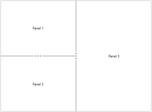
NOTE
Theme
SfGridSplitter supports various built-in themes. Refer to the below links to apply themes for the SfGridSplitter,