Appearance in WPF GridSplitter (SfGridSplitter)
18 Nov 20187 minutes to read
This section explains the UI customization and styling options available in the WPF GridSplitter control. The WPF GridSplitter is implemented through the SfGridSplitter class.
Setting the Background
You can change the background color of the SfGridSplitter by setting the Background property. The default value of the Background property is Light Gray.
<Border
    Margin="10"
    BorderBrush="DarkGray"
    BorderThickness="1">
    <Grid>
        <Grid.RowDefinitions>
            <RowDefinition />
            <RowDefinition Height="auto" />
            <RowDefinition />
        </Grid.RowDefinitions>
        <TextBlock Grid.Row="0"
                   HorizontalAlignment="Center"
                   VerticalAlignment="Center"
                   TextAlignment="Center"
                   Text="Panel 1">
        </TextBlock>
        <TextBlock Grid.Row="2"
                   HorizontalAlignment="Center"
                   VerticalAlignment="Center"
                   TextAlignment="Center"
                   Text="Panel 2">
        </TextBlock>

        <!--Grid Splitter-->
        <syncfusion:SfGridSplitter Background="Green"
                                   HorizontalAlignment="Stretch"
                                   Width="auto"
                                   Grid.Row="1">
        </syncfusion:SfGridSplitter>
    </Grid>
</Border>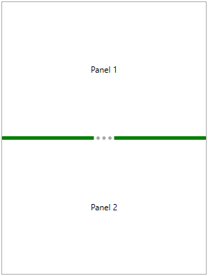
Custom drag preview
You can customize the preview UI of the WPF GridSplitter by using the SfGridSplitter.PreviewStyle property. The PreviewStyle property takes effect only when the ShowsPreview property is set to true.
<Border
    Margin="10"
    BorderBrush="DarkGray"
    BorderThickness="1">
    <Grid>
        <Grid.RowDefinitions>
            <RowDefinition />
            <RowDefinition Height="auto" />
            <RowDefinition />
        </Grid.RowDefinitions>
        <TextBlock Grid.Row="0"
                   HorizontalAlignment="Center"
                   VerticalAlignment="Center"
                   TextAlignment="Center"
                   Text="Panel 1">
        </TextBlock>
        <TextBlock Grid.Row="2"
                   HorizontalAlignment="Center"
                   VerticalAlignment="Center"
                   TextAlignment="Center"
                   Text="Panel 2">
        </TextBlock>

        <!--Grid Splitter-->
        <syncfusion:SfGridSplitter ShowsPreview="True"
                           HorizontalAlignment="Stretch"
                           Width="auto"
                           Grid.Row="1" >
            <syncfusion:SfGridSplitter.PreviewStyle>
                <Style TargetType="Control">
                    <Setter Property="Background" Value="Red"/>
                    <Setter Property="Template">
                        <Setter.Value>
                            <ControlTemplate TargetType="Control">
                                <Grid x:Name="Root" Opacity="0.5">
                                    <Ellipse Fill="{TemplateBinding Background}"/>
                                </Grid>
                            </ControlTemplate>
                        </Setter.Value>
                    </Setter>
                </Style>
            </syncfusion:SfGridSplitter.PreviewStyle>
        </syncfusion:SfGridSplitter>
    </Grid>
</Border>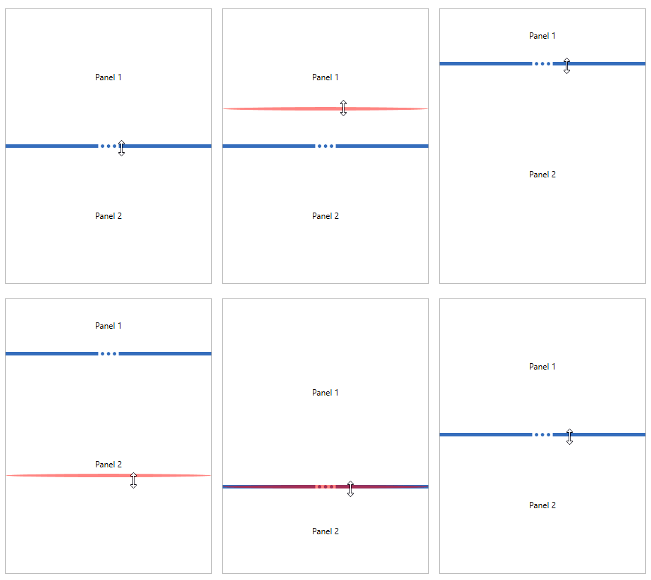
Theme
The WPF GridSplitter supports various built-in themes. Refer to the following links to apply themes to the control: