Getting Started with WPF Card View
13 Sep 202324 minutes to read
This section describes how to create a CardView control in a WPF application and overview of its basic functionalities.
Structure of CardView control
Assembly deployment
Refer to the Control Dependencies section to get the list of assemblies or NuGet package that needs to be added as a reference to use the control in any application.
Refer to the NuGet Packages Documentation to find more details about installing nuget packages in a WPF application.
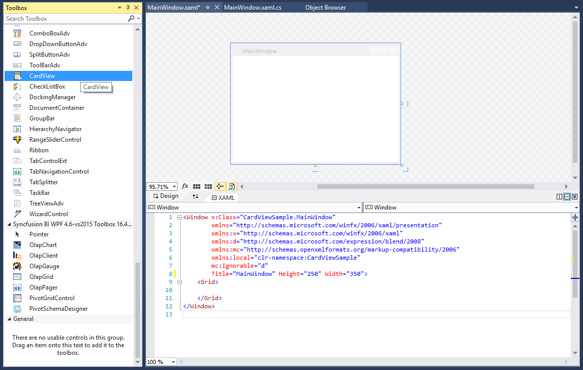
Adding WPF CardView control via designer
- The
CardViewcontrol can be added to an application by dragging it from the toolbox to a designer view. The following dependent assemblies will be added automatically:- Syncfusion.Shared.WPF
- Syncfusion.Tools.WPF
- Set the properties for
CardViewcontrol in design mode using the SmartTag feature.
Adding WPF CardView control via XAML
To add the CardView control manually in XAML, follow these steps:
- Create a new WPF project in Visual Studio.
- Add the following required assembly references to the project:
- Syncfusion.Shared.WPF
- Syncfusion.Tools.WPF
-
Import Syncfusion WPF schema http://schemas.syncfusion.com/wpf, and declare the
CardViewcontrol in XAML page.<Window x:Class="CardViewSample.MainWindow" xmlns="http://schemas.microsoft.com/winfx/2006/xaml/presentation" xmlns:x="http://schemas.microsoft.com/winfx/2006/xaml" xmlns:d="http://schemas.microsoft.com/expression/blend/2008" xmlns:mc="http://schemas.openxmlformats.org/markup-compatibility/2006" xmlns:local="clr-namespace:CardViewSample" xmlns:syncfusion="http://schemas.syncfusion.com/wpf" mc:Ignorable="d" Title="Card View" Height="450" Width="800"> <Grid Name="grid"> <syncfusion:CardView Name="cardView"/> </Grid> </Window>
Adding WPF CardView control via C#
To add the CardView control manually in C#, follow these steps:
- Create a new WPF application via Visual Studio.
- Add the following required assembly references to the project:
- Syncfusion.Shared.WPF
- Syncfusion.Tools.WPF
-
Include the required namespace.
using Syncfusion.Windows.Tools.Controls; -
Create an instance of
CardViewcontrol, and add it to the window.namespace CardViewSample { public partial class MainWindow : Window { public MainWindow() { InitializeComponent(); //Creating an instance of CardView control CardView cardView = new CardView (); //Adding CardView as window content this.Content = cardView; } } }
NOTE
Populating items using CardViewItem
You can add the card items inside the control by adding the CardViewItem into the CardView.Items collection property.
<syncfusion:CardView Name="cardView">
    <syncfusion:CardViewItem Header="Item 1">
        <TextBlock Text="Fruits"/>
    </syncfusion:CardViewItem>
    <syncfusion:CardViewItem Header="Item 2">
        <TextBlock Text="Stationaries"/>
    </syncfusion:CardViewItem>
    <syncfusion:CardViewItem Header="Item 3">
        <TextBlock Text="Dresses"/>
    </syncfusion:CardViewItem>
</syncfusion:CardView>
CardViewItem cardViewItem1 = new CardViewItem()
{
Header = "Item 1",
Content = new TextBlock() { Text = "Fruits" }
};
CardViewItem cardViewItem2 = new CardViewItem()
{
Header = "Item 2",
Content = new TextBlock() { Text = "Stationaries" }
};
CardViewItem cardViewItem3 = new CardViewItem()
{
Header = "Item 3",
Content = new TextBlock() { Text = "Dresses" }
};
CardView cardView= new CardView();
cardView.Items.Add(cardViewItem1);
cardView.Items.Add(cardViewItem2);
cardView.Items.Add(cardViewItem3);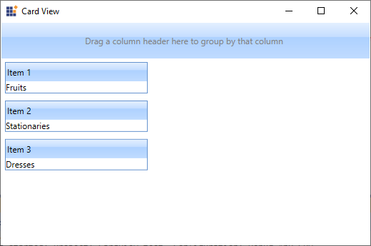
NOTE
Populating items using ItemsSource
You can populate the card items to the CardView control by using the ItemsSource property. You need to use HeaderTemplate and ItemTemplate to populate the items into the view.
NOTE
You can use the grouping, sorting, filtering and editing functionalities only by populating the card items through the
ItemsSourceproperty.
//Model.cs
public class CardViewModel
{
    public string Item { get; set; }
    public string Name { get; set; }
}

//ViewModel.cs
public class ViewModel : NotificationObject
{
    private ObservableCollection<CardViewModel> cardViewItems;
    public ObservableCollection<CardViewModel> CardViewItems
    {
        get { return cardViewItems; }
        set { cardViewItems = value;
            this.RaisePropertyChanged(nameof(CardViewItems)); }
    }
    public ViewModel()
    {
        CardViewItems = new ObservableCollection<CardViewModel>();
        populateItems();
    }
    private void populateItems()
    {
        CardViewItems.Add(new CardViewModel() { Item="Item 1", Name = "Fruits" });
        CardViewItems.Add(new CardViewModel() { Item="Item 2", Name = "Stationaries" });
        CardViewItems.Add(new CardViewModel() { Item = "Item 3", Name = "Dresses" });
    }
}<syncfusion:CardView ItemsSource="{Binding CardViewItems}"
Name="cardView">
<syncfusion:CardView.HeaderTemplate>
<DataTemplate>
<TextBlock Text="{Binding Item}"/>
</DataTemplate>
</syncfusion:CardView.HeaderTemplate>
<syncfusion:CardView.ItemTemplate>
<DataTemplate>
<StackPanel Orientation="Horizontal">
<TextBlock Text="Name:"
Margin="5" />
<TextBlock Grid.Column="1"
Margin="5"
Text="{Binding Name, UpdateSourceTrigger=PropertyChanged}" />
</StackPanel>
</DataTemplate>
</syncfusion:CardView.ItemTemplate>
</syncfusion:CardView>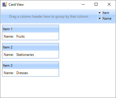
NOTE
Select a CardViewItem
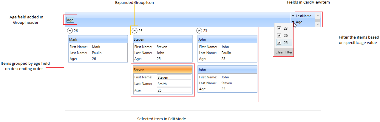
You can select any card item by mouse click on the specific item. You can get the selected item by using the SelectedItem property. The default value of SelectedItem property is null.
NOTE
You can select only one item at a time.
<syncfusion:CardView Name="cardView">
    <syncfusion:CardViewItem Header="Item 1">
        <TextBlock Text="Fruits"/>
    </syncfusion:CardViewItem>
    <syncfusion:CardViewItem Header="Item 2">
        <TextBlock Text="Stationaries"/>
    </syncfusion:CardViewItem>
    <syncfusion:CardViewItem Header="Item 3">
        <TextBlock Text="Dresses"/>
    </syncfusion:CardViewItem>
</syncfusion:CardView>
CardViewItem cardViewItem1 = new CardViewItem()
{
Header = "Item 1",
Content = new TextBlock() { Text = "Fruits" }
};
CardViewItem cardViewItem2 = new CardViewItem()
{
Header = "Item 2",
Content = new TextBlock() { Text = "Stationaries" }
};
CardViewItem cardViewItem3 = new CardViewItem()
{
Header = "Item 3",
Content = new TextBlock() { Text = "Dresses" }
};
CardView cardView= new CardView();
cardView.Items.Add(cardViewItem1);
cardView.Items.Add(cardViewItem2);
cardView.Items.Add(cardViewItem3);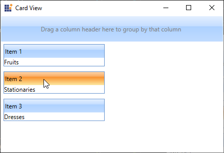
NOTE
Select CardViewItem programmatically using property
You can select a particular card item programmatically by using the CardViewItem.IsSelected property. The default value of CardViewItem.IsSelected property is false.
<syncfusion:CardView Name="cardView">
    <syncfusion:CardViewItem Header="Item 1" >
        <TextBlock Text="Fruits"/>
    </syncfusion:CardViewItem>
    <syncfusion:CardViewItem Header="Item 2"
                             IsSelected="True">
        <TextBlock Text="Stationaries"/>
    </syncfusion:CardViewItem>
    <syncfusion:CardViewItem Header="Item 3">
        <TextBlock Text="Dresses"/>
    </syncfusion:CardViewItem>
</syncfusion:CardView>
CardViewItem cardViewItem1 = new CardViewItem()
{
Header = "Item 1",
Content = new TextBlock() { Text = "Fruits" }
};
CardViewItem cardViewItem2 = new CardViewItem()
{
Header = "Item 2",
IsSelected = true,
Content = new TextBlock() { Text = "Stationaries" }
};
CardViewItem cardViewItem3 = new CardViewItem()
{
Header = "Item 3",
Content = new TextBlock() { Text = "Dresses" }
};
CardView cardView= new CardView();
cardView.Items.Add(cardViewItem1);
cardView.Items.Add(cardViewItem2);
cardView.Items.Add(cardViewItem3);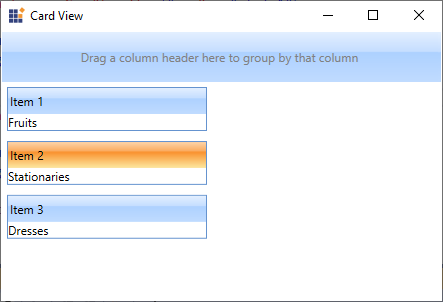
NOTE
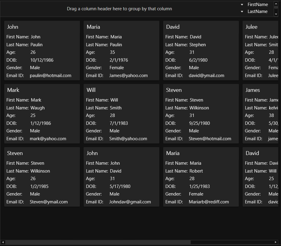
Group the CardViewItems
You can group the cards inside the CardView control by dragging the required fields from the list and drop it into the dropping region of the CardView control header. If you want to disable the grouping, use the CanGroup property value as false.
//Model.cs
public class CardViewModel
{
    public string FirstName { get; set; }
    public string LastName { get; set; }
    public int Age { get; set; }
}

//ViewModel.cs
public class ViewModel : NotificationObject
{
    private ObservableCollection<CardViewModel> cardViewItems;
    public ObservableCollection<CardViewModel> CardViewItems
    {
        get { return cardViewItems; }
        set { cardViewItems = value;
            this.RaisePropertyChanged(nameof(CardViewItems)); }
    }
    public ViewModel()
    {
        CardViewItems = new ObservableCollection<CardViewModel>();
        populateItems();
    }
    private void populateItems()
    {
        CardViewItems.Add(new CardViewModel() { FirstName = "John", LastName= "Paulin", Age = 23});
        CardViewItems.Add(new CardViewModel() { FirstName = "Mark", LastName = "Paulin",Age = 26 });
        CardViewItems.Add(new CardViewModel() { FirstName = "Steven", LastName = "John", Age = 25 });
        CardViewItems.Add(new CardViewModel() { FirstName = "John", LastName = "Steven", Age = 23 });
        CardViewItems.Add(new CardViewModel() { FirstName = "Steven", LastName = "Smith", Age = 25 });
    }
}<syncfusion:CardView CanGroup="True"
ItemsSource="{Binding CardViewItems}"
Name="cardView">
<syncfusion:CardView.HeaderTemplate>
<DataTemplate>
<TextBlock Text="{Binding FirstName}"/>
</DataTemplate>
</syncfusion:CardView.HeaderTemplate>
<syncfusion:CardView.ItemTemplate>
<DataTemplate >
<ListBox ScrollViewer.HorizontalScrollBarVisibility="Disabled">
<ListBoxItem Padding="1">
<Grid>
<Grid.ColumnDefinitions>
<ColumnDefinition Width="75" />
<ColumnDefinition />
</Grid.ColumnDefinitions>
<TextBlock Text="First Name:" />
<TextBlock Grid.Column="1"
Text="{Binding FirstName,
UpdateSourceTrigger=PropertyChanged}" />
</Grid>
</ListBoxItem>
<ListBoxItem Padding="1">
<Grid>
<Grid.ColumnDefinitions>
<ColumnDefinition Width="75" />
<ColumnDefinition Width="*" />
</Grid.ColumnDefinitions>
<TextBlock Text="Last Name:" />
<TextBlock Grid.Column="1"
Text="{Binding LastName,
UpdateSourceTrigger=PropertyChanged}" />
</Grid>
</ListBoxItem>
<ListBoxItem Padding="1">
<Grid>
<Grid.ColumnDefinitions>
<ColumnDefinition Width="75" />
<ColumnDefinition Width="*" />
</Grid.ColumnDefinitions>
<TextBlock Text="Age:" />
<TextBlock Grid.Column="1"
Text="{Binding Age,
UpdateSourceTrigger=PropertyChanged}" />
</Grid>
</ListBoxItem>
</ListBox>
</DataTemplate>
</syncfusion:CardView.ItemTemplate>
</syncfusion:CardView>cardView.CanGroup = true;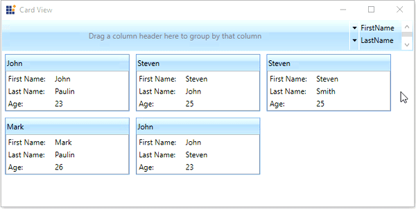
Here, CardViewItems grouped based on Age field.
NOTE
Sort the CardViewItems
You can sort the cards inside the CardView control either default, ascending or descending order by clicking the field names listed in the header. If you want to disable the sorting, use the CanSort property value as false.
<syncfusion:CardView CanSort="True"
                     ItemsSource="{Binding CardViewItems}"
Name="cardView"/>cardView.CanSort = true;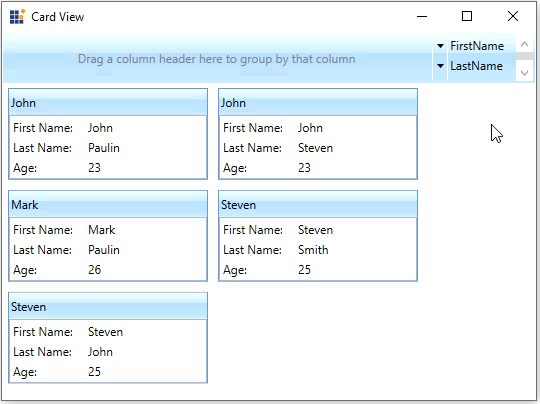
Here, CardViewItems sorted based on FirstName field.
NOTE
Edit the CardViewItems
You can edit the selected CardViewItem value by double-clicking on that item or by pressing the F2 key. To get out from the editing mode, you need to press the Esc or Enter key. You can enable the editing mode of card items by setting the CanEdit property value as true
NOTE
To perform an edit operation on selected
CardViewItem, you need to define theCardViewItemedit mode UI with editable functionalities by using EditItemTemplate.
<syncfusion:CardView CanEdit="True"
                     ItemsSource="{Binding CardViewItems}"
					 Name="cardView">
    <syncfusion:CardView.EditItemTemplate>
        <DataTemplate>
            <ListBox ScrollViewer.HorizontalScrollBarVisibility="Disabled">
                <ListBoxItem Padding="1">
                    <Grid>
                        <Grid.ColumnDefinitions>
                            <ColumnDefinition Width="75" />
                            <ColumnDefinition />
                        </Grid.ColumnDefinitions>
                        <TextBlock Text="First Name:" />
                        <TextBox
                            Grid.Column="1"
                            Text="{Binding FirstName,
                                   UpdateSourceTrigger=PropertyChanged}" />
                    </Grid>
                </ListBoxItem>
                <ListBoxItem Padding="1">
                    <Grid>
                        <Grid.ColumnDefinitions>
                            <ColumnDefinition Width="75" />
                            <ColumnDefinition Width="*" />
                        </Grid.ColumnDefinitions>
                        <TextBlock Text="Last Name:" />
                        <TextBox Grid.Column="1"
                                 Text="{Binding LastName,
                                        UpdateSourceTrigger=PropertyChanged}" />
                    </Grid>
                </ListBoxItem>
                <ListBoxItem Padding="1">
                    <Grid>
                        <Grid.ColumnDefinitions>
                            <ColumnDefinition Width="75" />
                            <ColumnDefinition Width="*" />
                        </Grid.ColumnDefinitions>
                        <TextBlock Text="Age:" />
                        <TextBox Grid.Column="1"
                                 Text="{Binding Age,
                                        UpdateSourceTrigger=PropertyChanged}" />
                    </Grid>
                </ListBoxItem>
            </ListBox>
        </DataTemplate>
    </syncfusion:CardView.EditItemTemplate>
</syncfusion:CardView>cardView.CanEdit = true;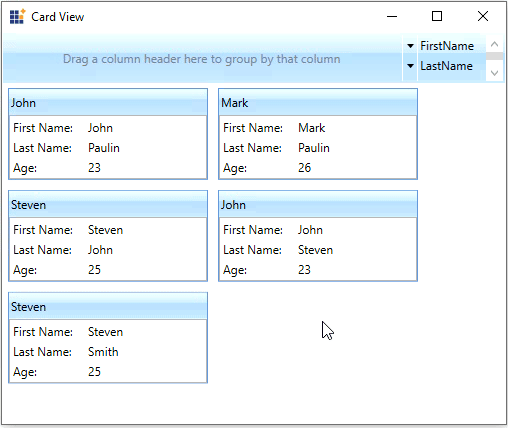
NOTE
Orientation of CardViewItems
You can arrange the cards either vertically or horizontally by using the Orientation property. The default value of Orientation property is Vertical.
NOTE
If there is no enough space to arrange the cards either vertically or horizontally that is assigned by
Orientationproperty, thenCardViewwill automatically arrange the cards at available position.
<syncfusion:CardView Orientation="Horizontal"
                     ItemsSource="{Binding CardViewItems}"
Name="cardView"/>cardView.Orientation = Orientation.Horizontal;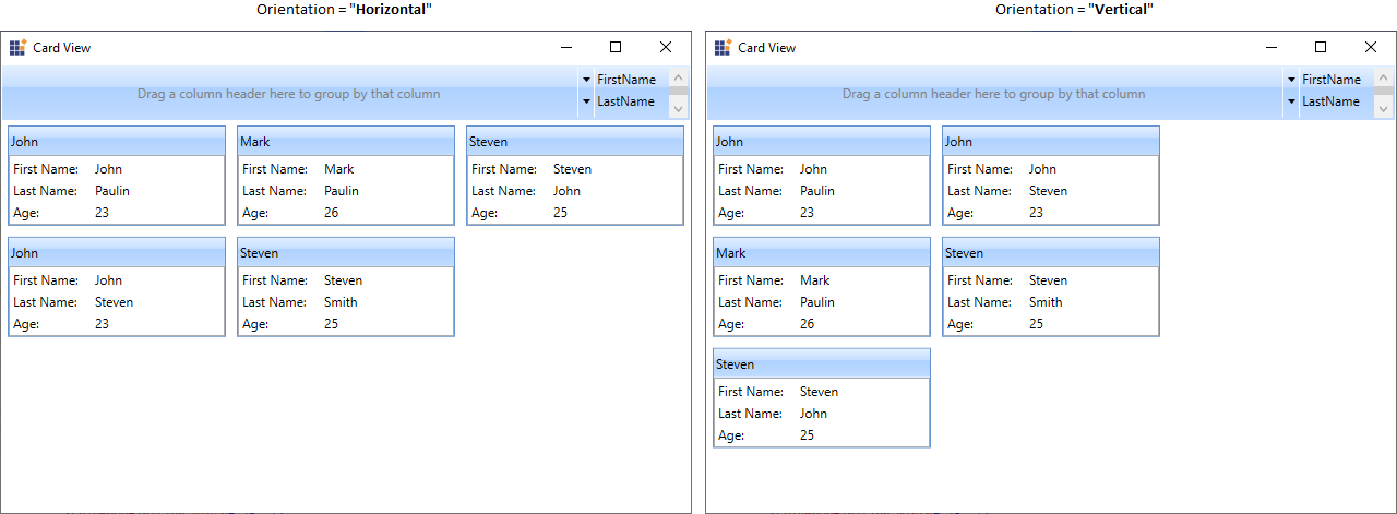
NOTE
Selected item changed notification
You will be notified when selected card item changed in CardView by using SelectedItemChanged event. The SelectedItemChanged event contains the old and newly selected card item in the OldValue and NewValue properties.
<syncfusion:CardView SelectedItemChanged="CardView_SelectedItemChanged"
                     ItemsSource="{Binding CardViewItems}"
Name="cardView"/>cardView.SelectedItemChanged += CardView_SelectedItemChanged;You can handle the event as follows:
private void CardView_SelectedItemChanged(DependencyObject d, DependencyPropertyChangedEventArgs e)
{
    var newItem = e.NewValue;
    var oldItem = e.OldValue;
}
Theme
CardView supports various built-in themes. Refer to the below links to apply themes for the CardView,
NOTE