How can I help you?
Dealing with Columns in UWP Picker (SfPicker)
10 May 202124 minutes to read
This section explains about the customization of SfPicker Columns
Adjust Column Width
SfPicker allows user to adjust the column width by hooking SfPicker.ColumnLoaded event and then check the column using ColumnLoadedEventArgs.Column property and then adjust width of column by setting ColumnLoadedEventArgs.Width property.
We have prepared below code snippets to demonstrated DateTimePicker sample using ColumnLoaded event.
MainPage
Column width of the each and every column can be adjusted by the use of ColumnLoaded event in SfPicker which is implemented in the below code.
<Page
    x:Class="ColumnDateTime.MainPage"
    xmlns="http://schemas.microsoft.com/winfx/2006/xaml/presentation"
    xmlns:x="http://schemas.microsoft.com/winfx/2006/xaml"
    xmlns:local="using:ColumnDateTime"
    xmlns:syncfusion="using:Syncfusion.UI.Xaml.Controls.Input"/>

      <Grid>

        <Button

            Click="Button_Click"

            Height="50"

            HorizontalAlignment="Center"

            Content="Show DateTimePicker"

            VerticalAlignment="Center"

            Width="200" />

        <local:CustomDateTime

            x:Name="date"

            ColumnHeaderHeight="40"

            HorizontalAlignment="Center"

            ColumnLoaded="date_ColumnLoaded"

            VerticalAlignment="Center"

            Height="500"

            PickerMode="Dialog"

            Width="500" SelectedItem="{Binding SelectedTime,Mode=TwoWay}"/>

      </Grid>

    </Page>
using Syncfusion.UI.Xaml.Controls.Input;
using Windows.UI.Xaml;
namespace ColumnDateTime
{
public sealed partial class MainPage : Page
{
public MainPage()
{
this.InitializeComponent();
DateTimePickerViewModel datetime picker view model = new DateTimePickerViewModel();
this.DataContext = datetime picker view model;
}
private void Button_Click(object sender, RoutedEventArgs e)
{
picker.IsOpen = !picker.IsOpen;
}
private void date_ColumnLoaded(object source, ColumnLoadedEventArgs args)
{
if (args.Column == 0)
args.Width = 150;
if (args.Column == 1)
args.Width = 100;
if (args.Column == 2)
args.Width = 120;
if (args.Column == 3)
args.Width = 80;
}
}
}We have attached sample for reference. Please download the below sample.
Sample link: ColumnDateTime
Add Caption
SfPicker allows user to add header for each column by setting SfPicker.ColumnHeaderText property and enabling SfPicker.ShowColumnHeader property to True.
ColumnHeaderText property is of object type and user can assign string or collection.
If a string type is assigned in SfPicker.ColumnHeaderText, that string will be updated in all the column of SfPicker.
To assign the collection in SfPicker.ColumnHeaderText, SfPicker column header update based on index with value on collection.
The below code illustrate assign the ColumnHeaderText for SfPicker
<Page xmlns="http://schemas.microsoft.com/winfx/2006/xaml/presentation"

    x:Class="DatePicker.MainPage"

    xmlns:local="using:DatePicker"

    xmlns:x="http://schemas.microsoft.com/winfx/2006/xaml"

    xmlns:input="using:Syncfusion.UI.Xaml.Controls.Input">

      <Grid>

        <Button Click="Button_Click" Height="50" VerticalAlignment="Center" HorizontalAlignment="Center" Content="Show Picker" Width="200" />

        <local:CustomDatePicker x:Name="date" ColumnHeaderHeight="40" HorizontalAlignment="Center" VerticalAlignment="Center"  PickerMode="Dialog" Height="400" Width="400"  SelectedItem="{Binding StartDate}"/>

      </Grid>

    </Page>
using Syncfusion.UI.Xaml.Controls.Input;
using Windows.UI.Xaml;
namespace DatePicker
{
public class CustomTimePicker:SfPicker
{
public ObservableCollection<object> Time { get; set; }
public ObservableCollection<object> Minute;
public ObservableCollection<object> Hour;
public ObservableCollection<object> Format;
public ObservableCollection<string> ColumnHeaders;
public CustomDatePicker()
{
Date = new ObservableCollection<object>();
ColumnHeaders = new ObservableCollection<string>();
ColumnHeaders.Add("Hour");
ColumnHeaders.Add("Minute");
ColumnHeaders.Add("Format");
PopulateDateCollection();
}
public void PopulateDateCollection()
{
//populate Days
for (int i = 1; i <= DateTime.DaysInMonth(DateTime.Now.Year, DateTime.Now.Month); i++)
{
if (i < 10)
Day.Add("0" + i);
else
Day.Add(i.ToString());
}
//populate Months
for (int i = 1; i < 13; i++)
{
if (!Months.ContainsKey(CultureInfo.CurrentCulture.DateTimeFormat.GetMonthName(i).Substring(0, 3)))
Months.Add(CultureInfo.CurrentCulture.DateTimeFormat.GetMonthName(i).Substring(0, 3), CultureInfo.CurrentCulture.DateTimeFormat.GetMonthName(i));
Month.Add(CultureInfo.CurrentCulture.DateTimeFormat.GetMonthName(i).Substring(0, 3));
}
//populate Years
for (int i = 1990; i <= 2050; i++)
Year.Add(i.ToString());
Date.Add(Month);
Date.Add(Day);
Date.Add(Year);
}
}
}Caption Customization
This section explains about the column header Background, TextColor and Fonts customization of SfPicker.
Background
Column header background color can be customized by setting SfPicker. ColumnHeaderBackground property of SfPicker.
<Page xmlns="http://schemas.microsoft.com/winfx/2006/xaml/presentation"

    x:Class="DatePicker.MainPage"

    xmlns:local="using:DatePicker"

    xmlns:x="http://schemas.microsoft.com/winfx/2006/xaml"

    xmlns:input="using:Syncfusion.UI.Xaml.Controls.Input">

      <Grid>

        <syncfusion:SfPicker x:Name="picker" ColumnHeaderBackground="Green" ColumnHeaderText="Color" ShowColumnHeader="True" />

      </Grid>

    </Page>
using Syncfusion.UI.Xaml.Controls.Input;
using Windows.UI.Xaml;
namespace DatePicker
{
public sealed partial class MainPage : Page
{
public MainPage()
{
this.InitializeComponent();
SfPicker picker = new SfPicker();
picker.ColumnHeaderBackground = new SolidColorBrush(Windows.UI.Colors.Green);
this.DataContext = picker;
}
}
}Text Color
Column header text color can be customized by setting SfPicker.ColumnHeaderForeground property of SfPicker.
<Page xmlns="http://schemas.microsoft.com/winfx/2006/xaml/presentation"

    x:Class="DatePicker.MainPage"

    xmlns:local="using:DatePicker"

    xmlns:x="http://schemas.microsoft.com/winfx/2006/xaml"

    xmlns:input="using:Syncfusion.UI.Xaml.Controls.Input">

      <Grid>

        <syncfusion:SfPicker x:Name="picker" ColumnHeaderForeground="Red" ColumnHeaderText="Color" ShowColumnHeader="True" />

      </Grid>

    </Page>
using Syncfusion.UI.Xaml.Controls.Input;
using Windows.UI.Xaml;
namespace DatePicker
{
public sealed partial class MainPage : Page
{
public MainPage()
{
this.InitializeComponent();
SfPicker picker = new SfPicker();
picker.ColumnHeaderForeground = new SolidColorBrush(Windows.UI.Colors.Red);
this.DataContext = picker;
}
}
}Font
This section explains about the customization of Column Header text of Font.
FontFamily
Column Header text FontFamily can be customized by setting SfPicker.ColumnHeaderFontFamily property of SfPicker.
<Page xmlns="http://schemas.microsoft.com/winfx/2006/xaml/presentation"

    x:Class="DatePicker.MainPage"

    xmlns:local="using:DatePicker"

    xmlns:x="http://schemas.microsoft.com/winfx/2006/xaml"

    xmlns:input="using:Syncfusion.UI.Xaml.Controls.Input">

      <Grid>

        <syncfusion:SfPicker x:Name="picker" ColumnHeaderFontFamily="Ariel" ColumnHeaderText="Color" ShowColumnHeader="True" />

      </Grid>

    </Page>
using Syncfusion.UI.Xaml.Controls.Input;
using Windows.UI.Xaml;
namespace DatePicker
{
public sealed partial class MainPage : Page
{
public MainPage()
{
this.InitializeComponent();
SfPicker picker = new SfPicker();
picker.ColumnHeaderFontFamily = new FontFamily("Ariel");
this.DataContext = picker;
}
}
}FontSize
Column header text FontSize can be customized by setting SfPicker.ColumnHeaderFontSize property of SfPicker.
<Page xmlns="http://schemas.microsoft.com/winfx/2006/xaml/presentation"

    x:Class="DatePicker.MainPage"

    xmlns:local="using:DatePicker"

    xmlns:x="http://schemas.microsoft.com/winfx/2006/xaml"

    xmlns:input="using:Syncfusion.UI.Xaml.Controls.Input">

      <Grid>

        <syncfusion:SfPicker x:Name="picker" ColumnHeaderFontSize="20" ColumnHeaderText="Color" ShowColumnHeader="True" />

      </Grid>

    </Page>
using Syncfusion.UI.Xaml.Controls.Input;
using Windows.UI.Xaml;
namespace DatePicker
{
public sealed partial class MainPage : Page
{
public MainPage()
{
this.InitializeComponent();
SfPicker picker = new SfPicker();
picker.ColumnHeaderFontSize = 20;
this.DataContext = picker;
}
}
}FontAttribute
Column header text FontAttribute can be customized by setting SfPicker.ColumnHeaderFontStyle property of SfPicker.
<Page xmlns="http://schemas.microsoft.com/winfx/2006/xaml/presentation"

    x:Class="DatePicker.MainPage"

    xmlns:local="using:DatePicker"

    xmlns:x="http://schemas.microsoft.com/winfx/2006/xaml"

    xmlns:input="using:Syncfusion.UI.Xaml.Controls.Input">

      <Grid>

        <syncfusion:SfPicker x:Name="picker" ColumnHeaderFontStyle="Italic" ColumnHeaderText="Color" ShowColumnHeader="True" />

      </Grid>

    </Page>
using Syncfusion.UI.Xaml.Controls.Input;
using Windows.UI.Xaml;
namespace DatePicker
{
public sealed partial class MainPage : Page
{
public MainPage()
{
this.InitializeComponent();
SfPicker picker = new SfPicker();
picker.ColumnHeaderFontStyle = Windows.UI.Text.FontStyle.Italic;
this.DataContext = picker;
}
}
}Cascading
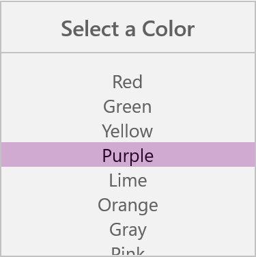
SfPicker allow user to get selection change intimation by setting SfPicker.SelectionChanged event
We have prepared cascading sample for change the SfPicker background color when change the Selection of SfPicker
<Page xmlns="http://schemas.microsoft.com/winfx/2006/xaml/presentation"

    x:Class="DatePicker.MainPage"

    xmlns:local="using:DatePicker"

    xmlns:x="http://schemas.microsoft.com/winfx/2006/xaml"

    xmlns:input="using:Syncfusion.UI.Xaml.Controls.Input">

      <Grid>

        <Button Click="Button_Click" Height="40" Content="Open Picker" Width="200"  HorizontalAlignment="Center" VerticalAlignment="Center" />

        <input:SfPicker

            x:Name="picker"

            Header="Select a Color"

            HorizontalAlignment="Center"

            Height="400"

            PickerMode="Dialog"

            SelectionChanged="picker_SelectionChanged"

            Width="400"

            ItemsSource="{Binding Colors}"

            VerticalAlignment="Center"/>

      </Grid>

</Page>*MainPage*
using Syncfusion.UI.Xaml.Controls.Input;
using Windows.UI.Xaml;
namespace DatePicker
{
public sealed partial class MainPage : Page
{
public MainPage()
{
this.InitializeComponent();
ColorInfo color info = new ColorInfo();
this.DataContext = color info;
}
private void Button_Click(object sender, RoutedEventArgs e)
{
picker.IsOpen = true;
}
private void picker_SelectionChanged(object sender, SelectionChangedEventArgs e)
{
if (e.AddedItems[0] != null)
{
var color = PickerHelper.GetColor(e.AddedItems[0].ToString());
picker.SelectionBackground = new SolidColorBrush(color);
}
}
public class ColorInfo
{
private ObservableCollection<string> _color;
public ObservableCollection<string> Colors
{
get { return _color; }
set { _color = value; }
}
public ColorInfo()
{
Colors = new ObservableCollection<string>();
Colors.Add("Red");
Colors.Add("Green");
Colors.Add("Yellow");
Colors.Add("Purple");
Colors.Add("Lime");
Colors.Add("Orange");
Colors.Add("Gray");
Colors.Add("Pink");
}
}
public static class PickerHelper
{
static Dictionary<string, Color> colors = new Dictionary<string, Color>();
public static Color GetColor(string color)
{
colors.Clear();
colors.Add("Yellow", Colors.Yellow);
colors.Add("Green", Colors.Green);
colors.Add("Orange", Colors.Orange);
colors.Add("Lime", Colors.Lime);
colors.Add("Purple", Colors.Purple);
colors.Add("Pink", Colors.Pink);
colors.Add("Red", Colors.Red);
colors.Add("Gray", Colors.Gray);
return colors[color];
}
}
}Screen shot for the above code
We have attached sample for reference. please download the sample from the below link.
Sample link:CascadingColor