How can I help you?
Getting Started with Blazor DataGrid in Web App
18 Nov 201819 minutes to read
This section briefly explains about how to include Syncfusion® Blazor DataGrid in your Blazor Web App using Visual Studio, Visual Studio Code, and the .NET CLI.
Ready to streamline your Syncfusion® Blazor development?
Discover the full potential of Syncfusion® Blazor components with Syncfusion® AI Coding Assistants. Effortlessly integrate, configure, and enhance your projects with intelligent, context-aware code suggestions, streamlined setups, and real-time insights—all seamlessly integrated into your preferred AI-powered IDEs like VS Code, Cursor, Syncfusion® CodeStudio and more. Explore Syncfusion® AI Coding Assistants
Prerequisites
Create a new Blazor Web App in Visual Studio
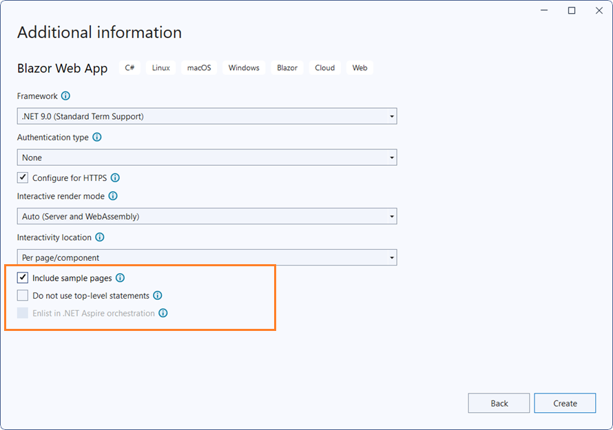
You can create a Blazor Web App using Visual Studio 2022 via Microsoft Templates or the Syncfusion® Blazor Extension. For detailed instructions, refer to this Blazor Web App Getting Started documentation.
Configure the appropriate Interactive render mode and Interactivity location while creating a Blazor Web App.

Install Blazor DataGrid and Themes NuGet in the Blazor Web App
To add the Syncfusion® Blazor DataGrid in the app, open the NuGet package manager in Visual Studio (Tools → NuGet Package Manager → Manage NuGet Packages for Solution), then search and install Syncfusion.Blazor.Grid and Syncfusion.Blazor.Themes.
If using the WebAssembly or Auto render modes in the Blazor Web App, install Syncfusion® Blazor component NuGet packages in the client project.
Alternatively, you can utilize the following package manager command to achieve the same.
Install-Package Syncfusion.Blazor.Grid -Version 33.1.44
Install-Package Syncfusion.Blazor.Themes -Version 33.1.44
NOTE
Syncfusion® Blazor components are available in nuget.org. Refer to the NuGet packages topic for the available NuGet packages list with component details.
Prerequisites
Create a new Blazor Web App in Visual Studio Code
You can create a Blazor Web App using Visual Studio Code via Microsoft Templates or the Syncfusion® Blazor Extension. For detailed instructions, refer to this Blazor Web App Getting Started documentation.
Configure the appropriate interactive render mode and interactivity location when setting up a Blazor Web App. For detailed information, refer to the interactive render mode documentation.
For example, in a Blazor Web App with the Auto interactive render mode, use the following commands.
dotnet new blazor -o BlazorWebApp -int Auto
cd BlazorWebApp
cd BlazorWebApp.Client
Install Blazor DataGrid and Themes NuGet in the app
If using the WebAssembly or Auto render modes in the Blazor Web App, install Syncfusion® Blazor component NuGet packages in the client project.
- Press Ctrl+` to open the integrated terminal in Visual Studio code.
- Ensure you’re in the project root directory where your
.csprojfile is located. - Run the following command to install a Syncfusion.Blazor.Grid and Syncfusion.Blazor.Themes NuGet package and ensure all dependencies are installed.
dotnet add package Syncfusion.Blazor.Grid -v 33.1.44
dotnet add package Syncfusion.Blazor.Themes -v 33.1.44
dotnet restore
NOTE
Syncfusion® Blazor components are available in nuget.org. Refer to the NuGet packages topic for the available NuGet packages list with component details.
Prerequisites
Latest version of the .NET SDK. If you previously installed the SDK, you can determine the installed version by executing the following command in a command prompt (Windows) or terminal (macOS) or command shell (Linux).
dotnet --versionCreate a Blazor Web App using .NET CLI
Run the following command to create a new Blazor Web App in a command prompt (Windows) or terminal (macOS) or command shell (Linux). For detailed instructions, refer to this Blazor Web App Getting Started documentation.
Configure the appropriate interactive render mode and interactivity location when setting up a Blazor Web Application. For detailed information, refer to the interactive render mode documentation.
For example, in a Blazor Web App with Auto interactive render mode, use the following commands:
dotnet new blazor -o BlazorApp -int Auto
cd BlazorApp
cd BlazorApp.Client
This command creates a new Blazor Web App and places it in a new directory called BlazorApp inside your current location. See the Create a Blazor App and dotnet new CLI command topics for more details.
Install Syncfusion® Blazor Grid and Themes NuGet in the App
Here’s an example of how to add Blazor DataGrid component in the application using the following command in the command prompt (Windows) or terminal (Linux and macOS) to install a Syncfusion.Blazor.Grid and Syncfusion.Blazor.Themes NuGet package. See Install and manage packages using the dotnet CLI topics for more details.
If using the WebAssembly or Auto render modes in the Blazor Web App, install Syncfusion® Blazor component NuGet packages in the client project.
dotnet add package Syncfusion.Blazor.Grid --version 33.1.44
dotnet add package Syncfusion.Blazor.Themes --version 33.1.44
dotnet restore
NOTE
Syncfusion® Blazor components are available in nuget.org. Refer to the NuGet packages topic for the available NuGet packages list with component details.
Add Import Namespaces
Open the ~/_Imports.razor file in the client project and import the Syncfusion.Blazor and Syncfusion.Blazor.Grids namespaces.
@using Syncfusion.Blazor
@using Syncfusion.Blazor.Grids
Register Syncfusion® Blazor service
Register the Syncfusion® Blazor service in the ~/Program.cs file of your Blazor Web App.
If the Interactive Render Mode is set to WebAssembly or Auto, register the Syncfusion® Blazor service in the ~/Program.cs files of the main server project and associated .Client project.
...
...
using Syncfusion.Blazor;

var builder = WebApplication.CreateBuilder(args);

// Add services to the container.
builder.Services.AddRazorComponents()
    .AddInteractiveServerComponents()
    .AddInteractiveWebAssemblyComponents();
builder.Services.AddSyncfusionBlazor();

var app = builder.Build();
....
...
using Syncfusion.Blazor;
var builder = WebAssemblyHostBuilder.CreateDefault(args);
builder.Services.AddSyncfusionBlazor();
await builder.Build().RunAsync();Add stylesheet and script resources
The theme stylesheet and script can be accessed from NuGet through Static Web Assets. Include the stylesheet reference in the <head> section and the script reference at the end of the <body> in the ~/Components/App.razor file as shown below:
<head>
    ....
    <link href="_content/Syncfusion.Blazor.Themes/bootstrap5.css" rel="stylesheet" />
</head>
....
<body>
    ....
    <script src="_content/Syncfusion.Blazor.Core/scripts/syncfusion-blazor.min.js" type="text/javascript"></script>

    //Blazor DataGrid Component script reference.
    <!-- <script src="_content/Syncfusion.Blazor.Grid/scripts/sf-grid.min.js" type="text/javascript"></script> -->
</body>
NOTE
Check out the Blazor Themes topic to discover various methods (Static Web Assets, CDN, and CRG) for referencing themes in your Blazor application. Also, check out the Adding Script Reference topic to learn different approaches for adding script references in your Blazor application.
Add Blazor DataGrid
Add the Syncfusion® Blazor Grid component to a Razor page located under the Pages folder (e.g., Pages/Home.razor) in either the Server or Client project. If an interactivity location as Per page/component in the web app, define a render mode at top of the component, as follows:
| Interactivity location | RenderMode | Code |
|---|---|---|
| Per page/component | Auto | @rendermode InteractiveAuto |
| WebAssembly | @rendermode InteractiveWebAssembly | |
| None | — |
NOTE
If an Interactivity Location is set to
Globaland the Render Mode is set toAutoorWebAssembly, the render mode is configured in theApp.razorfile by default.
@* desired render mode define here *@
@rendermode InteractiveAuto<SfGrid DataSource="@Orders" />
@code{
public List<Order> Orders { get; set; }
protected override void OnInitialized()
{
Orders = Enumerable.Range(1, 5).Select(x => new Order()
{
OrderID = 0 + x,
CustomerID = (new string[] { "ALFKI", "ANANTR", "ANTON", "BLONP", "BOLID" })[new Random().Next(5)],
}).ToList();
}
public class Order
{
public int? OrderID { get; set; }
public string CustomerID { get; set; }
}
}
- Press Ctrl+F5 (Windows) or ⌘+F5 (macOS) to launch the application. This will render the Syncfusion® Blazor Grid component in the default web browser.
Defining row data
To bind data for the Grid, you can assign a IEnumerable object to the DataSource property. The list data source can also be provided as an instance of the DataManager. You can assign the data source through the OnInitialized life cycle of the page.
<SfGrid DataSource="@Orders" />

@code{
    public List<Order> Orders { get; set; }

    protected override void OnInitialized()
    {
        Orders = Enumerable.Range(1, 75).Select(x => new Order()
        {
            OrderID = 1000 + x,
            CustomerID = (new string[] { "ALFKI", "ANANTR", "ANTON", "BLONP", "BOLID" })[new Random().Next(5)],
            Freight = 2.1 * x,
            OrderDate = DateTime.Now.AddDays(-x),
        }).ToList();
    }

    public class Order {
        public int? OrderID { get; set; }
        public string CustomerID { get; set; }
        public DateTime? OrderDate { get; set; }
        public double? Freight { get; set; }
    }
}
Defining columns
The columns are automatically generated when columns declaration is empty or undefined while initializing the Grid.
The Grid has an option to define columns using GridColumns component. To customize column properties, use GridColumns.
Let’s check the properties used here:
- Field is added to map with a property name in IEnumerable object.
- HeaderText is added to change the title of columns.
- TextAlign is used to change the alignment of columns. By default, columns will be left aligned. To change columns to right align, define TextAlign as Right.
- Also, you have used another useful property, Format. Using this, you can format number and date values to standard or custom formats.
<SfGrid DataSource="@Orders">
    <GridColumns>
        <GridColumn Field=@nameof(Order.OrderID) HeaderText="Order ID" TextAlign="TextAlign.Right" Width="120"></GridColumn>
        <GridColumn Field=@nameof(Order.CustomerID) HeaderText="Customer Name" Width="150"></GridColumn>
        <GridColumn Field=@nameof(Order.OrderDate) HeaderText=" Order Date" Format="d" Type="ColumnType.Date" TextAlign="TextAlign.Right" Width="130"></GridColumn>
        <GridColumn Field=@nameof(Order.Freight) HeaderText="Freight" Format="C2" TextAlign="TextAlign.Right" Width="120"></GridColumn>
    </GridColumns>
</SfGrid>
Enable paging
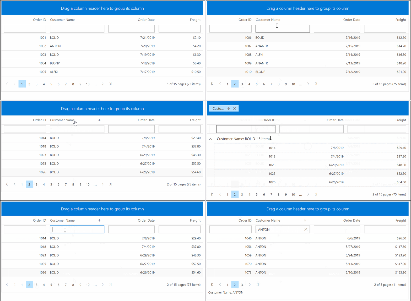
The paging feature enables users to view the Syncfusion® Blazor DataGrid record in a paged view. It can be enabled by setting the AllowPaging property to true. Pager can be customized using the GridPageSettings.
<SfGrid DataSource="@Orders" AllowPaging="true">
 <GridPageSettings PageSize="5"></GridPageSettings>
   <GridColumns>
     <GridColumn Field=@nameof(Order.OrderID) HeaderText="Order ID" TextAlign="TextAlign.Right" Width="120"></GridColumn>
     <GridColumn Field=@nameof(Order.CustomerID) HeaderText="Customer Name" Width="150"></GridColumn>
     <GridColumn Field=@nameof(Order.OrderDate) HeaderText=" Order Date" Format="d" Type="ColumnType.Date" TextAlign="TextAlign.Right" Width="130"></GridColumn>
     <GridColumn Field=@nameof(Order.Freight) HeaderText="Freight" Format="C2" TextAlign="TextAlign.Right" Width="120"></GridColumn>
   </GridColumns>
</SfGrid>
Enable sorting
The sorting feature enables you to order the records. It can be enabled by setting the AllowSorting property as true. Sorting feature can be customized using the GridSortSettings.
<SfGrid DataSource="@Orders" AllowPaging="true" AllowSorting="true">
 <GridPageSettings PageSize="5"></GridPageSettings>
   <GridColumns>
     <GridColumn Field=@nameof(Order.OrderID) HeaderText="Order ID" TextAlign="TextAlign.Right" Width="120"></GridColumn>
     <GridColumn Field=@nameof(Order.CustomerID) HeaderText="Customer Name" Width="150"></GridColumn>
     <GridColumn Field=@nameof(Order.OrderDate) HeaderText=" Order Date" Format="d" Type="ColumnType.Date" TextAlign="TextAlign.Right" Width="130"></GridColumn>
     <GridColumn Field=@nameof(Order.Freight) HeaderText="Freight" Format="C2" TextAlign="TextAlign.Right" Width="120"></GridColumn>
   </GridColumns>
</SfGrid>
Enable filtering
The filtering feature enables you to view reduced amount of records based on filter criteria. It can be enabled by setting the AllowFiltering property as true. Filtering feature can be customized using the GridFilterSettings.
<SfGrid DataSource="@Orders" AllowPaging="true" AllowSorting="true" AllowFiltering="true">
 <GridPageSettings PageSize="5"></GridPageSettings>
   <GridColumns>
     <GridColumn Field=@nameof(Order.OrderID) HeaderText="Order ID" TextAlign="TextAlign.Right" Width="120"></GridColumn>
     <GridColumn Field=@nameof(Order.CustomerID) HeaderText="Customer Name" Width="150"></GridColumn>
     <GridColumn Field=@nameof(Order.OrderDate) HeaderText=" Order Date" Format="d" Type="ColumnType.Date" TextAlign="TextAlign.Right" Width="130"></GridColumn>
     <GridColumn Field=@nameof(Order.Freight) HeaderText="Freight" Format="C2" TextAlign="TextAlign.Right" Width="120"></GridColumn>
   </GridColumns>
</SfGrid>
Enable grouping
The grouping feature enables you to view the Syncfusion® Blazor DataGrid record in a grouped view. It can be enabled by setting the AllowGrouping property as true. Grouping feature can be customized using the GridGroupSettings.
<SfGrid DataSource="@Orders" AllowPaging="true" AllowSorting="true" AllowFiltering="true" AllowGrouping="true">
 <GridPageSettings PageSize="5"></GridPageSettings>
   <GridColumns>
     <GridColumn Field=@nameof(Order.OrderID) HeaderText="Order ID" TextAlign="TextAlign.Right" Width="120"></GridColumn>
     <GridColumn Field=@nameof(Order.CustomerID) HeaderText="Customer Name" Width="150"></GridColumn>
     <GridColumn Field=@nameof(Order.OrderDate) HeaderText=" Order Date" Format="d" Type="ColumnType.Date" TextAlign="TextAlign.Right" Width="130"></GridColumn>
     <GridColumn Field=@nameof(Order.Freight) HeaderText="Freight" Format="C2" TextAlign="TextAlign.Right" Width="120"></GridColumn>
   </GridColumns>
</SfGrid>
Handling exceptions
Exceptions occurred during Syncfusion® Blazor DataGrid actions can be handled without stopping application. These error messages or exception details can be acquired using the OnActionFailure event.
- TValue - Specifies the row data type of the grid (for example, Order). It enables strong typing for templates and event args and ensures proper binding/formatting.
-
GridEvents - When you use GridEvents, set the same TValue on both SfGrid and GridEvents so the event argument types (like FailureEventArgs, RowSelectEventArgs
) are correctly bound.
The argument passed to the OnActionFailure event contains the error details returned from the server.
NOTE
Recommend you to bind
OnActionFailureevent during your application development phase, this helps you to find any exceptions. You can pass these exception details to our support team to get solution as early as possible.
The following sample code demonstrates notifying user when server-side exception has occurred during data operation,
@using Syncfusion.Blazor.Data

<span class="error">@ErrorDetails</span>
<SfGrid TValue="Order" AllowPaging="true">
    <GridEvents TValue="Order" OnActionFailure="@ActionFailure"></GridEvents>
    <GridPageSettings PageSize="10"></GridPageSettings>
    <SfDataManager Url="https://some.com/invalidUrl" Adaptor="Adaptors.WebApiAdaptor"></SfDataManager>
    <GridColumns>
        <GridColumn Field=@nameof(Order.OrderID) HeaderText="Order ID" IsPrimaryKey="true" TextAlign="TextAlign.Right" Width="120"></GridColumn>
        <GridColumn Field=@nameof(Order.CustomerID) HeaderText="Customer Name" Width="150"></GridColumn>
        <GridColumn Field=@nameof(Order.OrderDate) HeaderText=" Order Date" Format="d" Type="ColumnType.Date" TextAlign="TextAlign.Right" Width="130"></GridColumn>
        <GridColumn Field=@nameof(Order.Freight) HeaderText="Freight" Format="C2" TextAlign="TextAlign.Right" Width="120"></GridColumn>
    </GridColumns>
</SfGrid>

<style>
    .error {
        color: red;
    }
</style>

@code{
    public string ErrorDetails = "";
    public class Order
    {
        public int? OrderID { get; set; }
        public string CustomerID { get; set; }
        public DateTime? OrderDate { get; set; }
        public double? Freight { get; set; }
    }

    public void ActionFailure(FailureEventArgs args)
    {
        this.ErrorDetails = "Server exception: 404 Not found";
        StateHasChanged();
    }
}
NOTE