How can I help you?
Getting Started with Blazor DataGrid in WASM App
18 Nov 201817 minutes to read
This section briefly explains about how to include Syncfusion® Blazor DataGrid in a Blazor webAssembly app using Visual Studio, Visual Studio Code, and the .NET CLI.
Ready to streamline your Syncfusion® Blazor development?
Discover the full potential of Syncfusion® Blazor components with Syncfusion® AI Coding Assistants. Effortlessly integrate, configure, and enhance your projects with intelligent, context-aware code suggestions, streamlined setups, and real-time insights—all seamlessly integrated into your preferred AI-powered IDEs like VS Code, Cursor, Syncfusion® CodeStudio and more. Explore Syncfusion® AI Coding Assistants
Prerequisites
Create a new Blazor app in Visual Studio 2022
A Blazor WebAssembly App can be created using Visual Studio 2022 with the built-in Microsoft templates or the Syncfusion® Blazor Extension.
- Open Visual Studio 2022 (v17.8 or later).
- Select Create a new project.
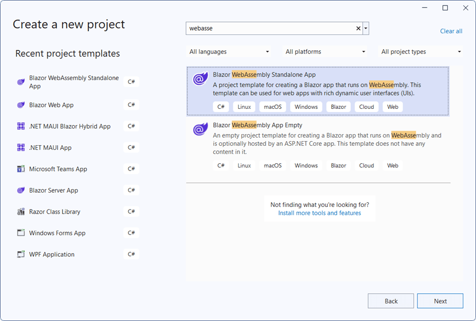
- Choose Blazor WebAssembly Standalone App from the list of templates and click Next.
- Configure the project name, location, and solution settings, then click Next.
- Select the target framework as .NET 8.0 or later (choose the latest installed version available on the system).
- Click Create to generate the project.

NOTE
For detailed steps, refer to Microsoft Blazor tooling documentation.
Install Syncfusion® Blazor DataGrid and Themes in Visual Studio
To integrate the Blazor DataGrid component, install the required NuGet packages in the Blazor WebAssembly project:
-
Open NuGet Package Manager in Visual Studio:
Tools → NuGet Package Manager → Manage NuGet Packages for Solution.
-
Search and install the following packages:
-
Alternatively, use the Package Manager Console:
Install-Package Syncfusion.Blazor.Grid -Version 32.1.19
Install-Package Syncfusion.Blazor.Themes -Version 32.1.19
NOTE
Syncfusion® Blazor components are available on nuget.org. For a complete list of packages, refer to NuGet packages.
Prerequisites
Create a Blazor WebAssembly application in Visual Studio Code
A Blazor WebAssembly App can be created using Visual Studio Code with the built-in Microsoft templates or the Syncfusion® Blazor Extension.
- Open Visual Studio Code.
- Press Ctrl + ` to open the integrated terminal.
- Navigate to the desired directory where the project should be created.
- Run the following command to create a new Blazor WebAssembly project
dotnet new blazorwasm -o BlazorApp
cd BlazorApp
Install Syncfusion® Blazor DataGrid and Themes in Visual Studio Code
To integrate the Blazor DataGrid component, install the required Syncfusion® NuGet packages using the integrated terminal:
- Press Ctrl + ` to open the integrated terminal in Visual Studio Code.
- Navigate to the directory containing the .csproj file.
- Run the following commands to install the packages:
dotnet add package Syncfusion.Blazor.Grid -v 32.1.19
dotnet add package Syncfusion.Blazor.Themes -v 32.1.19
dotnet restore
NOTE
Syncfusion® Blazor components are available on nuget.org. For a complete list of packages, refer to NuGet packages.
Prerequisites
Install the latest version of .NET SDK. If the .NET SDK is already installed, determine the installed version by running the following command in a command prompt (Windows), terminal (macOS), or command shell (Linux).
dotnet --versionCreate a Blazor WebAssembly App using .NET CLI
- Open a command prompt, terminal, or shell.
- Navigate to the directory where the project should be created.
- Run the following command to create a new Blazor WebAssembly App:
dotnet new blazorwasm -o BlazorApp
cd BlazorApp- This command creates a new Blazor WebAssembly App in a directory named BlazorApp inside the current location.
For additional details, refer to:
Install Syncfusion® Blazor DataGrid and Themes using .NET CLI
To integrate the Blazor DataGrid component in a Blazor WebAssembly App using the .NET CLI:
- Open a command prompt, terminal, or shell.
- Navigate to the directory containing the .csproj file.
-
Run the following commands to install the required NuGet packages:
dotnet add package Syncfusion.Blazor.Grid -Version 32.1.19
dotnet add package Syncfusion.Blazor.Themes -Version 32.1.19
dotnet restore
NOTE
For more details, refer to:
- Install and manage packages using the dotnet CLI
- Syncfusion® Blazor components are available on nuget.org. For a complete list of packages, refer to NuGet packages.
Add Import Namespaces
- Open the _Imports.razor file in the project root.
- Add the following namespace directives:
@using Syncfusion.Blazor
@using Syncfusion.Blazor.Grids
Register Syncfusion® Blazor service
Open the ~/Program.cs file and register the Syncfusion® Blazor service by adding the following code:
using Microsoft.AspNetCore.Components.Web;
using Microsoft.AspNetCore.Components.WebAssembly.Hosting;
using Syncfusion.Blazor;

var builder = WebAssemblyHostBuilder.CreateDefault(args);
builder.RootComponents.Add("#app");
builder.RootComponents.Add("head::after");

builder.Services.AddScoped(sp => new HttpClient
{
    BaseAddress = new Uri(builder.HostEnvironment.BaseAddress)
});

builder.Services.AddSyncfusionBlazor();
await builder.Build().RunAsync();
Add stylesheet and script resources
The theme stylesheet and script files are provided through Static Web Assets in the NuGet packages. Include these references in the <head> section of the ~/wwwroot/index.html file:
<head>
    ....
    <link href="_content/Syncfusion.Blazor.Themes/bootstrap5.css" rel="stylesheet" />
    <script src="_content/Syncfusion.Blazor.Core/scripts/syncfusion-blazor.min.js" type="text/javascript"></script>
</head>
NOTE
- Refer to Blazor Themes for various methods to reference themes in a Blazor application:
>* [Static Web Assets](https://blazor.syncfusion.com/documentation/appearance/themes#static-web-assets)
>* [CDN](https://blazor.syncfusion.com/documentation/appearance/themes#cdn-reference)
>* [Custom Resource Generator (CRG)](https://blazor.syncfusion.com/documentation/common/custom-resource-generator)
- For script reference options, see Adding Script References.
Add Blazor DataGrid component
Add the Syncfusion® Blazor DataGrid component in the ~/Pages/Home.razor file.
<SfGrid></SfGrid>- The component will render as an empty grid until data is bound.
Defining row data
The DataGrid requires a data source to display records. A collection implementing **IEnumerable
Data binding is typically performed in the OnInitialized lifecycle method of the component.
<SfGrid DataSource="@Orders">
</SfGrid>

@code {
    public List<Order> Orders { get; set; }

    protected override void OnInitialized()
    {
        Orders = Enumerable.Range(1, 75).Select(x => new Order()
        {
            OrderID = 1000 + x,
            CustomerID = (new[] { "ALFKI", "ANANTR", "ANTON", "BLONP", "BOLID" })[new Random().Next(5)],
            Freight = 2.1 * x,
            OrderDate = DateTime.Now.AddDays(-x)
        }).ToList();
    }

    public class Order
    {
        public int? OrderID { get; set; }
        public string CustomerID { get; set; }
        public DateTime? OrderDate { get; set; }
        public double? Freight { get; set; }
    }
}- Press Ctrl+F5 (Windows) or ⌘+F5 (macOS) to run the application. The DataGrid will render and display the collection.
Defining columns
The DataGrid automatically generates columns when no explicit column definitions are provided. For greater control over column behavior and appearance, use the GridColumns component along with individual GridColumn elements to define columns explicitly.
Common Column Properties
- Field: Maps the column to a property in the bound collection.
- HeaderText: Specifies the column header title.
- TextAlign: Aligns text within the column. Default alignment is Left; set to Right for numeric values.
- Format: Applies standard or custom formatting for numeric and date values.
- Type: Defines the column type, such as ColumnType.Date for date fields.
- Width: Sets the column width in pixels or percentage to control layout consistency.
<SfGrid DataSource="@Orders">
    <GridColumns>
        <GridColumn Field=@nameof(Order.OrderID) HeaderText="Order ID" TextAlign="TextAlign.Right" Width="120"></GridColumn>
        <GridColumn Field=@nameof(Order.CustomerID) HeaderText="Customer Name" Width="150"></GridColumn>
        <GridColumn Field=@nameof(Order.OrderDate) HeaderText="Order Date" Format="d" Type="ColumnType.Date" TextAlign="TextAlign.Right" Width="130"></GridColumn>
        <GridColumn Field=@nameof(Order.Freight) HeaderText="Freight" Format="C2" TextAlign="TextAlign.Right" Width="120"></GridColumn>
    </GridColumns>
</SfGrid>
Enable paging
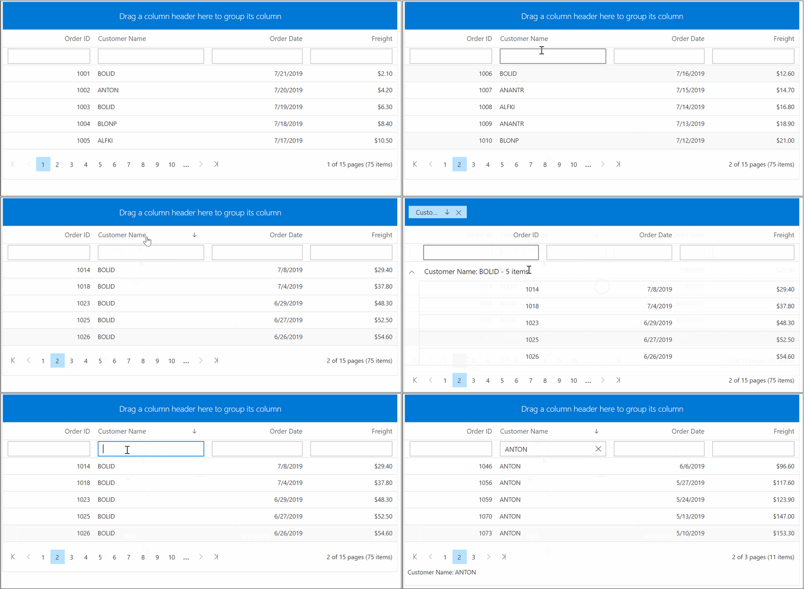
Paging allows the DataGrid to display records in a paged view, improving performance and readability for large datasets. Enable paging by setting the AllowPaging property to true. Paging behavior can be customized using the GridPageSettings component.
<SfGrid DataSource="@Orders" AllowPaging="true">
    <GridPageSettings PageSize="5"></GridPageSettings>
    <GridColumns>
        <GridColumn Field=@nameof(Order.OrderID) HeaderText="Order ID" TextAlign="TextAlign.Right" Width="120"></GridColumn>
        <GridColumn Field=@nameof(Order.CustomerID) HeaderText="Customer Name" Width="150"></GridColumn>
        <GridColumn Field=@nameof(Order.OrderDate) HeaderText="Order Date" Format="d" Type="ColumnType.Date" TextAlign="TextAlign.Right" Width="130"></GridColumn>
        <GridColumn Field=@nameof(Order.Freight) HeaderText="Freight" Format="C2" TextAlign="TextAlign.Right" Width="120"></GridColumn>
    </GridColumns>
</SfGrid>
Enable sorting
Sorting allows the DataGrid to arrange records based on column values. Enable this feature by setting the AllowSorting property to true. Sorting behavior can be customized using the GridSortSettings component.
<SfGrid DataSource="@Orders" AllowPaging="true" AllowSorting="true">
 <GridPageSettings PageSize="5"></GridPageSettings>
   <GridColumns>
     <GridColumn Field=@nameof(Order.OrderID) HeaderText="Order ID" TextAlign="TextAlign.Right" Width="120"></GridColumn>
     <GridColumn Field=@nameof(Order.CustomerID) HeaderText="Customer Name" Width="150"></GridColumn>
     <GridColumn Field=@nameof(Order.OrderDate) HeaderText=" Order Date" Format="d" Type="ColumnType.Date" TextAlign="TextAlign.Right" Width="130"></GridColumn>
     <GridColumn Field=@nameof(Order.Freight) HeaderText="Freight" Format="C2" TextAlign="TextAlign.Right" Width="120"></GridColumn>
   </GridColumns>
</SfGrid>
Enable filtering
Filtering allows the DataGrid to display a subset of records based on specified criteria. Enable filtering by setting the AllowFiltering property to true. Filtering behavior can be customized using the GridFilterSettings component.
<SfGrid DataSource="@Orders" AllowPaging="true" AllowSorting="true" AllowFiltering="true">
 <GridPageSettings PageSize="5"></GridPageSettings>
   <GridColumns>
     <GridColumn Field=@nameof(Order.OrderID) HeaderText="Order ID" TextAlign="TextAlign.Right" Width="120"></GridColumn>
     <GridColumn Field=@nameof(Order.CustomerID) HeaderText="Customer Name" Width="150"></GridColumn>
     <GridColumn Field=@nameof(Order.OrderDate) HeaderText=" Order Date" Format="d" Type="ColumnType.Date" TextAlign="TextAlign.Right" Width="130"></GridColumn>
     <GridColumn Field=@nameof(Order.Freight) HeaderText="Freight" Format="C2" TextAlign="TextAlign.Right" Width="120"></GridColumn>
   </GridColumns>
</SfGrid>
Enable grouping
Grouping organizes records into logical groups based on column values. Enable grouping by setting the AllowGrouping property to true. Grouping behavior can be customized using the GridGroupSettings component.
<SfGrid DataSource="@Orders" AllowPaging="true" AllowSorting="true" AllowFiltering="true" AllowGrouping="true">
    <GridPageSettings PageSize="5"></GridPageSettings>
    <GridColumns>
        <GridColumn Field=@nameof(Order.OrderID) HeaderText="Order ID" TextAlign="TextAlign.Right" Width="120"></GridColumn>
        <GridColumn Field=@nameof(Order.CustomerID) HeaderText="Customer Name" Width="150"></GridColumn>
        <GridColumn Field=@nameof(Order.OrderDate) HeaderText="Order Date" Format="d" Type="ColumnType.Date" TextAlign="TextAlign.Right" Width="130"></GridColumn>
        <GridColumn Field=@nameof(Order.Freight) HeaderText="Freight" Format="C2" TextAlign="TextAlign.Right" Width="120"></GridColumn>
    </GridColumns>
</SfGrid>
Handling exceptions
Exceptions that occur during DataGrid operations can be captured without interrupting the application flow. Use the OnActionFailure event to retrieve error details and handle them gracefully.
Key Points:
- TValue: Specifies the row data type for the grid (for example, Order). This ensures strong typing for templates and event arguments.
-
GridEvents: When using GridEvents, set the same
TValueon both SfGrid andGridEventsfor proper event argument binding.
NOTE
Binding the
OnActionFailureevent during development helps identify issues early. Exception details can be logged or displayed for troubleshooting.
@using Syncfusion.Blazor.Data

<span class="error">@ErrorDetails</span>

<SfGrid TValue="Order" AllowPaging="true">
    <GridEvents TValue="Order" OnActionFailure="@ActionFailure"></GridEvents>
    <GridPageSettings PageSize="10"></GridPageSettings>
    <SfDataManager Url="https://some.com/invalidUrl" Adaptor="Adaptors.WebApiAdaptor"></SfDataManager>
    <GridColumns>
        <GridColumn Field=@nameof(Order.OrderID) HeaderText="Order ID" IsPrimaryKey="true" TextAlign="TextAlign.Right" Width="120"></GridColumn>
        <GridColumn Field=@nameof(Order.CustomerID) HeaderText="Customer Name" Width="150"></GridColumn>
        <GridColumn Field=@nameof(Order.OrderDate) HeaderText="Order Date" Format="d" Type="ColumnType.Date" TextAlign="TextAlign.Right" Width="130"></GridColumn>
        <GridColumn Field=@nameof(Order.Freight) HeaderText="Freight" Format="C2" TextAlign="TextAlign.Right" Width="120"></GridColumn>
    </GridColumns>
</SfGrid>

<style>
    .error {
        color: red;
    }
</style>

@code {
    public string ErrorDetails = "";

    public class Order {
        public int? OrderID { get; set; }
        public string CustomerID { get; set; }
        public DateTime? OrderDate { get; set; }
        public double? Freight { get; set; }
    }

    public void ActionFailure(FailureEventArgs args) {
        ErrorDetails = "Server exception: 404 Not Found";
        StateHasChanged();
    }
}