Header in WPF Scheduler
Change the header height, date format, and appearance of the SfScheduler.
Header height
Change the scheduler header height by using HeaderHeight property of SfScheduler. By default, the header height is 50.
<Window
    . . .
    xmlns:syncfusion="http://schemas.syncfusion.com/wpf">
    <Grid>
        <syncfusion:SfScheduler x:Name="Schedule"
                            HeaderHeight="100" >
        </syncfusion:SfScheduler>
    </Grid>
</Window>
using Syncfusion.UI.Xaml.Scheduler;
this.Schedule.HeaderHeight = 100;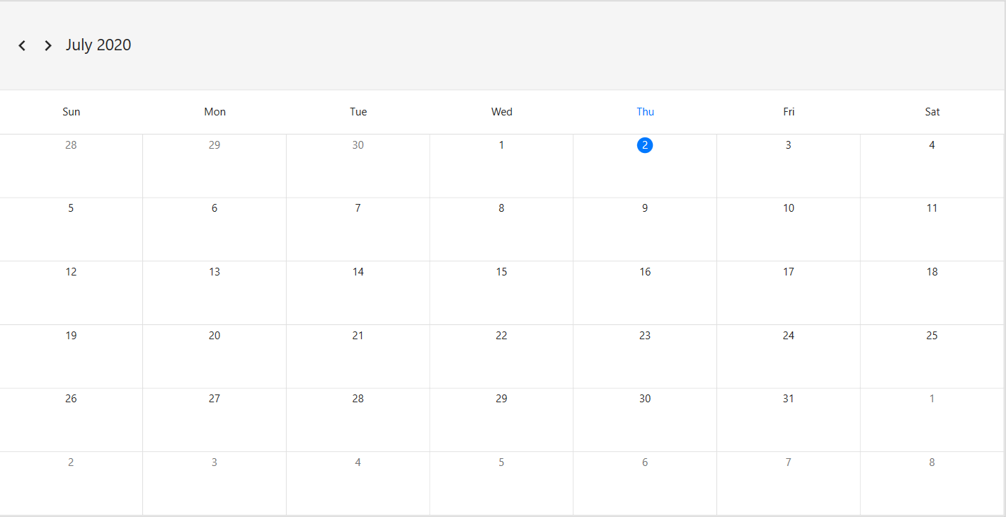
Header date format
Change the Scheduler header date format by using the HeaderDateFormat property of SfScheduler. By default, the header date format is MMMM yyyy.
<Window
    . . .
    xmlns:syncfusion="http://schemas.syncfusion.com/wpf">
    <Grid>
        <syncfusion:SfScheduler x:Name="Schedule"
                            HeaderDateFormat="MMM/yyyy">
        </syncfusion:SfScheduler>
    </Grid>
</Window>
using Syncfusion.UI.Xaml.Scheduler;
this.Schedule.HeaderDateFormat = "MMM/yyyy";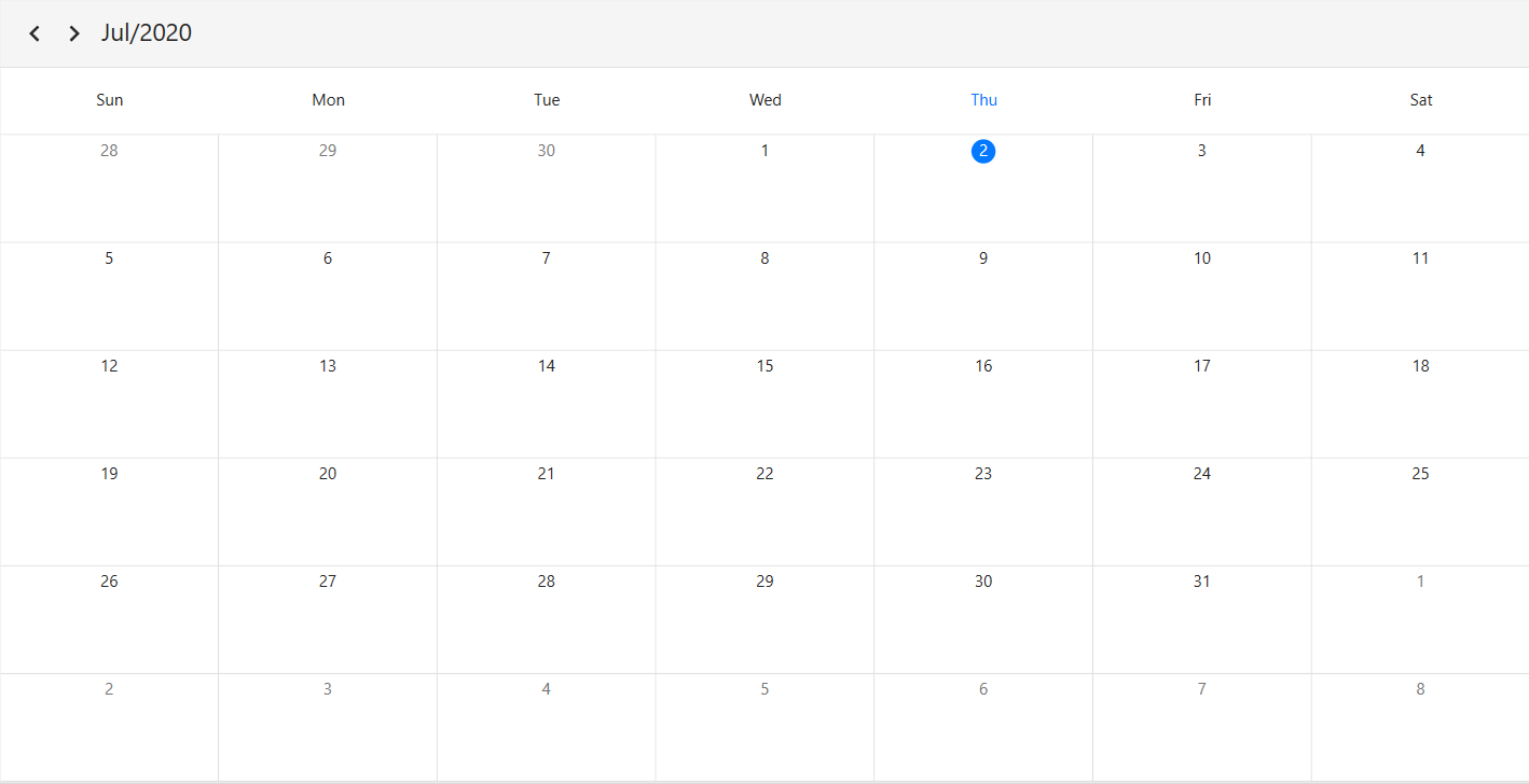
Appearance customization
Customize header appearance using Style
Style the Scheduler header appearance using SchedulerHeaderControl in scheduler. Change the background color, textStyle, and borderBrush etc. by setting style property for SchedulerHeaderControl.
<Window
    . . .
    xmlns:syncfusion="http://schemas.syncfusion.com/wpf">
    <Window.Resources>
        <Style TargetType="syncfusion:SchedulerHeaderControl">
            <Setter Property="Background" Value="LightCyan"/>
            <Setter Property="Foreground" Value="Red"/>
            <Setter Property="FontStyle" Value="Italic"/>
            <Setter Property="BorderBrush" Value="LightCoral"/>
            <Setter Property="BorderThickness" Value="2"/>
        </Style>
    </Window.Resources>
    <Grid>
        <syncfusion:SfScheduler x:Name="Schedule"/>
    </Grid>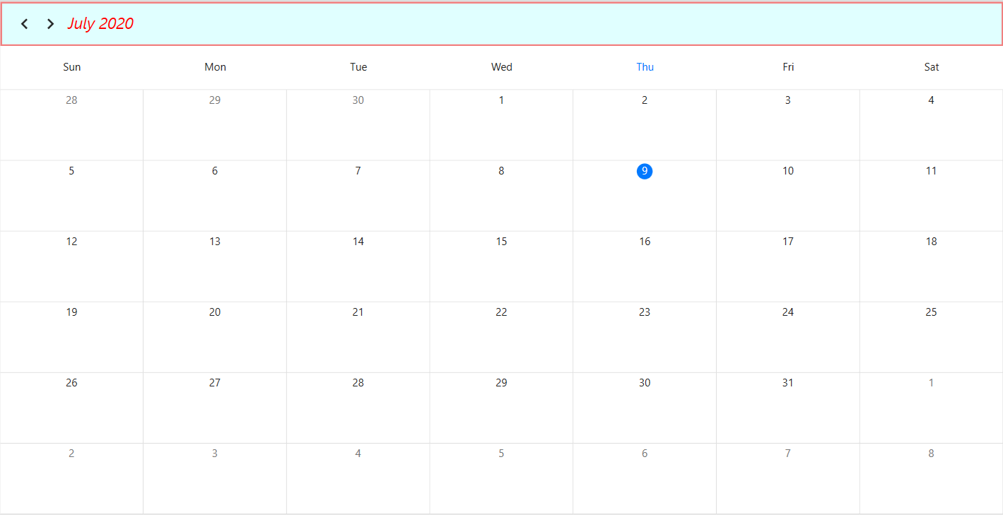
Customize header appearance using DataTemplate
Customize header appearance of scheduler by using HeaderTemplate property of SfScheduler.
<Window
    . . .
    xmlns:syncfusion="http://schemas.syncfusion.com/wpf">
    <Grid>
        <syncfusion:SfScheduler x:Name="Schedule">
            <syncfusion:SfScheduler.HeaderTemplate>
                <DataTemplate >
                        <TextBlock FontStyle="Italic"
                                   Foreground="Blue"
                                   FontSize="25"
                                   Text="{Binding}"/>
                </DataTemplate>
            </syncfusion:SfScheduler.HeaderTemplate>
        </syncfusion:SfScheduler>
    </Grid>
</Window>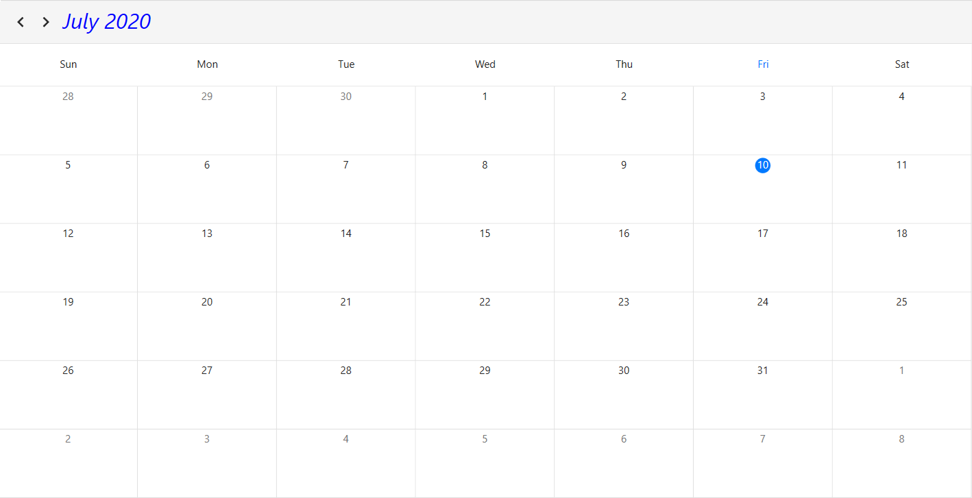
NOTE
You can refer to our WPF Scheduler feature tour page for its groundbreaking feature representations. You can also explore our WPF Scheduler example to know how to schedule and manage appointments through an intuitive user interface, similar to the Outlook calendar. For an overview of scheduler features, see Overview.