Appearance and Styling in UWP TimePicker (SfTimePicker)
Accent Brush
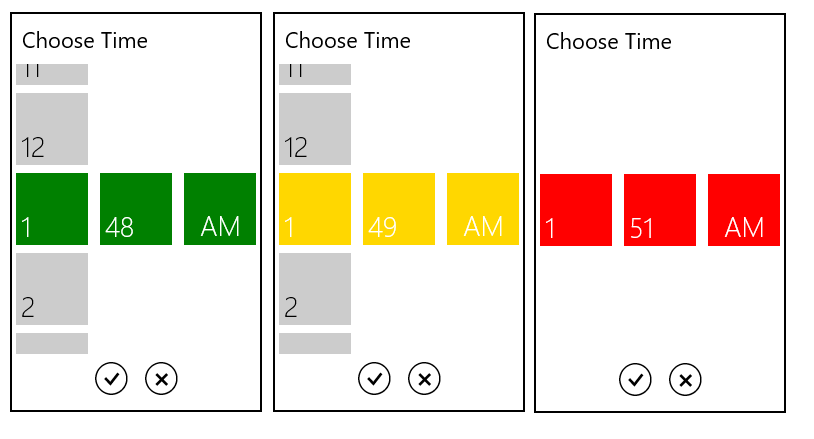
The AccentBrush property is used to decorate the hot spots of a control with a solid color.
<Page
   ...
   xmlns:input="using:Syncfusion.UI.Xaml.Controls.Input">

    <Grid Background="{StaticResource ApplicationPageBackgroundThemeBrush}">

        <syncfusion:SfTimePicker  VerticalAlignment="Center" x:Name="timePicker"

                                HorizontalAlignment="Center"

                                Width="200"

                                AccentBrush="Green"/>

    </Grid>

</Page>using Syncfusion.UI.Xaml.Controls.Input;
timePicker.AccentBrush = new SolidColorBrush(Colors.Green);Imports Syncfusion.UI.Xaml.Controls.Input;
timePicker.AccentBrush = New SolidColorBrush(Colors.Green)The following images showcase the control with various Accent Brushes:
Selected Foreground
The SelectedForeground property is used to change the foreground color of the selected time.
<Page
   ...
   xmlns:input="using:Syncfusion.UI.Xaml.Controls.Input">

    <Grid Background="{StaticResource ApplicationPageBackgroundThemeBrush}">

           <syncfusion:SfTimePicker VerticalAlignment="Center"

                             HorizontalAlignment="Center"

                             Width="200">

                <syncfusion:SfTimePicker.SelectorStyle>

                    <Style TargetType="syncfusion:SfTimeSelector">

                        <Setter Property="SelectedForeground" Value="Red"/>

                    </Style>

                </syncfusion:SfTimePicker.SelectorStyle>

          </syncfusion:SfTimePicker>

    </Grid>

</Page>