Customizing DropDown in UWP DatePicker
DropDown height
The height of the drop-down can be changed using the DropDownHeight property.
<Page
   ...
   xmlns:input="using:Syncfusion.UI.Xaml.Controls.Input">

    <syncfusion:SfDatePicker x:Name="sfdatePicker" VerticalAlignment="Center"  Width="200" Margin="15" DropDownHeight="300" />

</Page>using Syncfusion.UI.Xaml.Controls.Input;
sfdatePicker.DropDownHeight = 300;Imports Syncfusion.UI.Xaml.Controls.Input;
sfdatePicker.DropDownHeight = 300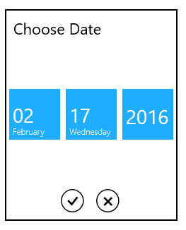
IsDropDownOpen
The drop-down can be programmatically opened or closed using the IsDropDownOpen property.
ShowDropDownButton
The drop-down button visibility can be changed by using the ShowDropDownButton property.
<Page
   ...
   xmlns:input="using:Syncfusion.UI.Xaml.Controls.Input">

    <syncfusion:SfDatePicker x:Name="sfdatePicker" VerticalAlignment="Center"  Width="200" Margin="15" ShowDropDownButton="true"/>

</Page>using Syncfusion.UI.Xaml.Controls.Input;
sfdatePicker.ShowDropDownButton = true;Imports Syncfusion.UI.Xaml.Controls.Input;
sfdatePicker.ShowDropDownButton = True