Month View in .NET MAUI Scheduler
By default, the Month view displays the entire days of a particular month and current month initially. The current date color is differentiated from other dates of the current month, and also the color differentiation for dates will be applicable for the previous and next month dates.
By default, when an appointment is created through the Month view, it is considered to be created for an entire day.
The appointment views for each month cell will be updated depending on the month cell height. While resizing the layout, the following actions will be performed:
- If the appointment views overlap with month cell dates or do not fit into the month cell height, then the appointment view is changed from AppointmentDisplayMode.Text to AppointmentDisplayMode.Indicator view.
- If the indicator views overlap with month cell dates, then the indicator view is changed from AppointmentDisplayMode.Indicator to AppointmentDisplayMode.None.
Appointment display mode
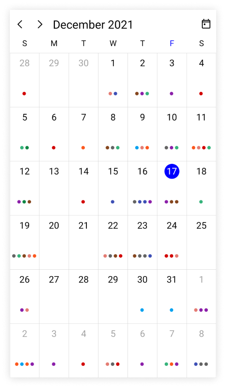
The scheduler month view appointment display can be handled by using the AppointmentDisplayMode property of MonthView. By default, AppointmentDisplayMode is set to Text.
You can set the month view appointments display as follows.
- None: Appointment will not be displayed.
- Indicator: Appointment will be denoted as the circle.
- Text: Appointment subject will be displayed in the month cell.
<ContentPage
    . . .
    xmlns:scheduler="clr-namespace:Syncfusion.Maui.Scheduler;assembly=Syncfusion.Maui.Scheduler">

    <scheduler:SfScheduler x:Name="scheduler"
                           View="Month">
        <scheduler:SfScheduler.MonthView>
            <scheduler:SchedulerMonthView
                           AppointmentDisplayMode="Indicator"/>
        </scheduler:SfScheduler.MonthView>
    </scheduler:SfScheduler>
</ContentPage>
using Syncfusion.Maui.Scheduler;
. . .
public partial class MainPage : ContentPage
{
public MainPage()
{
InitializeComponent();
SfScheduler scheduler = new SfScheduler();
scheduler.View = SchedulerView.Month;
scheduler.MonthView.AppointmentDisplayMode = SchedulerMonthAppointmentDisplayMode.Indicator;
this.Content = scheduler;
}
}
Appointment indicator count
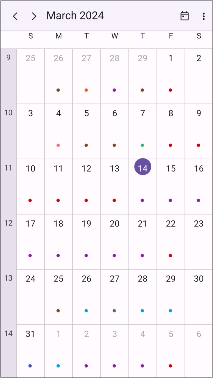
The scheduler month view appointment indicator count allows you to customize the count of the appointment indicator by using the AppointmentIndicatorCount property of the MonthView. By default, the AppointmentIndicatorCount is set to 5.
<ContentPage
    . . .
    xmlns:scheduler="clr-namespace:Syncfusion.Maui.Scheduler;assembly=Syncfusion.Maui.Scheduler">

    <scheduler:SfScheduler x:Name="scheduler"
                           View="Month" >
        <scheduler:SfScheduler.MonthView>
            <scheduler:SchedulerMonthView AppointmentDisplayMode="Indicator"
                                         AppointmentIndicatorCount="2"/>
        </scheduler:SfScheduler.MonthView>
    </scheduler:SfScheduler>
</ContentPage>
using Syncfusion.Maui.Scheduler;
. . .
public partial class MainPage : ContentPage
{
public MainPage()
{
InitializeComponent();
this.scheduler.View = SchedulerView.Month;
this.scheduler.MonthView.AppointmentDisplayMode = SchedulerMonthAppointmentDisplayMode.Indicator;
this.scheduler.MonthView.AppointmentIndicatorCount = 2;
}
}
Appointment indicator size
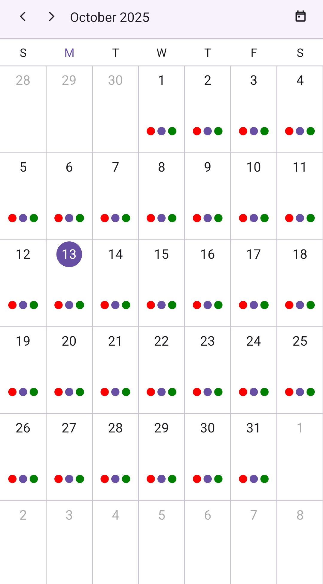
The scheduler month view allows you to customize the size of the appointment indicator by using the AppointmentIndicatorSize property of the MonthView. By default, the AppointmentIndicatorSize is set to 6d.
<ContentPage
    . . .
    xmlns:scheduler="clr-namespace:Syncfusion.Maui.Scheduler;assembly=Syncfusion.Maui.Scheduler">

    <scheduler:SfScheduler x:Name="scheduler"
                           View="Month" >
        <scheduler:SfScheduler.MonthView>
            <scheduler:SchedulerMonthView AppointmentDisplayMode="Indicator" AppointmentIndicatorSize="10"/>
        </scheduler:SfScheduler.MonthView>
    </scheduler:SfScheduler>
</ContentPage>
using Syncfusion.Maui.Scheduler;
. . .
public partial class MainPage : ContentPage
{
public MainPage()
{
InitializeComponent();
this.scheduler.View = SchedulerView.Month;
this.scheduler.MonthView.AppointmentDisplayMode = SchedulerMonthAppointmentDisplayMode.Indicator;
this.scheduler.MonthView.AppointmentIndicatorSize = 10;
}
}
Appointment indicator renderer mode
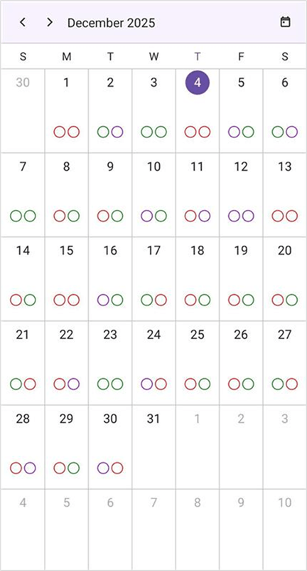
The scheduler month view allows you to customize the appointment indicator rendering mode by using the AppointmentIndicatorRenderMode property of the MonthView. The AppointmentIndicatorRenderMode property supports three different types: Fill, Stroke and FillAndStroke. By default, the AppointmentIndicatorRenderMode is set to Fill.
<ContentPage
    . . .
    xmlns:scheduler="clr-namespace:Syncfusion.Maui.Scheduler;assembly=Syncfusion.Maui.Scheduler">

    <scheduler:SfScheduler x:Name="scheduler"
                           View="Month" >
        <scheduler:SfScheduler.MonthView>
            <scheduler:SchedulerMonthView AppointmentIndicatorRenderMode="Stroke" AppointmentDisplayMode="Indicator" AppointmentIndicatorSize="15" AppointmentIndicatorCount="2" />
        </scheduler:SfScheduler.MonthView>
    </scheduler:SfScheduler>
</ContentPage>
using Syncfusion.Maui.Scheduler;
. . .
public partial class MainPage : ContentPage
{
public MainPage()
{
InitializeComponent();
this.scheduler.View = SchedulerView.Month;
this.scheduler.MonthView.AppointmentDisplayMode = SchedulerMonthAppointmentDisplayMode.Indicator;
this.scheduler.MonthView.AppointmentIndicatorRenderMode = AppointmentIndicatorRenderMode.Stroke;
this.scheduler.MonthView.AppointmentIndicatorSize = 15;
this.scheduler.MonthView.AppointmentIndicatorCount = 2;
}
}
Appointment indicator stroke thickness
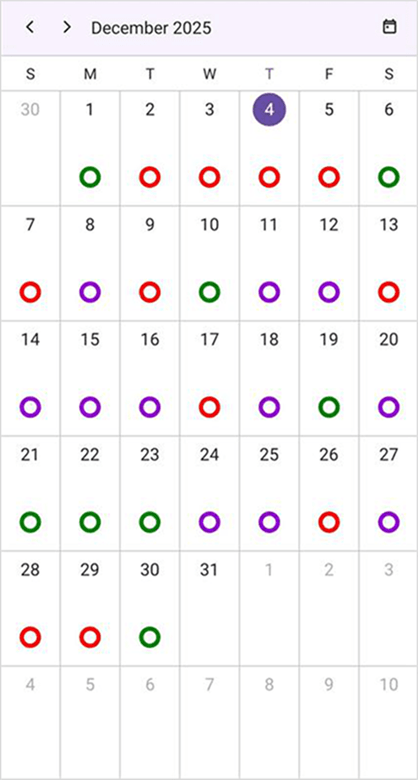
The scheduler month view allows you to customize the appointment indicator stroke thickness by using the AppointmentIndicatorStrokeThickness property of the MonthView. By default, the AppointmentIndicatorStrokeThickness is set to 1d.
<ContentPage
    . . .
    xmlns:scheduler="clr-namespace:Syncfusion.Maui.Scheduler;assembly=Syncfusion.Maui.Scheduler">

    <scheduler:SfScheduler x:Name="scheduler"
                           View="Month" >
        <scheduler:SfScheduler.MonthView>
            <scheduler:SchedulerMonthView AppointmentIndicatorStrokeThickness="4" AppointmentDisplayMode="Indicator" AppointmentIndicatorSize="20" AppointmentIndicatorRenderMode="Stroke" />
        </scheduler:SfScheduler.MonthView>
    </scheduler:SfScheduler>
</ContentPage>
using Syncfusion.Maui.Scheduler;
. . .
public partial class MainPage : ContentPage
{
public MainPage()
{
InitializeComponent();
this.scheduler.View = SchedulerView.Month;
this.scheduler.MonthView.AppointmentDisplayMode = SchedulerMonthAppointmentDisplayMode.Indicator;
this.scheduler.MonthView.AppointmentIndicatorRenderMode = AppointmentIndicatorRenderMode.Stroke;
this.scheduler.MonthView.AppointmentIndicatorSize = 20;
this.scheduler.MonthView.AppointmentIndicatorStrokeThickness = 4;
}
}
Customize appointment height in Month view
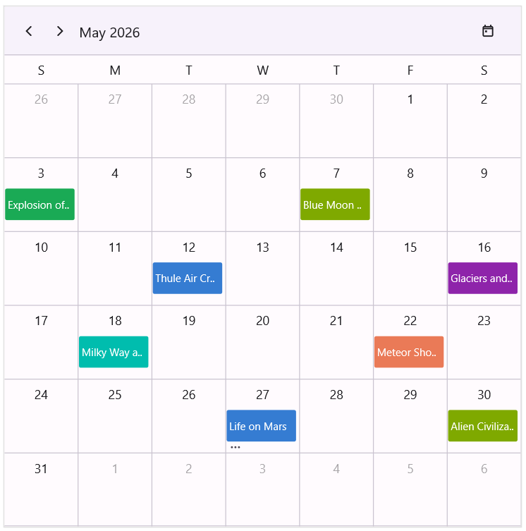
Use the AppointmentHeight property to specify the height of appointments displayed in the Month View. The default value of AppointmentHeight is -1, which automatically calculates the appointment height as 1.5 times the appointment font size. When a custom value is specified, appointments are rendered using the configured height, and the number of visible appointments in a month cell is determined based on the appointment height and the available cell space.
<ContentPage
    . . .
    xmlns:scheduler="clr-namespace:Syncfusion.Maui.Scheduler;assembly=Syncfusion.Maui.Scheduler">

    <scheduler:SfScheduler x:Name="scheduler"
                           View="Month">
        <scheduler:SfScheduler.MonthView>
            <scheduler:SchedulerMonthView AppointmentHeight="40"/>
        </scheduler:SfScheduler.MonthView>
    </scheduler:SfScheduler>
</ContentPage>
using Syncfusion.Maui.Scheduler;
. . .
public partial class MainPage : ContentPage
{
public MainPage()
{
InitializeComponent();
SfScheduler scheduler = new SfScheduler();
scheduler.View = SchedulerView.Month;
scheduler.MonthView.AppointmentHeight = 40;
this.Content = scheduler;
}
}
Hide leading and trailing dates
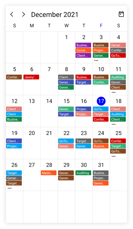
The previous and next month dates from a Scheduler month view can be hidden by using the ShowLeadingAndTrailingDates property in the MonthView. The ShowLeadingAndTrailingDates property defaults to true.
<ContentPage
    . . .
    xmlns:scheduler="clr-namespace:Syncfusion.Maui.Scheduler;assembly=Syncfusion.Maui.Scheduler">

    <scheduler:SfScheduler x:Name="scheduler"
                           View="Month">
        <scheduler:SfScheduler.MonthView>
            <scheduler:SchedulerMonthView
                           ShowLeadingAndTrailingDates="False"/>
        </scheduler:SfScheduler.MonthView>
    </scheduler:SfScheduler>
</ContentPage>
using Syncfusion.Maui.Scheduler;
. . .
public partial class MainPage : ContentPage
{
public MainPage()
{
InitializeComponent();
SfScheduler scheduler = new SfScheduler();
scheduler.View = SchedulerView.Month;
scheduler.MonthView.ShowLeadingAndTrailingDates = false;
this.Content = scheduler;
}
}
Date text positioning in Month view
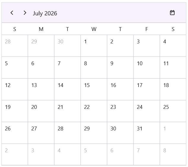
The DateHorizontalAlignment property specifies how the date text is aligned horizontally within each cell of the scheduler’s Month view. Its default value is Center, but you can set it to Left, Right or Justified to adjust the placement of the date numbers.
<ContentPage
    . . .
    xmlns:scheduler="clr-namespace:Syncfusion.Maui.Scheduler;assembly=Syncfusion.Maui.Scheduler">

    <scheduler:SfScheduler x:Name="scheduler"
                           View="Month">
        <scheduler:SfScheduler.MonthView>
            <scheduler:SchedulerMonthView DateHorizontalAlignment="Left"/>
        </scheduler:SfScheduler.MonthView>
    </scheduler:SfScheduler>
</ContentPage>
using Syncfusion.Maui.Scheduler;
. . .
public partial class MainPage : ContentPage
{
public MainPage()
{
InitializeComponent();
SfScheduler scheduler = new SfScheduler();
scheduler.View = SchedulerView.Month;
scheduler.MonthView.DateHorizontalAlignment = HorizontalAlignment.Left;
this.Content = scheduler;
}
}
Day string format
Customize the day text rendered inside each month cell by using the DayStringFormat property of SchedulerMonthView. Use it to elevate the cell label beyond a bare number — for example, a zero-padded day-and-month (dd MMM) for a calendar-app feel, a full weekday name (dddd) for editorial-style reads, or a day-of-year value (D) for project planning views.
The default value is string.Empty, which renders the day using the default value based on the CalendarType. The formatted text is rendered on a single line and trimmed with an ellipsis when it exceeds the cell width.
<ContentPage
    . . .
    xmlns:scheduler="clr-namespace:Syncfusion.Maui.Scheduler;assembly=Syncfusion.Maui.Scheduler">

    <scheduler:SfScheduler x:Name="Scheduler" View="Month">
        <scheduler:SfScheduler.MonthView>
            <scheduler:SchedulerMonthView DayStringFormat="ddd, d - yyyy" />
        </scheduler:SfScheduler.MonthView>
    </scheduler:SfScheduler>
</ContentPage>
using Syncfusion.Maui.Scheduler;
. . .
public partial class MainPage : ContentPage
{
public MainPage()
{
InitializeComponent();
this.Scheduler.View = SchedulerView.Month;
this.Scheduler.MonthView.DayStringFormat = "ddd, d - yyyy";
}
}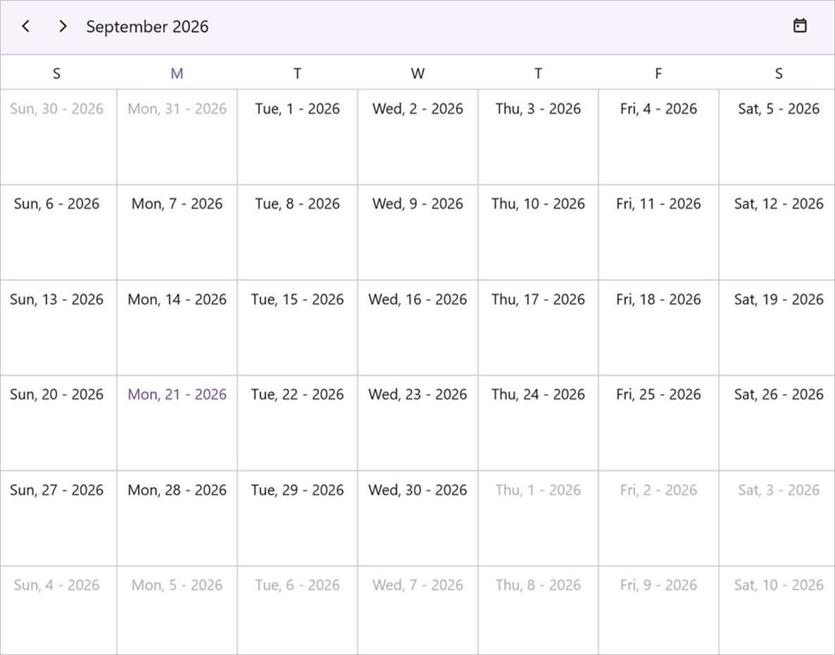
When the formatted today text exceeds the today highlight circle bounds, the today highlight circle is skipped and the
SchedulerMonthCellStyle.TodayBackgroundis applied to the text bounds instead.
Number of weeks visible in the month view
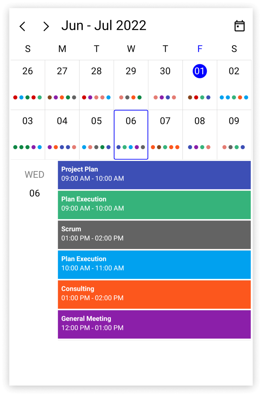
The number of week visible in the month view can be changed by setting the NumberOfVisibleWeeks property in the MonthView.
<ContentPage
    . . .
    xmlns:scheduler="clr-namespace:Syncfusion.Maui.Scheduler;assembly=Syncfusion.Maui.Scheduler">

    <scheduler:SfScheduler x:Name="scheduler"
                           View="Month">
        <scheduler:SfScheduler.MonthView>
            <scheduler:SchedulerMonthView
                           NumberOfVisibleWeeks="2"/>
        </scheduler:SfScheduler.MonthView>
    </scheduler:SfScheduler>
</ContentPage>
using Syncfusion.Maui.Scheduler;
. . .
public partial class MainPage : ContentPage
{
public MainPage()
{
InitializeComponent();
SfScheduler scheduler = new SfScheduler();
scheduler.View = SchedulerView.Month;
scheduler.MonthView.NumberOfVisibleWeeks = 2;
this.Content = scheduler;
}
}
Non working days in month view
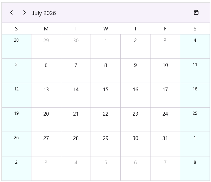
The scheduler allows you to define non-working days in the Month view using the NonWorkingDays property. This helps highlight weekends or specific days of the week as non-working, making it easier to distinguish them from working days. By default, no days are marked as non-working. The default value of NonWorkingDays property is SchedulerMonthWeekDays.None. You can configure this property to include one or more days of the week.
<ContentPage
    . . .
    xmlns:scheduler="clr-namespace:Syncfusion.Maui.Scheduler;assembly=Syncfusion.Maui.Scheduler">

    <scheduler:SfScheduler x:Name="scheduler"
                           View="Month">
        <scheduler:SfScheduler.MonthView>
            <scheduler:SchedulerMonthView NonWorkingDays="Saturday,Sunday"/>
        </scheduler:SfScheduler.MonthView>
    </scheduler:SfScheduler>
</ContentPage>
using Syncfusion.Maui.Scheduler;
. . .
public partial class MainPage : ContentPage
{
public MainPage()
{
InitializeComponent();
SfScheduler scheduler = new SfScheduler();
scheduler.View = SchedulerView.Month;
scheduler.MonthView.NonWorkingDays = SchedulerMonthWeekDays.Saturday | SchedulerMonthWeekDays.Sunday;
this.Content = scheduler;
}
}Show or Hide non working days in Month View
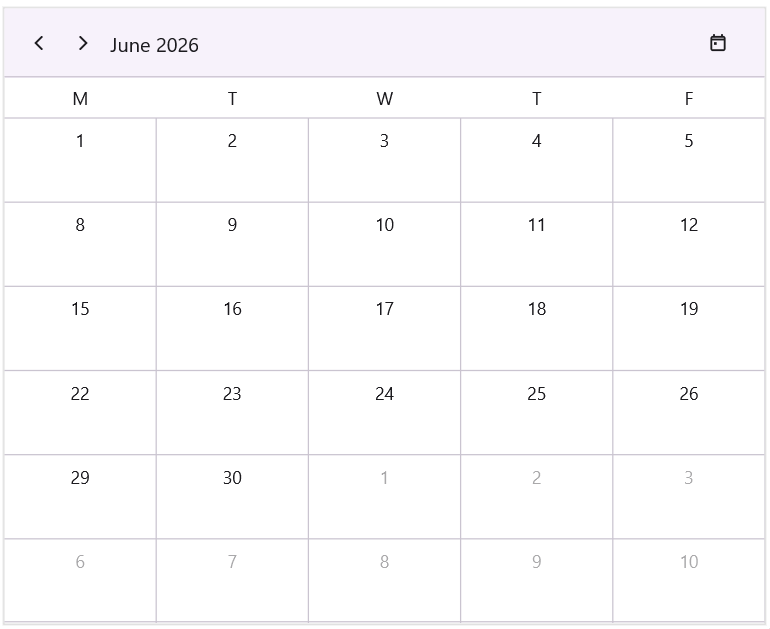
The HideNonWorkingDays property is used to control the visibility of non-working days in the Month view. When HideNonWorkingDays is false (default), the specified non-working days are displayed in the MonthView. When HideNonWorkingDays is true, the specified non-working days are hidden from the MonthView.
<ContentPage
    . . .
    xmlns:scheduler="clr-namespace:Syncfusion.Maui.Scheduler;assembly=Syncfusion.Maui.Scheduler">

    <scheduler:SfScheduler x:Name="scheduler"
                           View="Month">
        <scheduler:SfScheduler.MonthView>
            <scheduler:SchedulerMonthView NonWorkingDays="Saturday,Sunday" HideNonWorkingDays="True"/>
        </scheduler:SfScheduler.MonthView>
    </scheduler:SfScheduler>
</ContentPage>
using Syncfusion.Maui.Scheduler;
. . .
public partial class MainPage : ContentPage
{
public MainPage()
{
InitializeComponent();
SfScheduler scheduler = new SfScheduler();
scheduler.View = SchedulerView.Month;
scheduler.MonthView.NonWorkingDays = SchedulerMonthWeekDays.Saturday | SchedulerMonthWeekDays.Sunday;
scheduler.MonthView.HideNonWorkingDays = true;
this.Content = scheduler;
}
}
Customize Non-Working Days in Month View
Non-working days in the MonthView can be customized using the NonWorkingDaysBackground and NonWorkingDaysTextStyle properties of the SchedulerMonthCellStyle. These properties allow you to visually differentiate non-working days with custom background and text styles.
<ContentPage
    . . .
    xmlns:scheduler="clr-namespace:Syncfusion.Maui.Scheduler;assembly=Syncfusion.Maui.Scheduler">

    <scheduler:SfScheduler x:Name="scheduler"
                           View="Month">
        <scheduler:SfScheduler.MonthView>
            <scheduler:SchedulerMonthView NonWorkingDays="Saturday,Sunday">
                <scheduler:SchedulerMonthView.CellStyle>
                    <scheduler:SchedulerMonthCellStyle NonWorkingDaysBackground="Azure">
                        <scheduler:SchedulerMonthCellStyle.NonWorkingDaysTextStyle>
                            <scheduler:SchedulerTextStyle TextColor="Black" FontSize="12" />
                        </scheduler:SchedulerMonthCellStyle.NonWorkingDaysTextStyle>
                    </scheduler:SchedulerMonthCellStyle>
                </scheduler:SchedulerMonthView.CellStyle>
            </scheduler:SchedulerMonthView>
        </scheduler:SfScheduler.MonthView>
    </scheduler:SfScheduler>
</ContentPage>
using Syncfusion.Maui.Scheduler;
. . .
public partial class MainPage : ContentPage
{
public MainPage()
{
InitializeComponent();
SfScheduler scheduler = new SfScheduler();
scheduler.View = SchedulerView.Month;
scheduler.MonthView.NonWorkingDays = SchedulerMonthWeekDays.Saturday | SchedulerMonthWeekDays.Sunday;
SchedulerTextStyle nonWorkTextStyle = new SchedulerTextStyle()
{
TextColor = Colors.Black,
FontSize = 12,
};
SchedulerMonthCellStyle monthCellStyle = new SchedulerMonthCellStyle()
{
NonWorkingDaysBackground = Brush.Azure,
NonWorkingDaysTextStyle = nonWorkTextStyle
};
scheduler.MonthView.CellStyle = monthCellStyle;
this.Content = scheduler;
}
}
Inline Appointments in Month View
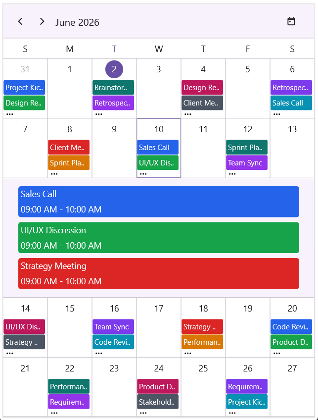
Appointments can be displayed inline within the Month view using the ShowAppointmentsInline property. When ShowAppointmentsInline is false (default), appointments are not shown inline in the MonthView. When ShowAppointmentsInline is true, tapping a date cell displays all appointments for that date inline below the tapped row. This provides a quick way to view daily schedules without switching to another view. Inline appointments are rendered in a collection view, allowing customization of styles such as background, text color, and layout.
<ContentPage
    . . .
    xmlns:scheduler="clr-namespace:Syncfusion.Maui.Scheduler;assembly=Syncfusion.Maui.Scheduler">

    <scheduler:SfScheduler x:Name="scheduler"
                           View="Month">
        <scheduler:SfScheduler.MonthView>
            <scheduler:SchedulerMonthView ShowAppointmentsInline="True"/>
        </scheduler:SfScheduler.MonthView>
    </scheduler:SfScheduler>
</ContentPage>
using Syncfusion.Maui.Scheduler;
. . .
public partial class MainPage : ContentPage
{
public MainPage()
{
InitializeComponent();
SfScheduler scheduler = new SfScheduler();
scheduler.View = SchedulerView.Month;
scheduler.MonthView.ShowAppointmentsInline = true;
this.Content = scheduler;
}
}
Appointment time format in inline view
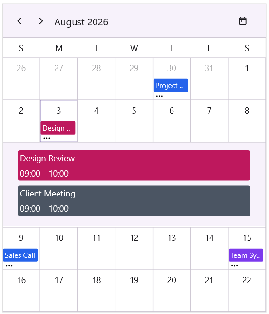
The TimeTextFormat property in MonthInlineViewStyle defines the string format used to display appointment time value in the inline view of the scheduler’s Month view. By default, appointment time is shown in the “hh:mm tt” format (12‑hour clock with AM/PM).
<ContentPage
    . . .
    xmlns:scheduler="clr-namespace:Syncfusion.Maui.Scheduler;assembly=Syncfusion.Maui.Scheduler">

    <scheduler:SfScheduler x:Name="scheduler"
                           View="Month">
        <scheduler:SfScheduler.MonthView>
            <scheduler:SchedulerMonthView ShowAppointmentsInline="True">
                <scheduler:SchedulerMonthView.MonthInlineViewStyle>
                    <scheduler:MonthInlineViewStyle TimeTextFormat="HH:mm"/>
                </scheduler:SchedulerMonthView.MonthInlineViewStyle>
            </scheduler:SchedulerMonthView>
        </scheduler:SfScheduler.MonthView>
    </scheduler:SfScheduler>
</ContentPage>
using Syncfusion.Maui.Scheduler;
. . .
public partial class MainPage : ContentPage
{
public MainPage()
{
InitializeComponent();
SfScheduler scheduler = new SfScheduler();
scheduler.View = SchedulerView.Month;
scheduler.MonthView.ShowAppointmentsInline = true;
scheduler.MonthView.MonthInlineViewStyle = new MonthInlineViewStyle()
{
TimeTextFormat = "HH:mm"
};
}
}
Appointment height in inline view
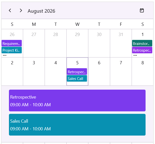
The ItemHeight property in MonthInlineViewStyle specifies the vertical height of each appointment item displayed in the inline view of the scheduler’s Month view. By default, each appointment item has a height of 50 units. You can increase or decrease this value to adjust how compact or spacious the inline appointment list appears.
<ContentPage
    . . .
    xmlns:scheduler="clr-namespace:Syncfusion.Maui.Scheduler;assembly=Syncfusion.Maui.Scheduler">

    <scheduler:SfScheduler x:Name="scheduler"
                           View="Month">
        <scheduler:SfScheduler.MonthView>
            <scheduler:SchedulerMonthView ShowAppointmentsInline="True">
                <scheduler:SchedulerMonthView.MonthInlineViewStyle>
                    <scheduler:MonthInlineViewStyle ItemHeight="70"/>
                </scheduler:SchedulerMonthView.MonthInlineViewStyle>
            </scheduler:SchedulerMonthView>
        </scheduler:SfScheduler.MonthView>
    </scheduler:SfScheduler>
</ContentPage>
using Syncfusion.Maui.Scheduler;
. . .
public partial class MainPage : ContentPage
{
public MainPage()
{
InitializeComponent();
SfScheduler scheduler = new SfScheduler();
scheduler.View = SchedulerView.Month;
scheduler.MonthView.ShowAppointmentsInline = true;
scheduler.MonthView.MonthInlineViewStyle = new MonthInlineViewStyle()
{
ItemHeight = 70
};
}
}
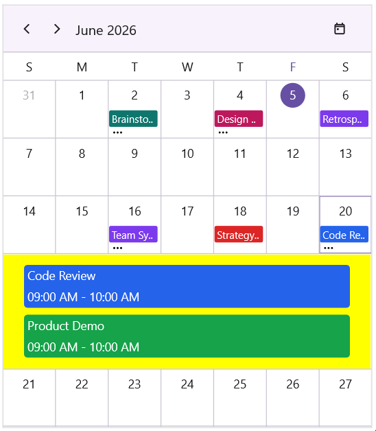
Inline appointments appearance
Customize inline appointments appearance using TextStyle
The MonthInlineViewStyle property allows you to customize the appearance of inline view in the scheduler’s Month view using the Background and TextStyle properties.
<ContentPage
    . . .
    xmlns:scheduler="clr-namespace:Syncfusion.Maui.Scheduler;assembly=Syncfusion.Maui.Scheduler">

    <scheduler:SfScheduler x:Name="scheduler"
                           View="Month">
        <scheduler:SfScheduler.MonthView>
            <scheduler:SchedulerMonthView ShowAppointmentsInline="True">
                <scheduler:SchedulerMonthView.MonthInlineViewStyle>
                    <scheduler:MonthInlineViewStyle Background="Yellow">
                        <scheduler:MonthInlineViewStyle.TextStyle>
                            <scheduler:SchedulerTextStyle TextColor="White"
                                                         FontSize="14"/>
                        </scheduler:MonthInlineViewStyle.TextStyle>
                    </scheduler:MonthInlineViewStyle>
                </scheduler:SchedulerMonthView.MonthInlineViewStyle>
            </scheduler:SchedulerMonthView>
        </scheduler:SfScheduler.MonthView>
    </scheduler:SfScheduler>
</ContentPage>
using Syncfusion.Maui.Scheduler;
. . .
public partial class MainPage : ContentPage
{
public MainPage()
{
InitializeComponent();
SfScheduler scheduler = new SfScheduler();
scheduler.View = SchedulerView.Month;
scheduler.MonthView.ShowAppointmentsInline = true;
scheduler.MonthView.MonthInlineViewStyle = new MonthInlineViewStyle()
{
Background = Colors.Yellow,
TextStyle = new SchedulerTextStyle()
{
TextColor = Colors.White,
FontSize = 14,
}
};
}
}
Customize inline appointments appearance using DateTemplate
The MonthInlineViewItemTemplate property allows you to define a custom DataTemplate to customize the appearance of appointment items displayed in the inline view of the scheduler’s Month view.
<ContentPage
. . .
xmlns:scheduler="clr-namespace:Syncfusion.Maui.Scheduler;assembly=Syncfusion.Maui.Scheduler">
<scheduler:SfScheduler x:Name="scheduler"
View="Month">
<scheduler:SfScheduler.MonthView>
<scheduler:SchedulerMonthView ShowAppointmentsInline="True">
<scheduler:SchedulerMonthView.MonthInlineViewItemTemplate>
<DataTemplate>
<Grid BackgroundColor="MediumOrchid" Padding="8">
<HorizontalStackLayout HorizontalOptions="Center"
VerticalOptions="Center"
Spacing="6">
<Label Text=""
FontFamily="MauiMaterialAssets"
TextColor="White"
VerticalOptions="Center"/>
<Label Text="{Binding Subject}"
TextColor="White"
FontFamily="Bold"
VerticalOptions="Center"/>
</HorizontalStackLayout>
</Grid>
</DataTemplate>
</scheduler:SchedulerMonthView.MonthInlineViewItemTemplate>
</scheduler:SchedulerMonthView>
</scheduler:SfScheduler.MonthView>
</scheduler:SfScheduler>
</ContentPage>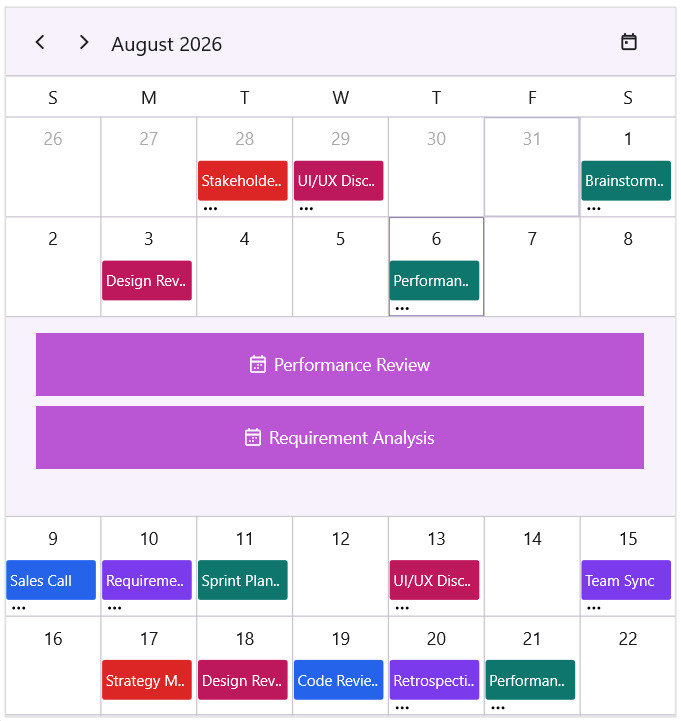
MonthInlineAppointmentTapped
The MonthInlineAppointmentTapped event is raised when a user taps on an appointment displayed in the inline view of the scheduler’s Month view.
-
sender- Refers to the SfScheduler instance that raised the event.
This event provides details about the tapped appointment and the selected date through the MonthInlineAppointmentTappedEventArgs.
-
Appointment: Gets the tapped appointment. Returns null if the user taps an empty area.
-
SelectedDate: Gets the date of the month cell where the inline view was opened.
<ContentPage
    . . .
    xmlns:scheduler="clr-namespace:Syncfusion.Maui.Scheduler;assembly=Syncfusion.Maui.Scheduler">

    <scheduler:SfScheduler x:Name="scheduler"
                           View="Month"
                           MonthInlineAppointmentTapped="Scheduler_MonthInlineAppointmentTapped" >
    </scheduler:SfScheduler>
</ContentPage>
using Syncfusion.Maui.Scheduler;
. . .
public partial class MainPage : ContentPage
{
public MainPage()
{
InitializeComponent();
this.scheduler.MonthInlineAppointmentTapped += Scheduler_MonthInlineAppointmentTapped;
}
private void Scheduler_MonthInlineAppointmentTapped(object sender, MonthInlineAppointmentTappedEventArgs e)
{
var appointment = e.Appointment;
var date = e.SelectedDate;
}
}View header
You can customize the default appearance of view header in a month view by setting the DayFormat, DayTextStyle, Background, Height, and ViewHeaderTemplate properties of MonthView in the SfScheduler.
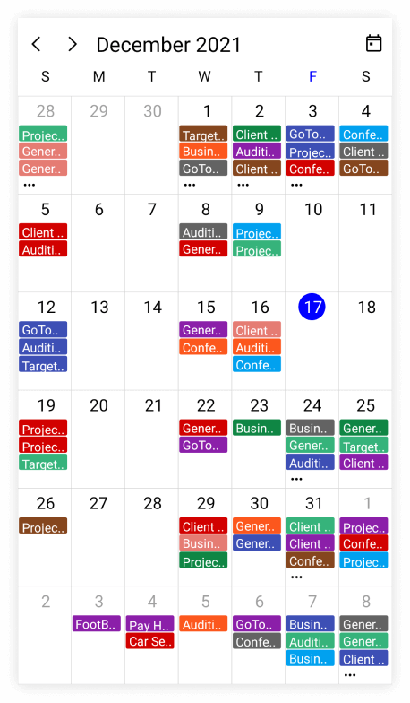
Change day format of view header
Customize the day format of Scheduler view header by using the DayFormat property of ViewHeaderSettings in MonthView.
<ContentPage
    . . .
    xmlns:scheduler="clr-namespace:Syncfusion.Maui.Scheduler;assembly=Syncfusion.Maui.Scheduler">

    <scheduler:SfScheduler x:Name="scheduler"
                           View="Month">
        <scheduler:SfScheduler.MonthView>
            <scheduler:SchedulerMonthView>
                <scheduler:SchedulerMonthView.ViewHeaderSettings>
                    <scheduler:SchedulerViewHeaderSettings DayFormat="dddd" />
                </scheduler:SchedulerMonthView.ViewHeaderSettings>
            </scheduler:SchedulerMonthView>
        </scheduler:SfScheduler.MonthView>
    </scheduler:SfScheduler>
</ContentPage>
using Syncfusion.Maui.Scheduler;
. . .
public partial class MainPage : ContentPage
{
public MainPage()
{
InitializeComponent();
SfScheduler scheduler = new SfScheduler();
scheduler.View = SchedulerView.Month;
scheduler.MonthView.ViewHeaderSettings.DayFormat = "dddd";
this.Content = scheduler;
}
}
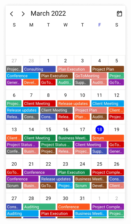
View header height
The height of the ViewHeader can be customized by setting the Height property of ViewHeaderSettings in MonthView.
<ContentPage
    . . .
    xmlns:scheduler="clr-namespace:Syncfusion.Maui.Scheduler;assembly=Syncfusion.Maui.Scheduler">

    <scheduler:SfScheduler x:Name="scheduler"
                           View="Month">
        <scheduler:SfScheduler.MonthView>
            <scheduler:SchedulerMonthView>
                <scheduler:SchedulerMonthView.ViewHeaderSettings>
                    <scheduler:SchedulerViewHeaderSettings Height="100" />
                </scheduler:SchedulerMonthView.ViewHeaderSettings>
            </scheduler:SchedulerMonthView>
        </scheduler:SfScheduler.MonthView>
    </scheduler:SfScheduler>
</ContentPage>
using Syncfusion.Maui.Scheduler;
. . .
public partial class MainPage : ContentPage
{
public MainPage()
{
InitializeComponent();
SfScheduler scheduler = new SfScheduler();
scheduler.View = SchedulerView.Month;
scheduler.MonthView.ViewHeaderSettings.Height = 100;
this.Content = scheduler;
}
}
Customize view header appearance
The view header appearance customization can be achieved by using the TextStyle and ViewHeaderTemplate properties of MonthView in the SfScheduler.
Customize view header appearance using text style
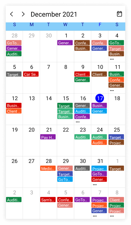
Customize the month view header day text style, day format and background color by using the DayTextStyle, DayFormat and Background of ViewHeaderSettings properties of MonthView respectively.
<ContentPage
    . . .
    xmlns:scheduler="clr-namespace:Syncfusion.Maui.Scheduler;assembly=Syncfusion.Maui.Scheduler">

    <scheduler:SfScheduler x:Name="scheduler"
                           View="Month">
        <scheduler:SfScheduler.MonthView>
            <scheduler:SchedulerMonthView>
                <scheduler:SchedulerMonthView.ViewHeaderSettings>
                    <scheduler:SchedulerViewHeaderSettings DayFormat="dddd"
                                                           Background="LightSkyBlue"/>
                </scheduler:SchedulerMonthView.ViewHeaderSettings>
            </scheduler:SchedulerMonthView>
        </scheduler:SfScheduler.MonthView>
    </scheduler:SfScheduler>
</ContentPage>
using Syncfusion.Maui.Scheduler;
. . .
public partial class MainPage : ContentPage
{
public MainPage()
{
InitializeComponent();
SfScheduler scheduler = new SfScheduler();
scheduler.View = SchedulerView.Month;
scheduler.MonthView.ViewHeaderSettings.Background = Brush.LightSkyBlue;
scheduler.MonthView.ViewHeaderSettings.DayFormat = "dddd";
this.Content = scheduler;
}
}
Customize view header appearance using DataTemplate
You can customize the view header appearance by using the ViewHeaderTemplate property of MonthView in the SfScheduler.
<ContentPage
    . . .
    xmlns:scheduler="clr-namespace:Syncfusion.Maui.Scheduler;assembly=Syncfusion.Maui.Scheduler">

    <scheduler:SfScheduler x:Name="scheduler"
                           View="Month">
        <scheduler:SfScheduler.MonthView>
            <scheduler:SchedulerMonthView>
                <scheduler:SchedulerMonthView.ViewHeaderTemplate>
                    <DataTemplate>
                        <Grid Background = "MediumPurple" >
                            <Label x:Name="label" HorizontalOptions="Center" VerticalOptions="Center" Text="{Binding StringFormat='{0:ddd}'}" TextColor="White" FontSize="Subtitle" FontFamily="Bold" />
                        </Grid>
                    </DataTemplate>
                </scheduler:SchedulerMonthView.ViewHeaderTemplate>
            </scheduler:SchedulerMonthView>
        </scheduler:SfScheduler.MonthView>
    </scheduler:SfScheduler>
</ContentPage>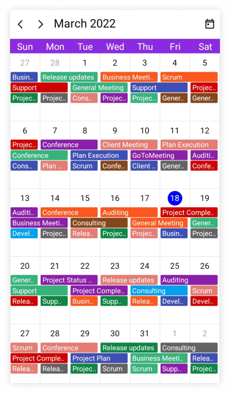
Customize view header appearance using DataTemplateSelector
You can customize the view header appearance by using the ViewHeaderTemplate property of MonthView in the SfScheduler. The DataTemplateSelector can choose a DataTemplate at runtime based on the value of a data-bound to scheduler view header by using the ViewHeaderTemplate. It allows you to choose a different data template for each view header, as well as customize the appearance of a particular view header based on certain conditions.
<ContentPage
    . . .
    xmlns:scheduler="clr-namespace:Syncfusion.Maui.Scheduler;assembly=Syncfusion.Maui.Scheduler">

    <Grid>
        <Grid.Resources>
            <DataTemplate x:Key="normaldatesTemplate">
                <Grid Background = "lightBlue">
                    <Label x:Name="label" HorizontalOptions="Center" VerticalOptions="Center" Text="{Binding StringFormat='{0:ddd}'}"  TextColor="Red" />
                </Grid>
            </DataTemplate>
            <DataTemplate x:Key="todayDatesTemplate">
                <Grid Background = "LightGreen" >
                    <Label x:Name="label" HorizontalOptions="Center" VerticalOptions="Center" Text="{Binding StringFormat='{0:ddd}'}"  TextColor="Orange" />
                </Grid>
            </DataTemplate>
            <local:MonthViewHeaderTemplateSelector x:Key="monthViewHeaderTemplateSelector"  TodayDatesTemplate="{StaticResource todayDatesTemplate}"  NormaldatesTemplate="{StaticResource normaldatesTemplate}" />
        </Grid.Resources>
        <scheduler:SfScheduler x:Name="scheduler"
                               View="Month">
            <scheduler:SfScheduler.MonthView>
                <scheduler:SchedulerMonthView ViewHeaderTemplate = "{StaticResource monthViewHeaderTemplateSelector}"/>
            </scheduler:SfScheduler.MonthView>
        </scheduler:SfScheduler>
    </Grid>
</ContentPage>
public class MonthViewHeaderTemplateSelector : DataTemplateSelector
{
public MonthViewHeaderTemplateSelector()
{
}
public DataTemplate TodayDatesTemplate { get; set; }
public DataTemplate NormaldatesTemplate { get; set; }
protected override DataTemplate OnSelectTemplate(object item, BindableObject container)
{
var viewHeaderDetails = (DateTime)item;
if (viewHeaderDetails.Date.Month == DateTime.Today.Month)
return TodayDatesTemplate;
return NormaldatesTemplate;
}
}
- When using data template selector, performance issues occur as the conversion template views take time within the framework.
Month Navigation direction
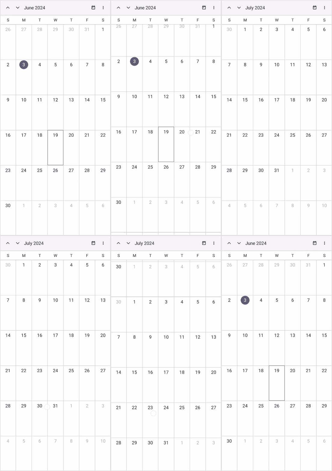
The MonthView of SfScheduler can be navigated in both horizontal and vertical directions. You can change the direction of navigation through the NavigationDirection property of MonthViewSettings in SfScheduler . By default, the navigation direction is Horizontal.
<ContentPage
    . . .
    xmlns:scheduler="clr-namespace:Syncfusion.Maui.Scheduler;assembly=Syncfusion.Maui.Scheduler">

    <scheduler:SfScheduler x:Name="schedule" View="Month">
        <scheduler:SfScheduler.MonthView >
            <scheduler:SchedulerMonthView NavigationDirection="Vertical"/>
        </scheduler:SfScheduler.MonthView>
    </scheduler:SfScheduler>
</ContentPage>
using Syncfusion.Maui.Scheduler;
. . .
public partial class MainPage : ContentPage
{
public MainPage()
{
InitializeComponent();
schedule.MonthView.NavigationDirection = SchedulerMonthNavigationDirection.Vertical;
}
}
Month cell appearance
The month cell appearance can be customized by using the CellStyle, and CellTemplate properties of MonthView in the SfScheduler.
Customize month cell appearance using text style
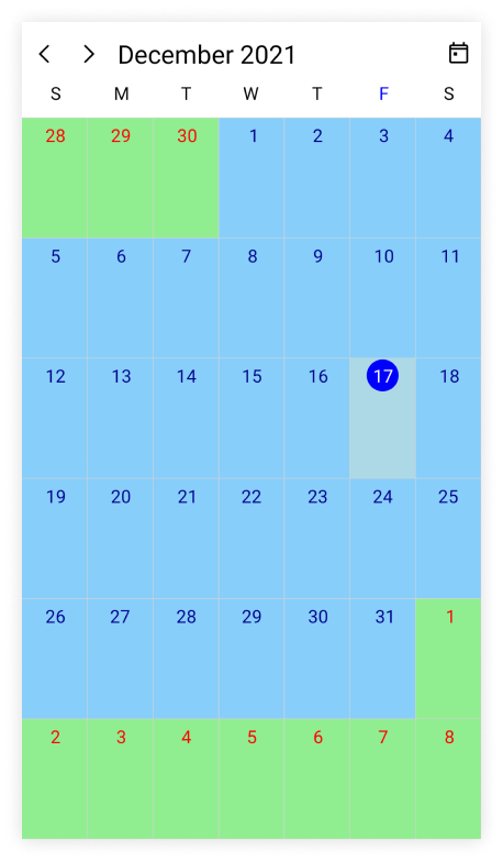
By using the CellStyle property of MonthView, the month properties such as Background, TodayBackground, TrailingMonthBackground, LeadingMonthBackground, TextStyle, TrailingMonthTextStyle, and LeadingMonthTextStyle can be customized.
<ContentPage
    . . .
    xmlns:scheduler="clr-namespace:Syncfusion.Maui.Scheduler;assembly=Syncfusion.Maui.Scheduler">

    <scheduler:SfScheduler x:Name="scheduler"
                           View="Month">
    </scheduler:SfScheduler>
</ContentPage>
using Syncfusion.Maui.Scheduler;
. . .
public partial class MainPage : ContentPage
{
public MainPage()
{
InitializeComponent();
this.scheduler.View = SchedulerView.Month;
var textStyle = new SchedulerTextStyle()
{
TextColor = Colors.DarkBlue,
FontSize = 14,
};
var leadingMonthTextStyle = new SchedulerTextStyle()
{
TextColor = Colors.Red,
FontSize = 14,
};
var trailingMonthTextStyle = new SchedulerTextStyle()
{
TextColor = Colors.Red,
FontSize = 14,
};
var monthCellStyle = new SchedulerMonthCellStyle()
{
Background = Brush.LightSkyBlue,
TodayBackground = Brush.LightBlue,
LeadingMonthBackground = Brush.LightGreen,
TrailingMonthBackground = Brush.LightYellow,
TextStyle = textStyle,
LeadingMonthTextStyle = leadingMonthTextStyle,
TrailingMonthTextStyle = trailingMonthTextStyle
};
this.scheduler.MonthView.CellStyle = monthCellStyle;
}
}
Customize month cell appearance using DataTemplate
You can customize the month cell appearance by using the CellTemplate property of MonthView in the SfScheduler.
<ContentPage
    . . .
    xmlns:scheduler="clr-namespace:Syncfusion.Maui.Scheduler;assembly=Syncfusion.Maui.Scheduler">

    <scheduler:SfScheduler x:Name="scheduler"
                           View="Month">
        <scheduler:SfScheduler.MonthView>
            <scheduler:SchedulerMonthView>
                <scheduler:SchedulerMonthView.CellTemplate>
                    <DataTemplate>
                        <Grid Background = "MediumPurple">
                            <Label HorizontalTextAlignment="Center" TextColor="White" Text="{Binding DateTime.Day}"/>
                        </Grid>
                    </DataTemplate>
                </scheduler:SchedulerMonthView.CellTemplate>
            </scheduler:SchedulerMonthView>
        </scheduler:SfScheduler.MonthView>
    </scheduler:SfScheduler>
</ContentPage>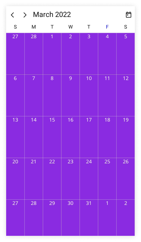
- The BindingContext of the
CellTemplateis theSchedulerMonthCellDetails.
Customize month cell appearance using DataTemplateSelector
You can customize the month cell appearance by using the CellTemplate property of MonthView in the SfScheduler. The DataTemplateSelector can choose a DataTemplate at runtime based on the value of a data-bound to scheduler month cells by using the CellTemplate. It allows you to choose a different data template for each month cell, as well as customize the appearance of a particular month cell based on certain conditions.
<ContentPage
    . . .
    xmlns:scheduler="clr-namespace:Syncfusion.Maui.Scheduler;assembly=Syncfusion.Maui.Scheduler">

    <Grid>
        <Grid.Resources>
            <DataTemplate x:Key="normalDateTemplate">
                <Grid Background = "MediumPurple">
                    <Label HorizontalTextAlignment="Center" TextColor="White" Text="{Binding DateTime.Day}"/>
                </Grid>
            </DataTemplate>
            <DataTemplate x:Key="todayDateTemplate">
                <Grid Background = "MediumPurple">
                    <Label HorizontalTextAlignment="Center" TextColor="Yellow" Text="{Binding DateTime.Day}"/>
                </Grid>
            </DataTemplate>
            <local:MonthCellTemplateSelector x:Key="monthCellTemplateSelector" TodayDateTemplate="{StaticResource todayDateTemplate}" NormalDateTemplate="{StaticResource normalDateTemplate}"/>
        </Grid.Resources>
        <scheduler:SfScheduler x:Name="scheduler"
                               View="Month" >
            <scheduler:SfScheduler.MonthView>
                <scheduler:SchedulerMonthView CellTemplate="{StaticResource monthCellTemplateSelector}" />
            </scheduler:SfScheduler.MonthView>
        </scheduler:SfScheduler>
    </Grid>
</ContentPage>
public class MonthCellTemplateSelector : DataTemplateSelector
{
public MonthCellTemplateSelector()
{
}
public DataTemplate NormalDateTemplate { get; set; }
public DataTemplate TodayDateTemplate { get; set; }
protected override DataTemplate OnSelectTemplate(object item, BindableObject container)
{
var monthCellDetails = item as SchedulerMonthCellDetails;
if (monthCellDetails.DateTime.Date == DateTime.Today.Date)
return TodayDateTemplate;
else
return NormalDateTemplate;
}
}using Syncfusion.Maui.Scheduler;
. . .
public partial class MainPage : ContentPage
{
public MainPage()
{
InitializeComponent();
this.scheduler.View = SchedulerView.Month;
}
}
- The BindingContext of the
CellTemplateis theSchedulerMonthCellDetails.- When using data template selector, performance issues occur as the conversion template views take time within the framework.
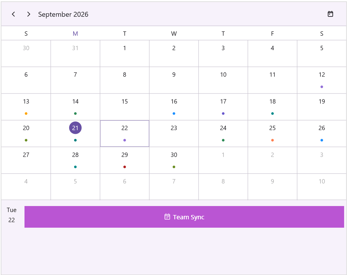
Month Agenda View
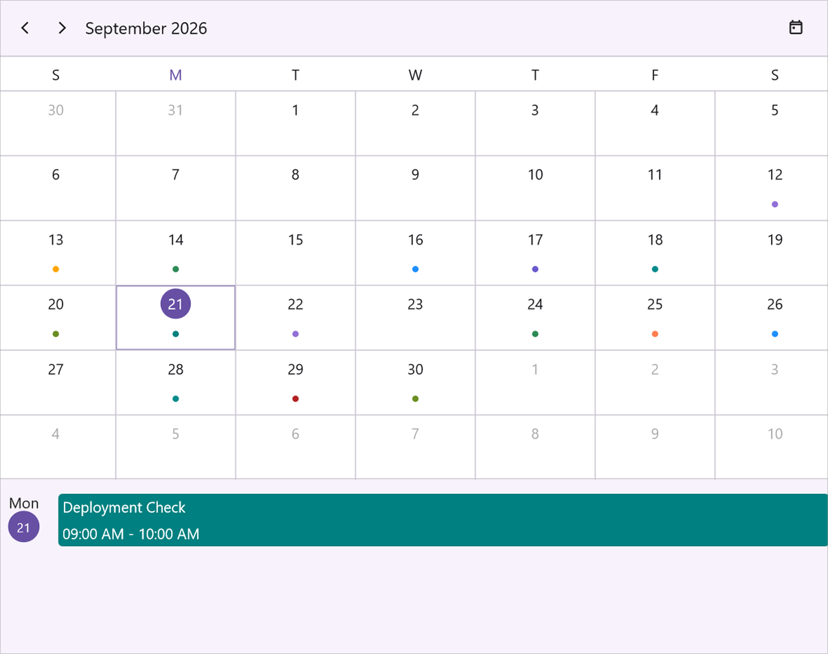
The Month Agenda View panel displays the appointments of the selected date in a split layout beneath the Month view, with an auto-sized date header column on the left and the agenda list on the right. Enable the panel by setting the ShowAgendaView property of MonthView to true. By default, ShowAgendaView is false.
<ContentPage
    . . .
    xmlns:scheduler="clr-namespace:Syncfusion.Maui.Scheduler;assembly=Syncfusion.Maui.Scheduler">

    <scheduler:SfScheduler x:Name="Scheduler" View="Month">
        <scheduler:SfScheduler.MonthView>
            <scheduler:SchedulerMonthView ShowAgendaView="True" />
        </scheduler:SfScheduler.MonthView>
    </scheduler:SfScheduler>
</ContentPage>
using Syncfusion.Maui.Scheduler;
. . .
public partial class MainPage : ContentPage
{
public MainPage()
{
InitializeComponent();
this.Scheduler.View = SchedulerView.Month;
this.Scheduler.MonthView.ShowAgendaView = true;
}
}
Agenda View Height
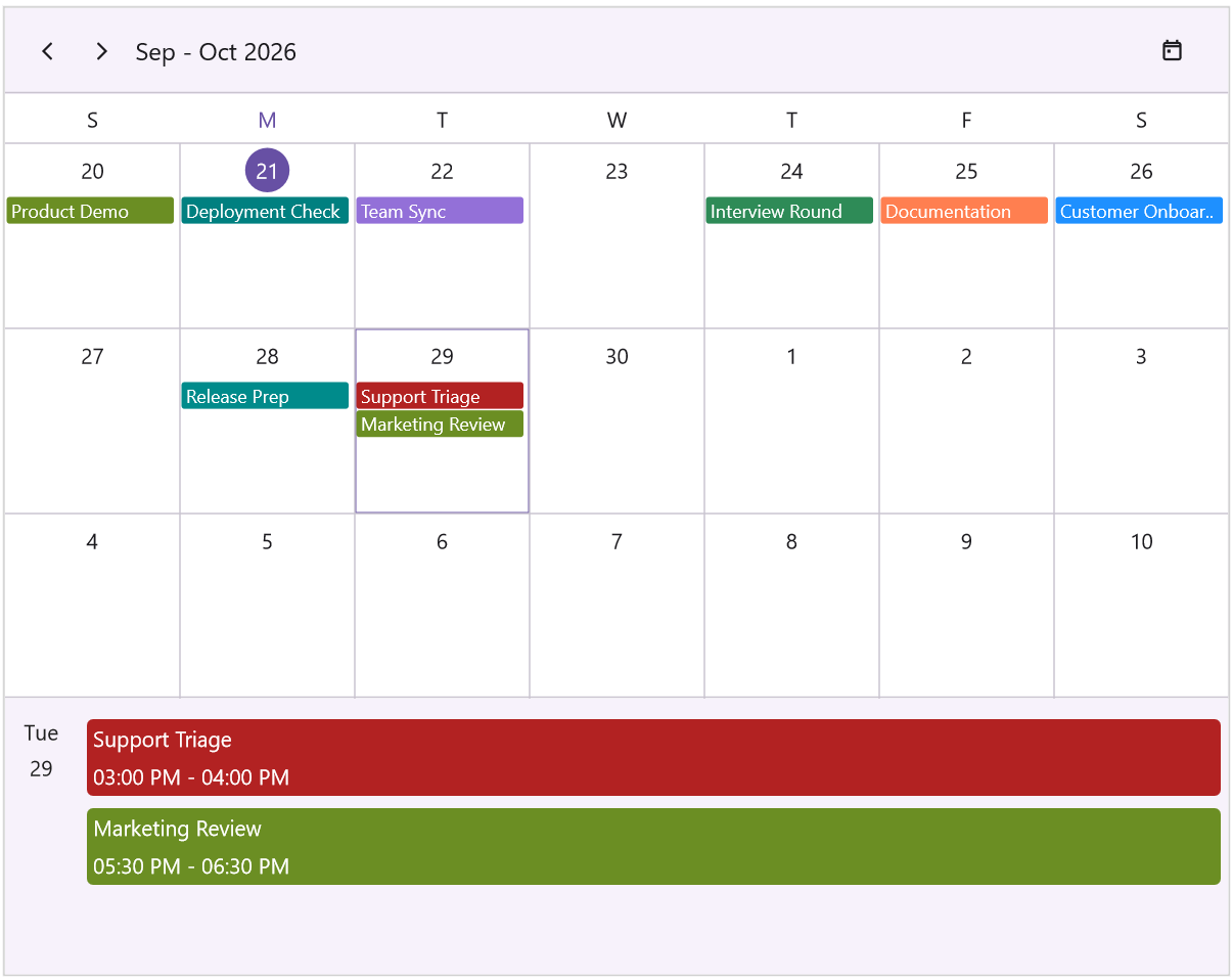
The height of the Month Agenda View panel can be customized by setting the AgendaViewHeight property of MonthView. The default value is -1d, which automatically calculates the agenda view height as 30% of the total scheduler height. When set to a value greater than or equal to 0, the agenda view uses the specified pixel height.
<ContentPage
    . . .
    xmlns:scheduler="clr-namespace:Syncfusion.Maui.Scheduler;assembly=Syncfusion.Maui.Scheduler">

    <scheduler:SfScheduler x:Name="Scheduler" View="Month">
        <scheduler:SfScheduler.MonthView>
            <scheduler:SchedulerMonthView ShowAgendaView="True" AgendaViewHeight="180" />
        </scheduler:SfScheduler.MonthView>
    </scheduler:SfScheduler>
</ContentPage>
using Syncfusion.Maui.Scheduler;
. . .
public partial class MainPage : ContentPage
{
public MainPage()
{
InitializeComponent();
this.Scheduler.View = SchedulerView.Month;
this.Scheduler.MonthView.ShowAgendaView = true;
this.Scheduler.MonthView.AgendaViewHeight = 180;
}
}
Agenda View Style
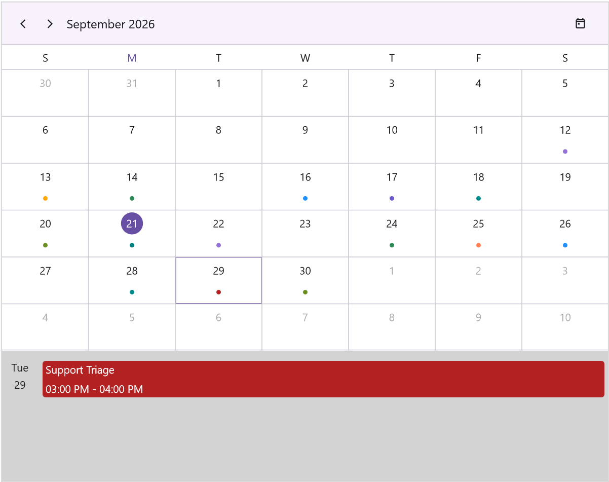
The styling configuration of the Month Agenda View panel can be customized using the AgendaViewStyle property of MonthView. The AgendaViewStyle is of type MonthAgendaViewStyle and provides properties such as Background, ItemHeight, TimeTextFormat, TextStyle, NoEventsTextStyle, DateTextStyle, and ItemTemplate for customizing the appearance and behavior of the agenda panel.
<ContentPage
    . . .
    xmlns:scheduler="clr-namespace:Syncfusion.Maui.Scheduler;assembly=Syncfusion.Maui.Scheduler">

    <scheduler:SfScheduler x:Name="Scheduler" View="Month">
        <scheduler:SfScheduler.MonthView>
            <scheduler:SchedulerMonthView ShowAgendaView="True">
                <scheduler:SchedulerMonthView.AgendaViewStyle>
                    <scheduler:MonthAgendaViewStyle Background="LightGray"
                                                    ItemHeight="48" />
                </scheduler:SchedulerMonthView.AgendaViewStyle>
            </scheduler:SchedulerMonthView>
        </scheduler:SfScheduler.MonthView>
    </scheduler:SfScheduler>
</ContentPage>
using Syncfusion.Maui.Scheduler;
. . .
public partial class MainPage : ContentPage
{
public MainPage()
{
InitializeComponent();
this.Scheduler.View = SchedulerView.Month;
this.Scheduler.MonthView.AgendaViewStyle.Background = Brush.LightGray;
this.Scheduler.MonthView.AgendaViewStyle.ItemHeight = 48;
}
}
Background
The Background property of MonthAgendaViewStyle gets or sets the background brush for the inline appointment collection view. The default value is SolidColorBrush(Color.FromArgb("#F7F2FB")). Setting this property to a color brush fills the agenda view with that color.
Item Height
The ItemHeight property of MonthAgendaViewStyle gets or sets the height of each appointment item in the inline view. The default value is 50.0. This property determines the uniform height of each appointment row in the inline collection view; smaller values compact the view, while larger values provide more spacing.
Time Text Format
The TimeTextFormat property of MonthAgendaViewStyle gets or sets the time format string for appointment times displayed in the inline view. The default value is "hh:mm tt". When the value is empty or null, the current culture’s short time format is used.
Common format strings:
-
"hh:mm tt"— 12-hour format with AM/PM (for example,2:30 PM) -
"HH:mm"— 24-hour format (for example,14:30) -
"h:mm"— 12-hour format without leading zero (for example,2:30)
Text Style
The TextStyle property of MonthAgendaViewStyle gets or sets the text style for appointment items in the inline view. The default value is new SchedulerTextStyle() { FontSize = 14, TextColor = Colors.Transparent }. This style applies to both the appointment subject and start or end times displayed in each item, and lets you customize the font family, size, text color, and font attributes such as Bold and Italic.
No Events Text Style
The NoEventsTextStyle property of MonthAgendaViewStyle gets or sets the text style for the “No Events” message displayed when a date has no appointments. The default value is new SchedulerTextStyle() { FontSize = 14, TextColor = Color.FromArgb("#49454F") }.
Date Text Style
The DateTextStyle property of MonthAgendaViewStyle gets or sets the text style applied to the date column header displayed at the top of the agenda panel. The default value is new SchedulerTextStyle() { FontSize = 14, TextColor = Color.FromArgb("#1F1F1F") }.
Item Template
The ItemTemplate property of MonthAgendaViewStyle gets or sets the custom data template for appointment items displayed in the month agenda view. The default value is null. When a template is provided, it replaces the default appointment item layout with developer-defined content.
<ContentPage
. . .
xmlns:scheduler="clr-namespace:Syncfusion.Maui.Scheduler;assembly=Syncfusion.Maui.Scheduler">
<scheduler:SfScheduler x:Name="Scheduler" View="Month">
<scheduler:SfScheduler.MonthView>
<scheduler:SchedulerMonthView ShowAgendaView="True">
<scheduler:SchedulerMonthView.AgendaViewStyle>
<scheduler:MonthAgendaViewStyle>
<scheduler:MonthAgendaViewStyle.ItemTemplate>
<DataTemplate>
<Grid BackgroundColor="MediumOrchid" Padding="8">
<HorizontalStackLayout HorizontalOptions="Center"
VerticalOptions="Center"
Spacing="6">
<Label Text=""
FontFamily="MauiMaterialAssets"
TextColor="White"
VerticalOptions="Center" />
<Label Text="{Binding Subject}"
TextColor="White"
FontAttributes="Bold"
VerticalOptions="Center" />
</HorizontalStackLayout>
</Grid>
</DataTemplate>
</scheduler:MonthAgendaViewStyle.ItemTemplate>
</scheduler:MonthAgendaViewStyle>
</scheduler:SchedulerMonthView.AgendaViewStyle>
</scheduler:SchedulerMonthView>
</scheduler:SfScheduler.MonthView>
</scheduler:SfScheduler>
</ContentPage>using Syncfusion.Maui.Scheduler;
. . .
public partial class MainPage : ContentPage
{
public MainPage()
{
InitializeComponent();
this.Scheduler.View = SchedulerView.Month;
this.Scheduler.MonthView.AgendaViewStyle = new MonthAgendaViewStyle()
{
ItemTemplate = new DataTemplate(() =>
{
var grid = new Grid
{
BackgroundColor = Colors.MediumOrchid,
Padding = 8
};
var stack = new HorizontalStackLayout
{
HorizontalOptions = LayoutOptions.Center,
VerticalOptions = LayoutOptions.Center,
Spacing = 6
};
stack.Add(new Label
{
Text = "\uE71D",
FontFamily = "MauiMaterialAssets",
TextColor = Colors.White,
VerticalOptions = LayoutOptions.Center
});
var subjectLabel = new Label
{
TextColor = Colors.White,
FontAttributes = FontAttributes.Bold,
VerticalOptions = LayoutOptions.Center
};
subjectLabel.SetBinding(Label.TextProperty, "Subject");
stack.Add(subjectLabel);
grid.Add(stack);
return grid;
})
};
}
}