Liquid Glass Effect in .NET MAUI Sunburst Chart
9 Jul 20265 minutes to read
The liquid glass effect is a modern design style that provides a sleek, minimalist appearance with clean lines, subtle visual effects, and elegant styling. It features smooth rounded corners and sophisticated visual treatments that create a polished, professional look for your charts.
NOTE
Prerequisite:
- Ensure that the required NuGet package is installed, the necessary namespaces are imported, and the Sunburst Chart control is properly configured in your application. For detailed setup and configuration instructions, refer to the Getting Started guide.
- To use SfGlassEffectView, ensure that the Syncfusion.Maui.Core package is installed and import the Syncfusion.Maui.Core namespace.
NOTE
The liquid glass effect is supported only on
.NET 10and oniOS 26andmacOS 26or later. Enabling these properties on other platforms (such as Windows or Android) has no effect; the chart renders normally without the glass appearance.
How it enhances chart UI on macOS and iOS
The liquid glass effect enhances MAUI SfSunburstChart with a sleek, glassy look and improved interactivity.
- Chart background: Wrap the chart in an SfGlassEffectView to give the chart surface a blurred or clear glass background.
- Tooltip: Applies a glassy appearance to tooltips for clearer data highlights.
Apply the liquid glass effect to the chart
To give the chart surface a glass (blurred or clear) appearance, wrap the SfSunburstChart inside an SfGlassEffectView. SfGlassEffectView is available in the Syncfusion.Maui.Core package, which must be installed separately. For detailed guidance on SfGlassEffectView.
The following properties of SfGlassEffectView are used to customize the glass appearance:
-
CornerRadius, of type
double, indicates the radius of the rounded corners. -
Padding, of type
Thickness, indicates the padding between the chart and the glass view. -
EffectType, of type
GlassEffectType, indicates the type of glass effect. -
EnableShadowEffect, of type
bool, indicates whether the shadow effect is enabled.
The EffectType property uses the GlassEffectType enum with the following values:
-
Regular- Produces a more blurred, frosted-glass appearance. -
Clear- Produces a crisper, glassy appearance.
<core:SfGlassEffectView CornerRadius="20"
                        Padding="12"
                        EffectType="Regular"
                        EnableShadowEffect="True">
    <sunburst:SfSunburstChart>
        <!-- code omitted for brevity -->
    </sunburst:SfSunburstChart>
</core:SfGlassEffectView>
SfSunburstChart chart = new SfSunburstChart();
// code omitted for brevity
SfGlassEffectView glass = new SfGlassEffectView
{
CornerRadius = 20,
Padding = 12,
EffectType = GlassEffectType.Regular,
EnableShadowEffect = true,
Content = chart
};
this.Content = glass;Apply the liquid glass effect to the tooltip
To enable the liquid glass effect on tooltips, set the EnableLiquidGlassEffect property and the EnableTooltip property of SfSunburstChart to true.
<sunburst:SfSunburstChart EnableLiquidGlassEffect="True"
                          EnableTooltip="True">
    <!-- code omitted for brevity -->
</sunburst:SfSunburstChart>
SfSunburstChart chart = new SfSunburstChart();
chart.EnableLiquidGlassEffect = true;
chart.EnableTooltip = true;
// code omitted for brevity
this.Content = chart;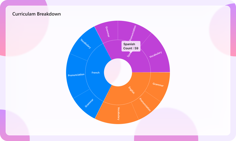
When using a custom tooltip template via the TooltipTemplate property, set the template’s background to Transparent so the liquid glass effect is visible.
<sunburst:SfSunburstChart EnableLiquidGlassEffect="True"
                          EnableTooltip="True">
    <sunburst:SfSunburstChart.TooltipTemplate>
        <DataTemplate>
            <Grid Background="Transparent"
                  Padding="8">
                <Label Text="{Binding Item[0]}"
                       TextColor="White"/>
            </Grid>
        </DataTemplate>
    </sunburst:SfSunburstChart.TooltipTemplate>
    <!-- code omitted for brevity -->
</sunburst:SfSunburstChart>
SfSunburstChart chart = new SfSunburstChart();
chart.EnableLiquidGlassEffect = true;
chart.EnableTooltip = true;
// Define a DataTemplate with a Transparent background and assign to chart.TooltipTemplate.
// code omitted for brevity
this.Content = chart;Best practices and tips
- The liquid glass effect is most visible when the chart is placed over images or colorful backgrounds.
- Set the EffectType property to
Regularfor a more blurred look, orClearfor a crisper, glassy look. - Tune the
CornerRadiusandPaddingvalues to balance content density and visual polish. - On unsupported platforms, the liquid glass properties are ignored and the chart renders normally.