How can I help you?
How to Apply CSS Style Rules in .NET MAUI SfMarkdownViewer
5 Sep 20256 minutes to read
The SfMarkdownViewer control in .NET MAUI comes with a set of built-in default styles that ensure Markdown content is rendered cleanly and consistently across platforms. However, in many real-world applications, developers may need to override these defaults to match their app’s branding, improve readability, or create a custom visual experience.
This guide explains how to override the default styles using the MarkdownStyleSettings class and the CssStyleRules property.
Defining Styles
XAML
<ContentPage.Resources>
    <ResourceDictionary>
        <x:String x:Key="CustomStyle">
        body {
            background: #F5F7FA;
            font-family: 'Segoe UI', sans-serif;
            font-size: 16px;
            color: #2E2E2E;
            line-height: 1.7;
        }

        h1 {
            font-weight: 700;
            font-size: 30px;
            line-height: 38px;
            letter-spacing: 0.5px;
            color: #1E3A8A;
            margin-bottom: 16px;
        }

        h2 {
            font-weight: 600;
            font-size: 24px;
            line-height: 32px;
            letter-spacing: 0.4px;
            color: #3B5BAA;
            margin-top: 24px;
            margin-bottom: 12px;
        }

        h3 {
            font-weight: 500;
            font-size: 20px;
            line-height: 28px;
            letter-spacing: 0.3px;
            color: #6C83C1;
            margin-top: 20px;
            margin-bottom: 10px;
        }
        </x:String>
    </ResourceDictionary>
</ContentPage.Resources>
Apply the defined CSS style to the Markdown Viewer using the CssStyleRules property, as shown in the XAML code below:
<ContentPage
    . . .
    xmlns:markdown="clr-namespace:Syncfusion.Maui.MarkdownViewer;
    assembly=Syncfusion.Maui.MarkdownViewer">
    . . .
    <markdown:SfMarkdownViewer Source={Binding MarkdownContent}>
        <markdown:SfMarkdownViewer.Settings>
            <markdown:MarkdownStyleSettings CssStyleRules="{StaticResource CustomStyle}" />
        </markdown:SfMarkdownViewer.Settings>
    </markdown:SfMarkdownViewer>

</ContentPage>
The output below reflects the styled appearance of the Markdown content.
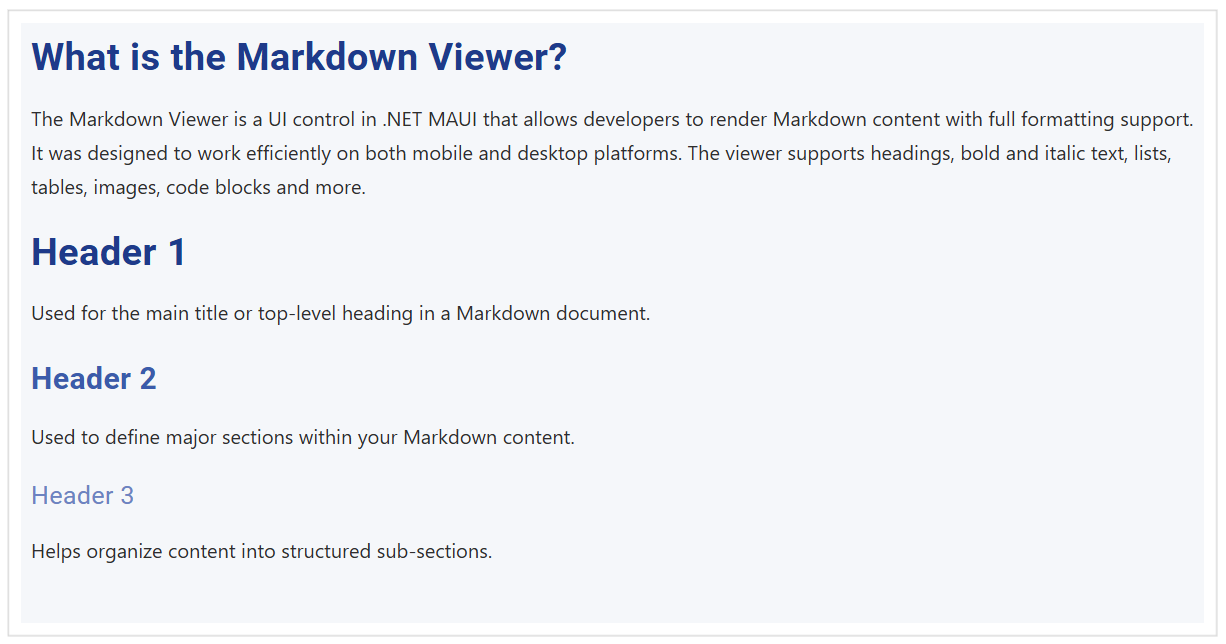
By defining custom styles, you can transform the Markdown Viewer into a fully branded and polished content surface that fits seamlessly into your app’s design system.
NOTE
Apply CSS styles only when necessary as they will override the properties of individual Markdown elements such as H1FontSize, H1Color, BodyTextColor, TableHeaderFontSize, etc., defined in the MarkdownStyleSettings class.
Define Styles for Images
Images are a vital part of Markdown content, providing visual context and detail. SfMarkdownViewer allows you to override the appearance of images through CSS, enabling custom sizing, borders, or even special effects. For example:
<x:String x:Key="CustomStyle">
img {
    border-radius: 12px;
    border: 8px solid #e0e3ea;
    max-width: 95%;
    box-shadow: 0 4px 16px rgba(31,45,61,0.75);
    margin: 16px 16px;
}
</x:String>
This CSS makes all images inside the Markdown content appear with rounded corners, a subtle border, and a shadow that helps them blend elegantly with modern app designs. Adjust the margin or max-width to fit the layout of your application.

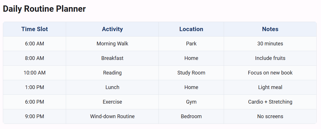
Define Styles for Tables
Tables are commonly used to present data and comparisons. While basic table styling (such as header font size, text color, and table background) can be easily set using properties of the MarkdownStyleSettings class, see the detailed explanation in the Customize Appearance documentation. You can take your table designs further by using custom CSS through the CssStyleRules property.
This enables effects such as striped rows, rounded corners, advanced padding, and borders for maximum brand consistency. For example:
<x:String x:Key="CustomStyle">
table {
    background: #FAFBFC;
    border-collapse: collapse;
    margin: 16px 0;
    width: 100%;
    border-radius: 6px;
    overflow: hidden;
}
th, td {
    border: 1px solid #E0E4EA;
    padding: 10px 16px;
    text-align: left;
}
th {
    background: #EDF2FB;
    color: #193466;
    font-size: 17px;
    font-weight: 600;
}
tr:nth-child(even) {
    background: #F5F7FB;
}
</x:String>
CSS styles provide much finer control over table appearance than the standard style properties. For thorough details on property based styling including TableHeaderFontSize, TableHeaderTextColor, and more, please refer to the Customize Appearance documentation page. When both CSS and style properties are specified, CSS will take precedence.
Define Styles for ScrollBar
Scrollbars are crucial for navigating through long Markdown documents, especially on desktop platforms or when embedding the control in a constrained space. SfMarkdownViewer enables you to customize scrollbar appearance and behavior via CSS:
-
Scrollbar Visibility: You can show or hide the scrollbar by targeting the
::-webkit-scrollbarselector (on applicable platforms). - Scrollbar Color: Make the scrollbar match your branding or fade it as needed.
Example CSS for a modern, visible scrollbar:
<x:String x:Key="CustomStyle">
::-webkit-scrollbar {
    width: 10px;
    background: #eeeeee;
}
::-webkit-scrollbar-thumb {
    background: #3B82F6;
    border-radius: 8px;
    border: 2px solid #1E293B;
}
::-webkit-scrollbar-thumb:hover {
    background: #2563EB;
}
</x:String>
You can further hide the scrollbar by setting display: none; in the ::-webkit-scrollbar selector or by setting its width to 0, or match its color and thickness to seamlessly blend with your application’s UI. Custom scrollbar styling will be effective on supported platforms (typically Windows and Android). Always verify cross-platform appearance for best results.
With tailored scrollbar, table, and image styles, the SfMarkdownViewer control delivers beautiful, readable, and fully brand-aligned Markdown content in your .NET MAUI applications.