Appearance in .NET MAUI Linear ProgressBar (SfLinearProgressBar)
12 Sep 202511 minutes to read
Range colors
Visualize multiple ranges with different colors mapped to each range to enhance the readability of progress.
The colors can be mapped to the specific ranges using the GradientStops property, which holds a collection of ProgressGradientStop.
The following properties in the GradientStops are used to map the colors to a range:
-
Color:Represents the color to the specified range. -
Value:Represents the start or end value for the specified color.
The following code sample demonstrates how to map the solid color range in the linear progress bar.
<progressBar:SfLinearProgressBar Progress="100">
    <progressBar:SfLinearProgressBar.GradientStops>
        <progressBar:ProgressGradientStop Color="#00bdaf" Value="0"/>
        <progressBar:ProgressGradientStop Color="#00bdaf" Value="25"/>
        <progressBar:ProgressGradientStop Color="#2f7ecc" Value="25"/>
        <progressBar:ProgressGradientStop Color="#2f7ecc" Value="50"/>
        <progressBar:ProgressGradientStop Color="#e9648e" Value="50"/>
        <progressBar:ProgressGradientStop Color="#e9648e" Value="75"/>
        <progressBar:ProgressGradientStop Color="#fbb78a" Value="75"/>
        <progressBar:ProgressGradientStop Color="#fbb78a" Value="100"/>
    </progressBar:SfLinearProgressBar.GradientStops>
</progressBar:SfLinearProgressBar>
SfLinearProgressBar linearProgressBar = new SfLinearProgressBar();
linearProgressBar.Progress = 100;
linearProgressBar.GradientStops.Add(new ProgressGradientStop { Color = Color.FromArgb("00bdaf"), Value = 0 });
linearProgressBar.GradientStops.Add(new ProgressGradientStop { Color = Color.FromArgb("00bdaf"), Value = 25 });
linearProgressBar.GradientStops.Add(new ProgressGradientStop { Color = Color.FromArgb("2f7ecc"), Value = 25 });
linearProgressBar.GradientStops.Add(new ProgressGradientStop { Color = Color.FromArgb("2f7ecc"), Value = 50 });
linearProgressBar.GradientStops.Add(new ProgressGradientStop { Color = Color.FromArgb("e9648e"), Value = 50 });
linearProgressBar.GradientStops.Add(new ProgressGradientStop { Color = Color.FromArgb("e9648e"), Value = 75 });
linearProgressBar.GradientStops.Add(new ProgressGradientStop { Color = Color.FromArgb("fbb78a"), Value = 75 });
linearProgressBar.GradientStops.Add(new ProgressGradientStop { Color = Color.FromArgb("fbb78a"), Value = 100 });
this.Content = linearProgressBar;
The following code sample demonstrates how to apply gradient transition effect to the range colors in the linear progress bar.
<progressBar:SfLinearProgressBar Progress="100" >
    <progressBar:SfLinearProgressBar.GradientStops>
        <progressBar:ProgressGradientStop Color="#00bdaf" Value="0"/>
        <progressBar:ProgressGradientStop Color="#2f7ecc" Value="25"/>
        <progressBar:ProgressGradientStop Color="#e9648e" Value="50"/>
        <progressBar:ProgressGradientStop Color="#fbb78a" Value="75"/>
    </progressBar:SfLinearProgressBar.GradientStops>
</progressBar:SfLinearProgressBar>
SfLinearProgressBar linearProgressBar = new SfLinearProgressBar();
linearProgressBar.Progress = 100;
linearProgressBar.GradientStops.Add(new ProgressGradientStop { Color = Color.FromArgb("00bdaf"), Value = 0 });
linearProgressBar.GradientStops.Add(new ProgressGradientStop { Color = Color.FromArgb("2f7ecc"), Value = 25 });
linearProgressBar.GradientStops.Add(new ProgressGradientStop { Color = Color.FromArgb("e9648e"), Value = 50 });
linearProgressBar.GradientStops.Add(new ProgressGradientStop { Color = Color.FromArgb("fbb78a"), Value = 75 });
this.Content = linearProgressBar;
Thickness
In the linear progress bar, the height of the track, progress, and secondary progress can be customized using the TrackHeight, ProgressHeight, and SecondaryProgressHeight properties, respectively.
<progressBar:SfLinearProgressBar Progress="30"
                                 TrackHeight="10"
                                 ProgressHeight="10"
                                 SecondaryProgressHeight="10"
                                 SecondaryProgress="70" />
SfLinearProgressBar linearProgressBar = new SfLinearProgressBar();
linearProgressBar.Progress = 100;
linearProgressBar.SecondaryProgress = 100;
linearProgressBar.TrackHeight = 10;
linearProgressBar.ProgressHeight = 10;
linearProgressBar.SecondaryProgressHeight = 10;
this.Content = linearProgressBar;
Padding
In the linear progress bar, the padding of the progress and the secondary progress indicator at the left and right ends can be adjusted by using the ProgressPadding property.
<progressBar:SfLinearProgressBar Progress="30"
                                 TrackHeight="15"
                                 ProgressHeight="5"
                                 SecondaryProgressHeight="5"
                                 SecondaryProgress="70"
                                 ProgressPadding="5"/>
SfLinearProgressBar linearProgressBar = new SfLinearProgressBar();
linearProgressBar.Progress = 30;
linearProgressBar.SecondaryProgress = 70;
linearProgressBar.TrackHeight = 15;
linearProgressBar.ProgressHeight = 5;
linearProgressBar.SecondaryProgressHeight = 5;
linearProgressBar.ProgressPadding = 5;
this.Content = linearProgressBar;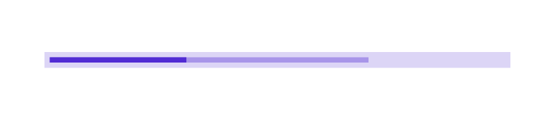
Corner radius
In the linear progress bar, the corner radius of the track, progress, and secondary progress can be customized using the TrackCornerRadius, ProgressCornerRadius, and SecondaryProgressCornerRadius properties, respectively.
<progressBar:SfLinearProgressBar Progress="50"
                                 TrackHeight="10"
                                 TrackCornerRadius="5"
                                 ProgressHeight="10"
                                 ProgressCornerRadius="5" />
SfLinearProgressBar linearProgressBar = new SfLinearProgressBar();
linearProgressBar.Progress = 50;
linearProgressBar.TrackHeight = 10;
linearProgressBar.ProgressHeight = 10;
linearProgressBar.ProgressCornerRadius = 5;
linearProgressBar.TrackCornerRadius = 5;
this.Content = linearProgressBar;
Color customization
The following properties are used to customize the color in the linear progress bar.
-
ProgressFill:Represents the color of the progress indicator. -
TrackFill:Represents the color of the track indicator.
The following code sample demonstrates the color customization in progress and track indicator.
<progressBar:SfLinearProgressBar Progress="75"
                                 TrackFill="#3351483a"
                                 ProgressFill="#FF51483a" />
SfLinearProgressBar linearProgressBar = new SfLinearProgressBar();
linearProgressBar.Progress = 75;
linearProgressBar.TrackFill = Color.FromArgb("3351483a");
linearProgressBar.ProgressFill = Color.FromArgb("FF51483a");
linearProgressBar.SecondaryProgressFill = Colors.CornflowerBlue;
this.Content = linearProgressBar;
The linear progress bar provides support to customize the color for the secondary progress bar using the SecondaryProgressFill property as demonstrated in the following code sample.
<progressBar:SfLinearProgressBar Progress="25"
                                 SecondaryProgress="75"
                                 SecondaryProgressFill="CornflowerBlue" />
SfLinearProgressBar linearProgressBar = new SfLinearProgressBar();
linearProgressBar.Progress = 25;
linearProgressBar.SecondaryProgress = 75;
linearProgressBar.SecondaryProgressFill = Colors.CornflowerBlue;
this.Content = linearProgressBar;
NOTE
Refer to our .NET MAUI Linear ProgressBar feature tour page for its groundbreaking feature representations. Also explore our .NET MAUI Linear ProgressBar example that shows how to configure a SfLinearProgressBar in .NET MAUI.