Scale Effect in .NET MAUI Effects View
18 Nov 201819 minutes to read
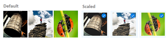
The SfEffects.Scale effect smoothly scales the Effects View and its Content from the current size to a new size determined by the ScaleFactor.
Adding a Basic Scale
The example below shrinks the Effects View to 85% of its current size when the user long-presses it. The other trigger properties are set to None so that only the Scale effect fires.
<HorizontalStackLayout HorizontalOptions="Center"
                       Spacing="12">
    <syncEffectsView:SfEffectsView x:Name="EffectsView1"
                                   ScaleFactor="0.85"
                                   LongPressEffects="Scale"
                                   TouchDownEffects="None"
                                   TouchUpEffects="None"
                                   LongPressed="OnEffectsView1LongPressed">
        <Grid WidthRequest="100"
              HeightRequest="100">
            <Image Source="person3.jpg"
                   WidthRequest="100"
                   HeightRequest="100"
                   Aspect="AspectFill" />
            <Border x:Name="Tick1"
                    Padding="0"
                    IsVisible="False"
                    BackgroundColor="Blue"
                    WidthRequest="18"
                    HeightRequest="18"
                    HorizontalOptions="End"
                    VerticalOptions="Start"
                    StrokeThickness="0">
                <Border.StrokeShape>
                    <RoundRectangle CornerRadius="9" />
                </Border.StrokeShape>
                <Label Text="✓"
                       FontSize="12"
                       TextColor="White"
                       FontAttributes="Bold"
                       HorizontalOptions="Center"
                       VerticalOptions="Center" />
            </Border>
        </Grid>
    </syncEffectsView:SfEffectsView>

    <syncEffectsView:SfEffectsView x:Name="EffectsView2"
                                   ScaleFactor="0.85"
                                   LongPressEffects="Scale"
                                   TouchDownEffects="None"
                                   TouchUpEffects="None"
                                   LongPressed="OnEffectsView2LongPressed">
        <Grid WidthRequest="100"
              HeightRequest="100">
            <Image Source="person2.jpg"
                   WidthRequest="100"
                   HeightRequest="100"
                   Aspect="AspectFill" />
            <Border x:Name="Tick2"
                    Padding="0"
                    IsVisible="False"
                    BackgroundColor="Blue"
                    WidthRequest="18"
                    HeightRequest="18"
                    HorizontalOptions="End"
                    VerticalOptions="Start"
                    StrokeThickness="0">
                <Border.StrokeShape>
                    <RoundRectangle CornerRadius="9" />
                </Border.StrokeShape>
                <Label Text="✓"
                       FontSize="12"
                       TextColor="White"
                       FontAttributes="Bold"
                       HorizontalOptions="Center"
                       VerticalOptions="Center" />
            </Border>
        </Grid>
    </syncEffectsView:SfEffectsView>

    <syncEffectsView:SfEffectsView x:Name="EffectsView3"
                                   ScaleFactor="0.85"
                                   LongPressEffects="Scale"
                                   TouchDownEffects="None"
                                   TouchUpEffects="None"
                                   LongPressed="OnEffectsView3LongPressed">
        <Grid WidthRequest="100"
              HeightRequest="100">
            <Image Source="person1.jpg"
                   WidthRequest="100"
                   HeightRequest="100"
                   Aspect="AspectFill" />
            <Border x:Name="Tick3"
                    Padding="0"
                    IsVisible="False"
                    BackgroundColor="Blue"
                    WidthRequest="18"
                    HeightRequest="18"
                    HorizontalOptions="End"
                    VerticalOptions="Start"
                    StrokeThickness="0">
                <Border.StrokeShape>
                    <RoundRectangle CornerRadius="9" />
                </Border.StrokeShape>
                <Label Text="✓"
                       FontSize="12"
                       TextColor="White"
                       FontAttributes="Bold"
                       HorizontalOptions="Center"
                       VerticalOptions="Center" />
            </Border>
        </Grid>
    </syncEffectsView:SfEffectsView>
</HorizontalStackLayout>
/// <summary>
/// Handle LongPressed event for EffectsView1
/// </summary>
private void OnEffectsView1LongPressed(object sender, EventArgs e)
{
SelectImage(EffectsView1, Tick1);
}
/// <summary>
/// Handle LongPressed event for EffectsView2
/// </summary>
private void OnEffectsView2LongPressed(object sender, EventArgs e)
{
SelectImage(EffectsView2, Tick2);
}
/// <summary>
/// Handle LongPressed event for EffectsView3
/// </summary>
private void OnEffectsView3LongPressed(object sender, EventArgs e)
{
SelectImage(EffectsView3, Tick3);
}
/// <summary>
/// Select an image: apply scale effect and show tick mark.
/// </summary>
private async void SelectImage(SfEffectsView effectsView, Border tickFrame)
{
// Apply scale effect to the newly selected image
await effectsView.ScaleTo(0.85, 300, Easing.CubicInOut);
// Show the tick mark
tickFrame.IsVisible = true;
}
Customizing the Duration
The example below uses a longer animation duration so the scale is easier to see.
<syncEffectsView:SfEffectsView x:Name="effectsView"
                               ScaleFactor="0.7"
                               ScaleAnimationDuration="800"
                               TouchDownEffects="None"
                               TouchUpEffects="None"
                               LongPressEffects="Scale">
    <Border WidthRequest="280"
            HeightRequest="120"
            StrokeShape="RoundRectangle 18">
        <Border.Background>
            <LinearGradientBrush EndPoint="1,1">
                <GradientStop Color="#FF6B6B"
                              Offset="0.0" />
                <GradientStop Color="#4ECDC4"
                              Offset="1.0" />
            </LinearGradientBrush>
        </Border.Background>
        <Grid Padding="16"
              HorizontalOptions="Center"
              VerticalOptions="Center">
            <VerticalStackLayout Spacing="4"
                                 HorizontalOptions="Center" VerticalOptions="Center">
                <Label Text="Long-press to scale"
                       TextColor="White"
                       FontSize="18"
                       FontAttributes="Bold"
                       HorizontalOptions="Center" />
                <Label Text="The whole card shrinks to 70%."
                       TextColor="White"
                       FontSize="13"
                       HorizontalOptions="Center" />
            </VerticalStackLayout>
        </Grid>
    </Border>
</syncEffectsView:SfEffectsView>
var titleLabel = new Label
{
Text = "Long-press to scale",
TextColor = Colors.White,
FontSize = 18,
FontAttributes = FontAttributes.Bold,
HorizontalOptions = LayoutOptions.Center
};
var subtitleLabel = new Label
{
Text = "The whole card shrinks to 70%.",
TextColor = Colors.White,
FontSize = 13,
HorizontalOptions = LayoutOptions.Center
};
var stack = new VerticalStackLayout
{
Spacing = 4,
HorizontalOptions = LayoutOptions.Center,
VerticalOptions = LayoutOptions.Center,
Children = { titleLabel, subtitleLabel }
};
var grid = new Grid
{
Padding = new Thickness(16),
HorizontalOptions = LayoutOptions.Center,
VerticalOptions = LayoutOptions.Center,
Children = { stack }
};
var border = new Border
{
WidthRequest = 280,
HeightRequest = 120,
StrokeShape = new RoundRectangle { CornerRadius = 18 },
Background = new LinearGradientBrush
{
EndPoint = new Point(1, 1),
GradientStops = new GradientStopCollection
{
new GradientStop(Color.FromArgb("#FF6B6B"), 0.0f),
new GradientStop(Color.FromArgb("#4ECDC4"), 1.0f)
}
},
Content = grid
};
var effectsView = new SfEffectsView
{
ScaleFactor = 0.7,
ScaleAnimationDuration = 800,
TouchDownEffects = SfEffects.None,
TouchUpEffects = SfEffects.None,
LongPressEffects = SfEffects.Scale,
Content = border
};
this.Content = effectsView;