About Syncfusion® .NET MAUI Digital Gauge Control
18 Nov 20185 minutes to read
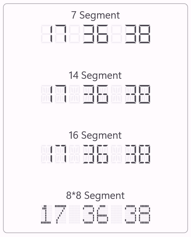
The Syncfusion® .NET MAUI DigitalGauge control is used to display alphanumeric characters in digital (LED display) mode. This control displays a range of values that use characters in combination with numbers.
Business use cases
- Dashboard applications that display numeric values such as counters, timers, or measurements in LED format.
- Industrial and monitoring systems that require digital-style displays for real-time data representation.
- IoT and device interfaces that present sensor values or status indicators using segment-based displays.
- Entertainment or media applications that use stylized digital text for clocks, scoreboards, or indicators.
Key features
- Multiple segment types support allows displaying characters using 7-segment, 14-segment, 16-segment, and 8x8 dot matrix formats.
- 7-segment display support is optimized for rendering numeric values using a simple and clear digital format.
- 14-segment display support allows displaying both numeric and alphabetical characters for extended representation.
- 16-segment display support provides improved clarity for alphanumeric characters with enhanced segment detail.
- 8x8 dot matrix display support allows rendering numbers, characters, and symbols using dot-based matrix patterns.
Globalization
The following table summarizes the globalization support available in this control.
 Full Support
 Partial Support
 No Support
| Control | Localization | RTL | Time zone | Screen reader | Keyboard navigation |
|---|---|---|---|---|---|
| Digital Gauge | |
|
|
|
|
Related controls
- Circular Charts for visualizing proportional data using circular charts.
- Linear Gauge for representing values using gauge-based visualization.
- Radial Gauge for displaying progress values in a circular style.
See Also
- Getting Started shows a step‑by‑step guide to begin using the Digital Gauge control.
- Segments Types helps you understand different segment types and configurations.
- Customization explains how to customize appearance and behavior of the control.
- UI Kit provides interactive demos and ready‑made UI examples.
Resources
Feature Tour
Get a quick overview of key features and capabilities to kick start your journey.
Explore Features
Tutorial Videos
Watch step‑by‑step video guides to quickly understand concepts and implementation.
Watch now
Knowledge Base
Find practical solutions, troubleshooting tips and how‑to guides for common scenarios.
Search KB's
Use Case Sample
Explore a real-world application that demonstrates the practical use of the Digital Gauge.
View Sample