Visual Customization in .NET MAUI CheckBox (SfCheckBox)
21 May 202513 minutes to read
Customizing a shape
The shape of the CheckBox can be customized using the CornerRadius property. This property specifies a uniform radius value for every corner of the CheckBox.
<syncfusion:SfCheckBox x:Name="checkBox" Text="CheckBox" IsChecked="True" CornerRadius="5.0"/>SfCheckBox checkBox = new SfCheckBox();
checkBox.Text = "CheckBox";
checkBox.IsChecked = true;
checkBox.CornerRadius = 5.0f;
this.Content = checkBox;
Customizing state colors
You can customize the state colors using the CheckedColor and UncheckedColor properties. The checked or indeterminate state color is updated based on the CheckedColor property, while the color for the unchecked state is based on the UncheckedColor property.
<StackLayout>
        <syncfusion:SfCheckBox x:Name="check" Text="CheckBox" IsChecked="True" CheckedColor="Green"/>
        <syncfusion:SfCheckBox x:Name="unCheck" Text="CheckBox" UncheckedColor="Violet"/>
        <syncfusion:SfCheckBox x:Name="intermediate " Text="CheckBox" IsThreeState="True" IsChecked="{x:Null}" CheckedColor="Purple"/>
    </Stacklayout>
StackLayout stackLayout = new StackLayout();
SfCheckBox check = new SfCheckBox();
check.Text = "CheckBox";
check.IsChecked = true;
check.CheckedColor = Colors.Green;
SfCheckBox uncheck = new SfCheckBox();
uncheck.Text = "CheckBox";
uncheck.UncheckedColor = Colors.Violet;
SfCheckBox intermediate = new SfCheckBox();
intermediate.IsChecked = null;
intermediate.IsThreeState = true;
intermediate.Text = "CheckBox";
intermediate.CheckedColor = Colors.Purple;
stackLayout.Children.Add(check);
stackLayout.Children.Add(uncheck);
stackLayout.Children.Add(intermediate);
this.Content = stackLayout;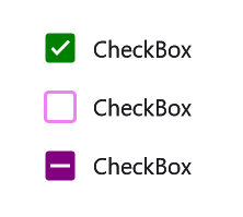
StrokeThickness
The stroke thickness of the CheckBox can be customized using the StrokeThickness property.
<StackLayout>
        <syncfusion:SfCheckBox Text="Hello" StrokeThickness="2" UncheckedColor="Blue" FontSize="20"/>
        <syncfusion:SfCheckBox Text="Hello" StrokeThickness="4" UncheckedColor="Blue" FontSize="25"/>
        <syncfusion:SfCheckBox Text="Hello" StrokeThickness="6" UncheckedColor="Blue" FontSize="30"/>
    </StackLayout>
StackLayout stackLayout = new StackLayout();
SfCheckBox check1 = new SfCheckBox();
check1.Text = "Hello";
check1.StrokeThickness = 2;
check1.FontSize = 20;
check1.UncheckedColor = Colors.Blue;
SfCheckBox check2 = new SfCheckBox();
check2.Text = "Hello";
check2.StrokeThickness = 4;
check2.FontSize = 25;
check2.UncheckedColor = Colors.Blue;
SfCheckBox check3 = new SfCheckBox();
check3.Text = "Hello";
check3.StrokeThickness = 6;
check3.FontSize = 30;
check3.UncheckedColor = Colors.Blue;
stackLayout.Children.Add(check1);
stackLayout.Children.Add(check2);
stackLayout.Children.Add(check3);
this.Content = stackLayout;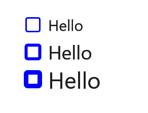
Setting a caption text appearance
You can customize the appearance of the text in the SfCheckBox control using the following properties:
-
TextColor: Changes the color of the text. -
HorizontalTextAlignment: Changes the horizontal alignment of the caption text. -
FontFamily: Changes the font family of the caption text. -
FontAttributes: Sets font attributes(bold/italic/none) of the caption text. -
FontSize: Sets font size of the caption text.
<syncfusion:SfCheckBox  x:Name="caption"
                            Text="CheckBox"
                            IsChecked="True"
                            TextColor="Blue"
                            HorizontalTextAlignment="Center"
                            FontFamily="Arial"
                            FontAttributes="Bold"
                            FontSize="20"/>
SfCheckBox caption = new SfCheckBox();
caption.IsChecked = true;
caption.Text = "CheckBox";
caption.TextColor = Colors.Blue;
caption.HorizontalTextAlignment = TextAlignment.Center;
caption.FontFamily = "Arial";
caption.FontAttributes = FontAttributes.Bold;
caption.FontSize = 20;
this.Content = caption;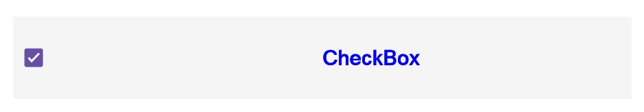
TickColor customization
The TickColor property customizes the color of the tick in the SfCheckBox control using the properties listed below.
<ContentPage xmlns="http://xamarin.com/schemas/2014/forms"
                 xmlns:x="http://schemas.microsoft.com/winfx/2009/xaml"
                 xmlns:syncfusion="clr-namespace:Syncfusion.Maui.Buttons;assembly=Syncfusion.Maui.Buttons"
                 x:Class="CheckBoxCustomization.MainPage">
         <ContentPage.Content>
                <StackLayout>
                    <syncfusion:SfCheckBox x:Name="checkBox" IsChecked="True" CheckedColor="Aqua" TickColor="Fuchsia" Text="CheckBox" />
                </StackLayout>
         </ContentPage.Content>
    </ContentPage>
using System;
using Syncfusion.Maui.Buttons;
namespace CheckBoxCustomization
{
public partial class MainPage : ContentPage
{
public MainPage()
{
InitializeComponent();
StackLayout stackLayout = new StackLayout();
SfCheckBox checkBox = new SfCheckBox();
checkBox.IsChecked = true;
checkBox.Text = "CheckBox";
checkBox.CheckedColor = Colors.Aqua;
checkBox.TickColor = Colors.Fuchsia;
stackLayout.Children.Add(checkBox);
this.Content = stackLayout;
}
}
}
LineBreakMode
The LineBreakMode property allows you to wrap or truncate the text. The default value is NoWrap, with other options available such as:
-
NoWrap- Avoids the text wrap. -
WordWrap- Wraps the text by words. -
CharacterWrap- Wraps the text by character. -
HeadTruncation- Truncates the text at the start. -
MiddleTruncation- Truncates the text at the center. -
TailTruncation- Truncates the text at the end.
<syncfusion:SfCheckBox x:Name="checkBox"
                               IsChecked="True"
                               WidthRequest="200"
                               LineBreakMode="WordWrap"
                               Text="The LineBreakMode allows you to wrap or truncate the text."/>
StackLayout stackLayout = new StackLayout();
SfCheckBox sfCheckBox = new SfCheckBox();
sfCheckBox.Text = "The LineBreakMode allows you to wrap or truncate the text.";
sfCheckBox.LineBreakMode = LineBreakMode.WordWrap;
sfCheckBox.WidthRequest = 200;
stackLayout.Children.Add(sfCheckBox);
this.Content = stackLayout;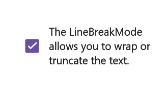
This demo can be downloaded from GitHub link.
Size customization
The ControlSize property is used to customize the size of the CheckBox control.
<StackLayout>
        <syncfusion:SfCheckBox Text="CheckBox" ControlSize="40"/>
    </StackLayout>
StackLayout stackLayout = new StackLayout();
SfCheckBox sfCheckBox = new SfCheckBox();
sfCheckBox.Text = "CheckBox";
sfCheckBox.ControlSize = 40;
stackLayout.Children.Add(sfCheckBox);
this.Content = stackLayout;FontAutoScalingEnabled
The FontAutoScalingEnabled property automatically scales the Checkbox’s font size based on the operating system’s text size. The default value is false.
<syncfusion:SfCheckBox Text="CheckBox" FontAutoScalingEnabled="True"/>SfCheckBox sfCheckBox = new SfCheckBox();
sfCheckBox.Text = "CheckBox";
sfCheckBox.FontAutoScalingEnabled = true;Enable animation
The EnabledAnimation property enables or disables the animation for the .NET MAUI CheckBox control. By default, this property is set to true.
<syncfusion:SfCheckBox Text="CheckBox" EnabledAnimation="False"/>SfCheckBox checkBox = new SfCheckBox
{
Text = "CheckBox",
EnabledAnimation = false
};ContentSpacing
The ContentSpacing property adjusts the content spacing in the SfCheckBox control.
<syncfusion:SfCheckBox Text="Check Box" ContentSpacing="25"/>StackLayout stackLayout = new StackLayout();
SfCheckBox sfCheckBox = new SfCheckBox();
sfCheckBox.Text = "Check Box";
sfCheckBox.ContentSpacing = 25;
stackLayout.Children.Add(sfCheckBox);
this.Content = stackLayout;