Trendlines in .NET MAUI Cartesian Chart
10 Jul 202624 minutes to read
NOTE
Prerequisite: Ensure that the required NuGet package is installed, the necessary namespaces are imported, and the SfCartesianChart control is properly configured in your application. For detailed setup and configuration instructions, refer to the Getting Started guide.
A trendline is a visual representation of the linear relationship between data points in a series. It shows the overall direction and trend of data by fitting a line (or curve) through the data points.
NOTE
Trendlines can be drawn for all types of Cartesian series except bar-type series (Bar, StackingBar, and their 100% variants).
NOTE
Prerequisite: Ensure that the required NuGet package is installed, the necessary namespaces are imported, and the SfCartesianChart control is properly configured in your application. For detailed setup and configuration instructions, refer to the Getting Started guide.
You can add trendlines to your charts using XAML or C# as shown in the following examples.
<chart:SfCartesianChart>
    <!-- code omitted for brevity -->
    <chart:ColumnSeries ItemsSource="{Binding Data}"
                        XBindingPath="X"
                        YBindingPath="Y">
        <chart:ColumnSeries.Trendlines>
            <chart:LinearTrendline/>
        </chart:ColumnSeries.Trendlines>
    </chart:ColumnSeries>
    <!-- code omitted for brevity -->
</chart:SfCartesianChart>
SfCartesianChart chart = new SfCartesianChart();
// code omitted for brevity
ColumnSeries series = new ColumnSeries
{
ItemsSource = new ViewModel().Data,
XBindingPath = "X",
YBindingPath = "Y"
};
series.Trendlines.Add(new LinearTrendline());
chart.Series.Add(series);
this.Content = chart;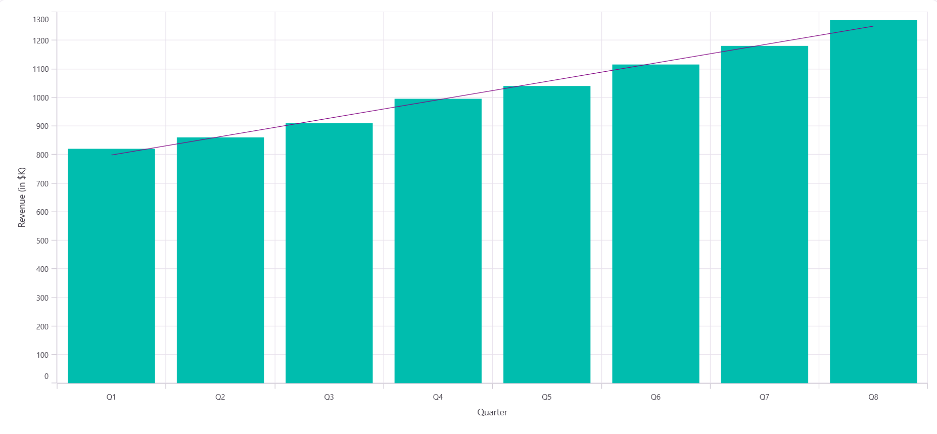
Types of trendline
The .NET MAUI Cartesian Chart supports the following trendline types:
Each type is described below.
Linear
A linear trendline draws a straight line through your data. Use this when your data moves in a consistent direction—either steadily up or down. It’s the simplest way to show the overall trend in your data.
<chart:SfCartesianChart>
    <!-- code omitted for brevity -->
    <chart:ColumnSeries ItemsSource="{Binding Data}" XBindingPath="X" YBindingPath="Y">
        <chart:ColumnSeries.Trendlines>
            <chart:LinearTrendline Stroke="Blue" StrokeWidth="2"/>
        </chart:ColumnSeries.Trendlines>
    </chart:ColumnSeries>
    <!-- code omitted for brevity -->
</chart:SfCartesianChart>
SfCartesianChart chart = new SfCartesianChart();
// code omitted for brevity
ColumnSeries series = new ColumnSeries()
{
ItemsSource = new ViewModel().Data,
XBindingPath = "X",
YBindingPath = "Y"
};
series.Trendlines.Add(new LinearTrendline
{
Stroke = new SolidColorBrush(Colors.Blue),
StrokeWidth = 2
});
chart.Series.Add(series);
this.Content = chart;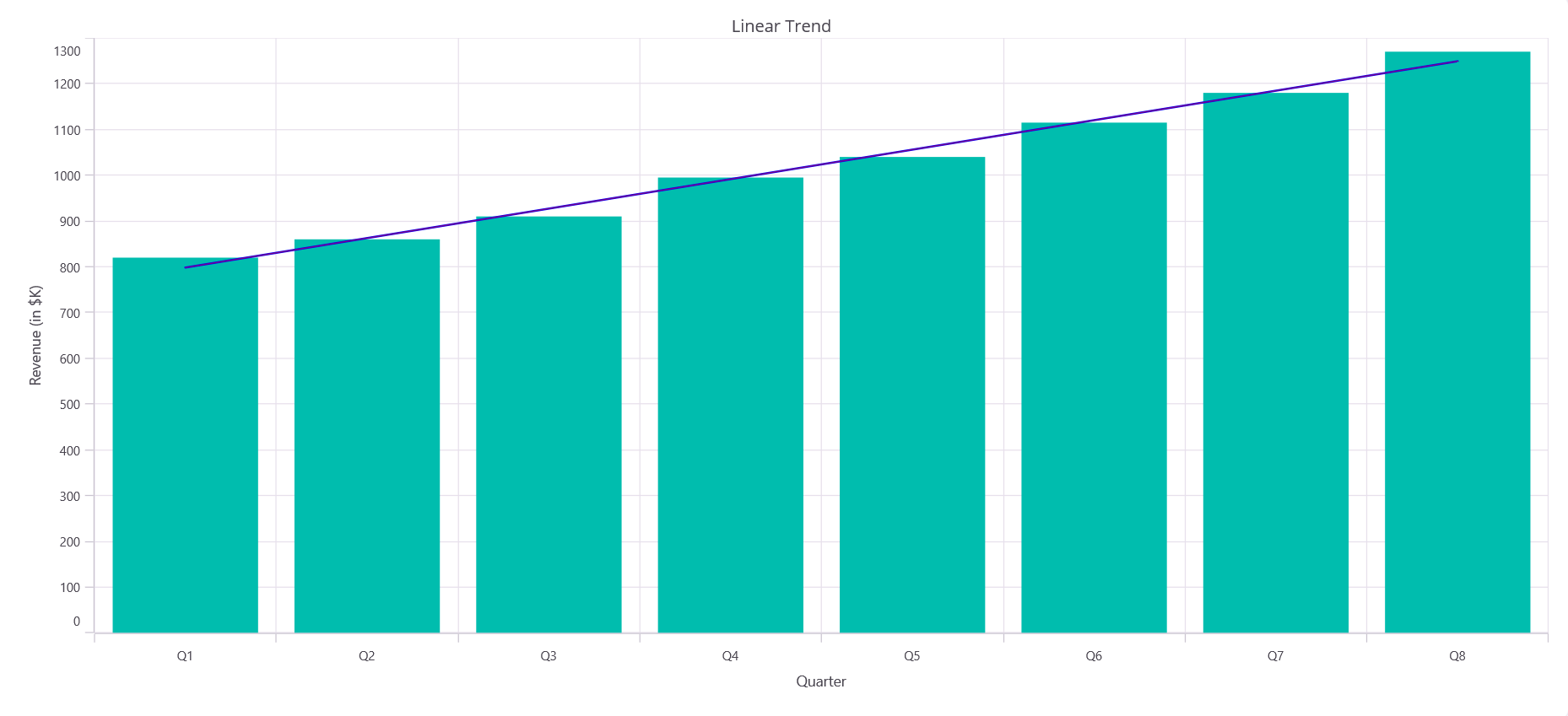
Logarithmic
A logarithmic trendline shows data that changes quickly at first and then levels off. This is useful for showing how something grows or reduces rapidly in the beginning but then stabilizes over time.
<chart:SfCartesianChart>
    <!-- code omitted for brevity -->
    <chart:ColumnSeries ItemsSource="{Binding Data}" XBindingPath="X" YBindingPath="Y">
        <chart:ColumnSeries.Trendlines>
            <chart:LogarithmicTrendline Stroke="Blue" StrokeWidth="2"/>
        </chart:ColumnSeries.Trendlines>
    </chart:ColumnSeries>
    <!-- code omitted for brevity -->
</chart:SfCartesianChart>
SfCartesianChart chart = new SfCartesianChart();
// code omitted for brevity
var series = new ColumnSeries()
{
ItemsSource = new ViewModel().Data,
XBindingPath = "X",
YBindingPath = "Y"
};
series.Trendlines.Add(new LogarithmicTrendline
{
Stroke = new SolidColorBrush(Colors.Blue),
StrokeWidth = 2
});
chart.Series.Add(series);
this.Content = chart;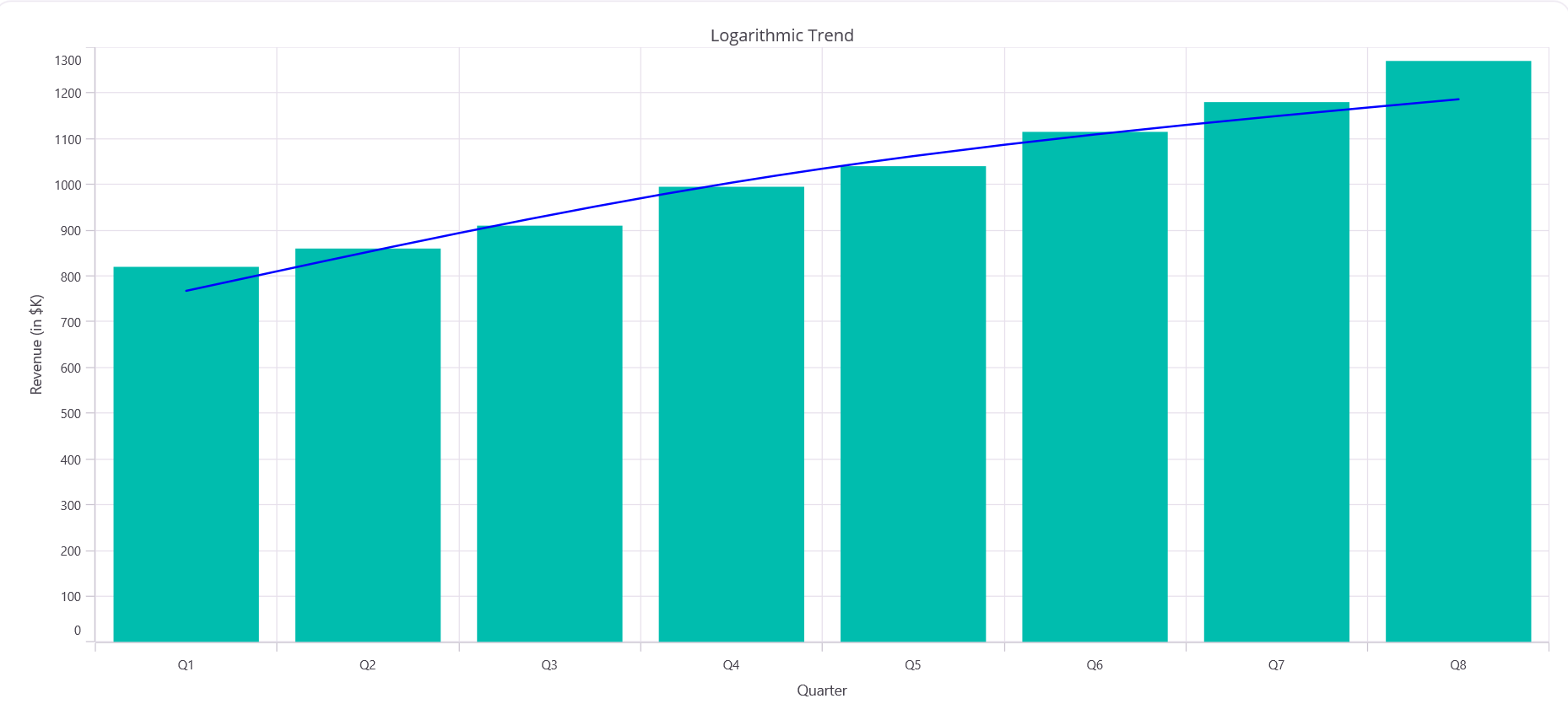
Exponential
An exponential trendline shows data that grows or shrinks at an increasingly fast rate. Use this for data that accelerates over time, like population growth or viral spread. This trendline requires all positive values and cannot work with zero or negative numbers.
<chart:SfCartesianChart>
    <!-- code omitted for brevity -->
    <chart:ColumnSeries ItemsSource="{Binding Data}" XBindingPath="X" YBindingPath="Y">
        <chart:ColumnSeries.Trendlines>
            <chart:ExponentialTrendline Stroke="Blue" StrokeWidth="2"/>
        </chart:ColumnSeries.Trendlines>
    </chart:ColumnSeries>
    <!-- code omitted for brevity -->
</chart:SfCartesianChart>
SfCartesianChart chart = new SfCartesianChart();
// code omitted for brevity
var series = new ColumnSeries()
{
ItemsSource = new ViewModel().Data,
XBindingPath = "X",
YBindingPath = "Y"
};
series.Trendlines.Add(new ExponentialTrendline
{
Stroke = new SolidColorBrush(Colors.Blue),
StrokeWidth = 2
});
chart.Series.Add(series);
this.Content = chart;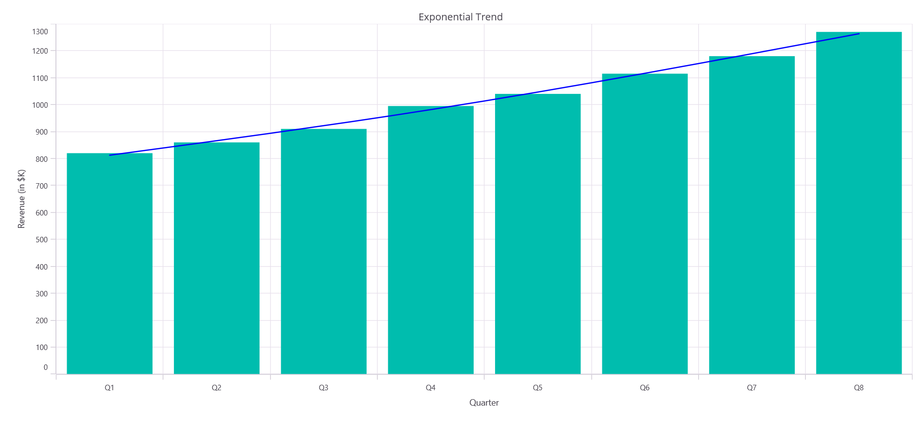
Power
A power trendline models data that accelerates at different rates. It works well for scientific or physical measurements where the rate of change depends on the magnitude of the values. Always use positive values for best results.
<chart:SfCartesianChart>
    <!-- code omitted for brevity -->
    <chart:ColumnSeries ItemsSource="{Binding Data}" XBindingPath="X" YBindingPath="Y">
        <chart:ColumnSeries.Trendlines>
            <chart:PowerTrendline Stroke="Blue" StrokeWidth="2"/>
        </chart:ColumnSeries.Trendlines>
    </chart:ColumnSeries>
    <!-- code omitted for brevity -->
</chart:SfCartesianChart>
SfCartesianChart chart = new SfCartesianChart();
// code omitted for brevity
var series = new ColumnSeries()
{
ItemsSource = new ViewModel().Data,
XBindingPath = "X",
YBindingPath = "Y"
};
series.Trendlines.Add(new PowerTrendline
{
Stroke = new SolidColorBrush(Colors.Blue),
StrokeWidth = 2
});
chart.Series.Add(series);
this.Content = chart;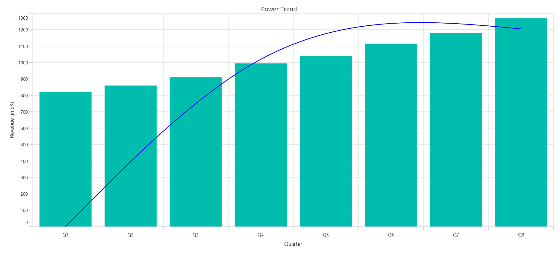
Polynomial
A polynomial trendline is a curved line that follows the ups and downs in your data. Use this when your data has multiple peaks and valleys or doesn’t follow a straight line. You can control how closely the curve follows your data using the Order property, of type int, describes the degree of the polynomial. The default value is 2.
<chart:SfCartesianChart>
    <!-- code omitted for brevity -->
    <chart:ColumnSeries ItemsSource="{Binding Data}" XBindingPath="X" YBindingPath="Y">
        <chart:ColumnSeries.Trendlines>
            <chart:PolynomialTrendline Order="3" Stroke="Blue" StrokeWidth="2"/>
        </chart:ColumnSeries.Trendlines>
    </chart:ColumnSeries>
    <!-- code omitted for brevity -->
</chart:SfCartesianChart>
SfCartesianChart chart = new SfCartesianChart();
// code omitted for brevity
var series = new ColumnSeries()
{
ItemsSource = new ViewModel().Data,
XBindingPath = "X",
YBindingPath = "Y"
};
series.Trendlines.Add(new PolynomialTrendline
{
Order = 3,
Stroke = new SolidColorBrush(Colors.Blue),
StrokeWidth = 2
});
chart.Series.Add(series);
this.Content = chart;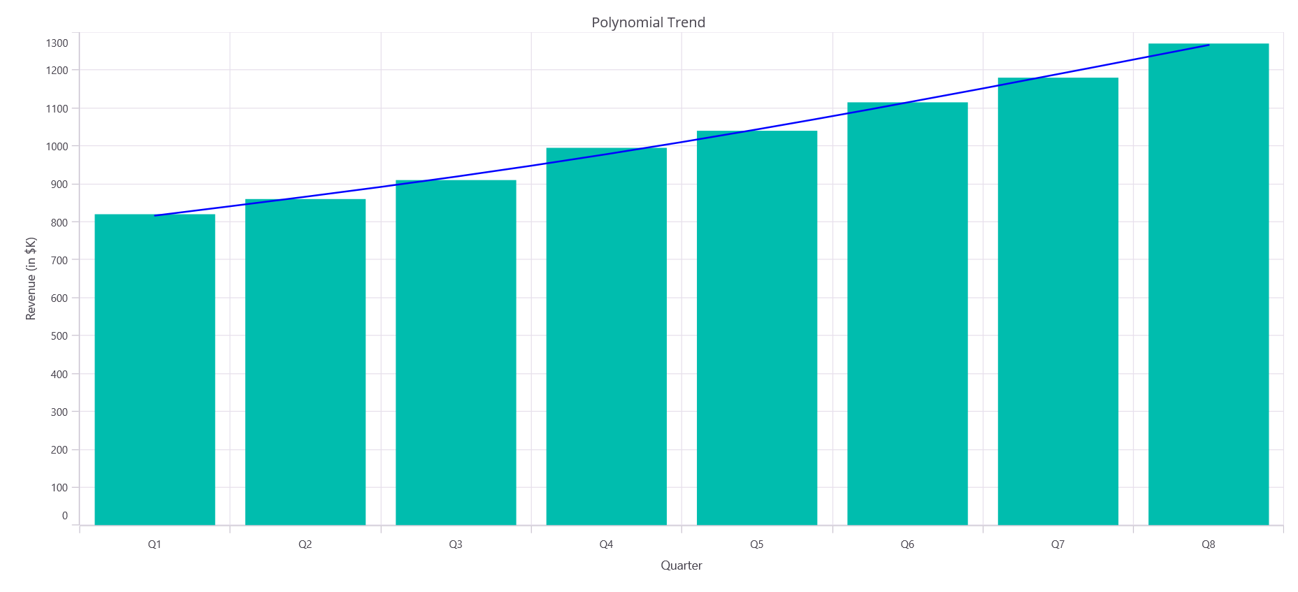
Moving average
A moving average trendline smooths out small bumps in your data by averaging nearby points. This helps you see the main trend without being distracted by temporary ups and downs. You can change how many points are used for averaging with the Period property, of type int, describes the number of data points used for the average. The default value is 2.
<chart:SfCartesianChart>
    <!-- code omitted for brevity -->
    <chart:ColumnSeries ItemsSource="{Binding Data}" XBindingPath="X" YBindingPath="Y">
        <chart:ColumnSeries.Trendlines>
            <chart:MovingAverageTrendline Period="5" Stroke="Blue" StrokeWidth="2"/>
        </chart:ColumnSeries.Trendlines>
    </chart:ColumnSeries>
    <!-- code omitted for brevity -->
</chart:SfCartesianChart>
SfCartesianChart chart = new SfCartesianChart();
// code omitted for brevity
var series = new ColumnSeries()
{
ItemsSource = new ViewModel().Data,
XBindingPath = "X",
YBindingPath = "Y"
};
series.Trendlines.Add(new MovingAverageTrendline
{
Period = 5,
Stroke = new SolidColorBrush(Colors.Blue),
StrokeWidth = 2
});
chart.Series.Add(series);
this.Content = chart;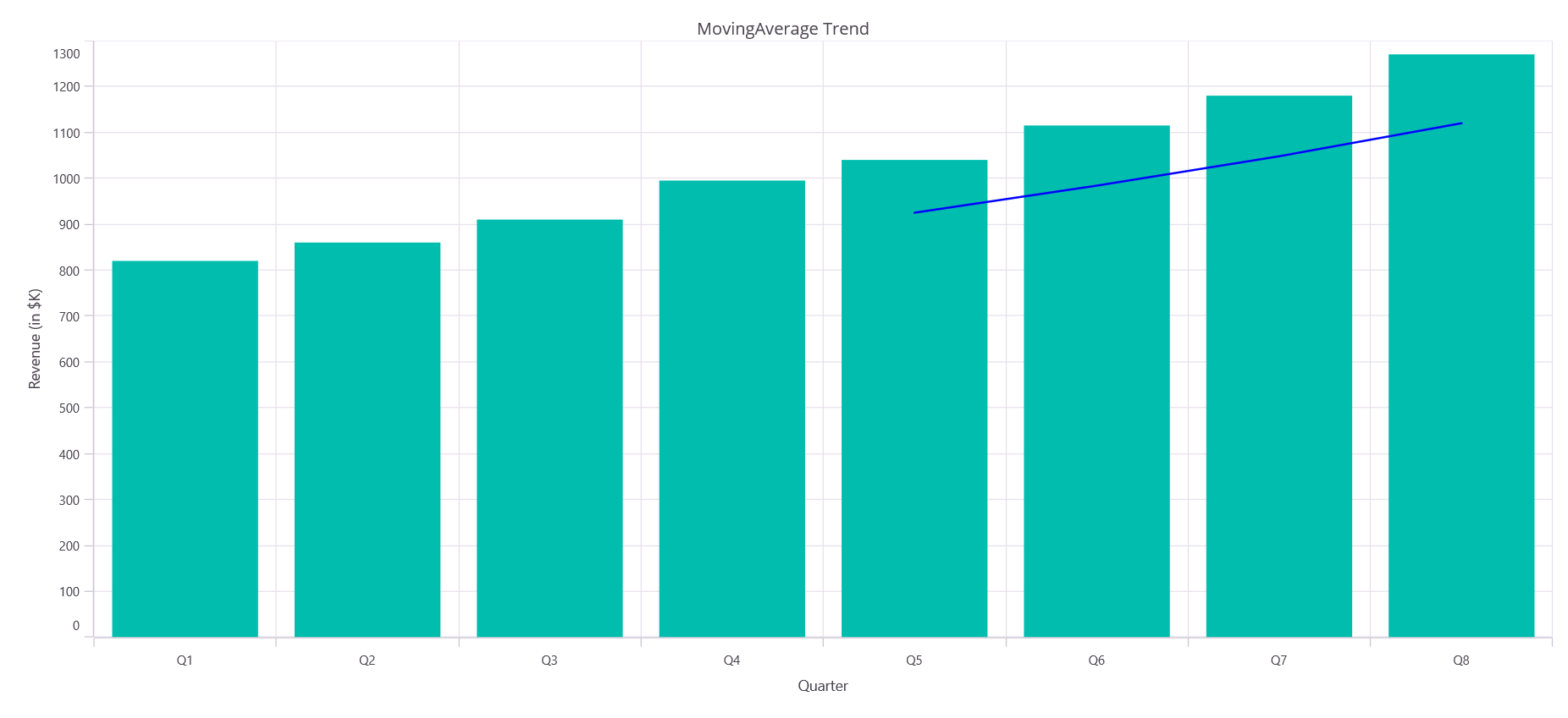
Forecasting
Forecasting extends the trendline beyond your existing data to predict future or past values based on the established trend. This is useful for projecting outcomes or understanding historical patterns. You can extend the trendline using two properties:
-
ForwardForecast, of type
double, extends the trendline into the future. -
BackwardForecast, of type
double, extends the trendline into the past.
Forward forecasting
Use the ForwardForecast property to extend the trendline forward and visualize predicted future trends. The value represents the number of data points to forecast ahead.
<chart:SfCartesianChart>
    <!-- code omitted for brevity -->
    <chart:ColumnSeries ItemsSource="{Binding Data}" XBindingPath="X" YBindingPath="Y">
        <chart:ColumnSeries.Trendlines>
            <chart:LinearTrendline ForwardForecast="5" Stroke="Blue" StrokeWidth="2"/>
        </chart:ColumnSeries.Trendlines>
    </chart:ColumnSeries>
    <!-- code omitted for brevity -->
</chart:SfCartesianChart>
SfCartesianChart chart = new SfCartesianChart();
// code omitted for brevity
var series = new ColumnSeries()
{
ItemsSource = new ViewModel().Data,
XBindingPath = "X",
YBindingPath = "Y"
};
series.Trendlines.Add(new LinearTrendline
{
ForwardForecast = 5,
Stroke = new SolidColorBrush(Colors.Blue),
StrokeWidth = 2
});
chart.Series.Add(series);
this.Content = chart;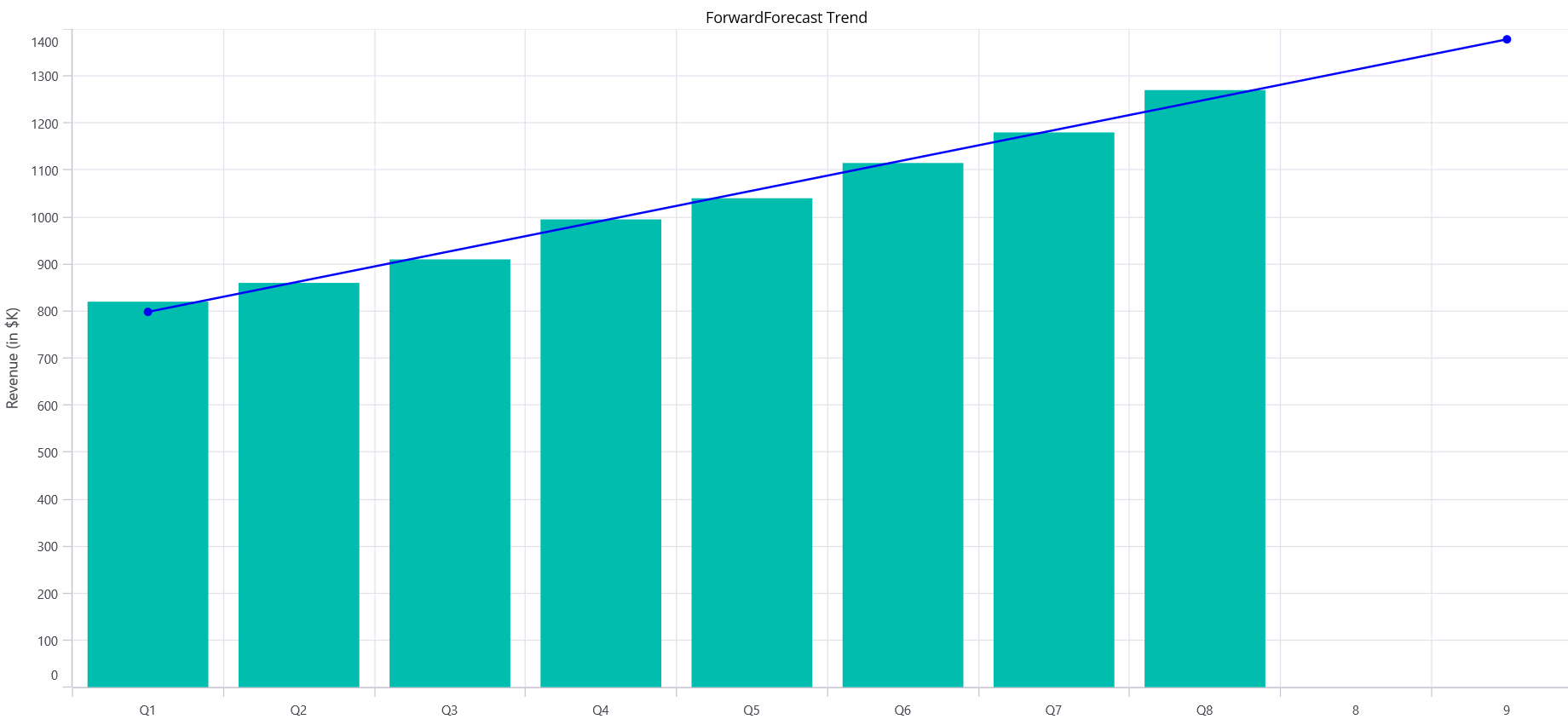
Backward forecasting
Use the BackwardForecast property to extend the trendline backward and visualize historical trend projections. The value represents the number of data points to forecast backward.
<chart:SfCartesianChart>
    <!-- code omitted for brevity -->
    <chart:ColumnSeries ItemsSource="{Binding Data}" XBindingPath="X" YBindingPath="Y">
        <chart:ColumnSeries.Trendlines>
            <chart:LinearTrendline BackwardForecast="3" Stroke="Blue" StrokeWidth="2"/>
        </chart:ColumnSeries.Trendlines>
    </chart:ColumnSeries>
    <!-- code omitted for brevity -->
</chart:SfCartesianChart>
SfCartesianChart chart = new SfCartesianChart();
// code omitted for brevity
var series = new ColumnSeries()
{
ItemsSource = new ViewModel().Data,
XBindingPath = "X",
YBindingPath = "Y"
};
series.Trendlines.Add(new LinearTrendline
{
BackwardForecast = 3,
Stroke = new SolidColorBrush(Colors.Blue),
StrokeWidth = 2
});
chart.Series.Add(series);
this.Content = chart;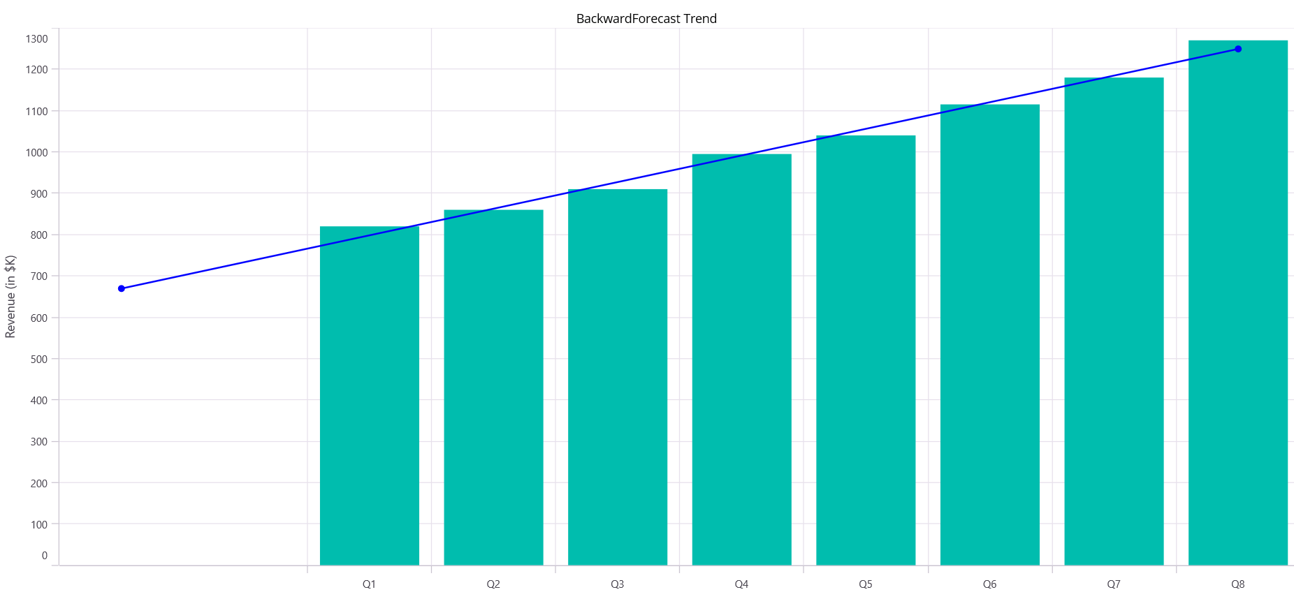
Customization
You can customize the appearance of trendlines to match your chart design. The key customization properties are:
-
Stroke, of type
Brush, describes the color of the trendline. -
StrokeWidth, of type
double, describes the thickness of the trendline. -
StrokeDashArray, of type
DoubleCollection, describes a dashed or dotted line pattern.
The following example shows how to customize a trendline with a black color, thickness of 2, and a dashed pattern:
<chart:SfCartesianChart>
    <!-- code omitted for brevity -->
    <chart:ColumnSeries ItemsSource="{Binding Data}" XBindingPath="X" YBindingPath="Y">
        <chart:ColumnSeries.Trendlines>
            <chart:LinearTrendline Stroke="Black" StrokeWidth="2" StrokeDashArray="5,6"/>
        </chart:ColumnSeries.Trendlines>
    </chart:ColumnSeries>
    <!-- code omitted for brevity -->
</chart:SfCartesianChart>
SfCartesianChart chart = new SfCartesianChart();
// code omitted for brevity
var series = new ColumnSeries()
{
ItemsSource = new ViewModel().Data,
XBindingPath = "X",
YBindingPath = "Y"
};
var trendline = new LinearTrendline
{
Stroke = new SolidColorBrush(Colors.Black),
StrokeWidth = 2
};
trendline.StrokeDashArray = new DoubleCollection { 5, 6 };
series.Trendlines.Add(trendline);
chart.Series.Add(series);
this.Content = chart;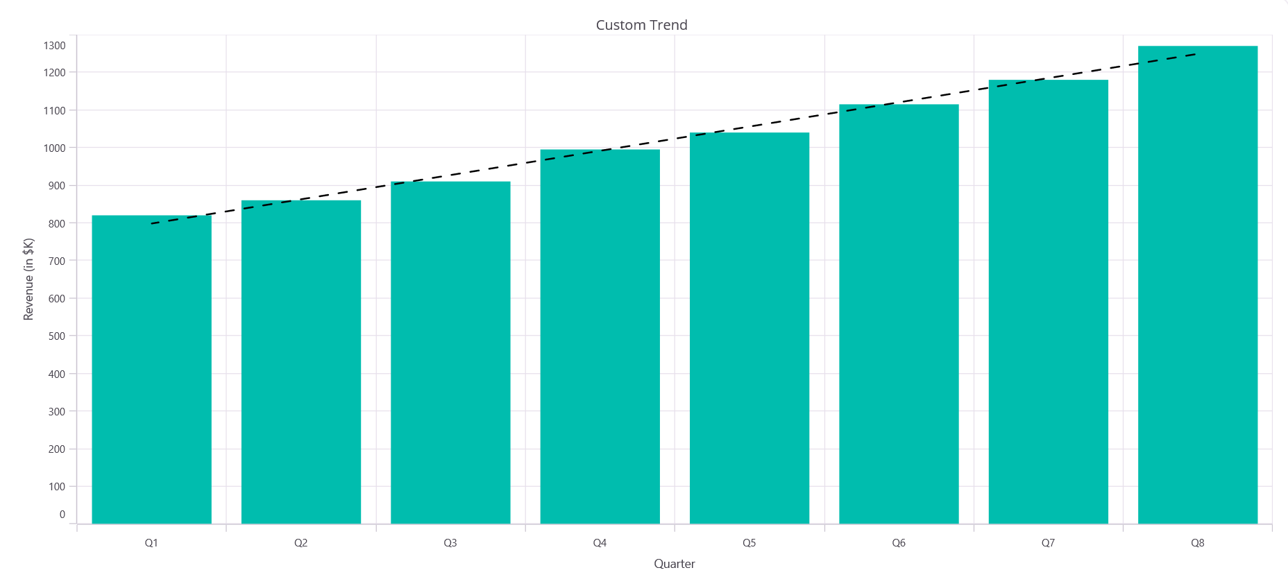
Trendline legend label
NOTE
The chart legend must be enabled for trendline legend labels to appear.
You can display a custom label for the trendline in the chart legend using the Label property, of type string. This helps distinguish between multiple trendlines and makes your chart more descriptive.
<chart:SfCartesianChart>
    <!-- code omitted for brevity -->
    <chart:ColumnSeries ItemsSource="{Binding Data}" XBindingPath="X" YBindingPath="Y">
        <chart:ColumnSeries.Trendlines>
            <chart:LinearTrendline Stroke="Blue" StrokeWidth="2" Label="Trend (shown in legend)"/>
        </chart:ColumnSeries.Trendlines>
    </chart:ColumnSeries>
    <!-- code omitted for brevity -->
</chart:SfCartesianChart>
SfCartesianChart chart = new SfCartesianChart();
// code omitted for brevity
var series = new ColumnSeries()
{
ItemsSource = new ViewModel().Data,
XBindingPath = "X",
YBindingPath = "Y"
};
series.Trendlines.Add(new LinearTrendline
{
Stroke = new SolidColorBrush(Colors.Blue),
StrokeWidth = 2,
Label = "Trend (shown in legend)"
});
chart.Series.Add(series);
this.Content = chart;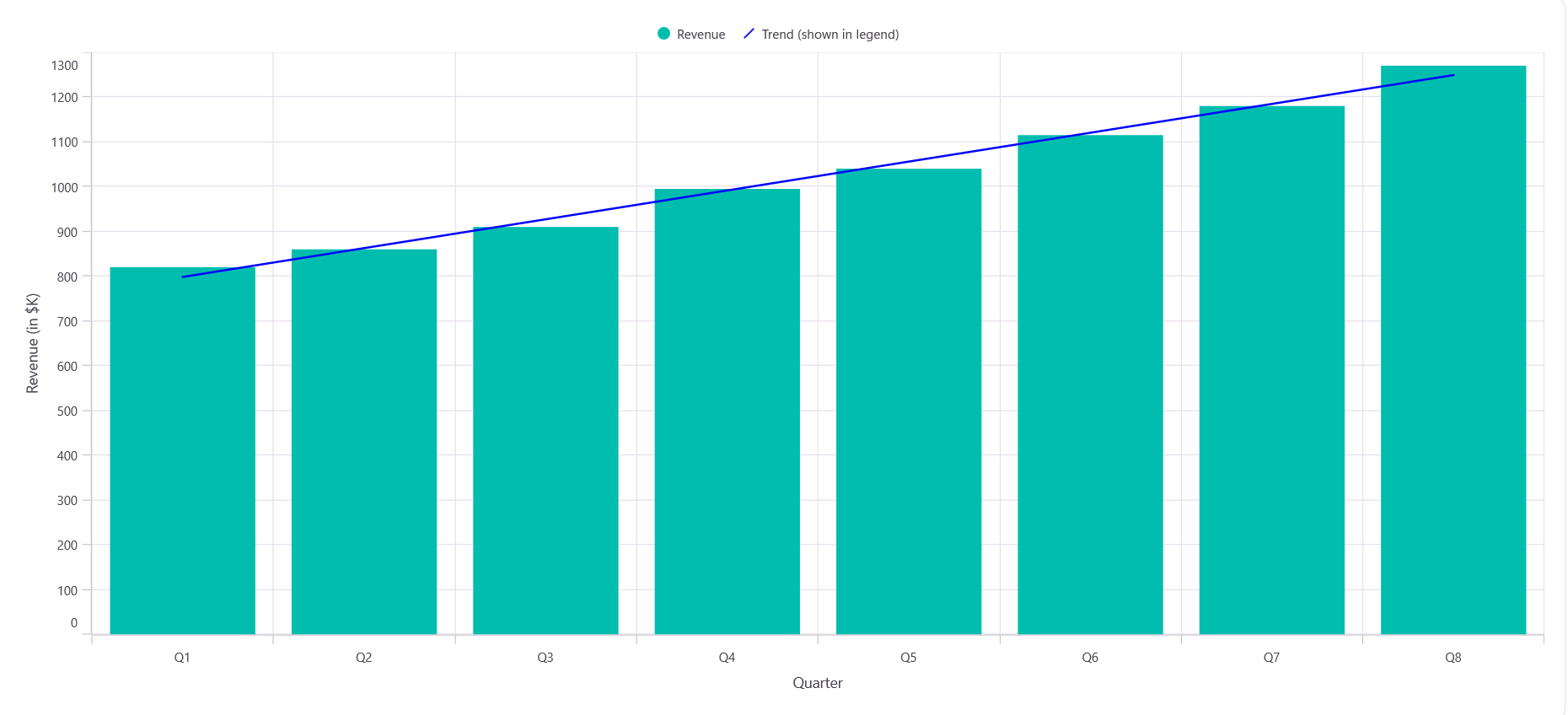
Markers
Markers are visual indicators (like circles, squares, etc.) placed along the trendline to highlight specific data points. You can enable and customize markers using:
-
ShowMarkers, of type
bool, enables markers on the trendline. - MarkerSettings, of type ChartMarkerSettings, customizes the appearance, size, shape, and color of markers.
The ChartMarkerSettings class exposes the following properties:
-
Width, of type
double, describes the width of the marker. -
Height, of type
double, describes the height of the marker. -
Fill, of type
Brush, describes the fill color of the marker. -
Stroke, of type
Brush, describes the stroke color of the marker. -
Type, of type ShapeType, describes the shape of the marker. The ShapeType enum has the following values:
Circle,Diamond,Hexagon,HorizontalCross,Pentagon,Plus,Rectangle,Triangle,VerticalCross,Image.
This is helpful for emphasizing key points on the trendline or making it more visually distinct.
<chart:SfCartesianChart>
    <!-- code omitted for brevity -->
    <chart:ColumnSeries ItemsSource="{Binding Data}" XBindingPath="X" YBindingPath="Y">
        <chart:ColumnSeries.Trendlines>
            <chart:LinearTrendline ShowMarkers="True">
                <chart:LinearTrendline.MarkerSettings>
                    <chart:ChartMarkerSettings Width="8" Height="8" Type="Circle" Fill="Purple" Stroke="Blue"/>
                </chart:LinearTrendline.MarkerSettings>
            </chart:LinearTrendline>
        </chart:ColumnSeries.Trendlines>
    </chart:ColumnSeries>
    <!-- code omitted for brevity -->
</chart:SfCartesianChart>
SfCartesianChart chart = new SfCartesianChart();
// code omitted for brevity
var series = new ColumnSeries()
{
ItemsSource = new ViewModel().Data,
XBindingPath = "X",
YBindingPath = "Y"
};
var trendline = new LinearTrendline() { ShowMarkers = true };
trendline.MarkerSettings = new ChartMarkerSettings
{
Width = 8,
Height = 8,
Stroke = new SolidColorBrush(Colors.Blue),
Fill = new SolidColorBrush(Colors.Purple),
Type = ShapeType.Circle
};
series.Trendlines.Add(trendline);
chart.Series.Add(series);
this.Content = chart;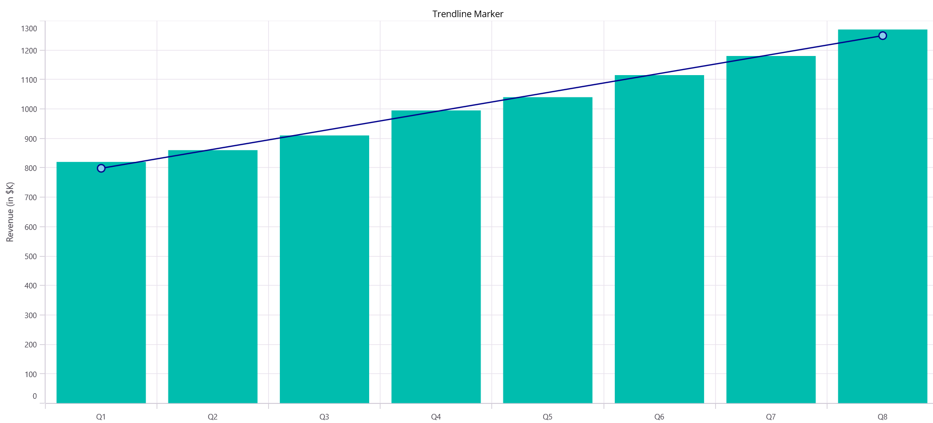
Tooltip and trackball
Tooltips and trackball labels provide interactive information when users hover over or tap the trendline:
-
EnableTooltip, of type
bool, displays a tooltip showing trendline data when hovered. The default value isfalse. -
ShowTrackballLabel, of type
bool, displays a label when the trackball intersects the trendline. -
TooltipTemplate, of type
DataTemplate, customizes the tooltip appearance and content. -
TrackballLabelTemplate, of type
DataTemplate, customizes the trackball label appearance.
These features enhance user interactivity and data exploration.
<chart:SfCartesianChart>
    <!-- code omitted for brevity -->
    <chart:ColumnSeries ItemsSource="{Binding Data}" XBindingPath="X" YBindingPath="Y">
        <chart:ColumnSeries.Trendlines>
            <chart:LinearTrendline EnableTooltip="True" ShowTrackballLabel="True"/>
        </chart:ColumnSeries.Trendlines>
    </chart:ColumnSeries>
    <!-- code omitted for brevity -->
</chart:SfCartesianChart>
SfCartesianChart chart = new SfCartesianChart();
// code omitted for brevity
var series = new ColumnSeries()
{
ItemsSource = new ViewModel().Data,
XBindingPath = "X",
YBindingPath = "Y"
};
var trendline = new LinearTrendline
{
EnableTooltip = true,
ShowTrackballLabel = true
};
series.Trendlines.Add(trendline);
chart.Series.Add(series);
this.Content = chart;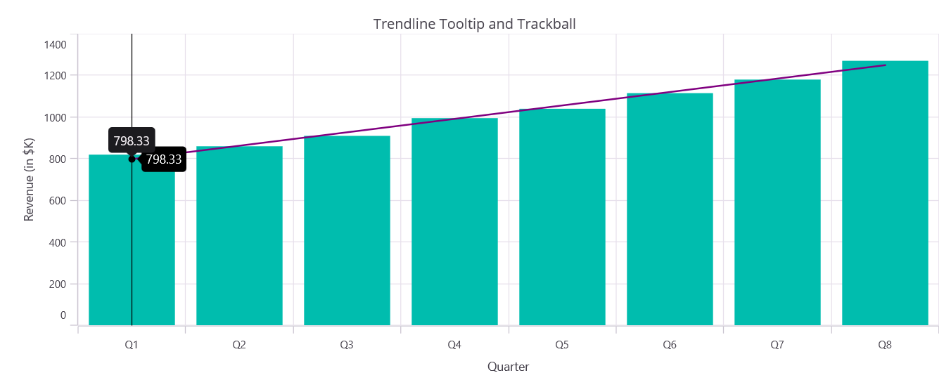
Multiple trendlines
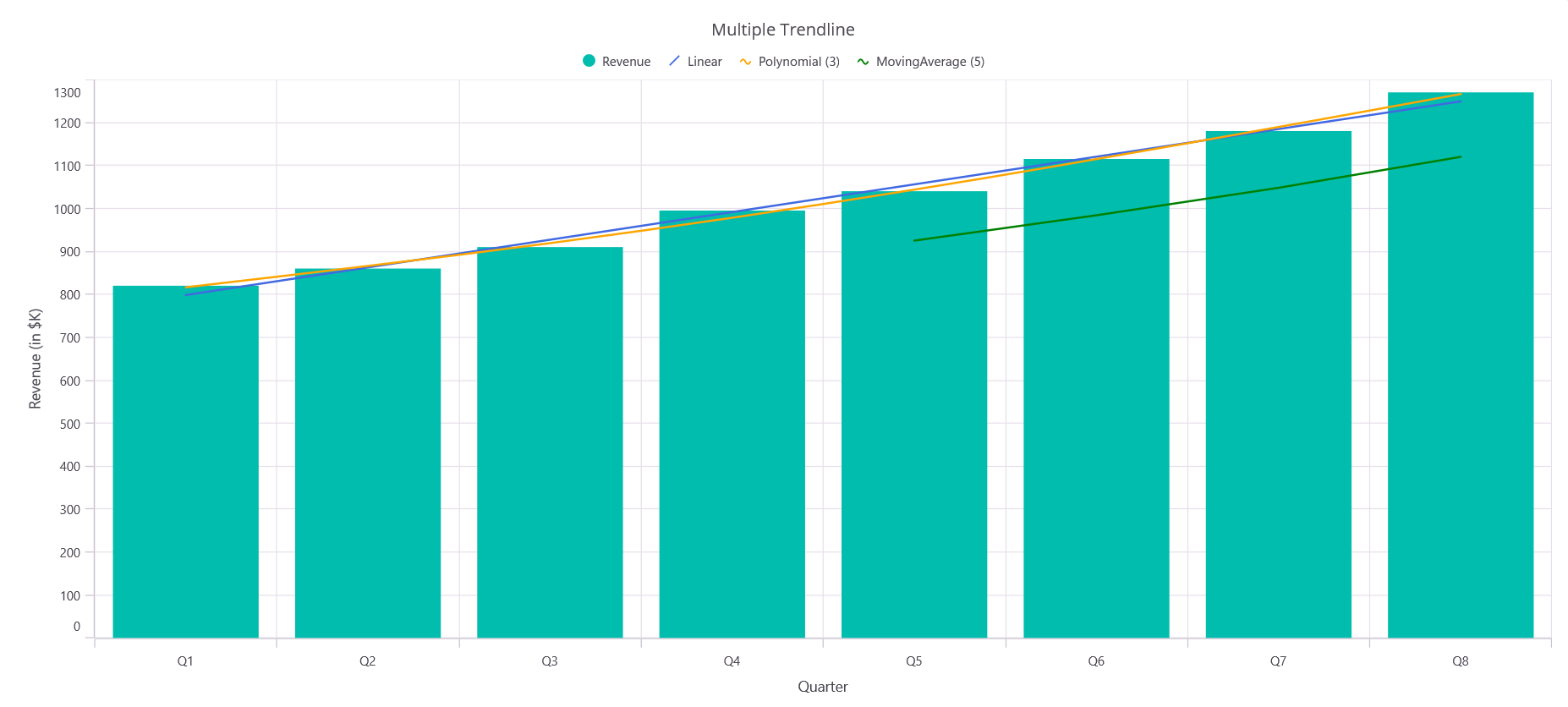
You can add multiple trendlines to a single series to compare different trend models and find the best fit for your data. This is useful for:
- Comparing different trendline types (Linear vs. Polynomial vs. MovingAverage)
- Analyzing which trend model best represents your data
- Providing multiple perspectives on the same dataset
Each trendline can have different properties, colors, and labels to make them easily distinguishable.
<chart:SfCartesianChart>
    <!-- code omitted for brevity -->
    <chart:ColumnSeries ItemsSource="{Binding Data}" XBindingPath="X" YBindingPath="Y">
        <chart:ColumnSeries.Trendlines>
            <chart:LinearTrendline Stroke="RoyalBlue" StrokeWidth="2" Label="Linear"/>
            <chart:PolynomialTrendline Order="3" Stroke="Orange" StrokeWidth="2" Label="Polynomial (3)"/>
            <chart:MovingAverageTrendline Period="5" Stroke="Green" StrokeWidth="2" Label="MovingAverage (5)"/>
        </chart:ColumnSeries.Trendlines>
    </chart:ColumnSeries>
    <!-- code omitted for brevity -->
</chart:SfCartesianChart>
SfCartesianChart chart = new SfCartesianChart();
// code omitted for brevity
ColumnSeries series = new ColumnSeries()
{
ItemsSource = new ViewModel().Data,
XBindingPath = "X",
YBindingPath = "Y"
};
series.Trendlines.Add(new LinearTrendline
{
Stroke = new SolidColorBrush(Colors.RoyalBlue),
StrokeWidth = 2,
Label = "Linear"
});
series.Trendlines.Add(new PolynomialTrendline
{
Order = 3,
Stroke = new SolidColorBrush(Colors.Orange),
StrokeWidth = 2,
Label = "Polynomial (3)"
});
series.Trendlines.Add(new MovingAverageTrendline
{
Period = 5,
Stroke = new SolidColorBrush(Colors.Green),
StrokeWidth = 2,
Label = "MovingAverage (5)"
});
chart.Series.Add(series);
this.Content = chart;