Liquid Glass Effect in .NET MAUI Autocomplete (SfAutocomplete)
21 Jul 20266 minutes to read
Prerequisites
Before using the SfAutocomplete, Install the Syncfusion.Maui.Inputs and Syncfusion.Maui.Core NuGet packages in your .NET MAUI project. The Syncfusion.Maui.Core package is required for the SfGlassEffectView container used to host the Liquid Glass Effect.
For a step-by-step setup, refer to the Getting Started documentation.
NOTE
- The Liquid Glass Effect is supported only on .NET 10 targeting macOS 26 or higher and iOS 26 or higher.
- It is not supported on Android or Windows.
Overview
The Liquid Glass Effect introduces a modern, translucent design with adaptive color tinting and light refraction, creating a sleek, glass-like user experience that remains readable on top of any background. This section explains how to enable and customize the effect in the SfAutocomplete control.
Apply the liquid glass effect
Follow these steps to enable and configure the Liquid Glass Effect in the SfAutocomplete control:
Step 1: Wrap the control inside the glass effect view
To apply the Liquid Glass Effect to the SfAutocomplete control, wrap it inside the SfGlassEffectView class.
Step 2: Enable the liquid glass effect on the SfAutocomplete
Set the EnableLiquidGlassEffect property to true. The default value is false. When enabled, the effect is also applied to the drop-down and suggestion list.
Step 3: Customize the background
To achieve a glass-like background in the SfAutocomplete, set the Background and DropDownBackground properties to Transparent. The background is then treated as a tinted color, ensuring a consistent glass effect across the input and the drop-down. Make sure the parent layout’s background is also transparent or a tinted color so the effect is visible.
Properties
| Property | Type | Default | Description |
|---|---|---|---|
EnableLiquidGlassEffect |
bool |
false |
Gets or sets a value that indicates whether the Liquid Glass Effect is applied. |
DropDownBackground |
Brush |
null |
Gets or sets the background of the drop-down. Set to Transparent for the glass effect. |
SfGlassEffectView.EffectType |
LiquidGlassEffectType |
Regular |
The thickness of the glass effect. Values: Clear, Regular. |
SfGlassEffectView.CornerRadius |
double |
8.0 |
The corner radius of the glass container. |
The following code snippet demonstrates how to apply the Liquid Glass Effect to the SfAutocomplete control:
<Grid BackgroundColor="Transparent">
    <Image Source="Wallpaper.png" Aspect="AspectFill" />
    <core:SfGlassEffectView EffectType="Regular"
                            CornerRadius="20">
        <autocomplete:SfAutocomplete x:Name="Autocomplete"
                                     Background="Transparent"
                                     HeightRequest="40"
                                     WidthRequest="300"
                                     ItemsSource="{Binding Names}"
                                     DropDownBackground="Transparent"
                                     EnableLiquidGlassEffect="True" />
    </core:SfGlassEffectView>
</Grid>
var grid = new Grid
{
BackgroundColor = Colors.Transparent
};
var image = new Image
{
Source = "Wallpaper.png",
Aspect = Aspect.AspectFill
};
grid.Children.Add(image);
var glass = new SfGlassEffectView
{
EffectType = LiquidGlassEffectType.Regular,
CornerRadius = 20
};
var autocomplete = new SfAutocomplete
{
Background = Colors.Transparent,
HeightRequest = 40,
WidthRequest = 300,
DropDownBackground = Colors.Transparent,
ItemsSource = new List<string> { "Jacob", "Will", "Noah", "Dustin" },
EnableLiquidGlassEffect = true
};
glass.Content = autocomplete;
grid.Children.Add(glass);
this.Content = grid;NOTE
The
Wallpaper.pngimage must be added to the project’sResources/Imagesfolder and have its build action set to MauiImage. Register the namespace inMauiProgram.csif required.
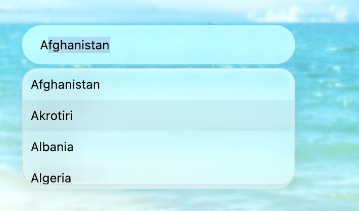
The following screenshot illustrates the SfAutocomplete with the Liquid Glass Effect applied to the input and the drop-down:
Customize the effect
You can change the appearance of the glass effect by adjusting the EffectType and CornerRadius of the SfGlassEffectView:
-
EffectType- chooseClear,Regular(default) to control the glass thickness. -
CornerRadius- set a value in device-independent units to round the corners of the glass container. - The
BackgroundandDropDownBackgroundof the SfAutocomplete can be set to any translucentColor(for example,Colors.TransparentorColor.FromArgb("#80FFFFFF")) to fine-tune the tint.