About Syncfusion® .NET MAUI Button Control
18 Nov 20185 minutes to read
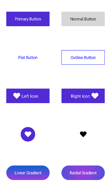
The Syncfusion® .NET MAUI Button is a custom button control with UI customization. Set icons, background images, and corner edge radii and customize the appearance for different visual states using the visual state manager.
Business use cases
- Form-based applications that require clear action buttons for submission, reset, or navigation.
- E-commerce applications that use call-to-action buttons such as add to cart or checkout.
- Dashboard and business apps that provide interactive controls for performing user actions.
- Mobile applications that rely on visually styled buttons for primary and secondary actions.
Key features
- Multiple button styles allow creating outline, flat, circle, and icon buttons based on UI requirements.
- Background image support enables displaying images as button backgrounds for enhanced visual design.
- Custom content support allows embedding text, images, or other UI elements inside the button.
- Visual state customization enables modifying appearance for different states such as normal, pressed, and disabled using the Visual State Manager.
Globalization
The following table summarizes the globalization support available in this control.
 Full Support
 Not Applicable
| Control | Localization | RTL | Time zone | Screen reader | Keyboard navigation |
|---|---|---|---|---|---|
| Button | |
|
|
|
|
Related controls
- Chips for compact interactive elements used in selection, filtering, or displaying information.
- Radio Button for choosing a single option from a group of mutually exclusive choices.
- CheckBox for enabling multi-selection from a list of options.
See Also
- Getting Started shows how to begin using the Button control step by step.
- Customization shows how to customize button appearance and styles.
- Visual States explains how to configure visual states and interactions.
- UI Kit provides interactive demos and ready-made UI examples.
Resources
Feature Tour
Get a quick overview of key features and capabilities to kick start your journey.
Explore Features
Tutorial Videos
Watch step‑by‑step video guides to quickly understand concepts and implementation.
Watch now
Knowledge Base
Find practical solutions, troubleshooting tips and how‑to guides for common scenarios.
Search KB's
Use Case Sample
Explore a real-world application that demonstrates the practical use of the Button.
View Sample