Customization in .NET MAUI Button
18 Nov 201824 minutes to read
The .NET MAUI Button control supports customizing the border color, image size, corner radius, background color, and more.
Prerequisites
Before using the SfButton, ensure the following NuGet package is installed in your .NET MAUI project:
Syncfusion.Maui.Buttons
For a step-by-step setup, refer to the Getting Started documentation.
Text Customization
The text inside the Button can be customized by its text color, font size, font attributes, font family, text alignment, and text transform.
Text Color
The TextColor property is used to customize the color of text in Button.
<buttons:SfButton x:Name="button"
                  HorizontalOptions="Center"
                  VerticalOptions="Center"
                  Text="Button"
                  TextColor="White"/>
SfButton button = new SfButton();
button.HorizontalOptions = LayoutOptions.Center;
button.VerticalOptions = LayoutOptions.Center;
button.Text = "Button";
button.TextColor = Colors.White;
this.Content = button;
Font Size
The FontSize property is used to customize the size of text in Button.
<buttons:SfButton x:Name="button"
                  HorizontalOptions="Center"
                  VerticalOptions="Center"
                  Text="Button"
                  FontSize="18"/>
SfButton button = new SfButton();
button.HorizontalOptions = LayoutOptions.Center;
button.VerticalOptions = LayoutOptions.Center;
button.Text = "Button";
button.FontSize = 18;
this.Content = button;
Font Attributes
The FontAttributes property is used to customize the font style of text in Button.
<buttons:SfButton x:Name="button"
                  HorizontalOptions="Center"
                  VerticalOptions="Center"
                  Text="Button"
                  FontAttributes = "Italic"/>
SfButton button = new SfButton();
button.HorizontalOptions = LayoutOptions.Center;
button.VerticalOptions = LayoutOptions.Center;
button.Text = "Button";
button.FontAttributes = FontAttributes.Italic;
this.Content = button;
Font Family
The FontFamily property is used to customize the font family of text in Button.
<buttons:SfButton x:Name="button"
                  HorizontalOptions="Center"
                  VerticalOptions="Center"
                  Text="Button"
                  FontFamily="OpenSansRegular"/>
SfButton button = new SfButton();
button.HorizontalOptions = LayoutOptions.Center;
button.VerticalOptions = LayoutOptions.Center;
button.Text = "Button";
button.FontFamily = "OpenSansRegular";
this.Content = button;
Text Alignment
The HorizontalTextAlignment and VerticalTextAlignment properties are used to customize the alignment of text in Button.
<buttons:SfButton x:Name="button"
                  HorizontalOptions="Center"
                  VerticalOptions="Center"
                  HorizontalTextAlignment="Center"
                  VerticalTextAlignment="Center"
                  Text="Button"/>
SfButton button = new SfButton();
button.HorizontalOptions = LayoutOptions.Center;
button.VerticalOptions = LayoutOptions.Center;
button.Text = "Button";
button.HorizontalTextAlignment = TextAlignment.Center;
button.VerticalTextAlignment = TextAlignment.Center;
this.Content = button;Text Transform
You can customize the Button text casing using the TextTransform property to switch between uppercase, lowercase, none, or default casing.
<buttons:SfButton x:Name="button"
                  Text="Submit"
                  TextTransform="Uppercase"
                  HorizontalTextAlignment="Center"
                  VerticalTextAlignment="Center"
                  HeightRequest="50"/>
SfButton button = new SfButton();
button.Text = "Submit";
button.TextTransform = TextTransform.Uppercase;
button.HorizontalTextAlignment = TextAlignment.Center;
button.VerticalTextAlignment = TextAlignment.Center;
button.HeightRequest = 50;
this.Content = button;
LineBreakMode
The LineBreakMode allows you to wrap or truncate the text. The default value of this property is NoWrap. The following options are available in LineBreakMode:
-
NoWrap- Avoids the text wrap. -
WordWrap- Wraps the text by words. -
CharacterWrap- Wraps the text by character. -
HeadTruncation- Truncates the text at the start. -
MiddleTruncation- Truncates the text at the center. -
TailTruncation- Truncates the text at the end. -
Default- Uses the platform default line break behavior.
<buttons:SfButton x:Name="button"
                  Text="Add Items To Cart"
                  LineBreakMode="MiddleTruncation"
                  HeightRequest="50"
                  WidthRequest="150"
                  ImageSource="Cart.png"
                  ShowIcon="True"/>
SfButton button = new SfButton();
button.Text = "Add Items To Cart";
button.LineBreakMode = LineBreakMode.MiddleTruncation;
button.ImageSource = ImageSource.FromFile("Cart.png");
button.WidthRequest = 150;
button.HeightRequest = 50;
button.ShowIcon = true;
this.Content = button;
Background Customization
The background of the Button can be customized by its background color, border color, border width and corner radius.
Background Color
The Background property is used to customize the background color of Button.
<buttons:SfButton x:Name="button"
                  Text="Button"
                  HeightRequest="50"
                  Background = "DeepSkyBlue"/>
SfButton button = new SfButton();
button.Text = "Button";
button.HeightRequest = 50;
button.Background = Colors.DeepSkyBlue;
this.Content = button;When defining the background colors of the SfButton control, always use the
Backgroundproperty instead of theBackgroundColorproperty.

Background Image
The button background image can be set using the BackgroundImageSource property of Button.
<buttons:SfButton x:Name="SfButton"
                    Text="Nature"
                    FontAttributes="Bold"
                    BackgroundImageSource="button_background.png"
                    CornerRadius="10"
                    HeightRequest="50"
                    WidthRequest="150"/>
SfButton button = new SfButton();
button.Text = "Nature";
button.FontAttributes = FontAttributes.Bold;
button.BackgroundImageSource = ImageSource.FromFile("button_background.png");
button.CornerRadius = 10;
button.WidthRequest = 150;
button.HeightRequest = 50;
this.Content = button;
Stroke
The Stroke property is used to customize the color of border in Button.
<buttons:SfButton x:Name="button"
                  Text="Button"
                  HeightRequest="50"
                  Stroke="Red"
                  StrokeThickness="2"/>
SfButton button = new SfButton();
button.Text = "Button";
button.Stroke = Colors.Red;
button.StrokeThickness = 2;
button.HeightRequest = 50;
this.Content = button;To display the
Strokecolor, you must also define theStrokeThicknessproperty (default value is0).

StrokeThickness
The StrokeThickness property is used to customize the thickness of the border in Button. The default value is 0 (no border).
<buttons:SfButton x:Name="button"
                  Text="Button"
                  HeightRequest="50"
                  Stroke="Red"
                  StrokeThickness="6"/>
SfButton button = new SfButton();
button.Text = "Button";
button.Stroke = Colors.Red;
button.StrokeThickness = 6;
button.HeightRequest = 50;
this.Content = button;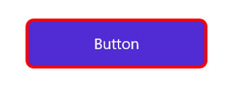
CornerRadius
The CornerRadius property is used to set the corner radius of Button, as demonstrated in the following code sample.
<buttons:SfButton x:Name="button"
                  Text="Button"
                  HeightRequest="50"
                  CornerRadius="20"/>
SfButton button = new SfButton();
button.Text = "Button";
button.CornerRadius = 20;
button.HeightRequest = 50;
this.Content = button;
Image Customization
The Image can be customized by its ShowIcon, ImageSource, ImageSize and ImageAlignment.
ImageSource
The ImageSource property is used to customize the icon image of Button by adding a custom image.
Enable the ShowIcon property to enable the ImageSource property.
<buttons:SfButton x:Name="button"
                  Text="Button"
                  HeightRequest="50"
                  ImageSource="Heart.png"
                  ShowIcon="True"/>
SfButton button = new SfButton();
button.Text = "Button";
button.ImageSource = ImageSource.FromFile("Heart.png");
button.ShowIcon = true;
button.HeightRequest = 50;
this.Content = button;
ShowIcon
Use the ShowIcon property to specify whether an image is displayed in Button. The default value is false.
<buttons:SfButton x:Name="button"
                  Text="Button"
                  HeightRequest="50"
                  ImageSource="Heart.png"
                  ShowIcon="True"/>
SfButton button = new SfButton();
button.Text = "Button";
button.ImageSource = ImageSource.FromFile("Heart.png");
button.ShowIcon = true;
button.HeightRequest = 50;
this.Content = button;ImageSize
The ImageSize property is used to customize the size of the icon image in Button. It sets both the width and height of the image.
Enable the
ShowIconproperty to enable theImageSizeproperty.
<buttons:SfButton x:Name="button"
                  Text="Button"
                  HeightRequest="50"
                  ImageSource="Heart.png"
                  ShowIcon="True"
                  ImageSize="50"/>
SfButton button = new SfButton();
button.Text = "Button";
button.ImageSource = ImageSource.FromFile("Heart.png");
button.ShowIcon = true;
button.HeightRequest = 50;
button.ImageSize = 50;
this.Content = button;ImageAlignment
The ImageAlignment property is used to customize the alignment of icon image in Button. The following options are available in ImageAlignment:
-
Start- Places the image at the left most ofSfButton. -
End- Places the image at the right most ofSfButton. -
Top- Places the image at the top of the text. -
Bottom- Places the image at the bottom of the text. -
Default- By default, the image is placed at the center of the text. -
Left- When a flow direction is applied, the image is always placed in the left part ofButton. For example, in RTL flow direction, aStartalignment is mirrored to the right, butLeftkeeps the image in the same left position. -
Right- When a flow direction is applied, the image is always placed in the right part ofButton. For example, in RTL flow direction, anEndalignment is mirrored to the left, butRightkeeps the image in the same right position.
Enable the
ShowIconproperty to enable theImageAlignmentproperty.
End image alignment in Button
<buttons:SfButton x:Name="button"
                  Text="Shopping"
                  TextColor="Black"
                  HorizontalOptions="Center"
                  ImageSource="add_to_card.png"
                  ShowIcon="True"
                  ImageSize="25"
                  Stroke="Black"
                  HeightRequest="50"
                  StrokeThickness="4"
                  Background="White"
                  ImageAlignment="End"/>
SfButton button = new SfButton()
{
Text = "Shopping",
TextColor = Colors.Black,
HorizontalOptions = LayoutOptions.Center,
ImageSource = ImageSource.FromFile("add_to_card.png"),
ShowIcon = true,
ImageSize = 25,
Stroke = Colors.Black,
StrokeThickness = 4,
HeightRequest = 50,
Background = Colors.White,
ImageAlignment = Alignment.End
};
this.Content = button;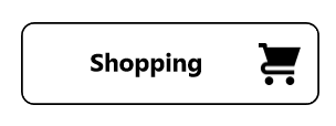
Start image alignment in Button
<buttons:SfButton x:Name="button"
                  Text="Shopping"
                  TextColor="Black"
                  HorizontalOptions="Center"
                  ImageSource="add_to_card.png"
                  ShowIcon="True"
                  ImageSize="25"
                  Stroke="Black"
                  HeightRequest="50"
                  StrokeThickness="4"
                  Background="White"
                  ImageAlignment="Start"/>
SfButton button = new SfButton()
{
Text = "Shopping",
TextColor = Colors.Black,
HorizontalOptions = LayoutOptions.Center,
ImageSource = ImageSource.FromFile("add_to_card.png"),
ShowIcon = true,
ImageSize = 25,
Stroke = Colors.Black,
StrokeThickness = 4,
HeightRequest = 50,
Background = Colors.White,
ImageAlignment = Alignment.Start
};
this.Content = button;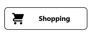
Top image alignment in Button
<buttons:SfButton x:Name="button"
                  Text="Shopping"
                  TextColor="Black"
                  HorizontalOptions="Center"
                  ImageSource="add_to_card.png"
                  ShowIcon="True"
                  ImageSize="25"
                  Stroke="Black"
                  HeightRequest="50"
                  StrokeThickness="4"
                  Background="White"
                  ImageAlignment="Top"/>
SfButton button = new SfButton()
{
Text = "Shopping",
TextColor = Colors.Black,
HorizontalOptions = LayoutOptions.Center,
ImageSource = ImageSource.FromFile("add_to_card.png"),
ShowIcon = true,
ImageSize = 25,
Stroke = Colors.Black,
StrokeThickness = 4,
HeightRequest = 50,
Background = Colors.White,
ImageAlignment = Alignment.Top
};
this.Content = button;
Bottom image alignment in Button
<buttons:SfButton x:Name="button"
                  Text="Shopping"
                  TextColor="Black"
                  HorizontalOptions="Center"
                  ImageSource="add_to_card.png"
                  ShowIcon="True"
                  ImageSize="25"
                  Stroke="Black"
                  HeightRequest="50"
                  StrokeThickness="4"
                  Background="White"
                  ImageAlignment="Bottom"/>
SfButton button = new SfButton()
{
Text = "Shopping",
TextColor = Colors.Black,
HorizontalOptions = LayoutOptions.Center,
ImageSource = ImageSource.FromFile("add_to_card.png"),
ShowIcon = true,
ImageSize = 25,
Stroke = Colors.Black,
StrokeThickness = 4,
HeightRequest = 50,
Background = Colors.White,
ImageAlignment = Alignment.Bottom
};
this.Content = button;
Default image alignment in Button
<buttons:SfButton x:Name="button"
                  Text="Shopping"
                  TextColor="Black"
                  HorizontalOptions="Center"
                  ImageSource="add_to_card.png"
                  ShowIcon="True"
                  ImageSize="25"
                  Stroke="Black"
                  HeightRequest="50"
                  StrokeThickness="4"
                  Background="White"
                  ImageAlignment="Default"/>
SfButton button = new SfButton()
{
Text = "Shopping",
TextColor = Colors.Black,
HorizontalOptions = LayoutOptions.Center,
ImageSource = ImageSource.FromFile("add_to_card.png"),
ShowIcon = true,
ImageSize = 25,
Stroke = Colors.Black,
StrokeThickness = 4,
HeightRequest = 50,
Background = Colors.White,
ImageAlignment = Alignment.Center
};
this.Content = button;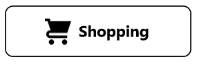
Left image alignment in Button
In RTL flow direction, image alignment with Start will change its direction of placing image to the right. To keep that in same left position, set Left alignment as shown in the following code sample.
<buttons:SfButton x:Name="button"
                  Text="Shopping"
                  TextColor="Black"
                  HorizontalOptions="Center"
                  ImageSource="add_to_card.png"
                  ShowIcon="True"
                  ImageSize="25"
                  Stroke="Black"
                  HeightRequest="50"
                  StrokeThickness="4"
                  Background="White"
                  ImageAlignment="Left"/>
SfButton button = new SfButton()
{
Text = "Shopping",
TextColor = Colors.Black,
HorizontalOptions = LayoutOptions.Center,
ImageSource = ImageSource.FromFile("add_to_card.png"),
ShowIcon = true,
ImageSize = 25,
Stroke = Colors.Black,
StrokeThickness = 4,
HeightRequest = 50,
Background = Colors.White,
ImageAlignment = Alignment.Left
};
this.Content = button;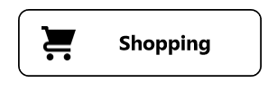
Right image alignment in Button
In RTL flow direction, image alignment with End will change its direction of placing image to the left. To keep that in same right position, set Right alignment as shown in the following code sample.
<buttons:SfButton x:Name="button"
                  Text="Shopping"
                  TextColor="Black"
                  HorizontalOptions="Center"
                  ImageSource="add_to_card.png"
                  ShowIcon="True"
                  ImageSize="25"
                  Stroke="Black"
                  HeightRequest="50"
                  StrokeThickness="4"
                  Background="White"
                  ImageAlignment="Right"/>
SfButton button = new SfButton()
{
Text = "Shopping",
TextColor = Colors.Black,
HorizontalOptions = LayoutOptions.Center,
ImageSource = ImageSource.FromFile("add_to_card.png"),
ShowIcon = true,
ImageSize = 25,
Stroke = Colors.Black,
StrokeThickness = 4,
HeightRequest = 50,
Background = Colors.White,
ImageAlignment = Alignment.Right
};
this.Content = button;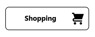
EnableRippleEffect
The EnableRippleEffect property is used to control the presence of the ripple effect. The default value is false.
<buttons:SfButton x:Name="button"
                  Text="Button"
                  HeightRequest="50"
                  EnableRippleEffect="True" />
SfButton button = new SfButton();
button.Text = "Button";
button.EnableRippleEffect = true;
button.HeightRequest = 50;
this.Content = button;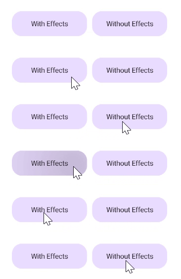
Gradient Background
You can set a gradient as the background of Button using the Background property. The following gradient types are supported:
- Linear gradient
- Radial gradient
Refer to the Microsoft gradient brush documentation for more details.
<buttons:SfButton Text="Linear Gradient"
                  HeightRequest="50"
                  CornerRadius="20">
    <buttons:SfButton.Background>
        <LinearGradientBrush>
            <LinearGradientBrush.GradientStops>
                <GradientStop Color="#0D62D4"
                              Offset="0"/>
                <GradientStop Color="#9F3CDC"
                              Offset="1"/>
            </LinearGradientBrush.GradientStops>
        </LinearGradientBrush>
    </buttons:SfButton.Background>
</buttons:SfButton>
SfButton linearButton = new SfButton();
linearButton.Text = "Linear Gradient";
linearButton.HeightRequest = 50;
linearButton.CornerRadius = 20;
LinearGradientBrush linearGradientBrush = new LinearGradientBrush();
linearGradientBrush.GradientStops = new GradientStopCollection()
{
new GradientStop(){ Color = Color.FromHex("#0D62D4"), Offset = 0 },
new GradientStop(){ Color = Color.FromHex("#9F3CDC"), Offset = 1 }
};
linearButton.Background = linearGradientBrush;
this.Content = linearButton;<buttons:SfButton Text="Radial Gradient"
HeightRequest="50"
CornerRadius="20">
<buttons:SfButton.Background>
<RadialGradientBrush Radius="1.5">
<RadialGradientBrush.GradientStops>
<GradientStop Color="#0D62D4"
Offset="0"/>
<GradientStop Color="#9F3CDC"
Offset="1"/>
</RadialGradientBrush.GradientStops>
</RadialGradientBrush>
</buttons:SfButton.Background>
</buttons:SfButton>SfButton radialButton = new SfButton();
radialButton.Text = "Radial Gradient";
radialButton.HeightRequest = 50;
radialButton.CornerRadius = 20;
RadialGradientBrush radialGradientBrush = new RadialGradientBrush();
radialGradientBrush.GradientStops = new GradientStopCollection()
{
new GradientStop(){ Color = Color.FromHex("#0D62D4"), Offset = 0 },
new GradientStop(){ Color = Color.FromHex("#9F3CDC"), Offset = 1 }
};
radialButton.Background = radialGradientBrush;
this.Content = radialButton;
Command
The Command property is used to associate a command with an instance of Button. This property is most often set with the MVVM pattern to bind callbacks back into the ViewModel. You can also pass a parameter using the CommandParameter property.
The default value of the
Commandproperty isnull.
<buttons:SfButton x:Name="button"
                  Text="Button"
                  Background="{Binding Background}"
                  Command="{Binding ButtonCommand}">
</buttons:SfButton>
public class CommandDemoViewModel : INotifyPropertyChanged
{
private Color _background = Color.Accent;
public Color Background
{
get { return _background; }
set
{
_background = value;
NotifyPropertyChanged();
}
}
private void NotifyPropertyChanged([CallerMemberName] String propertyName = "")
{
PropertyChanged?.Invoke(this, new PropertyChangedEventArgs(propertyName));
}
public event PropertyChangedEventHandler PropertyChanged;
public CommandDemoViewModel()
{
SetBackgroundColor();
this.Background=Color.Accent;
}
private void SetBackgroundColor()
{
//do whatever you want to do here
this.Background = this.Background == Color.DeepSkyBlue ? Color.Accent : Color.DeepSkyBlue;
}
public ICommand ButtonCommand => new Command(SetBackgroundColor);
}