About Syncfusion® .NET MAUI Circular Progress Bar Control
The .NET MAUI Circular Progress Bar shows the progress of a task with customizable visuals. It displaying the progress of a process in circular shapes, determinate and indeterminate states, segments, smooth animation, and with customizable content. You can also define ranges with different colors.
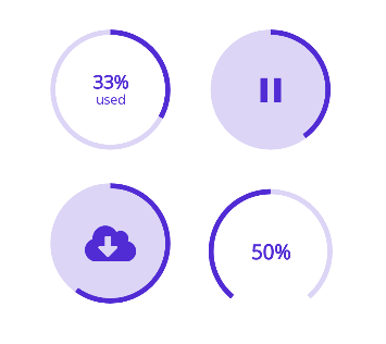
Business use cases
- Data-driven applications that require visual representation of task completion or processing progress.
- Dashboard applications that display progress metrics and performance indicators in circular form.
- Mobile apps that provide loading feedback using animated circular progress indicators.
- Business workflows that need step-based or segmented progress tracking for better user clarity.
Key features
- Progress states support allows visualizing both determinate and indeterminate progress scenarios.
- Circular visualization enables presenting progress in a circular shape for compact and intuitive UI design.
- Segmented progress allows dividing progress into multiple segments to represent gradual progression.
- Color range customization allows defining different colors for specific value ranges to enhance visibility.
- Appearance customization allows configuring track thickness, color, and corner radius styles.
- Custom content support allows displaying custom UI elements or text at the center of the progress indicator.
- Angle customization allows adjusting start and end angles for flexible circular layouts.
Related controls
- Linear Progress Bar for horizontal or vertical progress indication.
- Shimmer for loading state placeholders.
- Accordion for collapsible content sections.
See Also
- Getting Started shows a step‑by‑step guide to begin using the Circular Progress Bar control.
- States explains determinate, indeterminate, and buffer modes to show progress clearly.
- Customization lets you tweak colors, thickness, and styles to match your design.
- UI Kit provides interactive demos and ready‑made UI examples.
Resources
Feature Tour
Get a quick overview of key features and capabilities to kick start your journey.
Explore Features
Showcase Samples
Explore real-world sample apps to see components in action and learn by example.
View Samples
Tutorial Videos
Watch step‑by‑step video guides to quickly understand concepts and implementation.
Watch now
Knowledge Base
Find practical solutions, troubleshooting tips and how‑to guides for common scenarios.
Search KB's