- Show Rounded Corner
- Prevent Toggle
- Scaling
Contact Support
Miscellaneous
6 Feb 20183 minutes to read
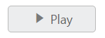
Show Rounded Corner
It sets the corner of Toggle Button in rounded shape. The Toggle Button, by default doesn’t have rounded corner. To set rounded corner, you can enable showRoundedCorner property.
The following steps explains you the details about rendering the Toggle Button with Rounded corner support.
In the HTML page, add the following button elements to configure Toggle Button widget.
<input type="checkbox" id="toggle_roundedCorner" />$(function () {
$("#toggle_roundedCorner").ejToggleButton({
width: "100px",
height: "30px",
contentType: "textandimage",
//used to specify the rounded corner for toggle button
showRoundedCorner: true,
defaultText: "Play",
activeText: "Next",
defaultPrefixIcon: "e-icon e-mediaplay",
activePrefixIcon: "e-icon e-mediapause"
});
});Execute the above code to render the following output.
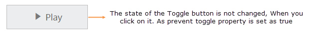
Prevent Toggle
This property is used to prevent the state change of Toggle Button when it is clicked. When you set preventToggle property as true, then the state of the Toggle Button is not changed even though it is clicked.
The following steps explains you the details about rendering the Toggle Button with preventToggle property enabled.
In the HTML page, add the following button elements to configure Toggle Button widget.
<input type="checkbox" id="toggle_prevent" />$(function () {
$("#toggle_prevent").ejToggleButton({
size: "large",
contentType: "textandimage",
defaultText: "Play",
activeText: "Next",
defaultPrefixIcon: " e-icon e-mediaplay",
activePrefixIcon: " e-icon e-mediapause",
//prevent changing state of toggle button
preventToggle: true
});
});Execute the above code to render the following output.
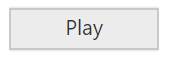
Scaling
ToggleButton widget provides you options to change its height, width and also to change popup height and width.
Change ToggleButton widget Height and width
You can use height and width property to customize ToggleButton width and height.
<input id="toggle" type="checkbox" />// You can customize the width and height of the ToggleButton as follows.
$(function () {
$("#toggle").ejToggleButton({defaultText:"Play",activeText:"Pause",width: "100px",height:"28px" });
});Execute the above code to render the following output.