How can I help you?
Easy Customization
Toggle Button is used in all applications. Toggle Button Size, Content and content location is varied according to each application. The following section contains some customizable option for Toggle Button that can perform easily.
Toggle State
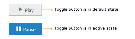
Toggle Button has two states like off / on state in a switch. By default you can set any state at initial and then you can move from one state to another state by clicking on the Toggle Button. These two states are Default and Active. toggleState property is used to set the state of Toggle Button as default state or active state.
The following steps explains you the details about rendering the Toggle Button with different toggle state.
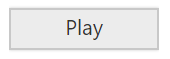
In the HTML page, add the following button elements to configure Toggle Button widget.
<input type="checkbox" id="toggle_default" />
<br />
<input type="checkbox" id="toggle_active" />$(function () {
$("#toggle_default").ejToggleButton({
size: "small",
contentType: "textandimage",
defaultText: "Play",
activeText: "Pause",
defaultPrefixIcon: "e-icon e-mediaplay",
activePrefixIcon: "e-icon e-mediapause",
//set the button in default state
toggleState: false
});
$("#toggle_active").ejToggleButton({
size: "small",
contentType: "textandimage",
defaultText: "Play",
activeText: "Pause",
defaultPrefixIcon: "e-icon e-mediaplay",
activePrefixIcon: "e-icon e-mediapause",
//set the button in active state
toggleState: true
});
});Execute the above code to render the following output.
Toggle state with icons
Prefix and Suffix Icons
You can add icons in prefix and suffix position of Toggle Button. Location of Icon is customized easily using the following mentioned option. This is applicable for the content type’s imageOnly, textandimage, imagetextimage and imageboth.
Toggle Button control also supports the Built-in icon libraries. The ej.widgets.core.min.css contains the definition for important icons that are used in toggle buttons. You can use these Built-in icons by mentioning the icon class name as value in defaultPrefixIcon, defaultSuffixIcon, activePrefixIcon, and activeSuffixIcon property. You can use any font icons that is defined in ej.widgets.core.min.css. It avoids the complexity in specifying icon using sprite image and CSS.
For example the following mentioned Built-in CSS class are used to show the font icons that are used by media player.
- e-mediaback
- e-mediaforward
- e-medianext
- e-mediaprev
- e-mediaeject
- e-mediaclose
- e-mediapause
- e-mediaplay
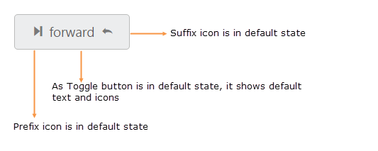
Prefix Icon
It inserts the icon at the starting position of Toggle Button. After this prefix icon, you can use text or suffix icon.
Suffix Icon
It inserts the icon at the ending position of Toggle Button. Before this suffix icon, you can use text or prefix icon.
You can also set icon in different location (prefix, suffix) and in different state (default, active) by using the option provided. The following properties are defined for merging the option to add text, icon with different position and in toggle states.
Property Table
| Property Type | Description |
|---|---|
| activeText | Specifies the text of toggle button in active state |
| activePrefixIcon | Specifies the prefix icon of toggle button in active state |
| activeSuffixIcon | Specifies the suffix icon of toggle button in active state |
| defaultText | Specifies the text of toggle button in default state. |
| defaultPrefixIcon | Specifies the prefix icon of toggle button in default state |
| defaultSuffixIcon | Specifies the suffix icon of toggle button in default state |
The following steps explains you the details about rendering the Toggle Button with above mentioned customization properties.
In the HTML page, add the following button elements to configure Toggle Button widget
<input type="checkbox" id="toggle_content" />
<label for="toggle_content">Toggle</label>$(function () {
$("#toggle_content").ejToggleButton({
showRoundedCorner: true,
contentType: "imagetextimage",
//e-mediaforward class contain font icon
defaultPrefixIcon: "e-icon e-mediaforward",
//e-mediaback class contain font icon
activePrefixIcon: "e-icon e-mediaback",
defaultText: "forward",
activeText: "backward",
//e-undo class contain font icon
defaultSuffixIcon: "e-icon e-undo",
//e- redo class contain font icon
activeSuffixIcon: "e-icon e-redo"
});
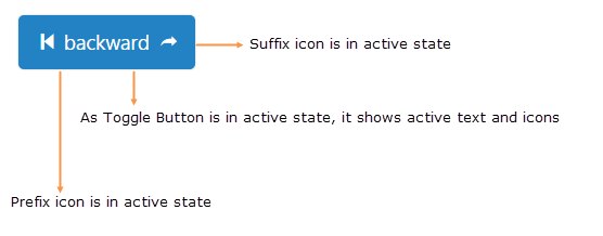
});Execute the above code to render the following output.
Toggle button size
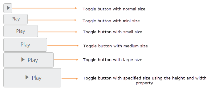
You can render the Toggle Button in different sizes. You can use some predefined size option for rendering a Toggle Button in easiest way. Each size option has different height and width. It mainly avoids the complexity in rendering Toggle Button with complex CSS class. You can mention the size of the Toggle Button using the following five predefined size options.
Predefined Toggle Button size
| Button Size | Description |
|---|---|
| normal | Creates toggle button with content size. |
| mini | Creates toggle button with Built-in mini size height, width specified. |
| small | Creates toggle button with Built-in small size height, width specified. |
| medium | Creates toggle button with Built-in medium size height, width specified. |
| large | Creates toggle button with Built-in large size height, width specified. |
You can also set your own width and height for toggle button using height and width property.
The following steps explains you the details about rendering the Toggle Button with above mentioned size options.
In the HTML page, add the following button elements to configure Toggle Button widget.
<table>
    <tr>
        <td class="btnsht">
            <input type="checkbox" id="toggle_normal" />
            <label for="toggle_normal">Toggle</label>
        </td>
    </tr>
    <tr>
        <td class="btnsht">
            <input type="checkbox" id="toggle_mini" />
            <label for="toggle_mini">Toggle</label>
        </td>
    </tr>
    <tr>
        <td class="btnsht">
            <input type="checkbox" id="toggle_small" />
            <label for="toggle_small">Toggle</label>
        </td>
    </tr>
    <tr>
        <td class="btnsht">
            <input type="checkbox" id="toggle_medium" />
            <label for="toggle_medium">Toggle</label>
        </td>
    </tr>
    <tr>
        <td class="btnsht">
            <input type="checkbox" id="toggle_large" />
            <label for="toggle_large">Toggle</label>
        </td>
    </tr>
  <tr>
        <td class="btnsht">
            <input type="checkbox" id="toggle_customSize" />
            <label for="toggle_customSize">Toggle</label>
        </td>
    </tr>
</table>//Here use size property to render the toggle button in different sizes
$(function () {
$("#toggle_normal").ejToggleButton({
//normal size of toggle button
size: "normal",
showRoundedCorner: true,
contentType: "imageonly",
defaultPrefixIcon: "e-icon e-mediaplay",
activePrefixIcon: "e-icon e-mediapause",
});
$("#toggle_mini").ejToggleButton({
defaultText: "Play",
showRoundedCorner: true,
activeText: "Next",
//mini size of toggle button
size: "mini",
});
$("#toggle_small").ejToggleButton({
showRoundedCorner: true,
defaultText: "Play",
activeText: "Next",
//small size of toggle button
size: "small",
});
$("#toggle_medium").ejToggleButton({
showRoundedCorner: true,
defaultText: "Play",
activeText: "Next",
//medium size of toggle button
size: "medium",
});
$("#toggle_large").ejToggleButton({
showRoundedCorner: true,
defaultText: "Play",
activeText: "Next",
//large size of toggle button
size: "large",
contentType: "textandimage",
defaultPrefixIcon: "e-icon e-mediaplay",
activePrefixIcon: "e-icon e-mediapause",
});
$("#toggle_customSize").ejToggleButton({
showRoundedCorner: true,
defaultText: "Play",
activeText: "Next",
//set own height and width
height: 50,
width: 150,
contentType: "textandimage",
defaultPrefixIcon: "e-icon e-mediaplay",
activePrefixIcon: "e-icon e-mediapause",
});
});Configure the styles
<style>
    .control {
        width: 600px;
    }
</style>
Execute the above code to render the following output.
Content type
The content of the Toggle Button is mainly text and images. Instead of using complex CSS classes to render Toggle Button with different content types, you can use some predefined content type options as listed in the following table. Using this content type you can easily add different types of content for Toggle Button. The Toggle Button supports the following content types.
List of Content types
| Content Type | Description |
|---|---|
| textonly | Supports only for text content only. |
| imageonly | Supports only for image content only |
| imageboth | Supports image for both ends of the toggle button. |
| textandimage | Supports image with the text content. |
| imagetextimage | Supports image with both ends and middle in text. |
The following steps explains you the details about rendering the Toggle Button with above mentioned content type options.
In the HTML page, add the following button elements to configure Toggle Button widget.
<table>
    <tr>
        <td class="btnsht">
            <input type="checkbox" id="toggle_imageonly" />
            <label for="toggle_imageonly">Toggle</label>
        </td>
        <td class="btnsht">
            <input type="checkbox" id="toggle_textonly" />
            <label for="toggle_textonly">Toggle</label>
        </td>
        <td class="btnsht">
            <input type="checkbox" id="toggle_imageboth" />
            <label for="toggle_imageboth">Toggle</label>
        </td>
        <td class="btnsht">
            <input type="checkbox" id="toggle_textandimage" />
            <label for="toggle_textandimage">Toggle</label>
        </td>
        <td class="btnsht">
            <input type="checkbox" id="toggle_imagetextimage" />
            <label for="toggle_imagetextimage">Toggle</label>
        </td>
    </tr>
     </table>
<br/>
<br/>
 <table>
      <tr>
        <td class="btnsht">
            <input type="checkbox" id="toggle_imageonly_small" />
            <label for="toggle_imageonly_small">Toggle</label>
        </td>
        <td class="btnsht">
            <input type="checkbox" id="toggle_textonly_small" />
            <label for="toggle_textonly_small">Toggle</label>
        </td>
        <td class="btnsht">
            <input type="checkbox" id="toggle_imageboth_small" />
            <label for="toggle_imageboth_small">Toggle</label>
        </td>
        <td class="btnsht">
            <input type="checkbox" id="toggle_textandimage_small" />
            <label for="toggle_textandimage_small">Toggle</label>
        </td>
        <td class="btnsht">
            <input type="checkbox" id="toggle_imagetextimage_small" />
            <label for="toggle_imagetextimage_small">Toggle</label>
        </td>
    </tr>
</table>// Here use contentType property to render the toggle button with different contents
$(function () {
$("#toggle_imageonly").ejToggleButton({
showRoundedCorner: true,
//only image is used as content
contentType: "imageonly",
defaultPrefixIcon: "e-icon e-mediaplay",
activePrefixIcon: "e-icon e-mediapause"
});
$("#toggle_textonly").ejToggleButton({
//only text is used as content
contentType: "textonly",
defaultText: "Play",
showRoundedCorner: true,
activeText: "Next"
});
$("#toggle_imageboth").ejToggleButton({
//only images in both end is used as content
contentType: "imageboth",
showRoundedCorner: true,
defaultPrefixIcon: "e-icon e-mediaforward",
activePrefixIcon: "e-icon e-mediaback",
defaultSuffixIcon: "e-icon e-undo",
activeSuffixIcon: "e-icon e-redo"
});
$("#toggle_textandimage").ejToggleButton({
//text and image is used as content
contentType: "textandimage",
showRoundedCorner: true,
defaultText: "Play",
activeText: "Next",
defaultPrefixIcon: "e-icon e-mediaplay",
activePrefixIcon: "e-icon e-mediapause"
});
$("#toggle_imagetextimage").ejToggleButton({
//image text image is used as content
contentType: "imagetextimage",
showRoundedCorner: true,
defaultPrefixIcon: "e-icon e-mediaforward",
activePrefixIcon: "e-icon e-mediaback",
defaultText: "forward",
activeText: "backward",
defaultSuffixIcon: "e-icon e-undo",
activeSuffixIcon: "e-icon e-redo"
});
$("#toggle_imageonly_small").ejToggleButton({
size: "small",
showRoundedCorner: true,
contentType: "imageonly",
defaultPrefixIcon: "e-icon e-mediaplay",
activePrefixIcon: "e-icon e-mediapause"
});
$("#toggle_textonly_small").ejToggleButton({
size: "small",
contentType: "textonly",
defaultText: "Play",
showRoundedCorner: true,
activeText: "Next"
});
$("#toggle_imageboth_small").ejToggleButton({
size: "small",
contentType: "imageboth",
showRoundedCorner: true,
defaultPrefixIcon: "e-icon e-mediaforward",
activePrefixIcon: "e-icon e-mediaback",
defaultSuffixIcon: "e-icon e-undo",
activeSuffixIcon: "e-icon e-redo"
});
$("#toggle_textandimage_small").ejToggleButton({
size: "small",
contentType: "textandimage",
showRoundedCorner: true,
defaultText: "Play",
activeText: "Next",
defaultPrefixIcon: "e-icon e-mediaplay",
activePrefixIcon: "e-icon e-mediapause"
});
$("#toggle_imagetextimage_small").ejToggleButton({
size: "small",
contentType: "imagetextimage",
showRoundedCorner: true,
defaultPrefixIcon: "e-icon e-mediaforward",
activePrefixIcon: "e-icon e-mediaback",
defaultText: "forward",
activeText: "backward",
defaultSuffixIcon: "e-icon e-undo",
activeSuffixIcon: "e-icon e-redo"
});
});Configure the styles
<style>
    .normal {
        width: 300px;
    }

    .small {
        width: 450px;
    }
</style>
Execute the above code to render the following output.
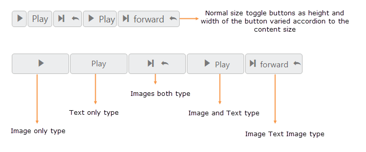
Image position
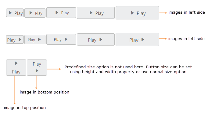
To provide the best look and feel for Toggle Button, position of images in toggle button is important. You can easily customize the position of images inside toggle button using imagePosition property without using any complex CSS. imagePosition property is applicable only with the textandimage content type property. This property represent the position of images with respect to text.
Property Table
| Image Position | Description |
|---|---|
| imageleft | Support for aligning text in right and image in left. |
| imageright | Support for aligning text in left and image in right. |
| imagetop | Support for aligning text in bottom and image in top. |
| imagebottom | Support for aligning text in top and image in bottom. |
The following steps explains you the details about rendering the Toggle Button with above mentioned image Position options.
In the HTML page, add the following button elements to configure Toggle Button widget.
<table>
    <tr>
        <td class="btnsht">
            <input type="checkbox" id="toggle_imageleft_normal" />
            <label for="toggle_imageleft_normal">Toggle</label>
        </td>
        <td class="btnsht">
            <input type="checkbox" id="toggle_imageleft_mini" />
            <label for="toggle_imageleft_mini">Toggle</label>
        </td>
        <td class="btnsht">
            <input type="checkbox" id="toggle_imageleft_small" />
            <label for="toggle_imageleft_small">Toggle</label>
        </td>
        <td class="btnsht">
            <input type="checkbox" id="toggle_imageleft_medium" />
            <label for="toggle_imageleft_medium">Toggle</label>
        </td>
        <td class="btnsht">
            <input type="checkbox" id="toggle_imageleft_large" />
            <label for="toggle_imageleft_large">Toggle</label>
        </td>
    </tr>
     </table>
<br />
<br />
 <table>
      <tr>
        <td class="btnsht">
            <input type="checkbox" id="toggle_imageright_normal" />
            <label for="toggle_imageright_normal">Toggle</label>
        </td>
        <td class="btnsht">
            <input type="checkbox" id="toggle_imageright_mini" />
            <label for="toggle_imageright_mini">Toggle</label>
        </td>
        <td class="btnsht">
            <input type="checkbox" id="toggle_imageright_small" />
            <label for="toggle_imageright_small">Toggle</label>
        </td>
        <td class="btnsht">
            <input type="checkbox" id="toggle_imageright_medium" />
            <label for="toggle_imageright_medium">Toggle</label>
        </td>
        <td class="btnsht">
            <input type="checkbox" id="toggle_imageright_large" />
            <label for="toggle_imageright_large">Toggle</label>
        </td>
    </tr>
</table>
 <br />
<br />
 <table>
      <tr>
        <td class="btnsht">
            <input type="checkbox" id="toggle_imagetop" />
            <label for="toggle_imagetop">Toggle</label>
        </td>
        <td class="btnsht">
            <input type="checkbox" id="toggle_imagebottom" />
            <label for="toggle_imagebottom">Toggle</label>
        </td>
    </tr>
</table>//It explains how to render the toggle button images with different position
$(function () {
$("#toggle_imageleft_normal").ejToggleButton({
size: "normal",
imagePosition: "imageleft",
contentType: "textandimage",
showRoundedCorner: true,
defaultText: "Play",
activeText: "Next",
defaultPrefixIcon: "e-icon e-mediaplay",
activePrefixIcon: "e-icon e-mediapause"
});
$("#toggle_imageleft_mini").ejToggleButton({
size: "mini",
imagePosition: "imageleft",
contentType: "textandimage",
showRoundedCorner: true,
defaultText: "Play",
activeText: "Next",
defaultPrefixIcon: "e-icon e-mediaplay",
activePrefixIcon: "e-icon e-mediapause"
});
$("#toggle_imageleft_small").ejToggleButton({
size: "small",
imagePosition: "imageleft",
contentType: "textandimage",
showRoundedCorner: true,
defaultText: "Play",
activeText: "Next",
defaultPrefixIcon: "e-icon e-mediaplay",
activePrefixIcon: "e-icon e-mediapause"
});
$("#toggle_imageleft_medium").ejToggleButton({
size: "medium",
imagePosition: "imageleft",
contentType: "textandimage",
showRoundedCorner: true,
defaultText: "Play",
activeText: "Next",
defaultPrefixIcon: "e-icon e-mediaplay",
activePrefixIcon: "e-icon e-mediapause"
});
$("#toggle_imageleft_large").ejToggleButton({
size: "large",
imagePosition: "imageleft",
contentType: "textandimage",
showRoundedCorner: true,
defaultText: "Play",
activeText: "Next",
defaultPrefixIcon: "e-icon e-mediaplay",
activePrefixIcon: "e-icon e-mediapause"
});
$("#toggle_imageright_normal").ejToggleButton({
size: "normal",
imagePosition: "imageright",
contentType: "textandimage",
showRoundedCorner: true,
defaultText: "Play",
activeText: "Next",
defaultPrefixIcon: "e-icon e-mediaplay",
activePrefixIcon: "e-icon e-mediapause"
});
$("#toggle_imageright_mini").ejToggleButton({
size: "mini",
imagePosition: "imageright",
contentType: "textandimage",
showRoundedCorner: true,
defaultText: "Play",
activeText: "Next",
defaultPrefixIcon: "e-icon e-mediaplay",
activePrefixIcon: "e-icon e-mediapause"
});
$("#toggle_imageright_small").ejToggleButton({
size: "small",
imagePosition: "imageright",
contentType: "textandimage",
showRoundedCorner: true,
defaultText: "Play",
activeText: "Next",
defaultPrefixIcon: "e-icon e-mediaplay",
activePrefixIcon: "e-icon e-mediapause"
});
$("#toggle_imageright_medium").ejToggleButton({
size: "medium",
imagePosition: "imageright",
contentType: "textandimage",
showRoundedCorner: true,
defaultText: "Play",
activeText: "Next",
defaultPrefixIcon: "e-icon e-mediaplay",
activePrefixIcon: "e-icon e-mediapause"
});
$("#toggle_imageright_large").ejToggleButton({
size: "large",
imagePosition: "imageright",
contentType: "textandimage",
showRoundedCorner: true,
defaultText: "Play",
activeText: "Next",
defaultPrefixIcon: "e-icon e-mediaplay",
activePrefixIcon: "e-icon e-mediapause"
});
$("#toggle_imagetop").ejToggleButton({
imagePosition: "imagetop",
contentType: "textandimage",
showRoundedCorner: true,
defaultText: "Play",
activeText: "Next",
defaultPrefixIcon: "e-icon e-mediaplay",
activePrefixIcon: "e-icon e-mediapause",
width: 60
});
$("#toggle_imagebottom").ejToggleButton({
imagePosition: "imagebottom",
contentType: "textandimage",
showRoundedCorner: true,
defaultText: "Play",
activeText: "Next",
defaultPrefixIcon: "e-icon e-mediaplay",
activePrefixIcon: "e-icon e-mediapause",
width: 60
});
});Configure the styles
<style>
    .one {
        width: 450px;
    }

    .two{
        width: 115px;
    }
</style>
Execute the above code to render the following output.
Theme support
You can control the style and appearance of Toggle Button based on CSS classes. To apply styles to the Toggle Button control, you can refer two files, ej.widgets.core.min.css and ej.theme.min.css. When you refer ej.widgets.all.min.css file, then it is not necessary to include the files ej.widgets.core.min.css and ej.theme.min.css in your project, as ej.widgets.all.min.css is the combination of these two.
By default, there are 12 themes support available for Toggle Button control namely,
- default-theme
- flat-azure-dark
- fat-lime
- flat-lime-dark
- flat-saffron
- flat-saffron-dark
- gradient-azure
- gradient-azure-dark
- gradient-lime
- gradient-lime-dark
- gradient-saffron
- gradient-saffron-dark
Custom CSS
You can use the CSS to customize the Toggle Button control appearance. Define a CSS class as per requirement and assign the class name to cssClass property.
The following steps explains you the details about rendering the Toggle Button with custom CSS.
In the HTML page, add the following button elements to configure Toggle Button widget.
<table>
    <tr>
        <td class="btnsht">
            <input type="checkbox" id="toggle_customCss1" />
            <label for="toggle_customCss1">Toggle</label>
        </td>
        <td class="btnsht">
            <input type="checkbox" id="toggle_customCss2" />
            <label for="toggle_customCss2">Toggle</label>
        </td>
        <td class="btnsht">
            <input type="checkbox" id="toggle_customCss3" />
            <label for="toggle_customCss3">Toggle</label>
        </td>
        <td class="btnsht">
            <input type="checkbox" id="toggle_customCss4" />
            <label for="toggle_customCss4">Toggle</label>
        </td>
        <td class="btnsht">
            <input type="checkbox" id="toggle_customCss5" />
            <label for="toggle_customCss5">Toggle</label>
        </td>
    </tr>
</table>//implement custom CSS for each toggle button
$(function () {
$("#toggle_customCss1").ejToggleButton({
cssClass: "customCss1",
size: "small",
showRoundedCorner: true,
contentType: "textandimage",
defaultText: "Play",
activeText: "Next",
defaultPrefixIcon: "e-icon e-mediaplay",
activePrefixIcon: "e-icon e-mediapause"
});
$("#toggle_customCss2").ejToggleButton({
cssClass: "customCss2",
size: "small",
showRoundedCorner: true,
contentType: "textandimage",
defaultText: "Play",
activeText: "Next",
defaultPrefixIcon: "e-icon e-mediaplay",
activePrefixIcon: "e-icon e-mediapause"
});
$("#toggle_customCss3").ejToggleButton({
cssClass: "customCss3",
size: "small",
showRoundedCorner: true,
contentType: "textandimage",
defaultText: "Play",
activeText: "Next",
defaultPrefixIcon: "e-icon e-mediaplay",
activePrefixIcon: "e-icon e-mediapause"
});
$("#toggle_customCss4").ejToggleButton({
cssClass: "customCss4",
size: "small",
showRoundedCorner: true,
contentType: "textandimage",
defaultText: "Play",
activeText: "Next",
defaultPrefixIcon: "e-icon e-mediaplay",
activePrefixIcon: "e-icon e-mediapause"
});
$("#toggle_customCss5").ejToggleButton({
cssClass: "customCss5",
size: "small",
showRoundedCorner: true,
contentType: "textandimage",
defaultText: "Play",
activeText: "Next",
defaultPrefixIcon: "e-icon e-mediaplay",
activePrefixIcon: "e-icon e-mediapause"
});
});Configure the CSS styles to apply on buttons.
<style type="text/css" class="cssStyles">
    /* Customize the button background */
    .e-togglebutton.customCss1 {
        background-color: #121111;
    }
    .e-togglebutton.customCss2 {
        background-color: #94bbd5;
    }
    .e-togglebutton.customCss3 {
        background-color: #f3533c;
    }
    .e-togglebutton.customCss4 {
        background-color: #d1eeed;
    }
    .e-togglebutton.customCss5 {
        background-color: #deb66e;
    }
     /* Customize the button image & text color */
    .e-togglebutton.customCss1.e-btn.e-select .e-icon, .e-togglebutton.customCss1.e-btn.e-select .e-btntxt {
        color: #94bbd5;
    }
    .e-togglebutton.customCss2.e-btn.e-select .e-icon, .e-togglebutton.customCss2.e-btn.e-select .e-btntxt {
        color: #121111;
    }
    .e-togglebutton.customCss3.e-btn.e-select .e-icon, .e-togglebutton.customCss3.e-btn.e-select .e-btntxt {
        color: #cef6f7;
    }
    .e-togglebutton.customCss5.e-btn.e-select .e-icon, .e-togglebutton.customCss5.e-btn.e-select .e-btntxt {
        color: #534f4f;
    }
</style>
Execute the above code to render the following output.

State persistence
ToggleButton widget provide options to maintain the selected value after you refresh the page by using enablePersistence property.
Steps to use State persistence of the ToggleButton
The following steps explains you to use enablePersistence property.
In the HTML page, add a <input> element to configure ToggleButton widget.
<input id="toggle" type="checkbox" />// Use enablePersistence property to maintain selected value as follows.
$(function () {
$("#toggle").ejToggleButton({ defaultText:"Play",
activeText:"Pause",
enablePersistence : true
});
});Enable/Disable ToggleButton
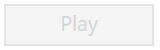
ToggleButton provides you an option to enable /disable the ToggleButton. You can disable the ToggleButton by setting the “enabled” property value as false.
The following steps explain you to enable/disable property in ToggleButton .
<input id="toggle" type="checkbox" />// To enable/disable ToggleButton controls use the following code example.
//Enable ToggleButton:
$(function () {
$("#toggle").ejToggleButton({defaultText:"Play",activeText:"Pause",enabled: true });
});
//Disable ToggleButton:
$(function () {
$("#toggle").ejToggleButton({defaultText:"Play",activeText:"Pause",enabled: false });
});Execute the above code to render the following output.