Grouping Style in React Data Grid
The appearance of grouping elements in the React Data Grid component can be customized using CSS. Here are examples for customizing the group header, group expand/collapse icons, group caption row, and grouping indent cell.
Customizing the group header
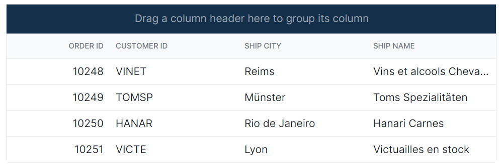
The .e-groupdroparea class is used to style the group header element.
.e-grid .e-groupdroparea {
    background-color: #132f49;
}
Customizing the group expand or collapse icons
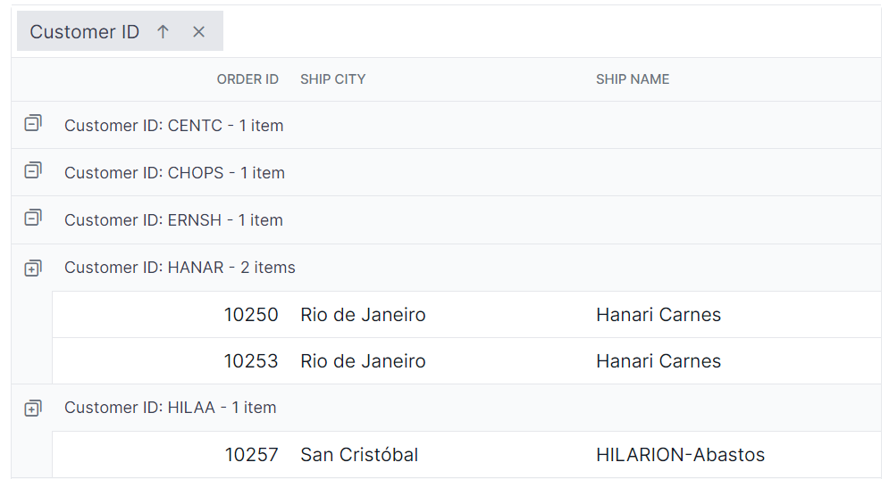
The .e-icon-gdownarrow and .e-icon-grightarrow classes are used to style the expand and collapse icons.
.e-grid .e-icon-gdownarrow::before{
    content:'\e7c9'
    }
    .e-grid .e-icon-grightarrow::before{
    content:'\e80f'
}
In this example, the content property is modified to change the icon displayed. Available Syncfusion® icons can be used based on the active theme.
Customizing the group caption row
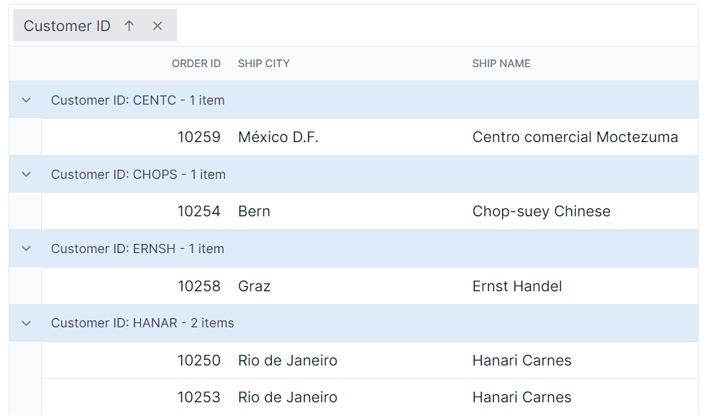
The .e-groupcaption class is used to style the group caption row element, and the .e-recordplusexpand and .e-recordpluscollapse classes are used for the icons indicating record expansion or collapse.
.e-grid .e-groupcaption {
    background-color: #deecf9;
}

.e-grid .e-recordplusexpand,
.e-grid .e-recordpluscollapse {
    background-color: #deecf9;
}
Customizing the grouping indent cell
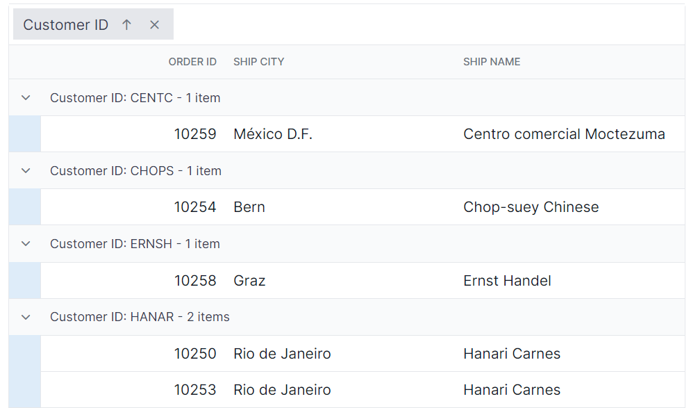
The .e-indentcell class is used to style the indent cell that appears in grouped grid rows.
.e-grid .e-indentcell {
    background-color: #deecf9;
}