ToolTip in MAUI DataGrid (SfDataGrid)
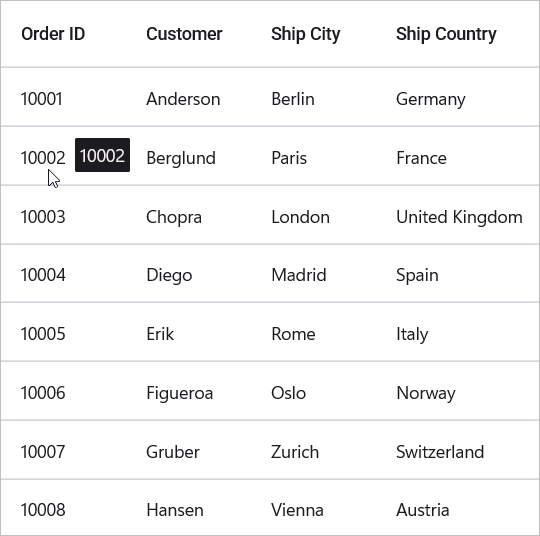
The SfDataGrid provides support for displaying tooltips. A tooltip displays a pop-up window showing information when interacting with cells of SfDataGrid.
To show tooltips:
- On Windows/Mac: Hover the mouse cursor over any cell in the grid
- On Android/iOS: Long press on any cell in the grid
Show tooltip in a header and record cell
To enable tooltip for the DataGrid, set the SfDataGrid.ShowToolTip property to true (default: false). This displays a tooltip containing cell content when users interact with cells.
<syncfusion:SfDataGrid x:Name="DataGrid"
                       ItemsSource="{Binding Orders}"
                       ShowToolTip="True" />
public partial class MainPage : ContentPage
{
public MainPage()
{
InitializeComponent();
SfDataGrid dataGrid = new SfDataGrid();
OrderInfoViewModel viewModel = new OrderInfoViewModel();
dataGrid.ItemsSource = viewModel.Orders;
dataGrid.ShowToolTip = true;
this.Content = dataGrid;
}
}
You can enable tooltips for specific columns by setting the DataGridColumn.ShowToolTip property to true for the desired columns. If a column has ShowToolTip explicitly set to false, the tooltip will not display for that column even if grid-level ShowToolTip is true.
<syncfusion:SfDataGrid x:Name="DataGrid"
                       ItemsSource="{Binding Orders}"
                       ShowToolTip="True"
                       AutoGenerateColumnsMode="None">
    <syncfusion:SfDataGrid.Columns>
        <syncfusion:DataGridTextColumn MappingName="OrderID"
                                       HeaderText="Order ID"
                                       ShowToolTip="True" />
        <syncfusion:DataGridTextColumn MappingName="Customer"
                                       HeaderText="Customer"
                                       ShowToolTip="True" />
        <syncfusion:DataGridTextColumn MappingName="City"
                                       HeaderText="Ship City"
                                       ShowToolTip="False" />
        <syncfusion:DataGridTextColumn MappingName="Country"
                                       HeaderText="Ship Country"
                                       ShowToolTip="False" />
    </syncfusion:SfDataGrid.Columns>
</syncfusion:SfDataGrid>
public partial class MainPage : ContentPage
{
public MainPage()
{
InitializeComponent();
OrderInfoViewModel viewModel = new OrderInfoViewModel();
SfDataGrid dataGrid = new SfDataGrid
{
ItemsSource = viewModel.Orders,
ShowToolTip = true,
AutoGenerateColumnsMode = AutoGenerateColumnsMode.None
};
// Add columns
dataGrid.Columns.Add(new DataGridTextColumn
{
MappingName = "OrderID",
HeaderText = "Order ID",
ShowToolTip = true
});
dataGrid.Columns.Add(new DataGridTextColumn
{
MappingName = "Customer",
HeaderText = "Customer",
ShowToolTip = true
});
dataGrid.Columns.Add(new DataGridTextColumn
{
MappingName = "City",
HeaderText = "Ship City",
ShowToolTip = false
});
dataGrid.Columns.Add(new DataGridTextColumn
{
MappingName = "Country",
HeaderText = "Ship Country",
ShowToolTip = false
});
this.Content = dataGrid;
}
}Note:
TheDataGridColumn.ShowToolTipproperty takes higher priority than theSfDataGrid.ShowToolTipproperty.
ToolTip Customization
You can customize the appearance of the tooltip in the MAUI SfDataGrid using either implicit styles or default style properties. Below are two approaches to achieve this:
Apply Implicit Style
You can define an implicit style in the ContentPage.Resources section by targeting the DataGridToolTipView. This allows you to customize various visual aspects of the tooltip such as Background, TextColor, FontAttributes, FontFamily, and FontSize.
To change the tooltip’s border appearance, use the Stroke and StrokeThickness properties within the implicit style.
-
Stroke: Sets the border color of the tooltip. -
StrokeThickness: Defines the thickness of the tooltip border.
<ContentPage.Resources>
    <Style TargetType="syncfusion:DataGridToolTipView">
        <Setter Property="Background" Value="AliceBlue" />
        <Setter Property="Stroke" Value="Red" />
        <Setter Property="StrokeThickness" Value="2" />
        <Setter Property="TextColor" Value="Brown" />
    </Style>
</ContentPage.Resources>
<syncfusion:SfDataGrid x:Name="DataGrid"
                       ItemsSource="{Binding Orders}"
                       ShowToolTip="True" />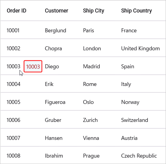
Apply Default Style
You can apply basic tooltip styling using the DefaultStyle property of SfDataGrid. This method supports only background and text color customization.
<syncfusion:SfDataGrid x:Name="DataGrid"
                       ItemsSource="{Binding Orders}"
                       ShowToolTip="True">
    <syncfusion:SfDataGrid.DefaultStyle>
        <syncfusion:DataGridStyle ToolTipBackground="Red"
                                  ToolTipTextColor="White" />
    </syncfusion:SfDataGrid.DefaultStyle>
</syncfusion:SfDataGrid>
Creating custom tooltip views
Customizing the ToolTip using DataTemplate
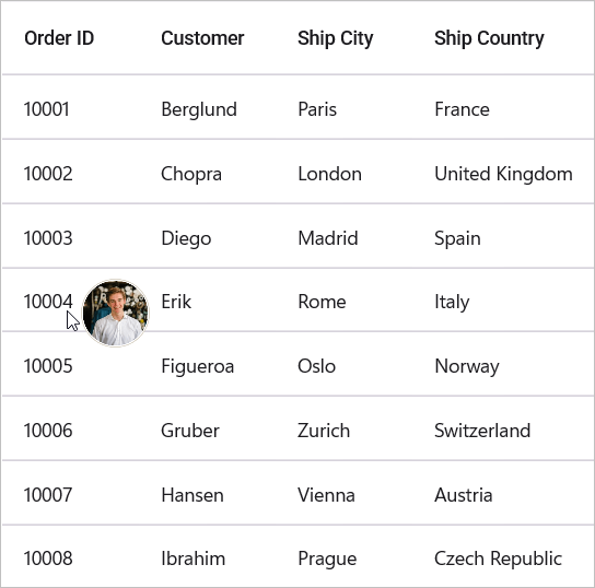
You can customize the appearance and content of tooltips by setting the SfDataGrid.ToolTipTemplate property.
<ContentPage.Resources>
    <local:ImageConverter x:Key="ImageConverter" />
</ContentPage.Resources>

<syncfusion:SfDataGrid x:Name="dataGrid"
                       ItemsSource="{Binding Orders}"
                       ShowToolTip="True">
    <syncfusion:SfDataGrid.ToolTipTemplate>
        <DataTemplate>
            <Image HeightRequest="100" WidthRequest="100" Source="{Binding Customer,Converter={StaticResource ImageConverter}}" />
        </DataTemplate>
    </syncfusion:SfDataGrid.ToolTipTemplate>
</syncfusion:SfDataGrid>
// Create a custom converter to convert customer name to image source
public class ImageConverter : IValueConverter
{
public object Convert(object value, Type targetType, object parameter, CultureInfo culture)
{
if (value is string customerName)
{
// Example: Map customer names to image resources
return customerName switch
{
"Anderson" => "anderson.png",
"Chopra" => "chopra.png",
_ => "placeholder.png"
};
}
return null;
}
public object ConvertBack(object value, Type targetType, object parameter, CultureInfo culture)
{
return null;
}
}
Customizing the ToolTip with DataTemplateSelector
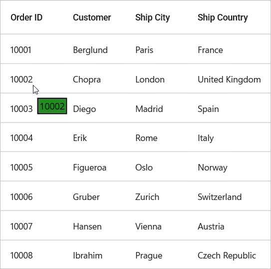
You can load different tooltip templates conditionally based on cell data by using a DataTemplateSelector with the SfDataGrid.ToolTipTemplate property.
<ContentPage.Resources>
    <ResourceDictionary>
        <DataTemplate x:Key="Default">
            <Border Stroke="Black" StrokeThickness="2">
                <Label Text="{Binding OrderID}" Background="Red" TextColor="White" Padding="2" />
            </Border>
        </DataTemplate>
        <DataTemplate x:Key="Alternative">
            <Border Stroke="Black" StrokeThickness="2">
                <Label Text="{Binding OrderID}" Background="ForestGreen" TextColor="Black" Padding="2" />
            </Border>
        </DataTemplate>
    </ResourceDictionary>
</ContentPage.Resources>

<syncfusion:SfDataGrid x:Name="DataGrid"
                       ItemsSource="{Binding Orders}"
                       ShowToolTip="True">
    <syncfusion:SfDataGrid.ToolTipTemplate>
        <local:ToolTipTemplateSelector AlternateTemplate="{StaticResource Alternative}"
                                       DefaultTemplate="{StaticResource Default}" />
    </syncfusion:SfDataGrid.ToolTipTemplate>
</syncfusion:SfDataGrid>
public class ToolTipTemplateSelector : DataTemplateSelector
{
public DataTemplate DefaultTemplate { get; set; }
public DataTemplate AlternateTemplate { get; set; }
protected override DataTemplate OnSelectTemplate(object item, BindableObject container)
{
if (item is OrderInfo order)
{
// Select template based on OrderID value
if (order.OrderID % 2 == 0)
{
return AlternateTemplate;
}
else
{
return DefaultTemplate;
}
}
return DefaultTemplate;
}
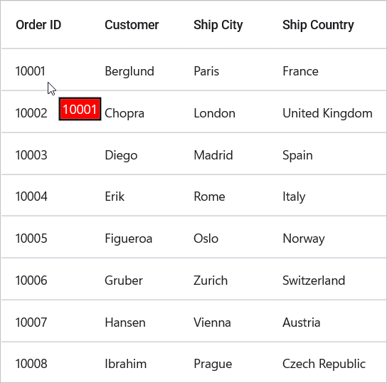
}The following image shows the DefaultTemplate which is applied through ToolTipTemplate.
The following image shows the AlternateTemplate which is applied through ToolTipTemplate.
ToolTip Delay
You can control how long the grid waits before showing a tooltip using the SfDataGrid.TooltipDelay property. The value is specified in milliseconds and applies to hover delay on Windows and macOS only. On touch platforms (Android/iOS) tooltips are shown via long-press and TooltipDelay is not applicable.
This is helpful for preventing tooltip interference with other interactions, such as context menu popups or sorting operations.
<syncfusion:SfDataGrid x:Name="DataGrid"
                       ItemsSource="{Binding Orders}"
                       ShowToolTip="True"
                       TooltipDelay="800" />
SfDataGrid dataGrid = new SfDataGrid();
OrderInfoViewModel viewModel = new OrderInfoViewModel();
dataGrid.ItemsSource = viewModel.Orders;
dataGrid.ShowToolTip = true;
dataGrid.TooltipDelay = 800; // delay in milliseconds (Windows/macOS)
this.Content = dataGrid;Events
CellToolTipOpening event
The CellToolTipOpening event is raised when a tooltip is about to be displayed for a cell. The event provides DataGridCellToolTipOpeningEventArgs which contains the following properties:
- Column: Gets the GridColumn of the cell for which the tooltip is being shown.
- RowData: Gets the data object associated with the row containing the cell.
- RowColumnIndex: Gets the row and column index of the cell.
- ToolTipText: Gets the text content that is displayed within the tooltip.
-
Cancel: Gets or sets a value indicating whether the tooltip should be displayed. Set totrueto prevent the tooltip from showing.
<syncfusion:SfDataGrid x:Name="DataGrid"
                       ItemsSource="{Binding Orders}"
                       ShowToolTip="True"
                       CellToolTipOpening="DataGrid_CellToolTipOpening">
</syncfusion:SfDataGrid>
public partial class MainPage : ContentPage
{
public MainPage()
{
InitializeComponent();
dataGrid.CellToolTipOpening += DataGrid_CellToolTipOpening;
}
private void DataGrid_CellToolTipOpening(object sender, DataGridCellToolTipOpeningEventArgs e)
{
// Access the row data
if (e.RowData is OrderInfo order)
{
// Optionally cancel tooltip for specific conditions
if (order.OrderID < 10000)
{
e.Cancel = true; // Hide tooltip for orders below 10000
}
}
}
}